Facebook creates heat map showing the number of people who complain of new coronavirus infection
Based on a survey of `` presence or absence of new coronavirus infection (COVID-19) symptoms '' answered by users on Facebook, Facebook and Carnegie Mellon University understand at a glance the area where many people complain of COVID-19 symptoms I made and published a map that I can. This data will also show whether the number of infected people in the area is increasing or decreasing, and is expected to be useful in predicting future epidemics.
Self-reported COVID-19 Symptoms Show Promise for Disease Forecasts
Mark Zuckerberg: How data can aid the fight against covid-19-The Washington Post
https://www.washingtonpost.com/opinions/2020/04/20/how-data-can-aid-fight-against-covid-19/
Although COVID-19 infection spreads in the United States, it was difficult to collect accurate data for each county, so information was being collected via Facebook. The survey, with the cooperation of Carnegie Mellon University, asks Facebook users opt-in questions about fever, cough, shortness of breath, loss of smell, etc. The user's response is sent to researchers at Carnegie Mellon University instead of Facebook, which makes it possible to 'reach areas where patients are increasing,' 'how many days will patients appear in hospitals,' and 'where successful suppression was achieved?' It was thought that it would be possible to make early predictions such as 'somewhere.'
Actually, in the United States, about 1 million responses are received each week. The collected data has been confirmed to correlate with data from infected cases by public institutions, indicating that the collected data is useful for predicting the epidemic of COVID-19. It is also possible to see detailed data such as '2 to 3% of people who have symptoms of COVID-19 in a certain area of New York City'. From this data, Facebook has created an interactive map showing the status of new coronavirus infections in each region, and updates it daily during the epidemic.
Below is the map.
Facebook COVID-19 Symptom Map
https://covid-survey.dataforgood.fb.com/
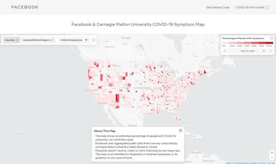
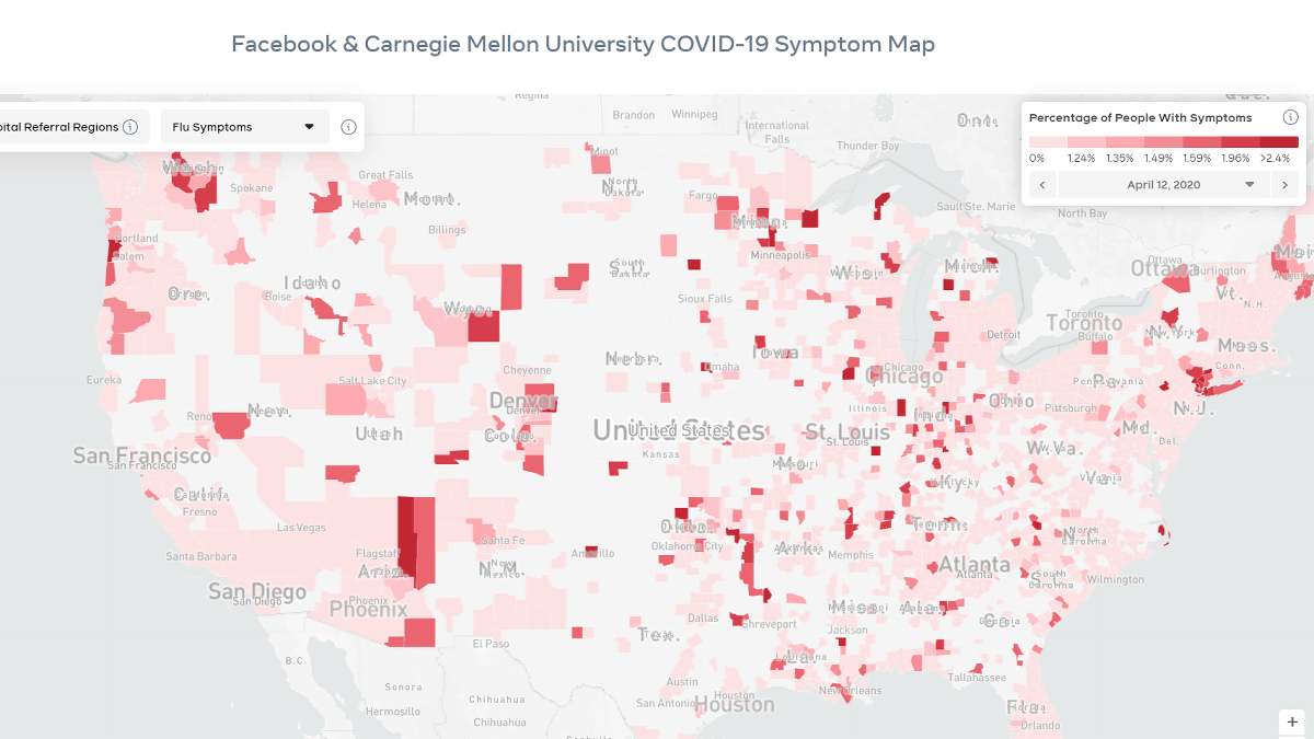
On the top page, a map of the United States is displayed in different shades of red. It is only in the United States that the shade can be confirmed at the time of article creation.
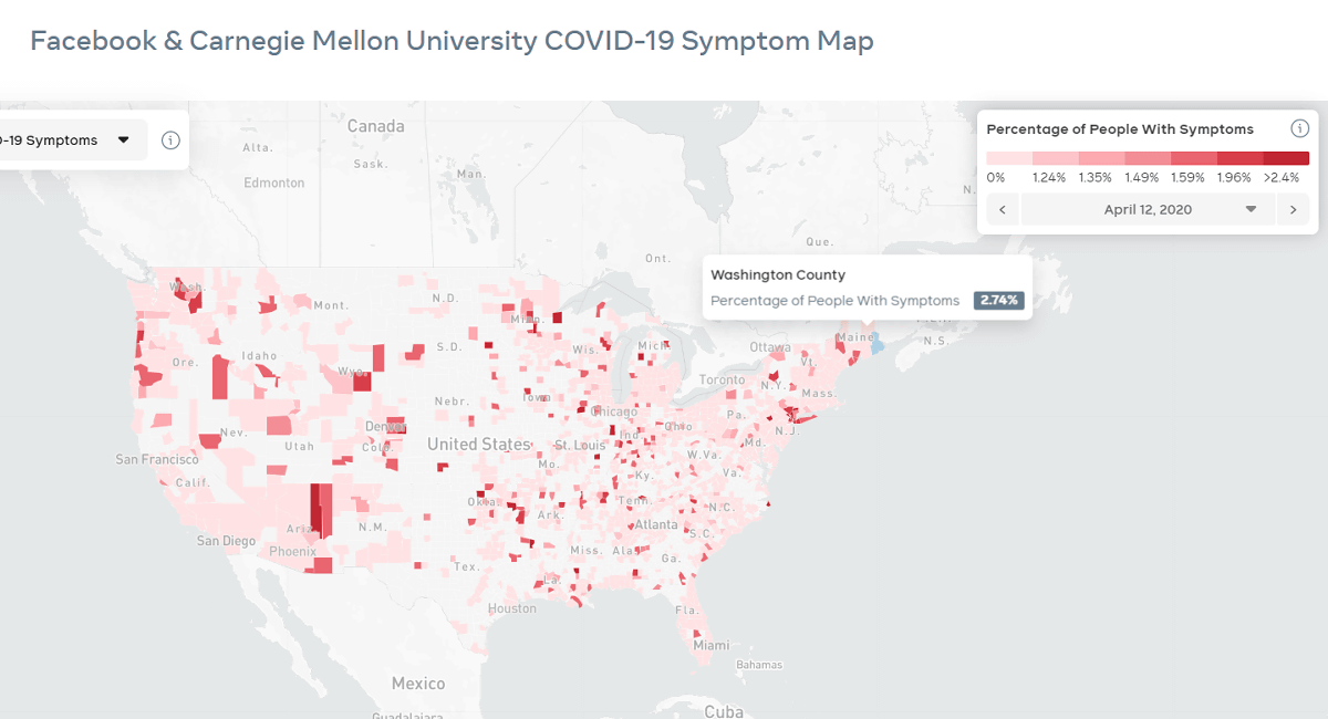
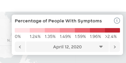
The shade of color tells you what percentage of the county the person with the symptom represents represents 0% of the lightest pink and 2.4% or more of the darkest red.
The map can be enlarged or reduced using the '+' and '-' icons at the bottom right of the screen.
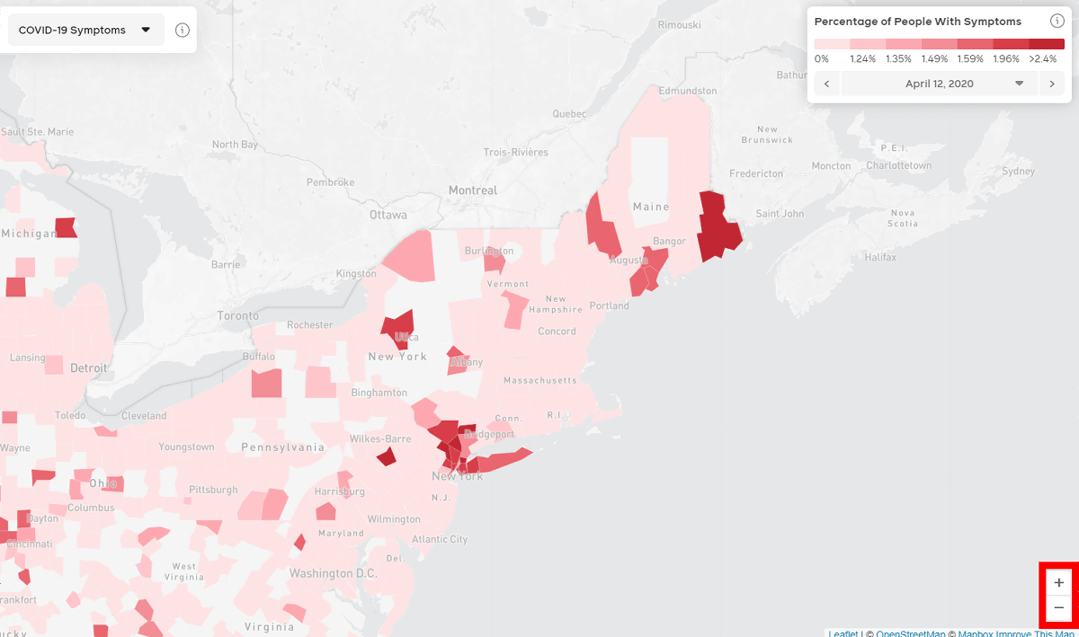
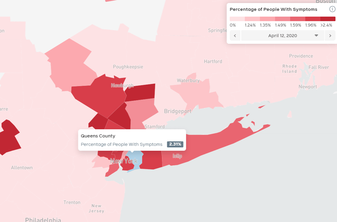
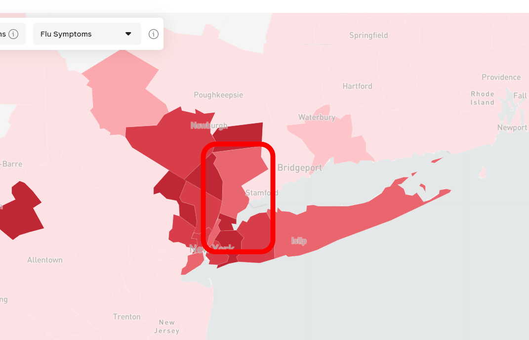
Looking at the state of New York, there were several places showing more than 2.4%.
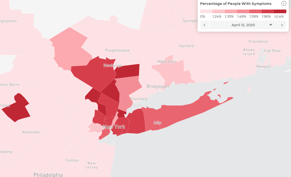
New York City says it's 2.31%, but ...
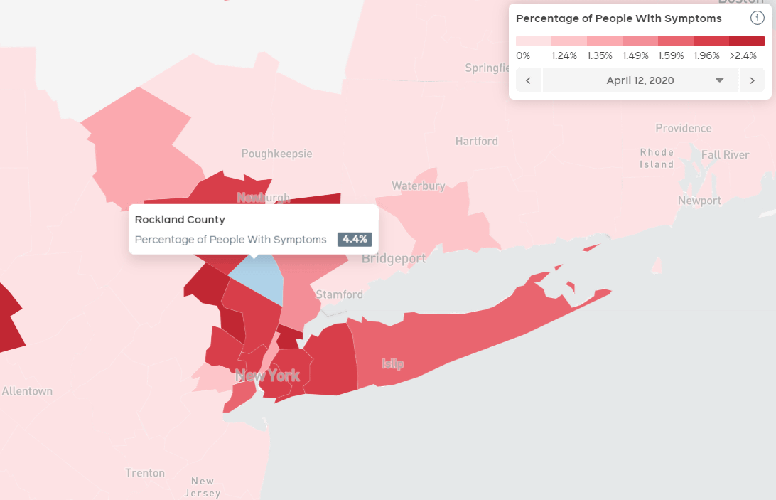
The highest ratio was 4.4% in 'Rockland County'. In addition, Rockland County is a bedtown-like suburb 19 km from Manhattan and is a
In addition to COVID-19, the map could show the proportion of people with influenza symptoms, so let's display it ...
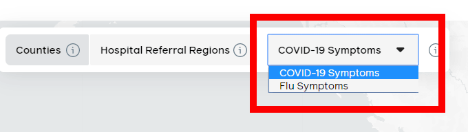
Although there was almost no change in the shade due to overlapping symptoms, in some counties, more people had influenza symptoms than COVID-19.
Related Posts:
in Web Service, Posted by darkhorse_log