`` COVID-19 data explorer '' that can visualize and compare the trend of the new coronavirus by country
With the rise of the new coronavirus (SARS-CoV-2), the word '
Databrew's COVID-19 data explorer
https://datacat.cc/covid19/
When you access the above URL, the following page will open.
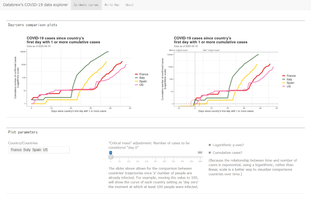
There are two graphs at the top of the screen. On the left screen, the X axis starts with 'Day Zero', while the right graph shows the movement of the graph before 'Day Zero'. The definition of Day Zero can be determined by yourself.

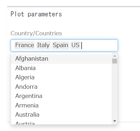
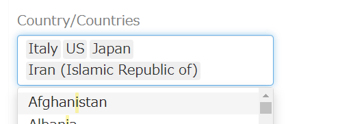
Below the graph, on the left, you can select the countries to display as a graph. The default is France, Italy, Spain, and the United States, but if you place your cursor in the text box, other country candidates are displayed, so if you select from here, it is OK.
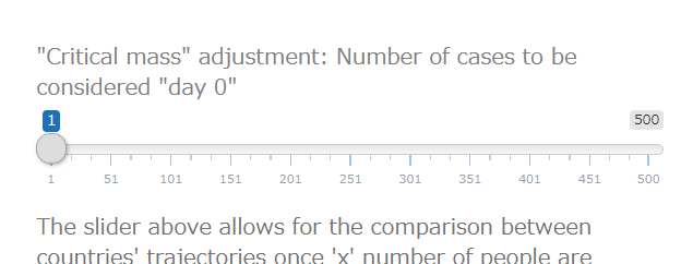
At the bottom, near the middle of the graph, is a slider, where you can determine the
On the right side, there are check boxes for whether to set the Y axis to logarithmic scale and to set the graph to cumulative numbers.

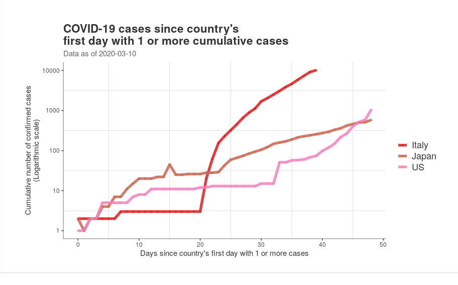
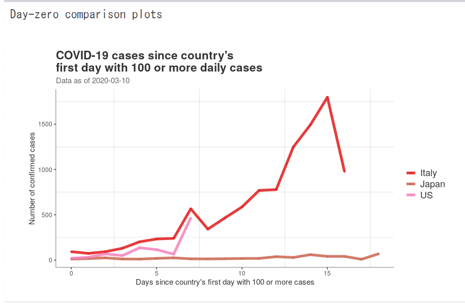
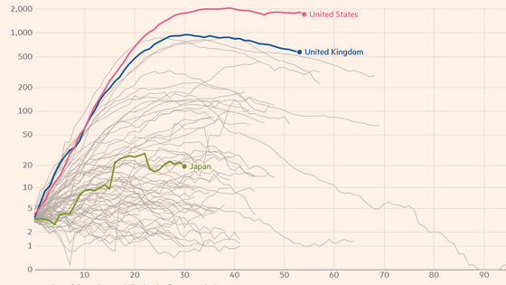
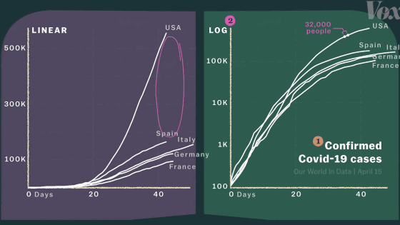
For example, if the countries to be graphed are Italy, the United States, and Japan, it looks like this. Day zero is one case, log scale and cumulative.
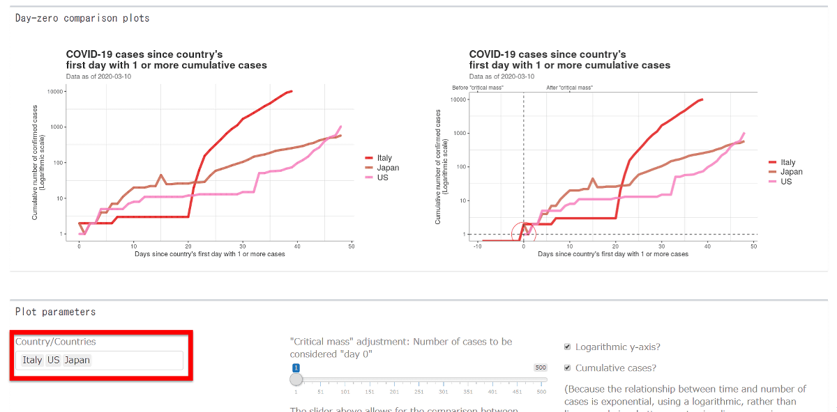
Below, the vertical axis is 'the cumulative number of confirmed cases' and the horizontal axis is 'the number of days since the first case was found'. Red is the graph of Italy, Japan is brown, and the United States is pink. Looking at the graph, you can see from a certain moment that the Italian graph suddenly jumped up. Japan has relatively calm graphs. In the United States, the cumulative number of infected people surpasses Japan around the 46th day.
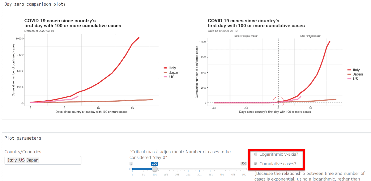
The definition of Day Zero is '100 cases of infection'.

Then you can see that the United States has just surpassed 100 cases.
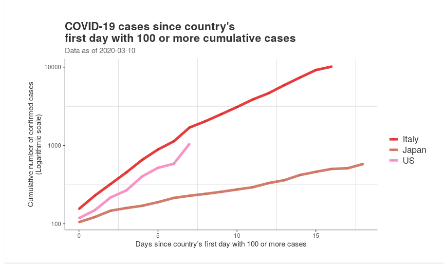
If you look at the graphs that show fluctuations before Day Zero, you can see that the U.S. graph has gained momentum around 100 cases. Conversely, Italy is losing momentum, albeit slightly.

If you uncheck the log scale, it looks like this. The momentum of the Italian graph has been emphasized.
……, but unchecking the cumulative number and limiting it to the number of new infections showed that the momentum in Italy was starting to drop sharply.

Conversely, in the United States, the graph is showing a jump, and it is clear that infections in each country are decreasing or increasing.
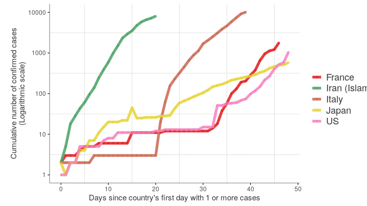
I added Iran to the graph.
Then the color of the graph changes. This time, Iran is red, Italy is green, Japan is yellow, and the United States is pink. In Iran, the graph is growing rapidly as in Italy.
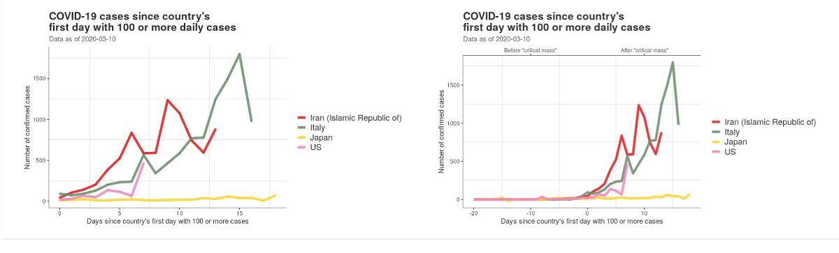
Furthermore, when the definition of day zero was changed back to one case of infection, there was a marked difference between countries in the momentum of the graph from the first report of a case to the increase in the number of confirmed infections.

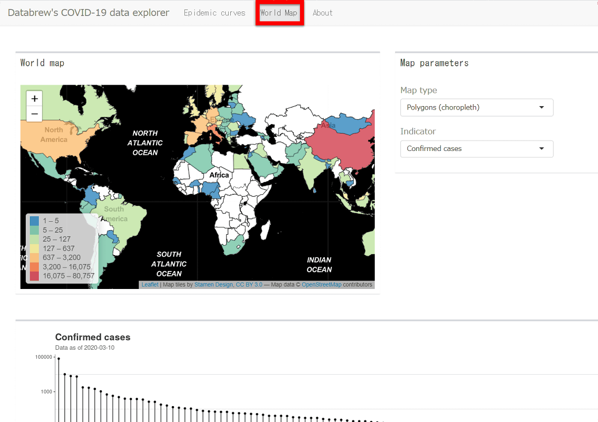
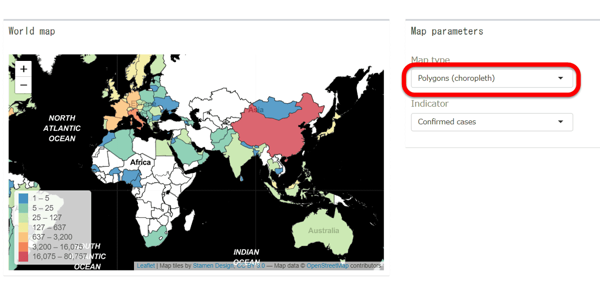
In addition, clicking the 'World Map' tab at the top of the screen, the number of infected people in each country was displayed on the map.
By default, the
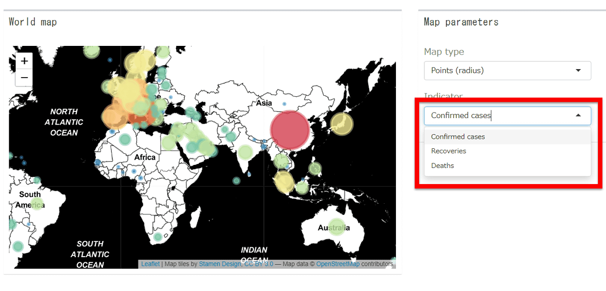
When you visualize the number with the size of the circle, it looks like this.

In addition to the number of confirmed infections, it is also possible to display the number of recovered and dead people.
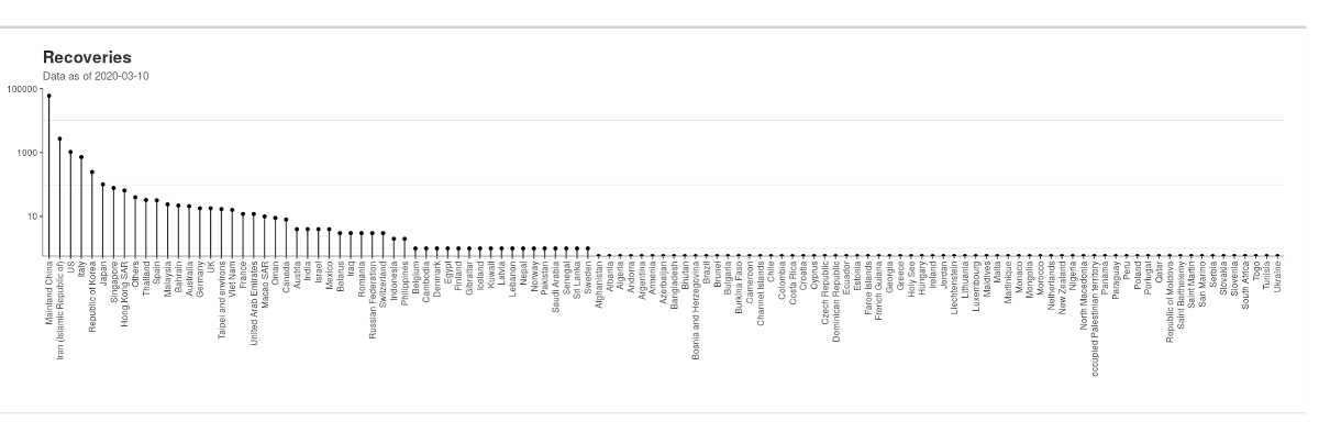
Below the map, the country-specific rankings of the number of confirmed infections, the number of people recovered, and the number of deaths were displayed.
It should be noted, COVID-19 data explorer were summarized by the Johns Hopkins University, medical institutions have been published, including the WHO and CDC is that of that based on the data .
Related Posts:

in Review, Posted by darkhorse_log