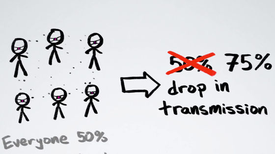
A movie that can understand whether the infection of the new coronavirus is expanding or converging
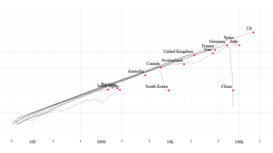
As a countermeasure against the new coronavirus infection (COVID-19), each country has issued its own measures such as `` restrictions on going out '' and `` order to suspend business '', but `` Whether the epidemic is expanding or converging? There has been little coverage on the subject. A YouTube channel
How To Tell If We're Beating COVID-19-YouTube
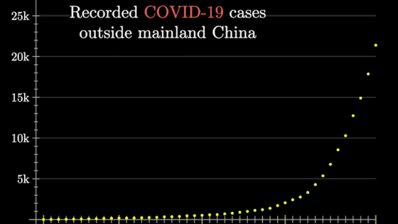
COVID-19 is rampant around the world, and news outlets have reported numerous news reports, including: 'The total number of confirmed cases of COVID-19 in New York has exceeded 15,000.'

The problem with such news is that it focuses on 'total infections.' Since the total number of infected people is updated immediately, it is difficult to imagine 'what is happening now' with the total number of infected people alone.
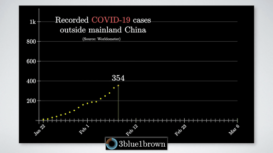
We need to look beyond the total number of infected people in order to know 'is mankind overcoming or losing COVID-19?'

Infectious diseases like COVID-19 tend to exponentially increase the number of people infected during the early epidemics. However, the number of infected people cannot grow exponentially forever.
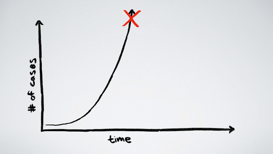
The exponential growth of infected people will end with either of two scenarios: 'all humans around the world will be infected' and 'successful in controlling epidemics'.
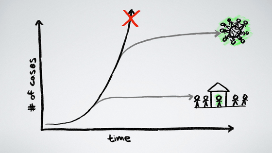
The worrisome question is, 'When will the exponential increase in infected people end?' The situation is different depending on whether the total number of infected people at the end of the epidemic is 10 times or 1000 times the current number.
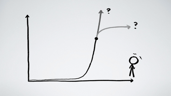
The key to knowing that is to know 'is the epidemic ending?'

So, the following is a graph created by Bhatia that shows whether the epidemic of COVID-19 is converging.
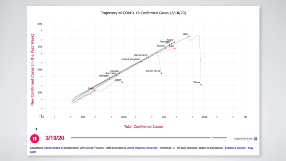
In the graph, the vertical axis shows the number of new infected people confirmed per week, the horizontal axis shows the total number of infected people, and the trend of the number of infected people in countries such as Japan and the United States is indicated by a line.
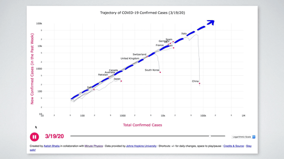
As a whole, the total number of infected people rises to the right like the blue line, but falls below the blue line on the way. This means that the exponential growth of COVID-19 is in the convergence phase.
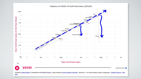
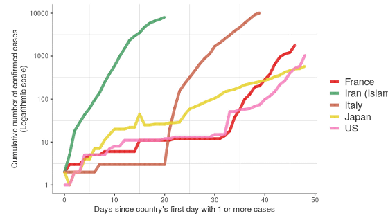
Since this graph focuses on 'whether the epidemic of COVID-19 has converged', there are various differences from the graph that you usually see. One of them is that it is drawn on a
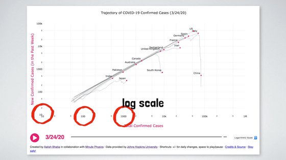
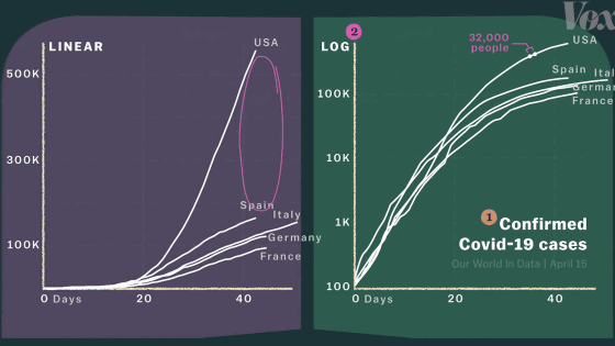
The logarithmic scale has the advantage of expanding small numbers and shrinking large numbers, making it easier to compare countries with large numbers of infected people.
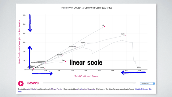
Second, the vertical axis shows the number of new infections (confirmed per week). In a common graph, the vertical axis indicates 'total number of infected people.' However, in the graph of the total number of infected people on the vertical axis, it is difficult to tell whether the increase in the number of infected people is accelerating or decelerating. In the graph below, the area painted red is 'accelerating the increase in the number of infected people' and the area painted blue is 'decelerating the increase in the number of infected people'.
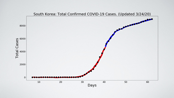
However, if the vertical axis is set to 'new number of infected people', it can be seen that when the slope becomes zero, 'the increase in the number of infected people is flat'. If the slope is positive, the increase in the number of infected people is accelerating; if the slope is negative, the increase in the number of infected people is slowing down.
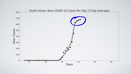
Third, the horizontal axis does not indicate 'time'. A graph with the horizontal axis fixed at time (t) is common, but this time it is different.
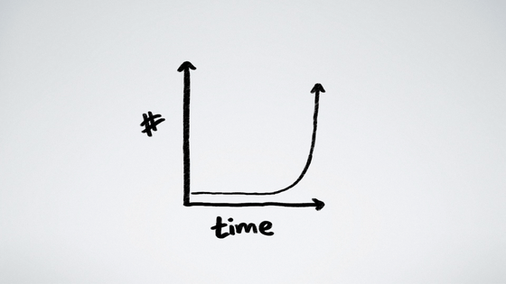
This is because there are two important points in understanding the outbreak of COVID-19: the total number of infected people and the number of new infected people. The time was cut off to give priority to these two.

Bhatia's 'Graph showing whether the epidemic of COVID-19 is converging' can be checked from the link below.
Covid Trends
The graph explained in the movie is displayed in the center. Move the cursor to each point where the country name is written ...
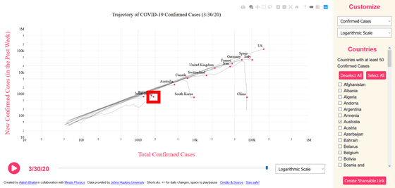
Changes in “Total Confirmed Cases (total number of infected people)” and “Weelky Confirmed Cases (total number of newly infected people per week)” for that country are displayed in red.
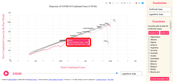
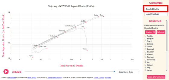
In 'Customize', you can switch to 'Reported Deaths' as well as 'Confirmed Cases'.
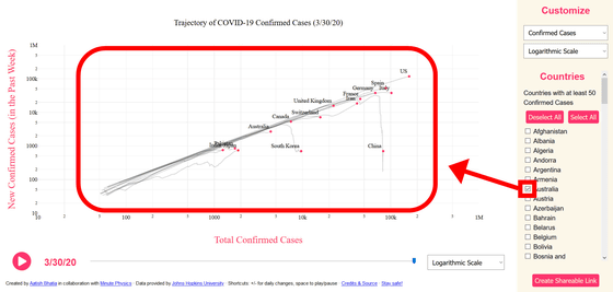
Only the countries checked in the 'Country' in the right column are displayed on the graph.
Related Posts:
in Web Application, Video, Posted by darkhorse_log
