What is the misconception that the 'New Coronavirus Infected People Graph' invites?
Graphs showing the epidemic of the new coronavirus infection (COVID-19) appear in many news and media, but there is basically 'emphasis' in the graph, and therefore 'hidden things' ”Is also present, the points to note when viewing the graph are explained on YouTube.
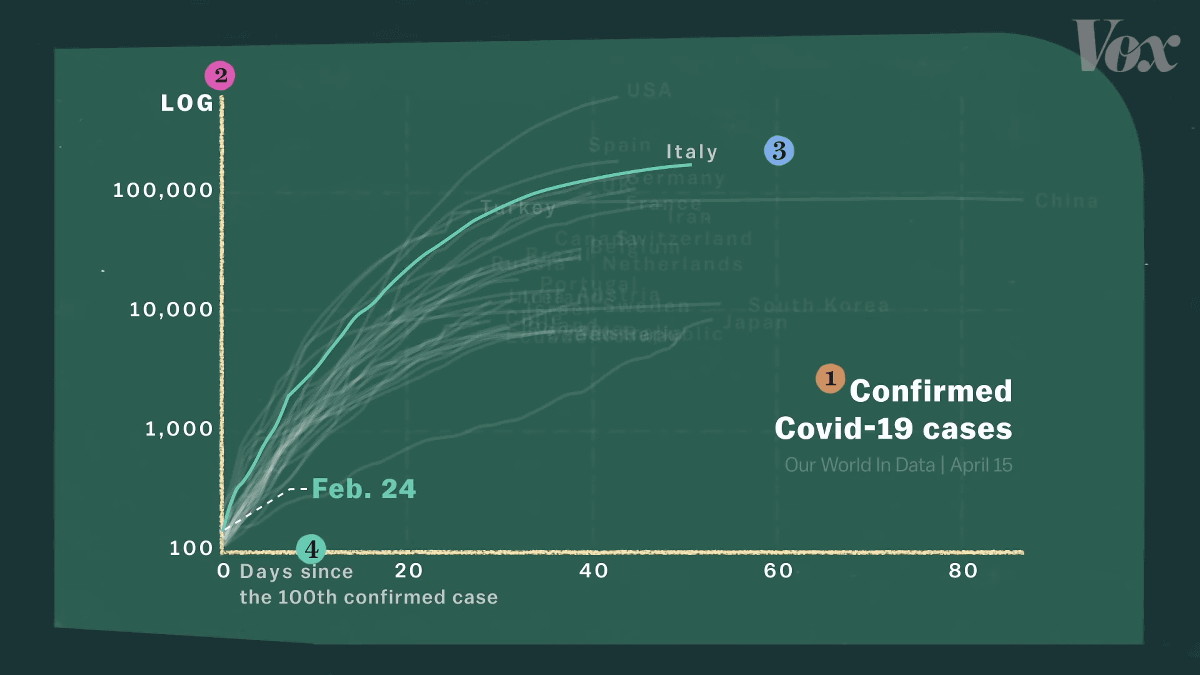
When looking at the graph showing COVID-19 infected people, there are four important points to avoid misunderstandings.
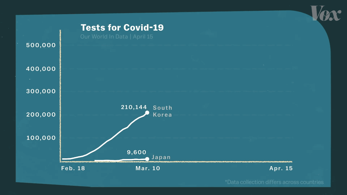
First of all, this graph does not show all cases of COVID-19, but only 'cases with confirmed infection'. For this reason, it cannot be said that the outbreaks of all countries are accurately represented. For example, the difference between South Korea and Japan is noticeable because the number of inspections in Japan is small.
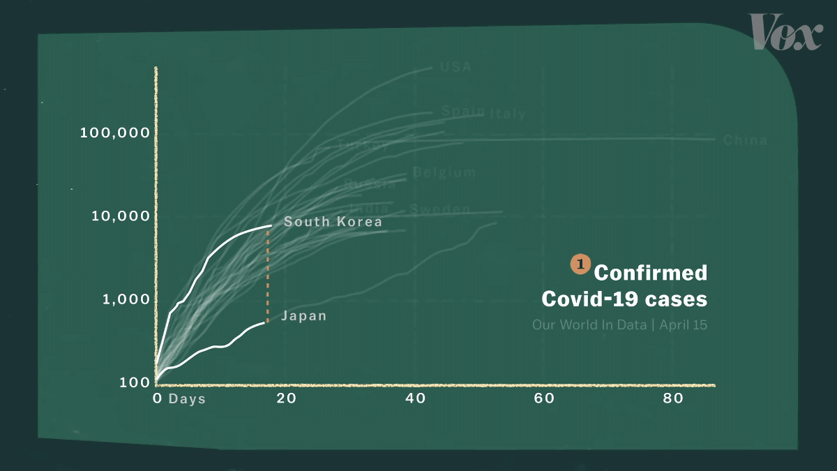
As of March 10, more than 210,000 inspections were conducted in South Korea, but only 9600 in Japan.
Outbreaks are gradually subsiding in South Korea, where a large number of inspections have been conducted, but the situation in Japan becomes more pressing as the number of inspections catches up.
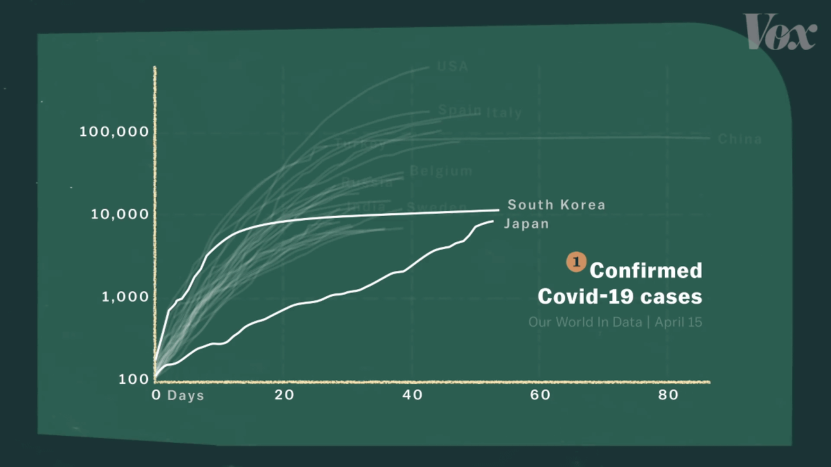
In other words, it is impossible to understand the meaning of 'number of confirmed cases' without regard to the number of tests and the accuracy of the tests. Outbreaks do not appear to have occurred in poor countries, but this is also largely related to the number of tests.
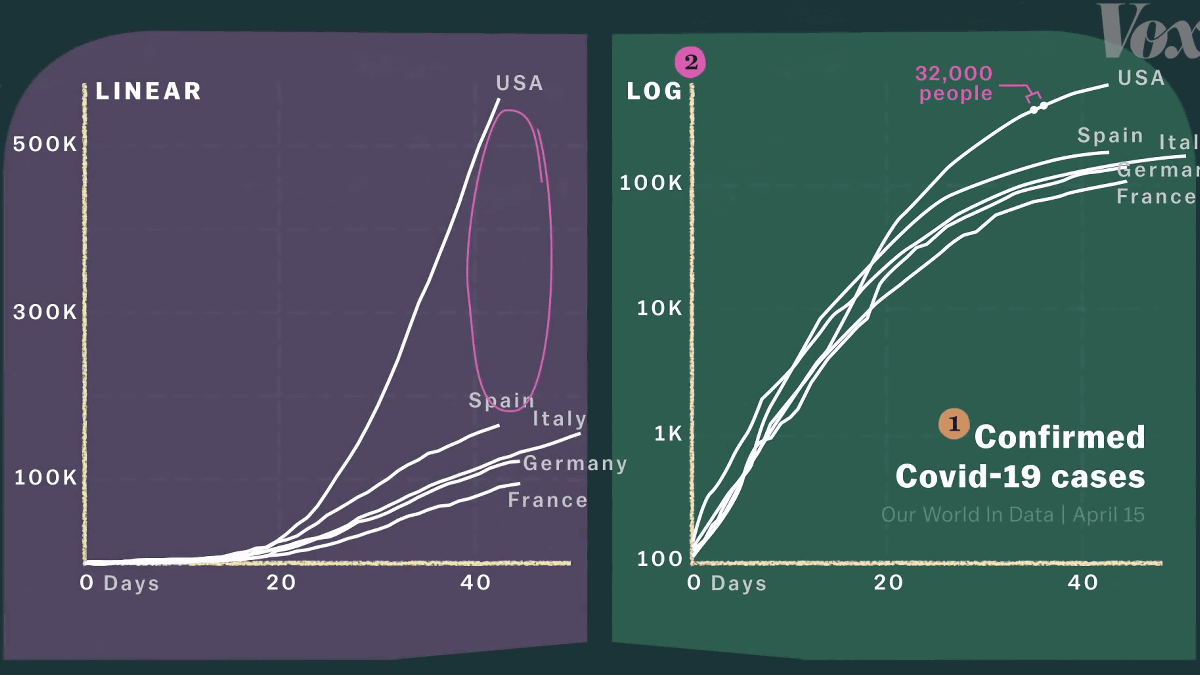
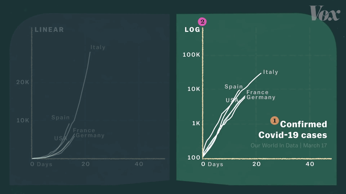
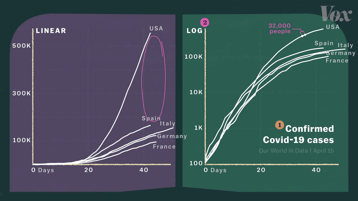
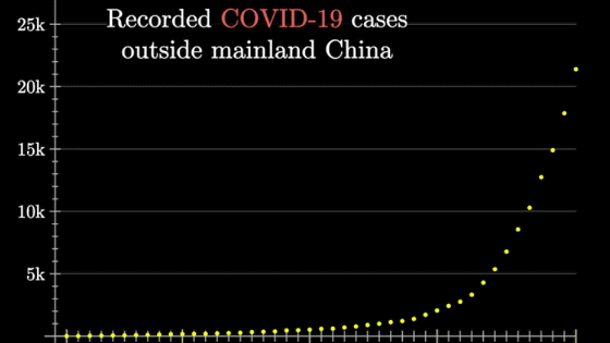
The second point to note is the Y axis of the graph. A typical graph uses a uniform scale, while COVID-19 graphs sometimes use a
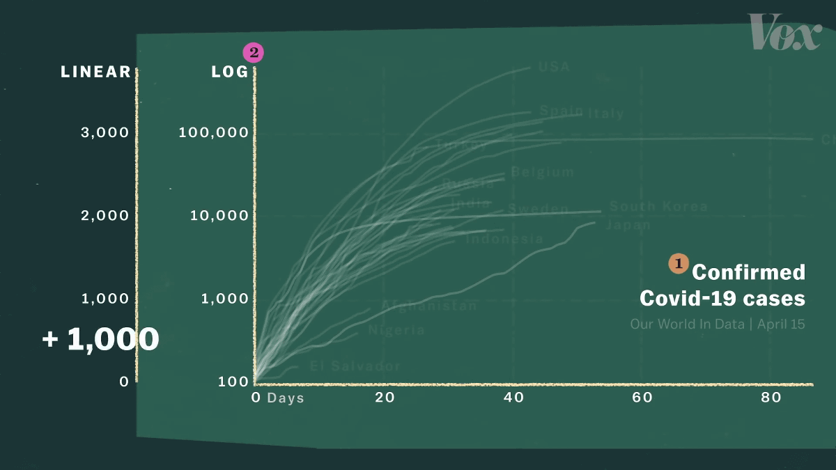
In the logarithmic scale, the intervals between the scales are increased by several times. If you look at the graph below, you can see that the scale from the bottom is 1,000, 10,000, 100,000, 10 times larger.
So with the first 100,000 ...

The next 100,000 people have a very different 'width'. The larger the number, the more compressed the 'width' that appears on the graph.
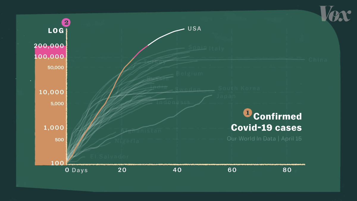
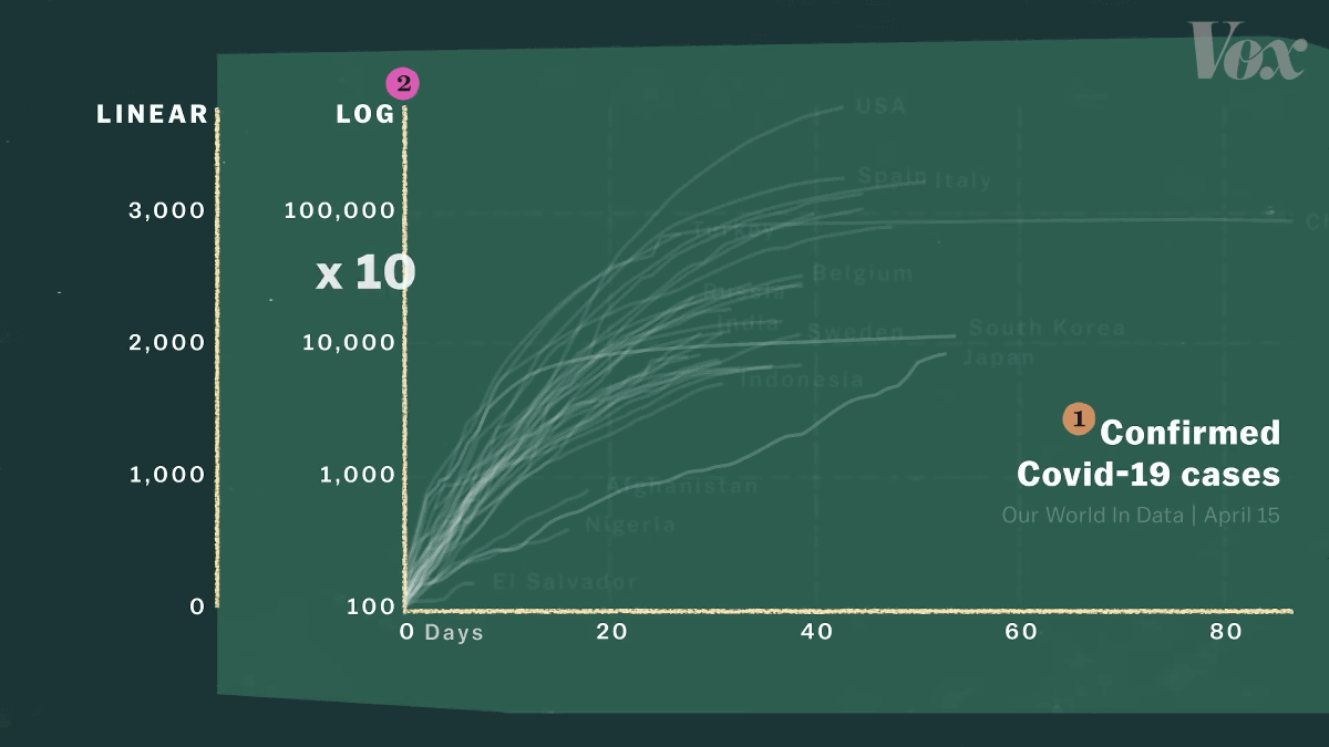
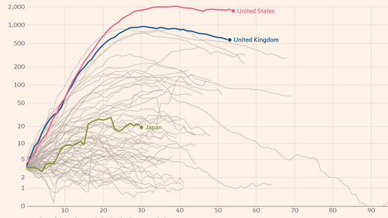
The reason why the logarithmic scale is used is that even if Italy looks prominent when the uniform scale is used ...
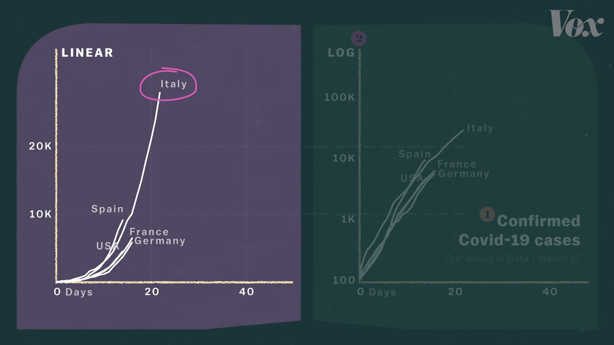
The logarithmic scale shows that other countries have the same ruts as Italy. Since the number of infectious diseases is increasing rapidly, it can be said that a logarithmic scale that gives a clearer warning is more useful.
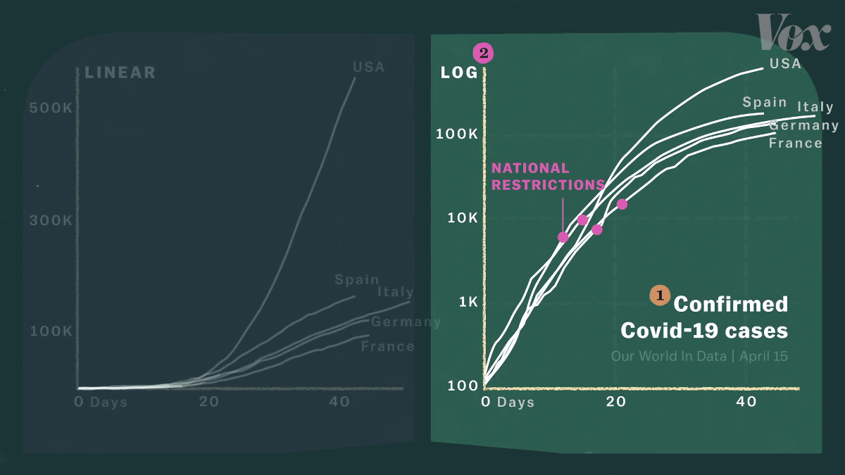
Also, after each government has locked down, it can be seen that the trend of the trend has calmed down on the logarithmic scale graph, but it can not be read in the case of the uniform scale graph.
However, it should be noted that in the case of the logarithmic scale, the slight difference shown in the upper part of the graph is a large number.
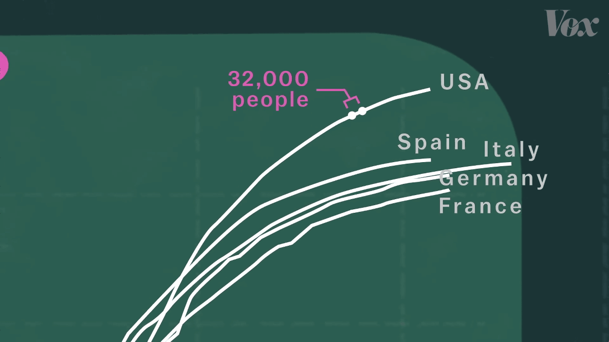
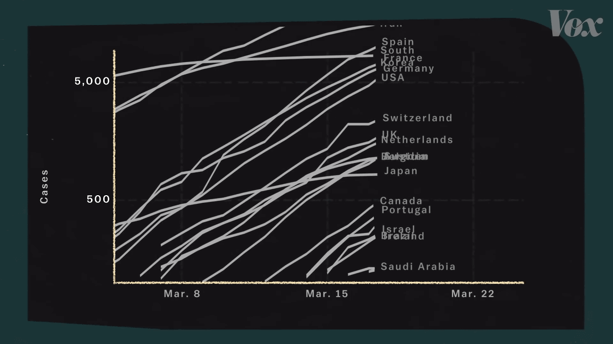
On a logarithmic scale, the difference between the United States and Spain looks small, but on a uniform scale, a large difference can be seen.
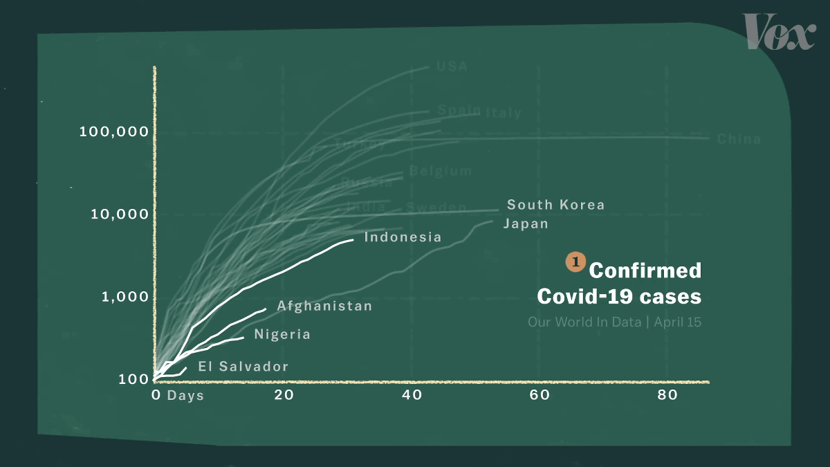
The third caveat is that the graph ignores the total population. Considering the population, due to the large number of inspections, the epidemics of countries such as Luxembourg and Iceland stand out.
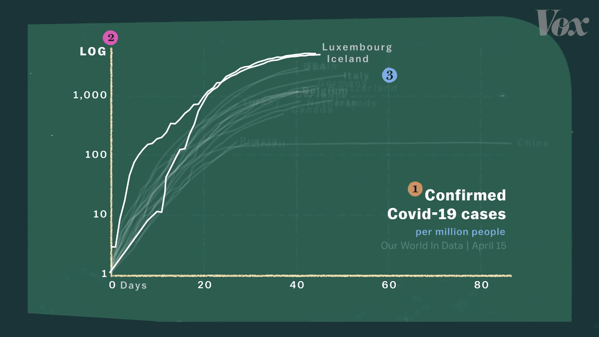
The graph is slightly lower when considering the population because the population of the United States and China is large. However, the population does not affect the “momentum” of the increase in confirmed cases.
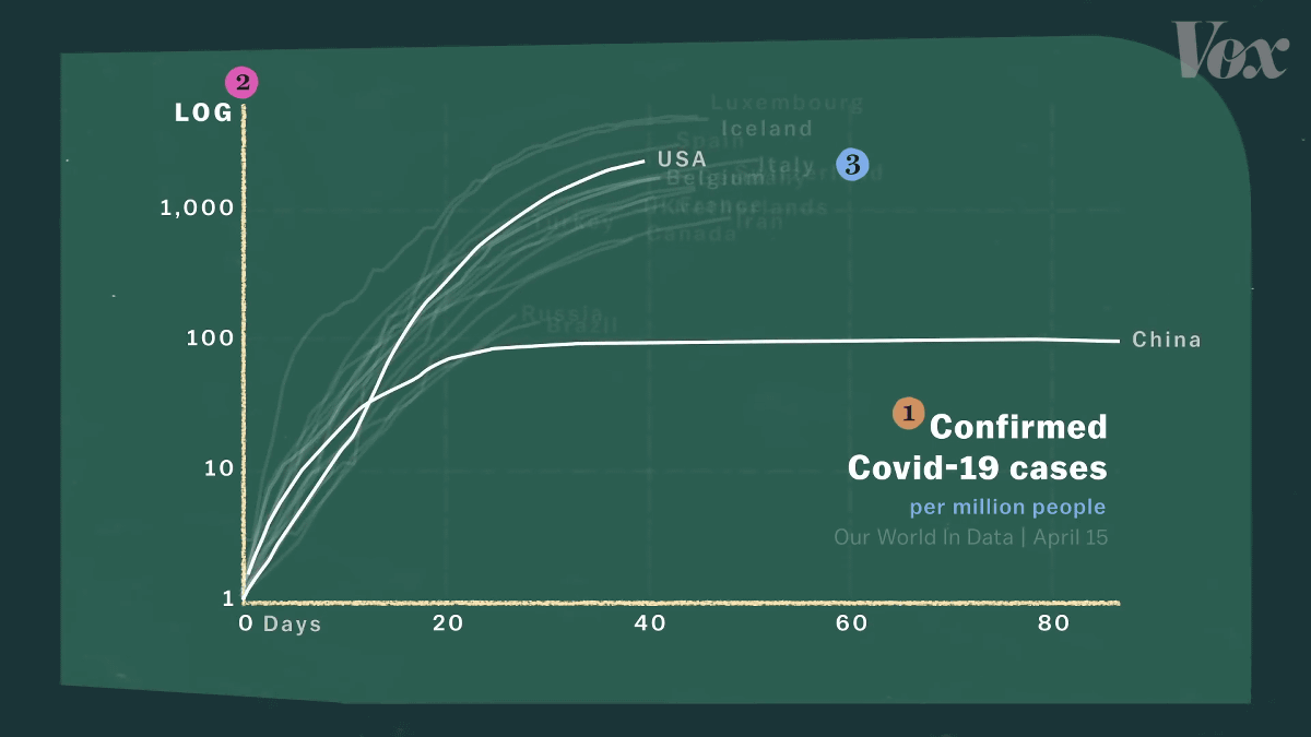
Also, by creating a graph at the level of 'country', it is easy to overlook a pandemic in a specific region in Japan. The epidemic in New York is bigger than the epidemic across the United States.

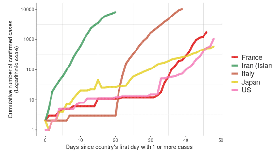
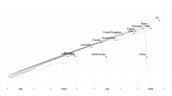
And the fourth point to note is that the X-axis is not the date, but “the number of days since each country recorded 100 cases”. Italy is February 24th, Turkey is March 19th, and the origin dates are different.
Countermeasures against infectious diseases are a matter of time. Since there is a big difference between taking measures early or delaying measures, countries with a later outbreak will have more preparation time than countries with an outbreak. The fact that 'the government had a longer lead time by country' should not be overlooked.
Related Posts:


in Video, Posted by darkhorse_log