What is the important “color selection” method to achieve accessible design?

by
Stripe, an online payment processing service that has raised over $ 450 million from investors such as Elon Musk and has been used on over 13,000 websites ”Explains on the company's blog the important points of“ color selection ”in the design of its products.
Designing accessible color systems
https://stripe.com/au/blog/accessible-color-systems
Color contrast in software and services is an important aspect that greatly affects accessibility . Using the correct contrast makes it easier for people with visual impairments to use the product, and users who use the product in non-recommended environments such as “low-light displays” and “users using old equipment” Even easier to handle the product.
Stripe seems to have succeeded in creating an accessible design by designing the interface of the service and the system used in the company with the correct color contrast. However, “color” is very subjective, and “what color is used” and “how much contrast is used” greatly affect the impression that the product itself gives to the user. It is very important to correctly evaluate whether the correct design is being performed.
So Stripe evaluated several external tools to improve the product's color contrast and accessibility. Among them, in general color design, there are two approaches: “1: Select a color and check the standard contrast” and “2: Generate light and dark tones from a set of basic colors”. He noticed that it was being taken. However, the Stripe system designer team thought that the “1: Select color and check standard contrast” approach had the disadvantage that color selection was too dependent on trial and error. In addition, the approach of “2: Create bright and dark color sets from the basic color set” tends to simply lighten or darken the colors, making them dull or calm. However, Stripe points out that there are cases where it becomes difficult to distinguish between the different colors, and it does not look good.
When designing the product interface, choose the color to use from the brand's color palette. For example, in the case of Stripe, the design is done by selecting a color from the following color palette.
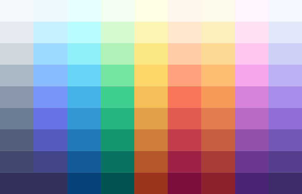
To create accessible color combinations, individual designers or engineers need to understand WCAG 2.0 and choose color combinations that produce the right contrast ratio in various situations. In order to improve the color contrast in the product, the Stripe design team first considered darkening the colors in the left column below by one step like the colors in the right column. However, although there is a problem that it is difficult to secure a sufficient contrast ratio if it is a bright color as in the left column, if a sufficient contrast ratio is ensured as in the right column, however, the brightness and vividness as a color Stripe notes that has been drastically lost and has become dark and murky on a white background.
The Stripe design team paid attention to the “
In such a case, it is more intuitive to use “ HSL ” of the color space consisting of the three elements of “Hue”, “Saturation”, and “Lightness” which are so-called “ three elements of color”. It seems to be easy to understand. HSL is also supported by general design tools and code libraries used to specify colors.
However, Stripe's design team pointed out that 'the method of calculating HSL brightness is flawed,' 'Some color spaces have different hues of the same brightness but perceived by human eyes with different brightness. Is not taken into account. ”
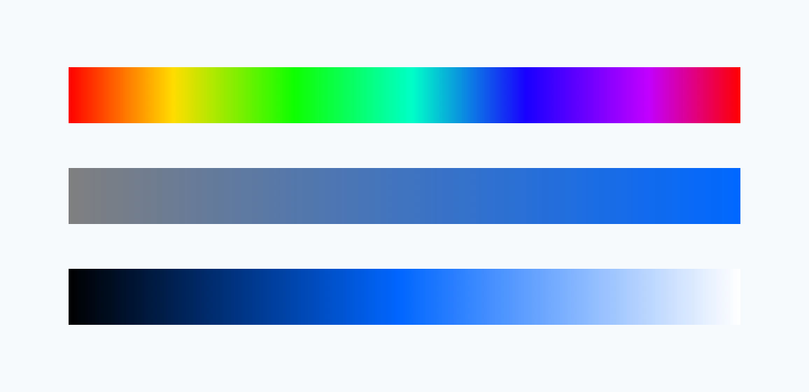
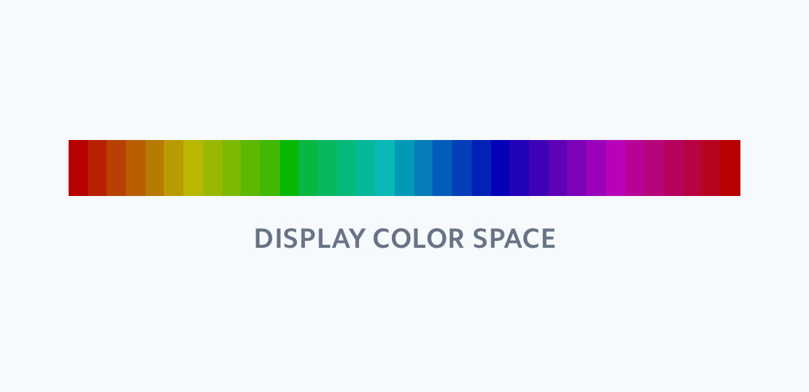
The following images have the same brightness and saturation on a computer display that uses a color space such as HSL or RGB. In color space, saturation and brightness are all the same, but some colors appear brighter or more saturated than others when viewed with the human eye. Specifically, blue should be dark and yellow and green should appear bright. Stripe points out that these “subtle nuances of colors reflected in the human eye” cannot be reproduced in a color space like HSL.
On the other hand, the color space called '
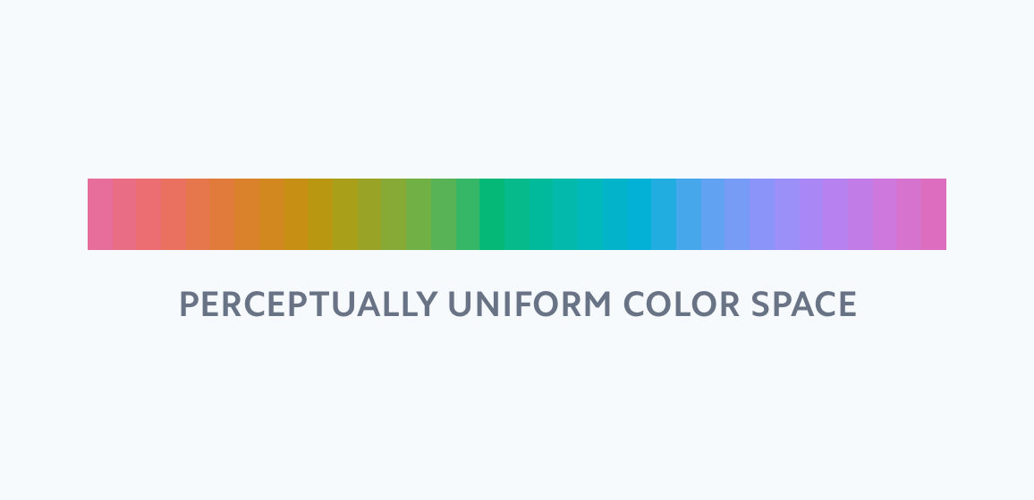
Stripe says, “When you create a color set with the same brightness and saturation in the Lab color space, you can see a big difference from that created with HSL under the same conditions. It looks as saturated as it is, and this is perceptual uniformity itself. ”
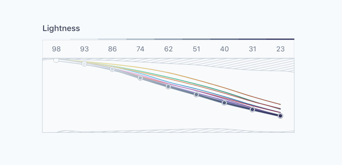
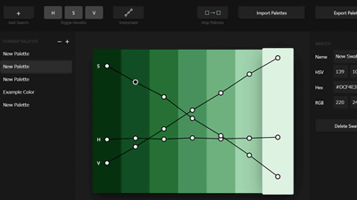
In RGB and HSL, a graph of the “same brightness and contrast” color palette is shown below. Each line on the graph represents each color in the color palette, the horizontal axis of the graph represents the brightness, and the vertical axis of the graph represents the contrast. Although the numerical value should be the same, the brightness and contrast differ as `` the color perceived by the human eye '' You can see that
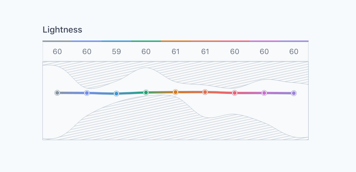
If you create a color palette with the same brightness and the same contrast in the Lab color space, it looks like this: The shaded portion of the graph below shows the contrast value of the color that is output when each color is expressed in a color space such as RGB or HSL. A color palette with the same brightness and the same contrast in the Lab color space is shown. You can see how difficult it is to make.
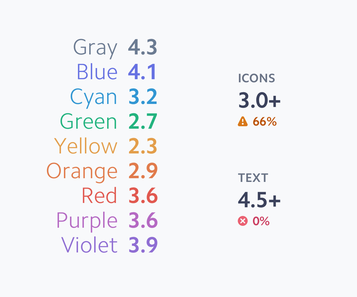
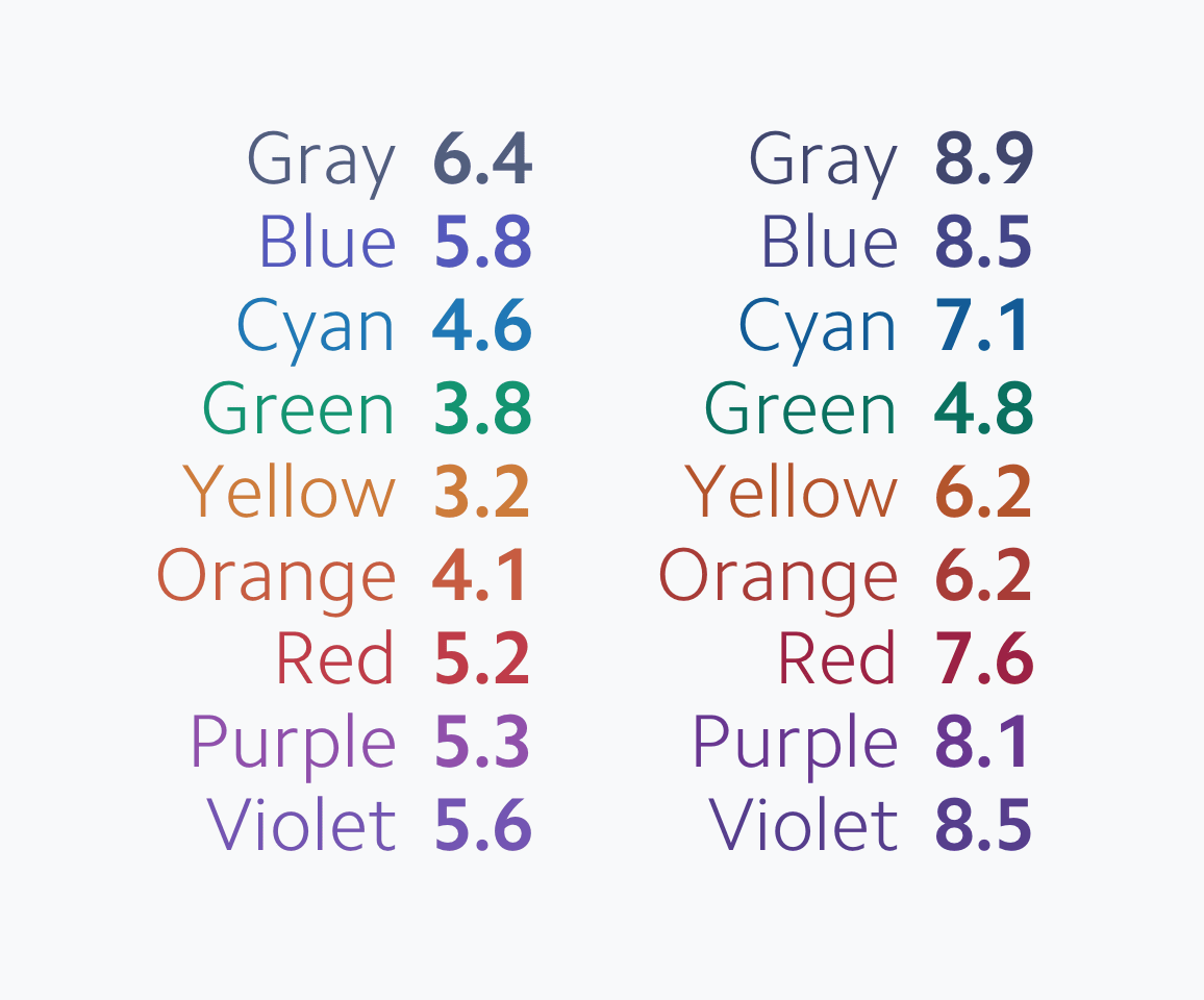
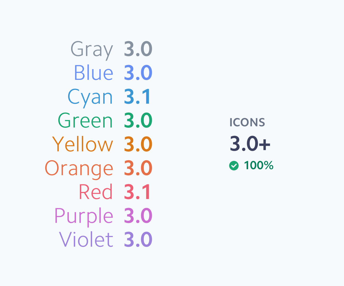
Stripe succeeded in creating a color palette based on this Lab color space so that the contrast ratio satisfies the default value of WCAG 2.0. As a result, it seems that it has become possible to maintain beautiful and vivid colors while maintaining the minimum contrast ratio. The following is a color set with a contrast ratio of 4.5 or more suitable for “small letters” ...

This is a color set with a contrast ratio of 3 or more, suitable for “large letters”.
Stripe has designed its own color system to make accessible color choices. What he needed was to change the way of thinking about color, not the penance of exploring the darkness. Specifically, know and use a 'perceptually uniform color space', that is, a color space such as Lab color space. And it was important to understand that “accessibility is high = not vivid”. Stripe's design team notes that WCAG 2.0 is only focused on the contrast ratio between the background color and the foreground color, and understanding the vividness of each color also helped distinguish the hues. .
In addition, because colors are complex, it is difficult to create correct color combinations by themselves, and stressed that “building a color system that suits us” is very useful for design. It is. However, Stripe mentions that there are `` colors that cannot be reproduced '' as a pitfall in `` perceptually uniform color space '' such as Lab color space, `` very bright dark yellow '' and `` It is written that there is no color such as “brilliant light royal blue”.
Related Posts:

in Design, Posted by logu_ii