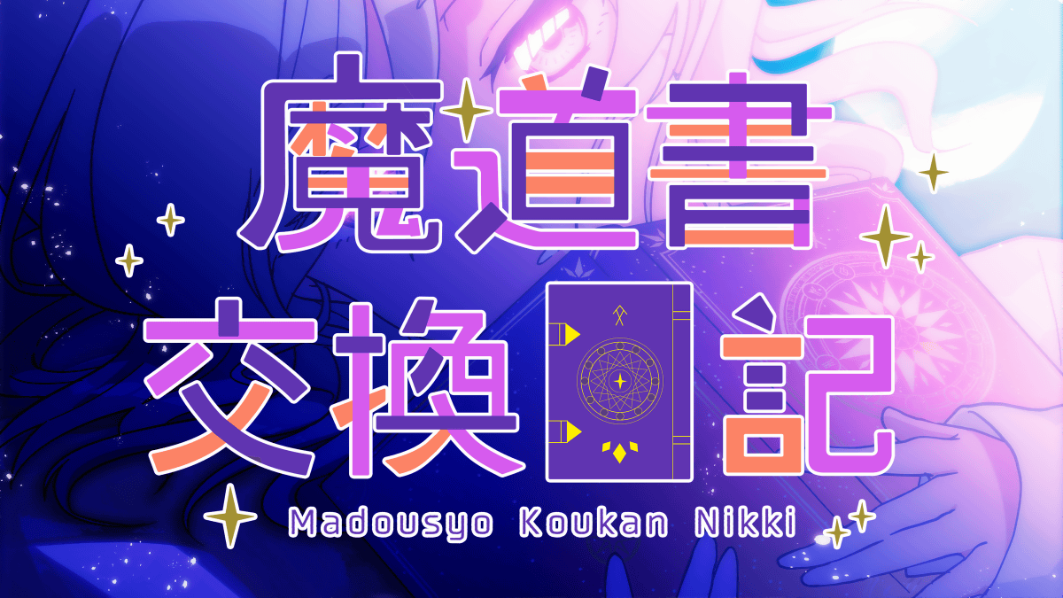
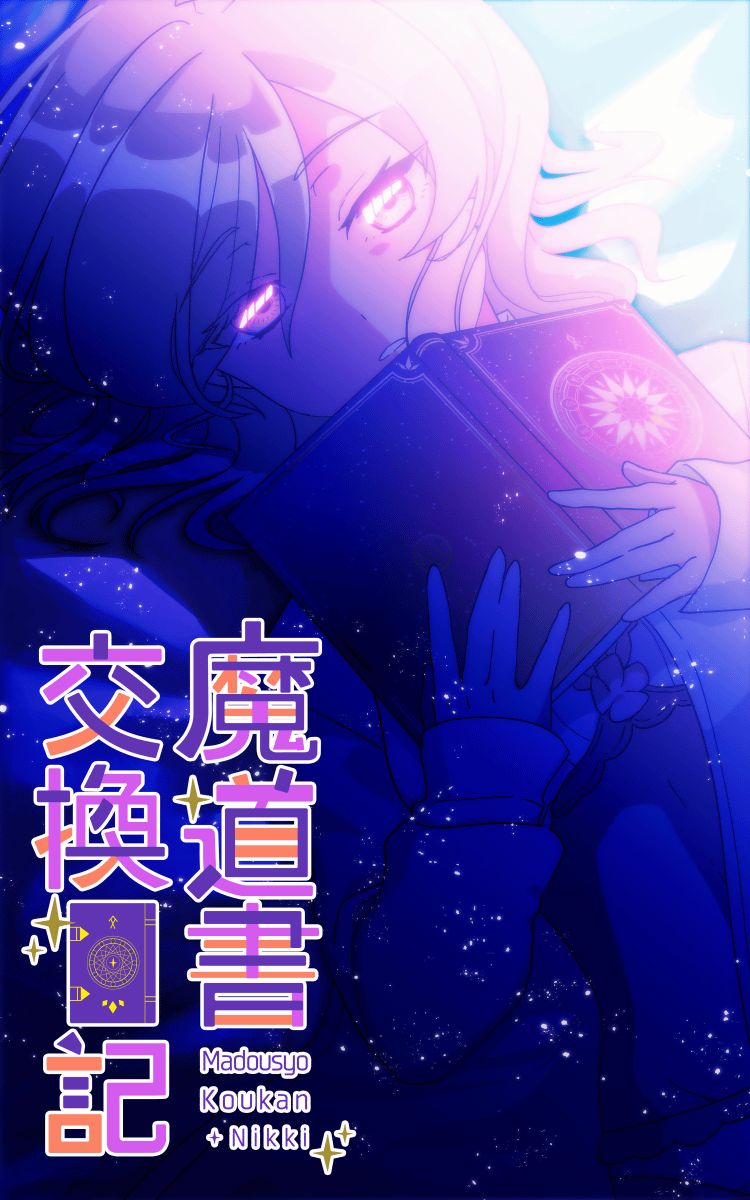
Making up to the logo of the manga 'Madosho Exchange Diary'
In the full-color comic '
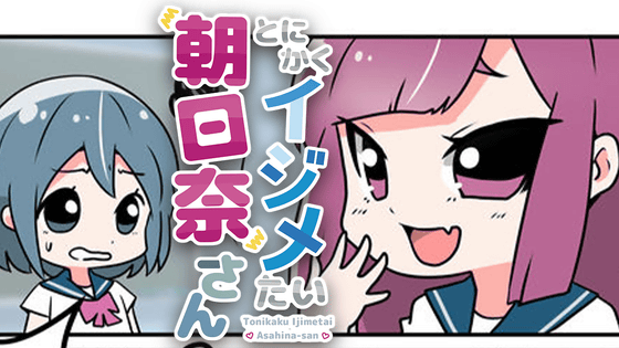
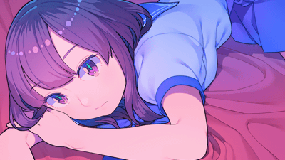
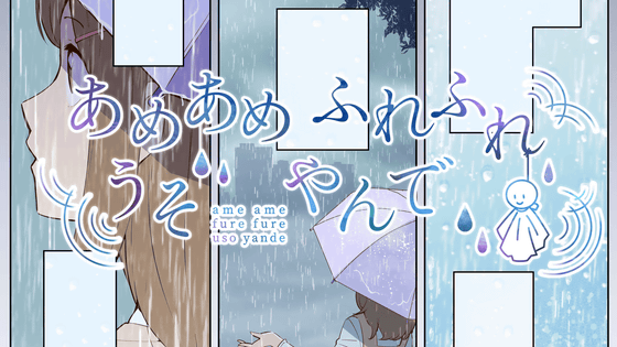
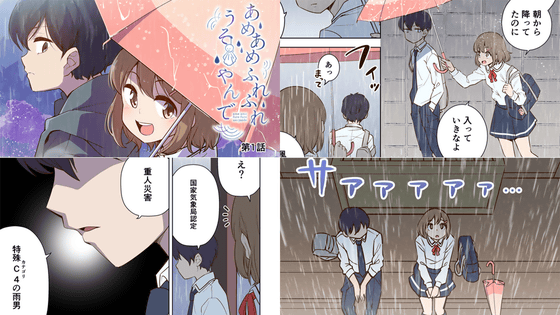
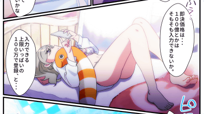
Mage Book Exchange Diary Episode 1 'To My Sister' --GIGAZINE
For the title logo of 'Madosho Exchange Diary', we asked Little by Little, who designed a wonderful logo for 'Princess and Gamer'. The previous logo design also introduced the making, so please see that as well.
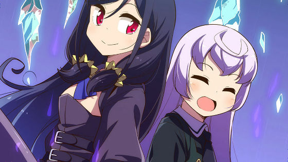
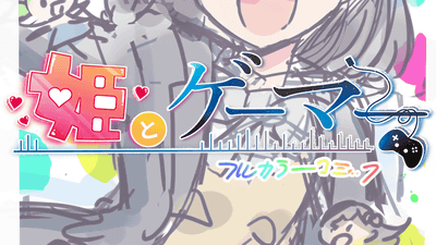
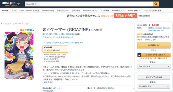
Making up to the logo of the manga 'Princess and Gamer' --GIGAZINE
The following is the logo making. Mr. aoya from Little by Little commented on what he imagined and how he worked.
Logo design A plan. The expression of the starry sky and light and shadow in the letters is very attractive. aoya 'It's a neat atmosphere plan with a spellbook (intelligent feeling?) As the main image.'
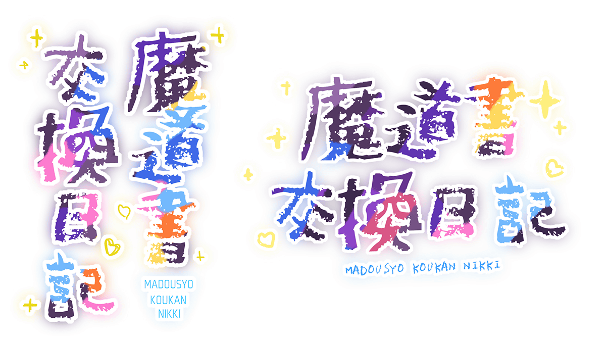
Plan B is a cute design with crayon-style pastel colors. aoya 'It's a cute idea like writing by hand with the cuteness of an exchange diary in the main image.'
Design C plan. aoya 'It's a pop and flat atmosphere plan. I made it as a simpler plan than the other two plans. The color is taken from the original image of the spellbook.'
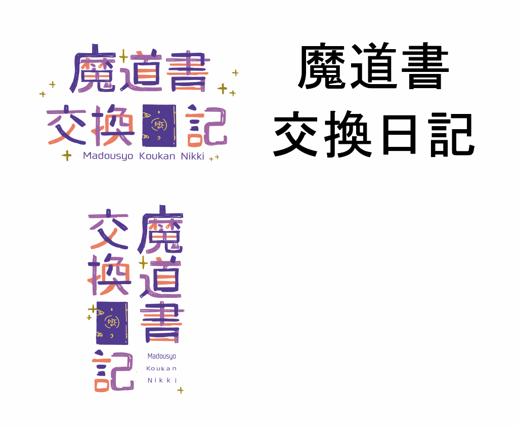
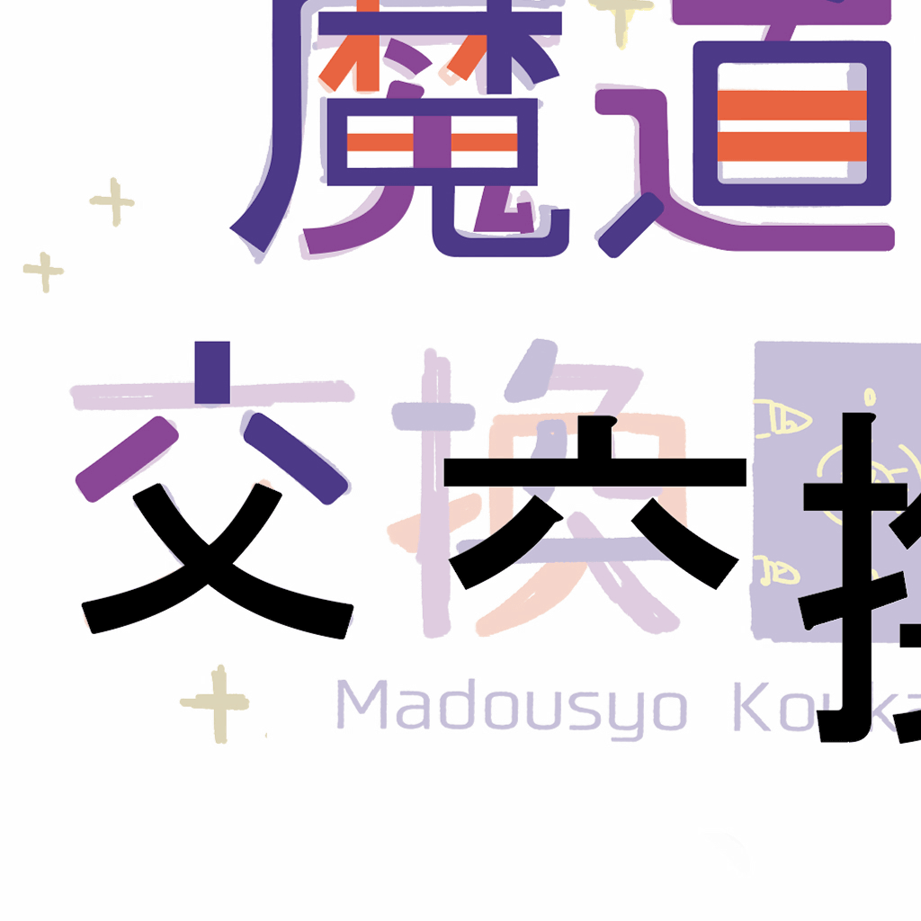
At the request of the person in charge of drawing, I asked for the style of Plan C to be adopted in the layout of Plan B. The decision rough looks like this.
aoya 'Looking at the rough, I will write the title name in Gothic style with a similar atmosphere.'
aoya 'This logo has different colors for each part of the Chinese characters, so we will separate the Chinese characters.'
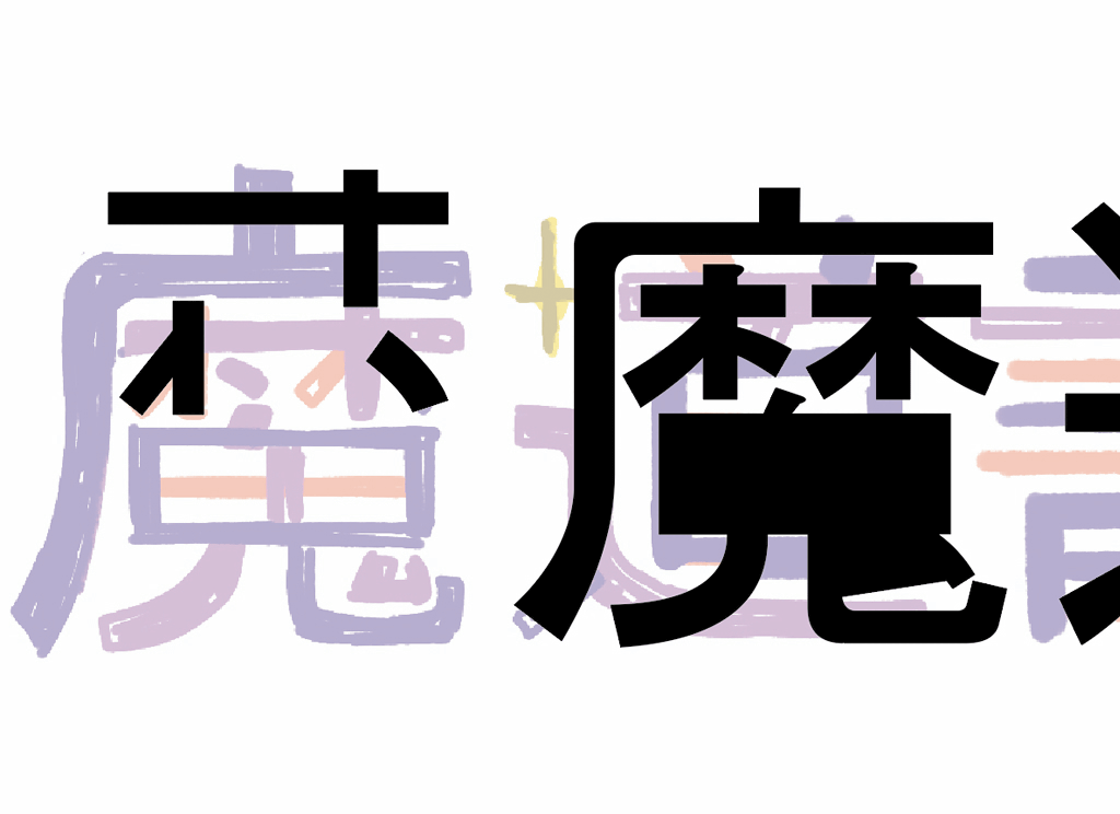
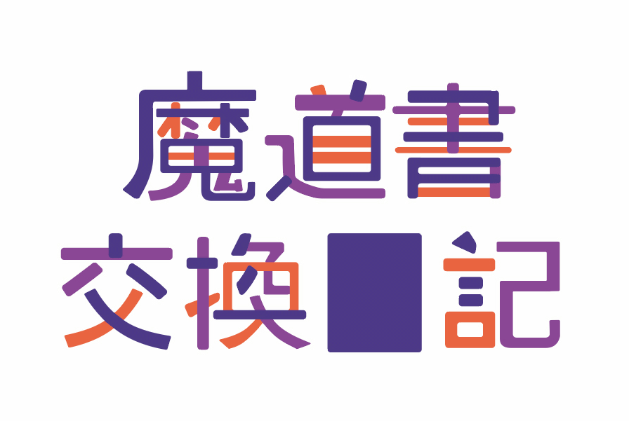
aoya 'I will assemble the pieces that have been disassembled. At first, I was thinking of working with a single color of black and then coloring it later, but as expected, it was in a state of something wrong with a single color of black, so the color Is also being assembled while changing at this stage. '
aoya 'Once assembled, adjust the line thickness and character balance.'
aoya 'Next, I will make stars scattered around.'
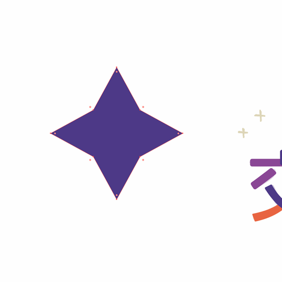
aoya 'Since the letters are rounded, the stars are also rounded.'

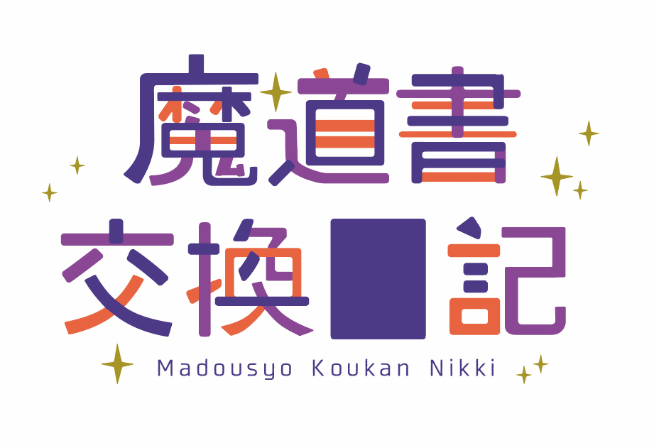
aoya 'I placed the stars and letters'
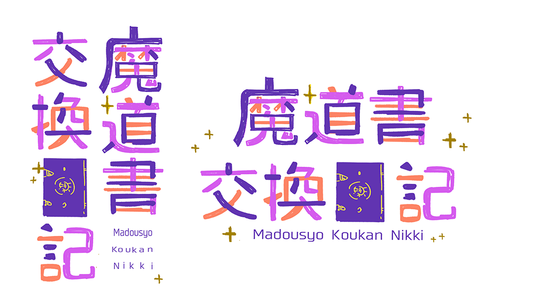
aoya 'Make the cover of the spellbook'
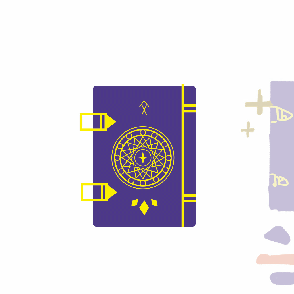
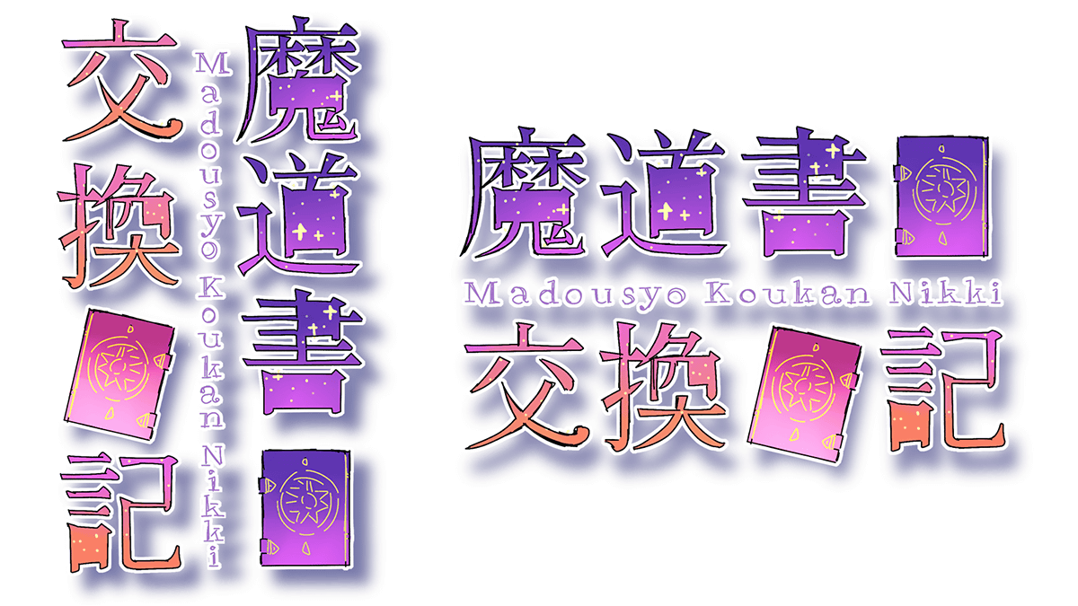
aoya 'I placed the cover of the grimoire and adjusted the line thickness, etc. Also, since the color tone was more plain than the rough, I also adjusted the color tone. Further fine-tune the fine details of the letters. The horizontal version is complete. '
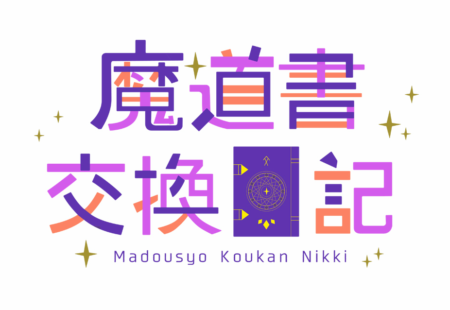
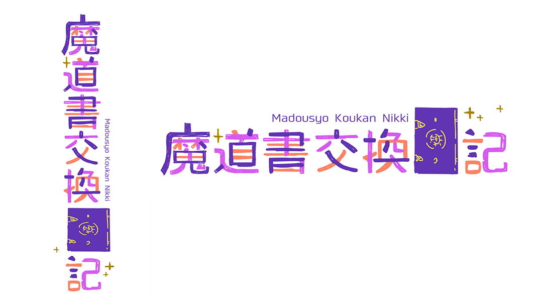
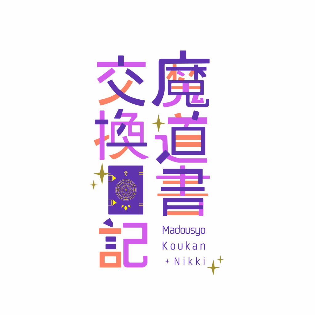
aoya 'I will make a vertical version. I will arrange each character vertically while looking at the rough.'
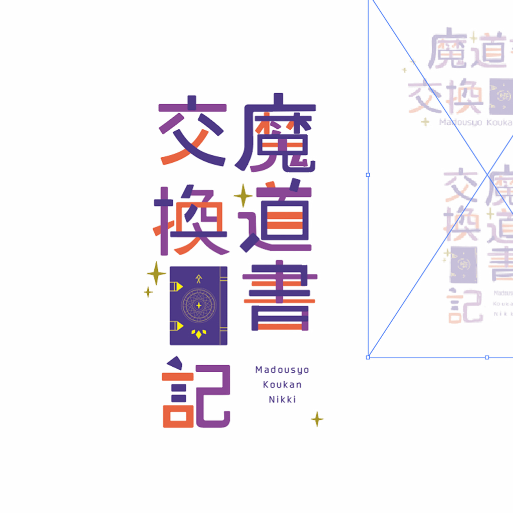
aoya 'I adjusted the spacing between letters and the balance of stars and letters. Also, I adjusted the hue to complete it.'
The logo design created in this way is also used in the frontispiece of the first episode.
In addition, Little by Little's logo design was also adopted in the previous 'Princess and Gamer ', and you can immediately see how it reflects the atmosphere of the whole work using Amazon Kindle. .. If you are a Kindle Unlimited member, you can read it for free, and if you haven't tried it yet, you can read it immediately with the 30-day free trial.
Princess and Gamer | Shoio, 392kyo, GIGAZINE | Manga | Kindle Store | Amazon
Related Posts: