Until the logo of the pure, gorgeous and cyber-flavored manga 'Secret Miyazono' is created
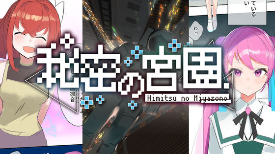
[Free Manga] Secret Miyazono Episode 1 'Loneliness, Beautiful Girl and Android' --GIGAZINE
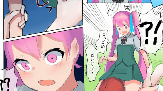
We asked Little by Little, who works on logo design and binding design, for the title logo of 'Secret Miyazono'. Along with the making, aoya from Little by Little has also commented on the commentary.
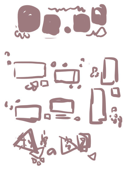
In devising the title logo, after showing the almost completed manuscript of the first episode and the name plot of the second and subsequent episodes, the image of the original author as 'neat, pretty, simple, slightly cyber' I told them to make a rough.
aoya 'First of all, I'm worried about the silhouette of the design. I will start thinking roughly while looking at the atmosphere of the story and the character design.'
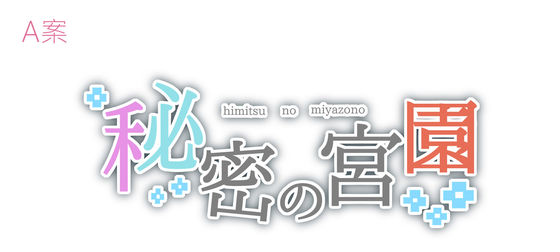
aoya 'I'm creating a rough design of the logo immediately. While adding decorations with illustration creation software, while enlarging and reducing the characters, I get closer to the image when thinking about the silhouette. In Plan A, the Mincho style Based on the calm atmosphere, I imagined the gorgeous atmosphere of the character design. '
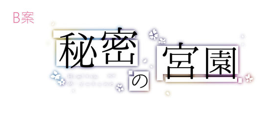
aoya 'Even in Plan B, we designed it based on the calm atmosphere of the Ming Dynasty, but on the basis of white and black so as not to spoil the gorgeous atmosphere.'
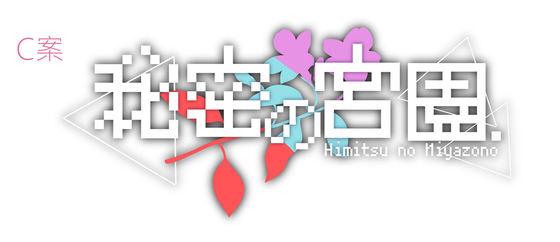
aoya 'As a variant of Plan C, I tried to combine the atmosphere of the near future with the image of flowers.'
The image below is the one I put on the frontispiece of
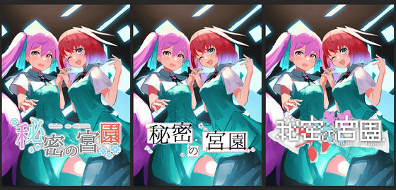
The final decision rough looks like this.
aoya 'I changed the flower motif of Plan C to the motif used for Plan A, and added a dark shadow that seems to be shining in Plan B, so I corrected the rough.'
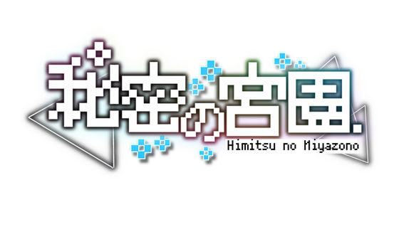
aoya 'We will make a completed version based on the rough. We will also make a vertical version at the same time.'
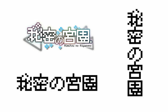
aoya 'Since I didn't adjust the gap between letters in Rough, I also adjusted the width of the gap to match the dot-like letters.'
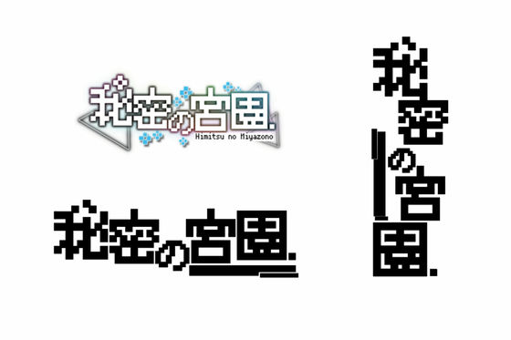
aoya 'Set the color to white and add letters.'
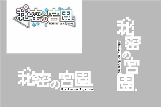
aoya 'I created the entire shadow. I adjusted the density of each shadow so that the character part, flower, and triangular decorations look just right.'
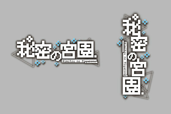
aoya 'I'm going to add color to the shadows. I've added and erased the colors several times so that the gradation is just right so that the shades aren't biased, and so on.'
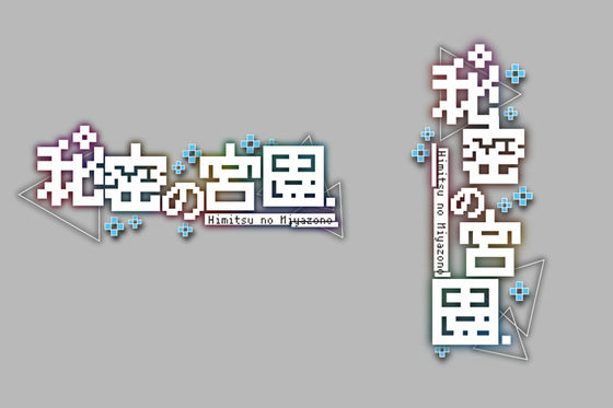
aoya 'Add a white texture to prevent the shadows from being buried when placed on the illustration and to make the logo look a little shiny.'
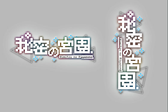
aoya 'We asked you to correct the shade of the shadow and the thickness of the letters, so here we will correct the shadows a little darker and black, and adjust the thickness of the letters a little thinner to complete!'
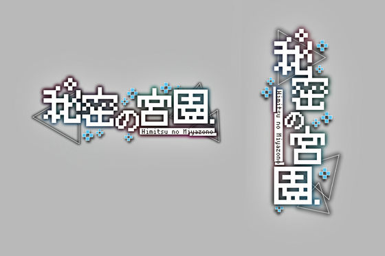
The frontispiece that I actually posted looks like this. The shadow and color effects can be turned on / off according to the illustration on which the logo is placed, making the title logo easy to read, simple, and suitable anywhere.
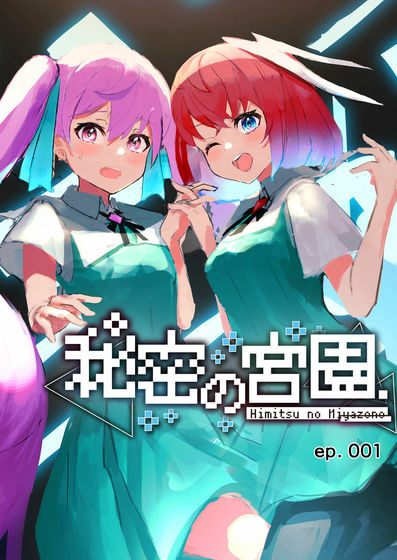
The triangular motif used in the logo is also used as an effect in the main story.
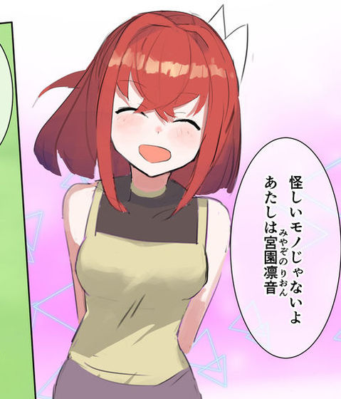
You can read the main part of the manga 'Secret Miyazono' from the following.
[Free Manga] Secret Miyazono Episode 1 'Loneliness, Beautiful Girl and Android' --GIGAZINE

Related Posts:
