Until the logo of 'My husband smells garlic!' Is created, which is a fusion of the mystery of vampires and the taste of garlic.
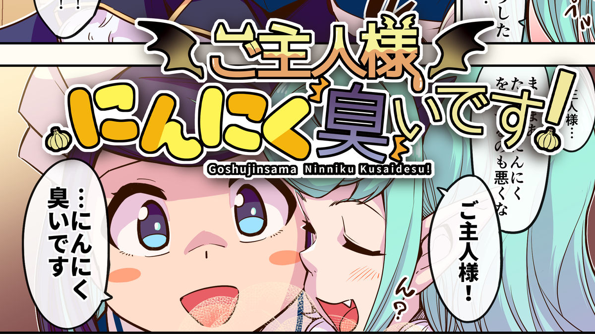
The title logo of the unique work 'Vampire x Maid x Garlic Gourmand !' Is based on the concept of vampire and garlic, but there is no vampire element in the title, so if you look at the logo, you can tell that it is a vampire story. The point was that I wanted to do it. We will send you the making of how such a logo was finished from the idea to the completion, along with the designer's commentary.
We asked Little by Little, who works on logo design and binding design, for the title logo of 'My husband smells garlic!'. Aoya from Little by Little has also commented on the commentary along with the making.
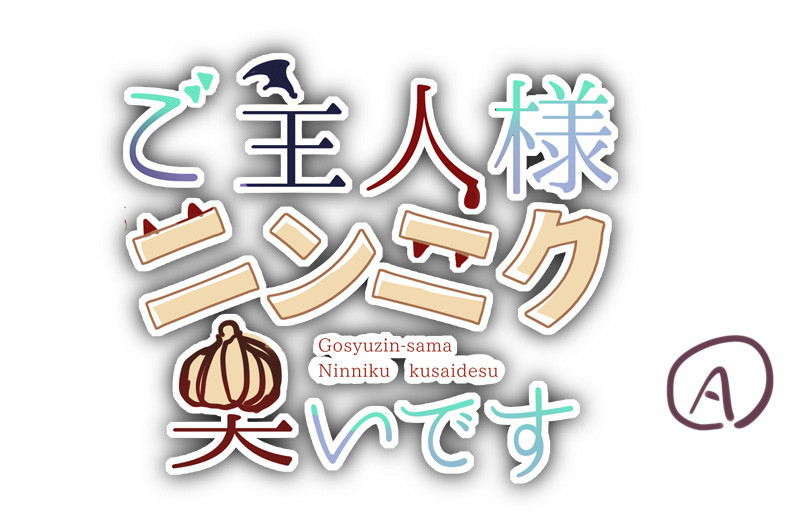
First, I sent the work materials and requests and asked them to make three rough drafts. In Plan A, the decoration is devised with a relatively calm color, the vampire wings in the Chinese character of 'lord', the kiba in 'garlic', and the garlic icon in the Chinese character of 'smell'.
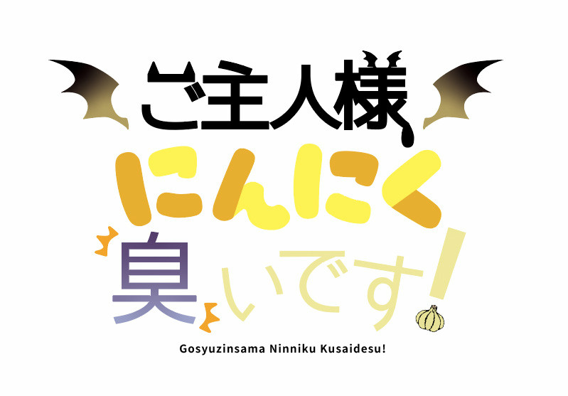
In Plan B, the bright red color expresses the vampire-like appearance, and the wings are placed on both sides to give the impression that the vampire-like appearance is more noticeable.
In Plan C, the coloring is finely adjusted to a decoration similar to Plan A. In addition, the two lines make the overall character layout unique.

In response to a request from the manga author, the color was adjusted to a unified shape while adopting the design of Plan B as a base. In addition to making 'garlic' pop with hiragana, we asked for the production of two-line and three-line versions in consideration of the ease of arranging the logo. aoya 'I created it with the intention of incorporating the vampire motif into the design. At first, I created a red design, but in the yellow shade you requested.'
aoya 'Starting work! I started creating from the person who is divided into 3 lines. I will make a rough temporary arrangement.'
aoya 'I adjusted the position, thickness, and balance of the characters. I will also arrange small items after this, so it is still a temporary arrangement.'
aoya 'I placed small items. I had a little trouble adjusting the balance of the' smell! 'Part.'
aoya 'I will leave the color. It is OK for the time being except for the' master 'part.'
aoya 'I added the wave pattern of the' master 'part. If I added a uniform wave pattern, the visibility was low, so I added it according to the characters.'
aoya 'Modify 3 lines to create 2 lines'
aoya 'Create black and white edges, respectively, and add shadows to complete!'
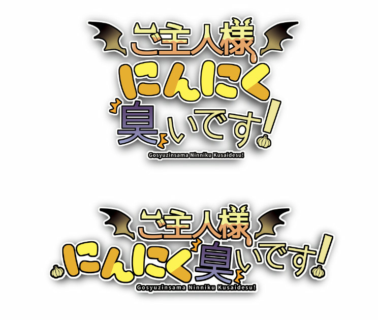
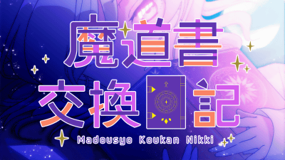
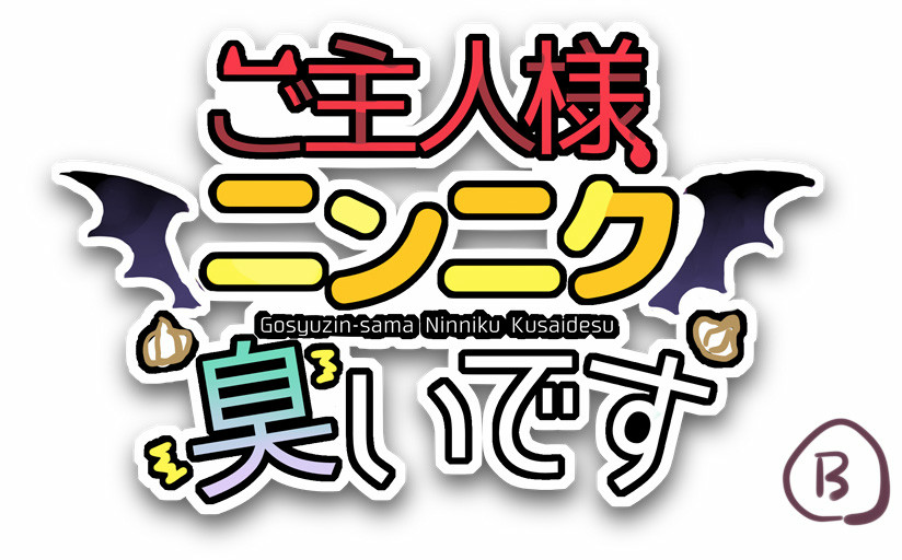
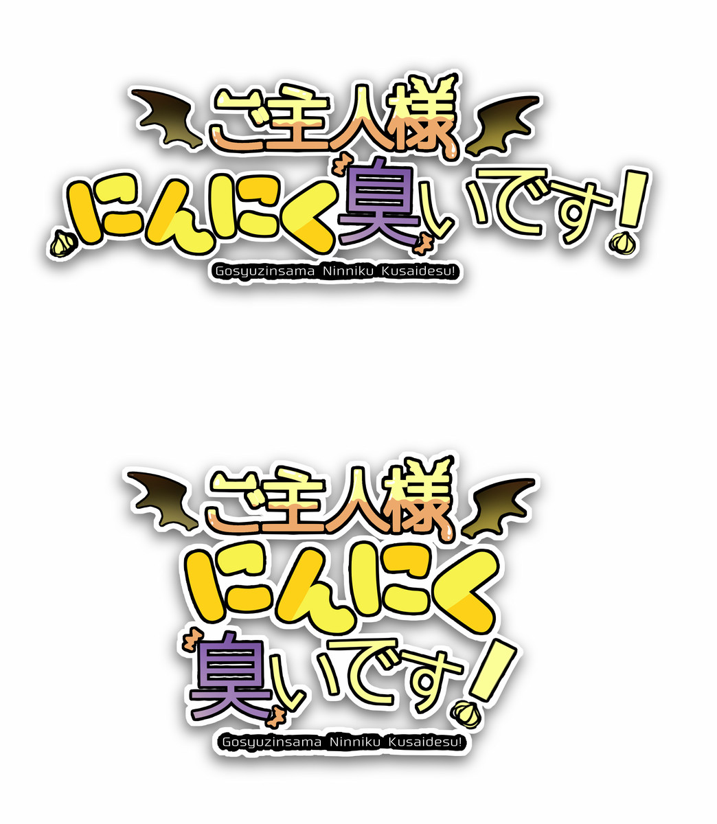
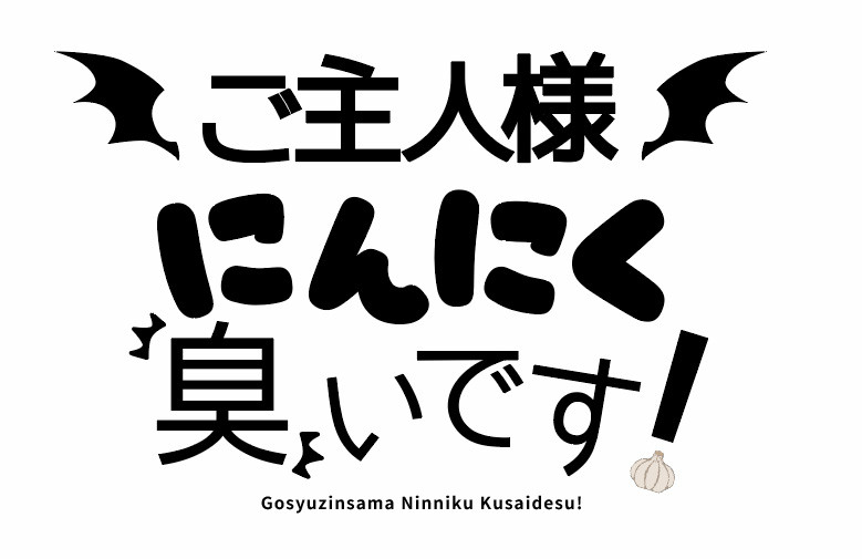
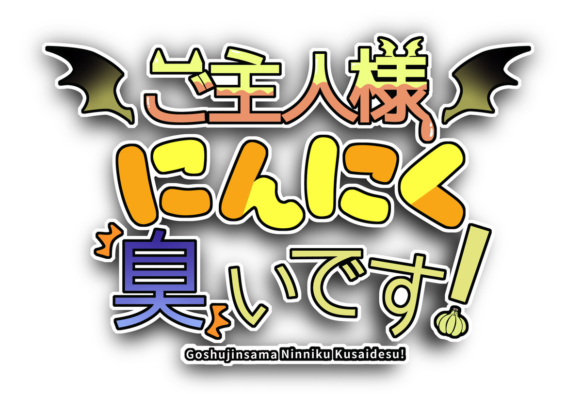
The final finished logo looks like this. The feeling that 'master' is a vampire with wings is transmitted, and 'garlic' has also become a conspicuous logo. Also, since the English part was decided at the completion stage, we asked them to change it to the correct shape.
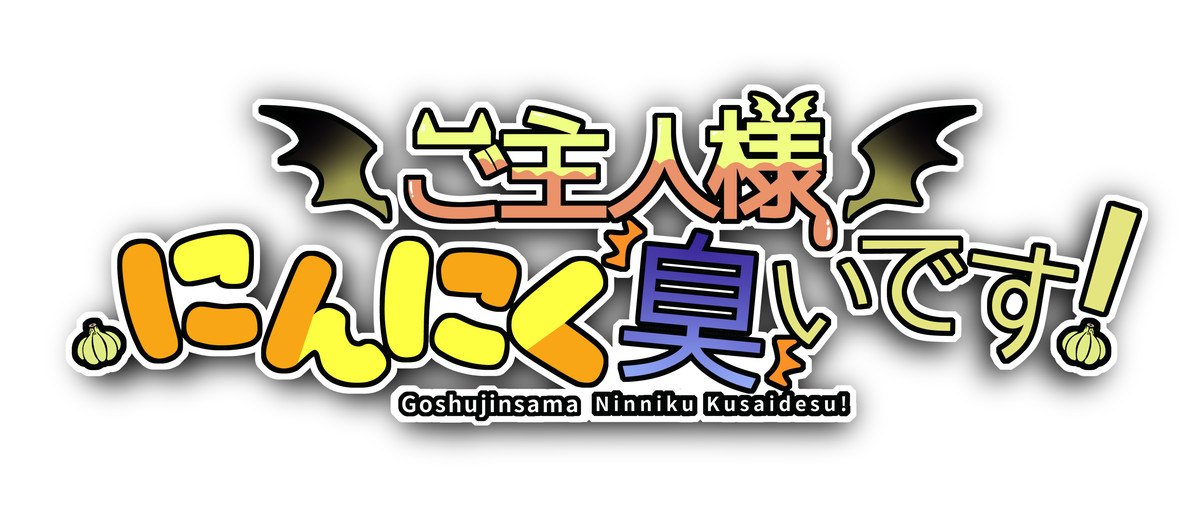
Two-line version. The sentence 'It smells like garlic!' Is easier to read.
You can read 'My husband smells garlic!' From the following.
It smells like garlic! Episode 1
Related Posts: