Making too much of the twists and turns of Kindle book "Light Painting" created with Adobe InDesign
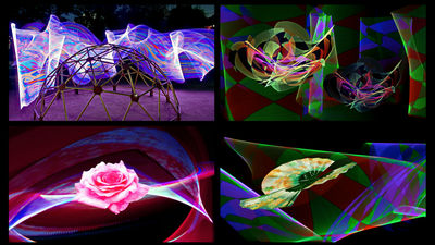
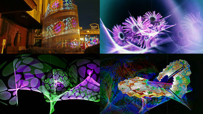
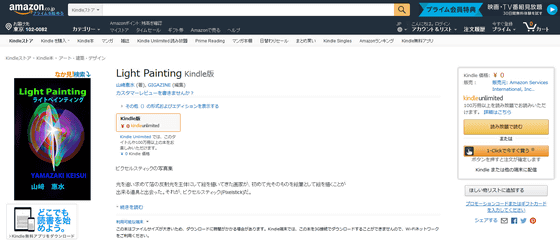
Works released by GIGAZINE at Amazon's Kindle "Light PaintingI attempted to make the layout as proficient as possible, but the layout will not be as ideal as easily, the design of the display is not going to make me think that it was quite a steep road.
Light Painting | Kindle Store | Amazon
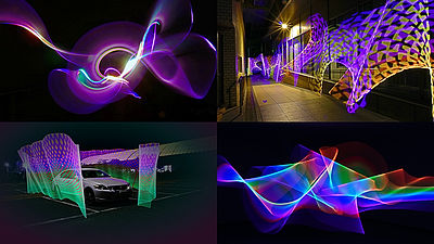
◆ Layout that can fully enjoy the collection of works
In the Kindle book "Light Painting", it has become a little special layout so that you can enjoy the work without fail even on a screen that is not so big. You can see how the viewer of "Light Painting" looks like by seeing the following movie.
"Layout of" Light Painting "for maximizing the enjoyment of Kindle books
I thought that I wanted the work to be viewed as big as possible with tablets, as well as smartphones, and I fiddled with the layout. Used softwareAdobe InDesignSo the original works are landscape as follows.
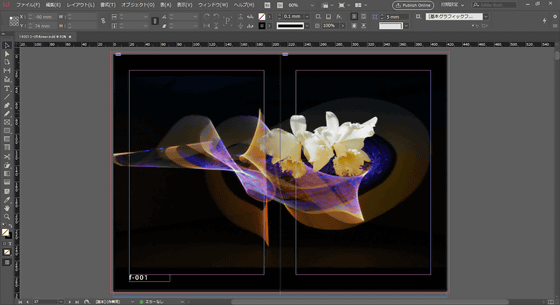
If you output without doing anything, it will look like this on your terminal. Apparently, if you try to see a landscape image on a portrait terminal, it seems that it will automatically be tilted sideways.
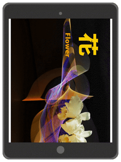
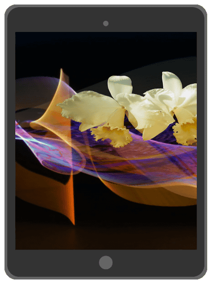
The ideal is the following form. When you set the terminal vertically, the interrupted image is displayed on the screen full ... ....
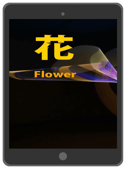
If you swipe horizontally, a horizontally long image continues without separating pages.
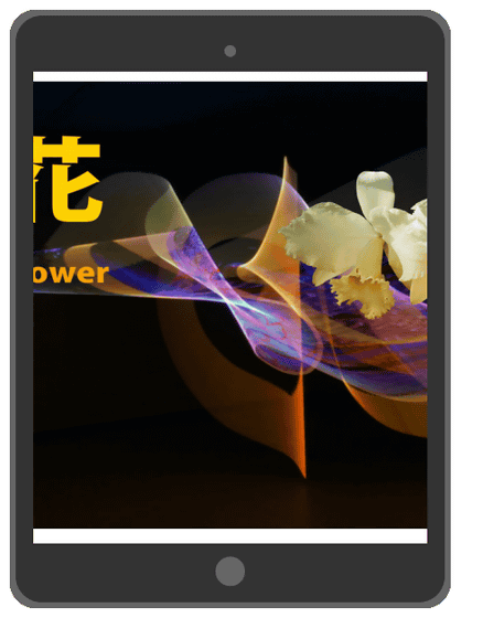
Go to the far right and page forward if you swipe further. In this case, even a terminal with a relatively small screen can see the work carefully. In addition to this, the goal is to display a landscape image when you tilt the terminal sideways.
In Adobe InDesign, you just paste an image on the page and the file is completed. Normally, if you make a photo album, you should create a blank page in accordance with the size and size of the photo, but this time we created a portrait page with consciousness of smartphone.
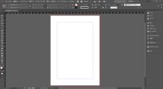
I will paste one image on the two-page spread page where this is arranged.
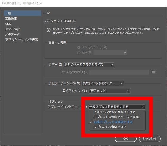
When all pages are ready, output fixed layout of EPUB from Adobe InDesign. By selecting "Enable Composite Spread" from "Spread Control" of the EPUB export option, the spread pages will stick together so that one image will be displayed.
However, if you check what you output with a portrait terminal, it will look like an image. Certainly two pages of spread are sticking together and becoming one, but this is not different from simply arranging a landscape image.

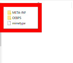
Therefore, it is necessary to change the display method by directly changing the contents of the EPUB file. Since EPUB is a compressed format, you can edit internal data directly by decompressing it. The content of EPUB that has been decompressed looks like an image. Click on the "OEBPS" folder to expand it.
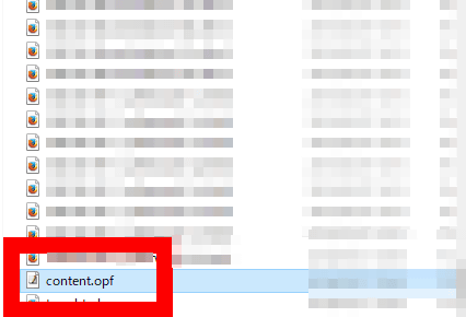
Under the OEBPS folder, the images used are arranged side by side and there is a file called "content.opf". Open content.opf with a text editor etc.
Find "fixed layout options" from content.opf and change "rendition: orientation" from "landscape" to "auto".
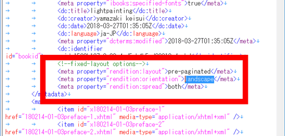
Likewise, "rendition: spread" is rewritten from "both" to "landscape".

OK when it is as follows. Save and close the file. Since the editing of EPUB contents is complete, compress the decompressed file again.

If you check the e-books that you can do with the terminal, when you have a vertically long terminal vertically, half of the work is magnified and reflected, and when you hold it horizontally you can see the whole work It was.
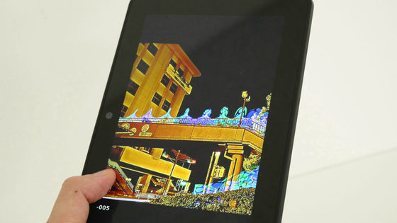
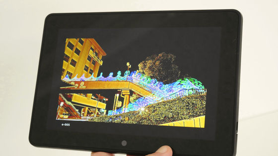
◆ Problem occurrence and resolution
In editing Kindle books, basically, I repeat the process of "Create with editing software (Adobe InDesign)" → "Convert to a format (.mobi) that can be checked with a terminal" → "Confirm with terminal", but desperately Even though I thought that it was "edited" after editing it, it will be inconvenient if various problems are encountered when checking with the terminal. I would like to explain the problem that occurred this time and how it was solved.
In "Light Painting", works are numbered sequentially. Enter white characters with black background according to the atmosphere of the work.
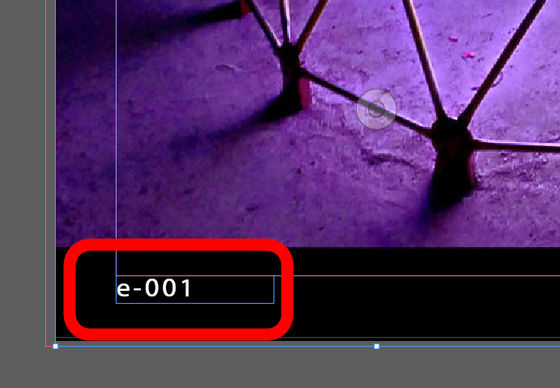
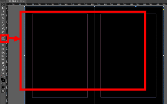
Therefore, we first draw a black rectangle on the entire page and make it a background.
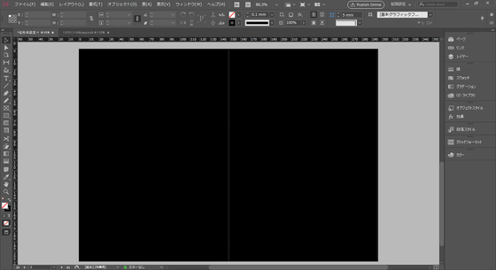
Put a picture frame on a black background ......
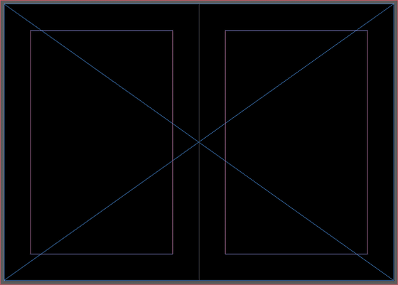
Input images.
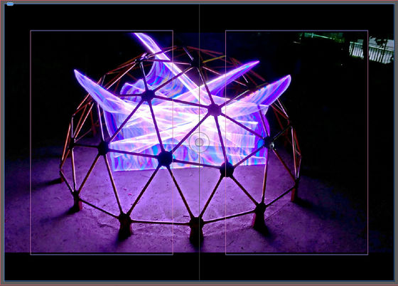
Since I was able to create a space below the image, enter the serial number. I tried to write it in e-book format (. Epub) because it was completed ... ...
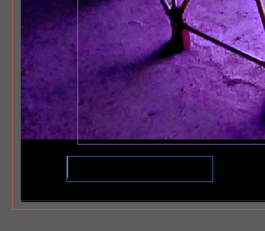
Like the image, the background was not exported and the white space was empty. Apparently it is only an image to export, it does not seem to export the rectangle drawn with InDesign.

"If so, it would be fine if the image had a black background", I first tried writing out the page in image format (.jpg).
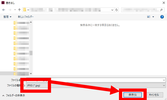
Create an image with the upper and lower gaps painted black as follows.

Next insert an image frame on the whole page as it is blank ... ...
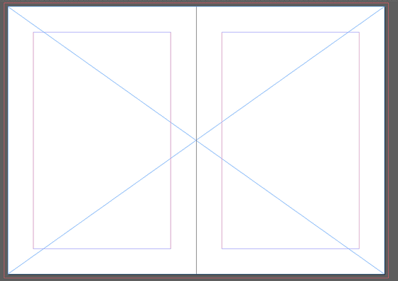
Input images. The appearance on InDesign is the same as before, enter a serial number here and try it on the terminal.
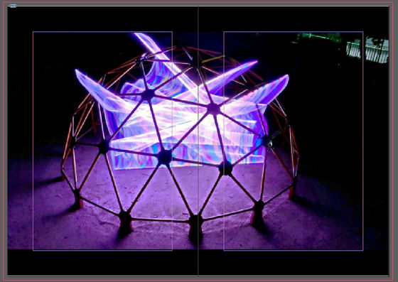
Then, a black background appears above and below, and the serial number of the white character is also displayed. I feel like a brute force method, but this solves the first problem.

When checking the display once again that the black background could be inserted, a vertical line between the pages caused a situation where a line was inserted between the work and the background.
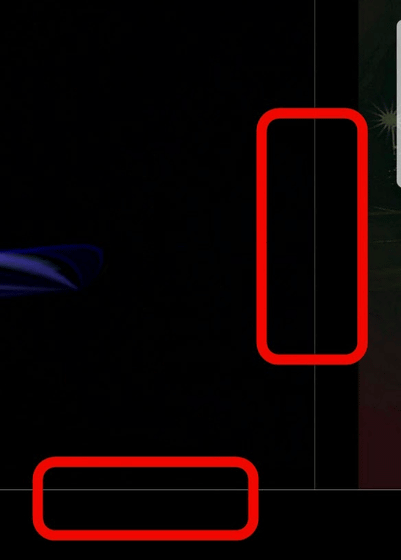
The reason for this is that I created the background perfectly. On InDesign's editing screen, a line of "bleeding margin" is drawn outside the line at the end of the page like the image.
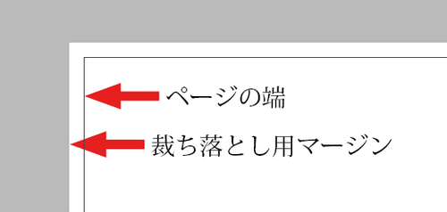
Since cutting is not always done at the time of printing / bookbinding, etc., it is theory to arrange the background beyond a few millimeters outside like a picture so that white spots will not be exposed even if it is slightly misaligned .
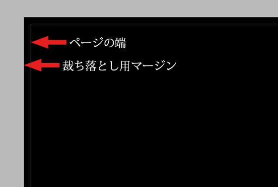
However, "I believe that it is not related to cutting because it is an electronic book," I thought that it was perfect for a page like an image. Perhaps this is probably the reason why the delimited white line is entered ... ...

Enlarge the image slightly so that it is larger than the edge of the page.
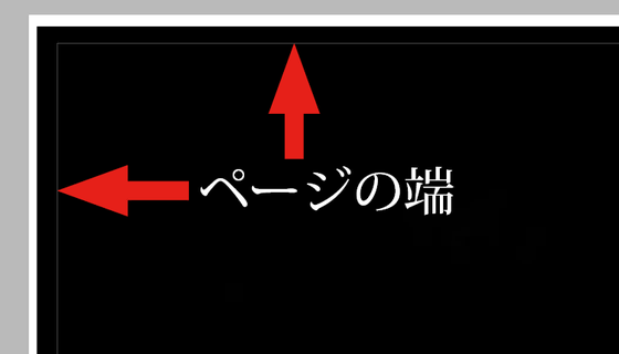
Then the separator line disappeared and it is displayed smoothly.
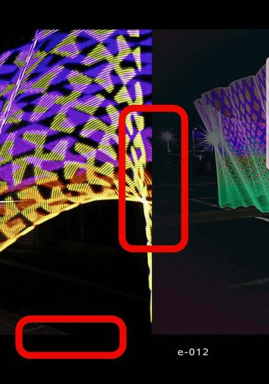
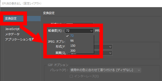
In addition, although you can select "Resolution" from the "conversion setting" of the export option, if you set it low, you will still get a separator line, so it is recommended to select about 150 PPI.
That's why you can get "Light Painting" which is a layout that you can fully enjoy the collection of works even on smaller terminals. If you have any complaints such as "There is something wrong here on this terminal" or a story such as "This editing is easier"HereThank you.
Light Painting | Kindle Store | Amazon

Related Posts:

