Color tool to follow the spread of "material design" advocated by Google has appeared
As a new UX system from 2014, Google has overcome the differences of devices to improve the ease of use by giving a sense of unity to operabilityAdvocate "material design". Not just a voice call"Material.io" opened as a unified support siteWe are striving to share and disseminate information. Within this site, a new color tool has appeared to help you decide what kind of color palette should be used for the application.
Color Tool - Material Design
https://material.io/color/
At the beginning, the lower one is grayed out. Clicking anywhere on the page ... ...
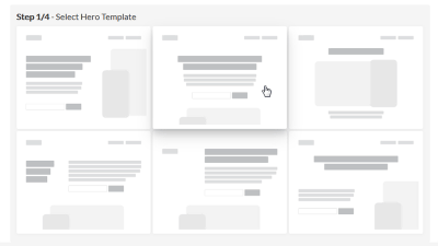
You will be able to use the tool. There is a page layout on the left side, "Material Palette" on the right side.
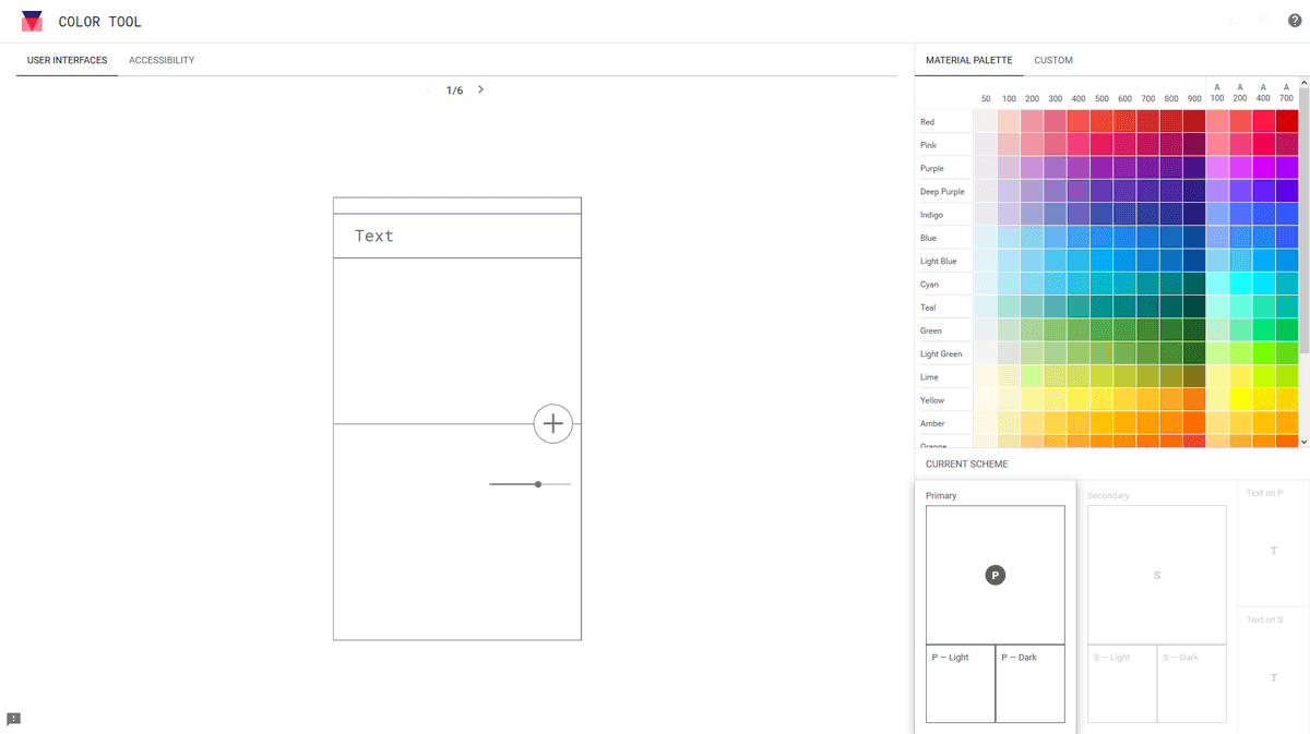
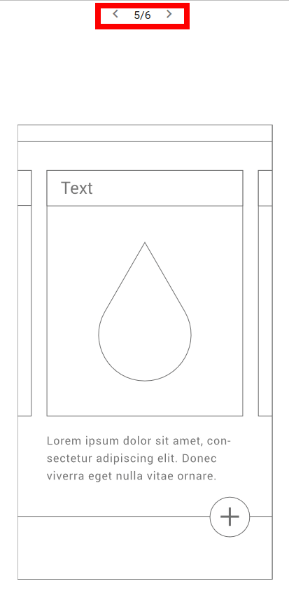
There are six kinds of page layouts, such as character-centered ones and images with centering on them, and can be switched with "<" ">". This time I will try with the layout of number 5.
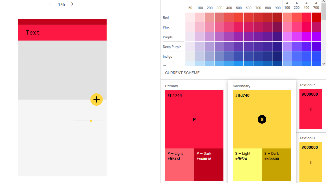
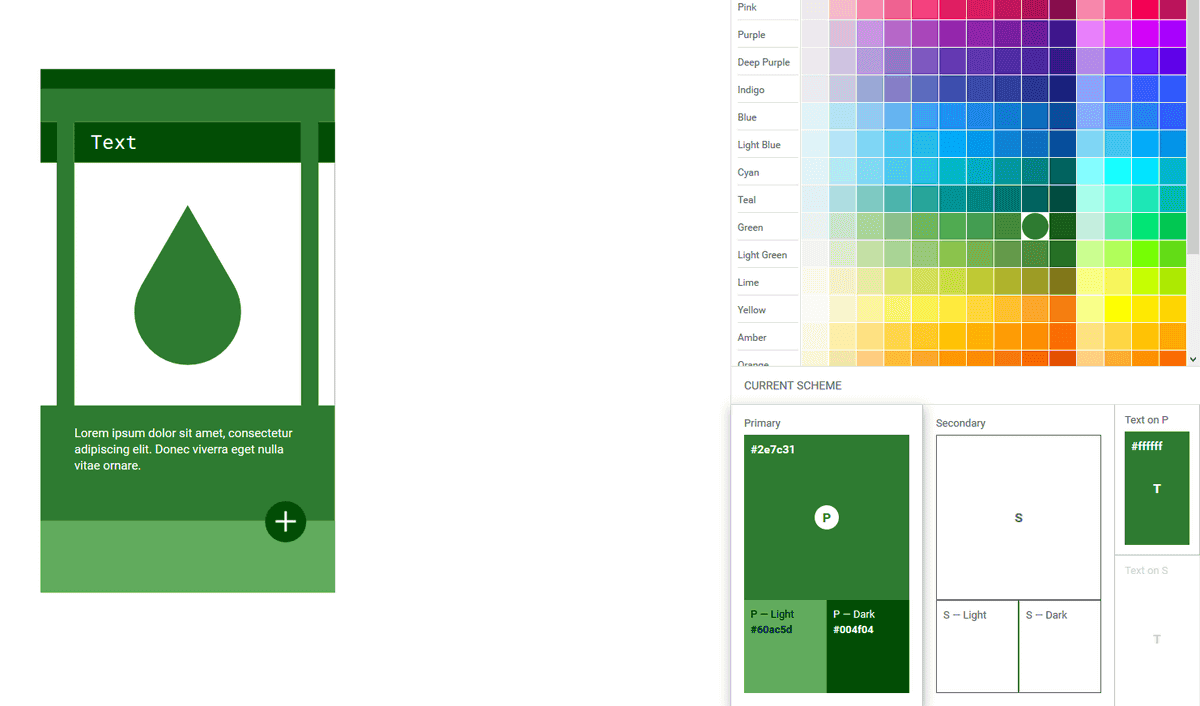
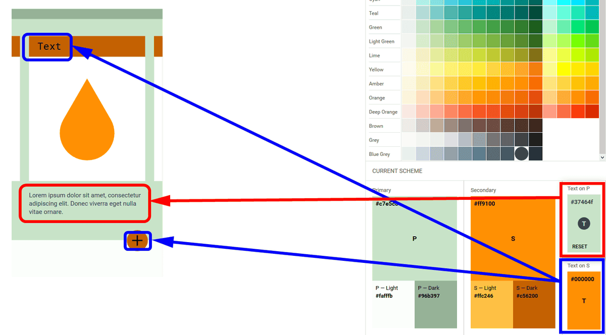
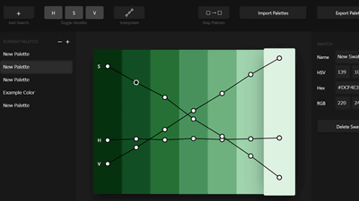
When you move your eyes to the right side of the screen, there is an item "CURRENT SCHEME" in the lower side, "Primary" is selected at the beginning.
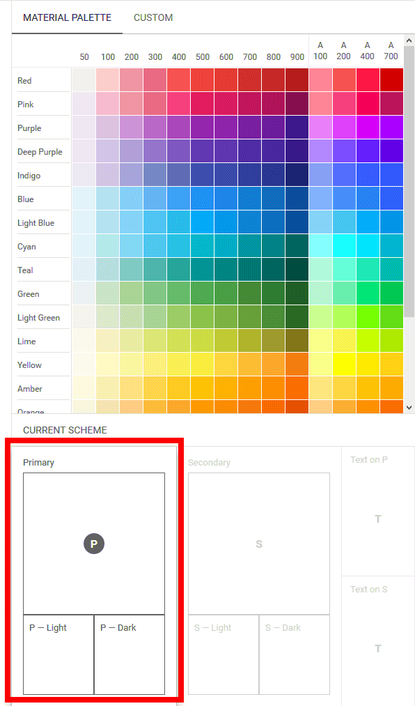
In this state, when choosing the appropriate color from the material palette, the color on the left side layout is attached. The heading on the image is based on the selected color based on darkness, while the footer part is bright on the contrary.
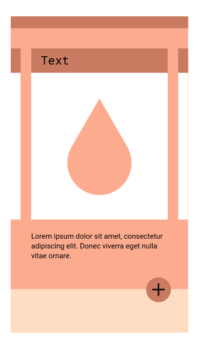
Based on Deep Orange's "# ffab 91" as a base it looks something like this.
When "Primary" becomes the color of this, then select "Secondary" in the lower right item and select a color from the material palette, the headline and the button color change.
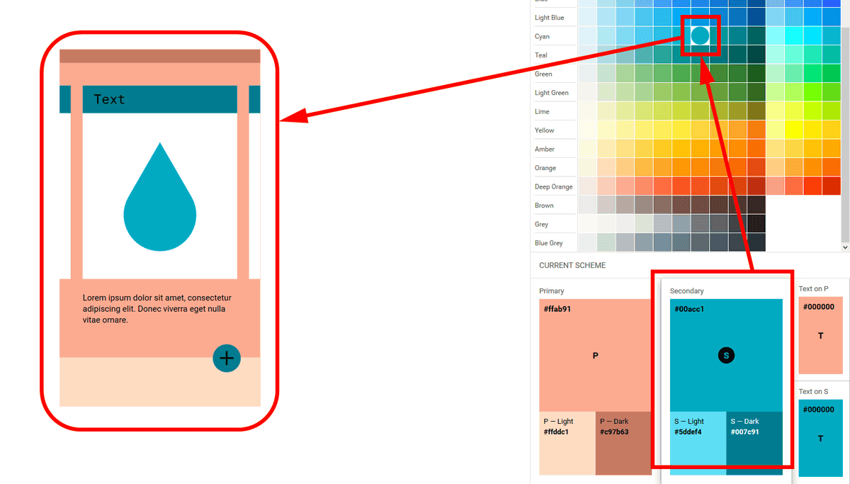
In the same way, adjust the color of the two texts as well. In the case of layout 5, "Text on P" is reflected in the letters displayed below, and "Text on S" is reflected in the heading part & button characters as indicated by the arrows below.
For color, you can change it freely by clicking "CUSTOM", not just the material palette.

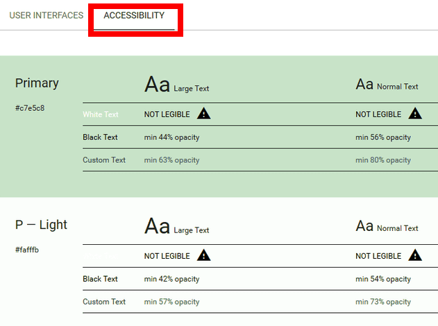
After arranging the colors, click "ACCESSIBILITY" on the upper left of the screen to display advice on the background and font color. Here, "White Text" is "NOT LEGIBLE". In other words, it is difficult to see if the font becomes white.
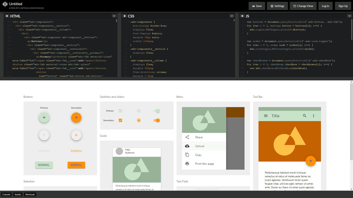
When you have a good one, click the <> icon in the upper right of the screen.

Source code is issued in HTML / CSS / JavaScript, which is ready to use by copying and pasting respectively. At the bottom of the screen, you can see how the buttons, sliders, menus, etc. will look.
If you click an icon like a clip that was next to the <> icon, the URL will be copied to the clipboard. You can share your design with this URL, and you can restart it even if the work ends in the middle.

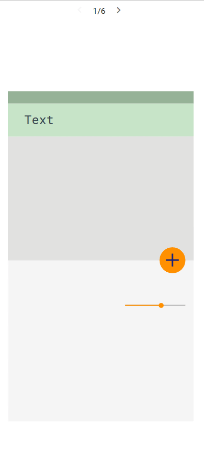
I made this in a URL like "Primary: Light Green / Secondary: Orange" which I made in the article.
https://material.io/color/#!/?view.left=0&view.right=0&primary.color=c7e5c8&secondary.color=ff9100&primary.text.color=37464f&secondary.text.color=18227c
Since the arrangement of colors is saved, you can try out what happens with different layouts.
Related Posts:

in Web Service, Review, Design, Posted by logc_nt