"Wonder Graph Generator" which can realize impression operation at will by biasing a pie chart or causing distortion of space-time sky
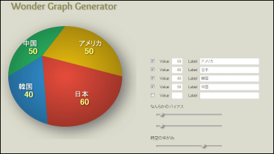
A pie chart, which is often used in business and mass media as a statistical chart, is very convenient to understand general information from the color and area of the area by just looking at the glance, but it is easy to understand the impression simply by processing a little I can change it. Then, a web service that can create a pie chart that can manipulate impressions with the intention of the producer by shifting the center of the circle so as to create a pie chart that can actually perform impression manipulation is "Wonder Graph Generator"is.
Wonder Graph Generator
http://aikelab.net/wdgg/
When accessing the above URL, the pie chart on the left of the screen and the data entry on the right are displayed. Five items on the right side show the pie chartYellow · Red · Blue · Green · GrayIt corresponds toValueIs the value of the item, and Label is the item name. With "some bias" you can move the adjustment button to shift the center of the pie chart up and down, left and right, and in "Spatio-temporal distortion" it is possible to display the pie chart in an elliptical shape.
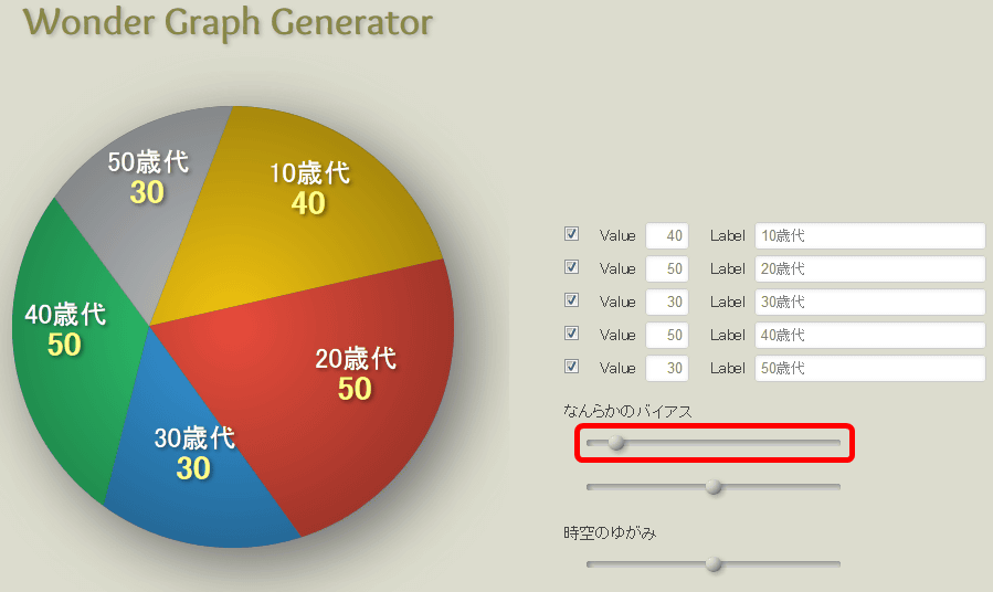
immediately,Value: 40 Label: 10 years old "Value: 50 Label: 20's" Value: 30 Label: 30's "Value: 50 Label: 40's" Value: 30 Label: 50'sIn yellow, red, blue, green, gray.
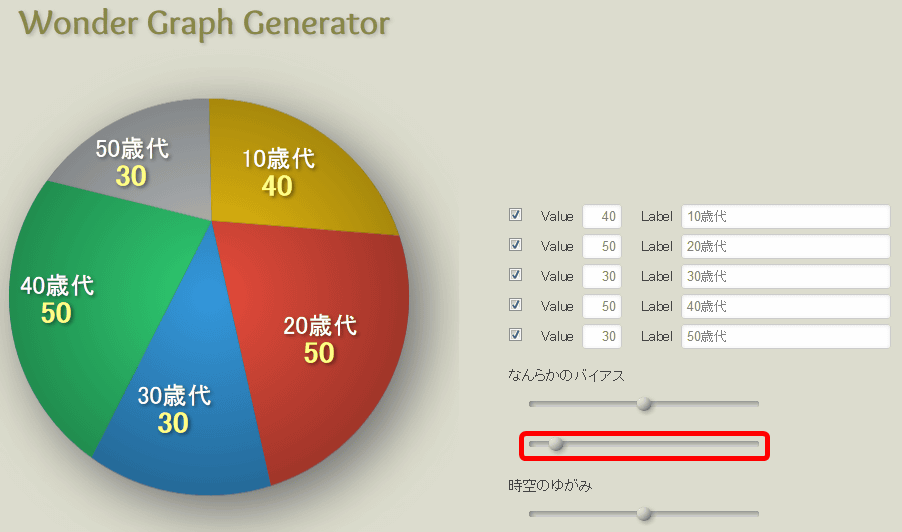
Make a standard pie chart. Value: 40 Label: 10 years old "Value: 50 Label: 20 years old" Value: 30 Label: 30's "Value: 50 Label: 40's "Value: 30 Label: 50 years old" and entering the adjustment bar of "some bias" "Spatio-temporal distortion" in the middle. Then, an ordinary pie chart was displayed on the left side of the screen.

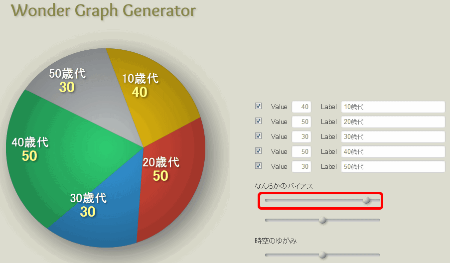
Next, adjust "some bias" and shift the center of the pie chart. If you shift the adjustment lever at the top of "some bias" to the left, the center of the circle is shifted to the left and the area of the item displayed on the right becomes obviously broad.
Next, when the adjustment lever is shifted to the right, the area of the item on the left becomes larger.
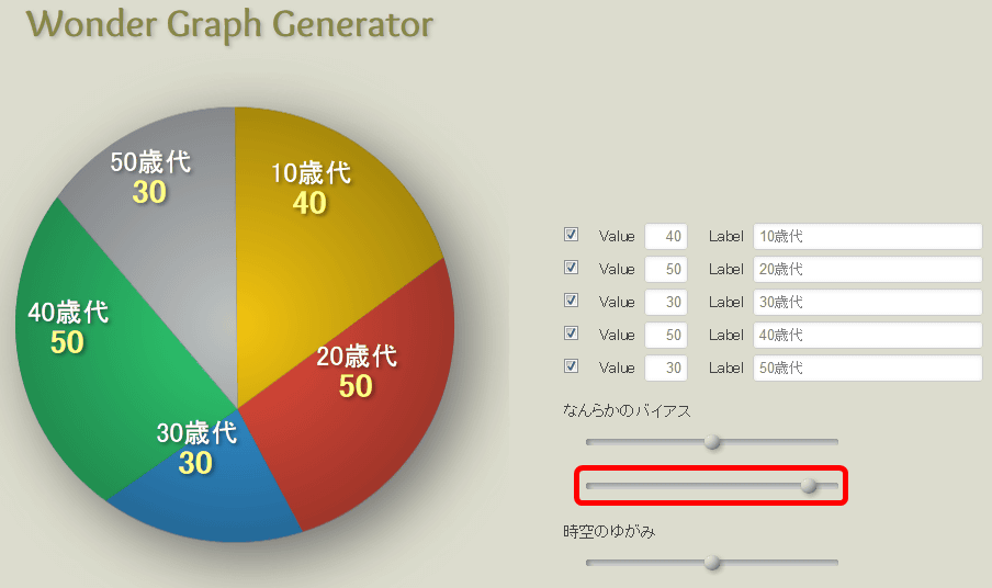
Next, try to shift the center of the circle up and down. Return "middle bias" upper adjustment bar to the middle and shake the lower bar to the left, the center of the pie chart moves up.
On the contrary, the center of the pie chart shifted downward as you pushed it to the right.
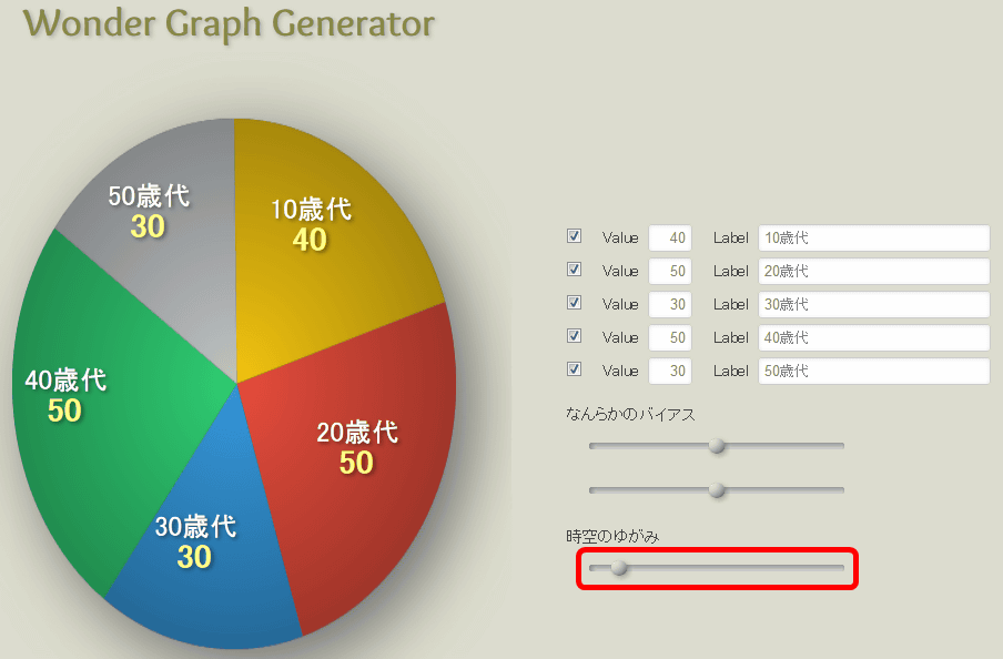
Moving the adjustment bar of "Spatio-Temporal Distortion" to the left, the pie chart became a vertically elongated ellipse.
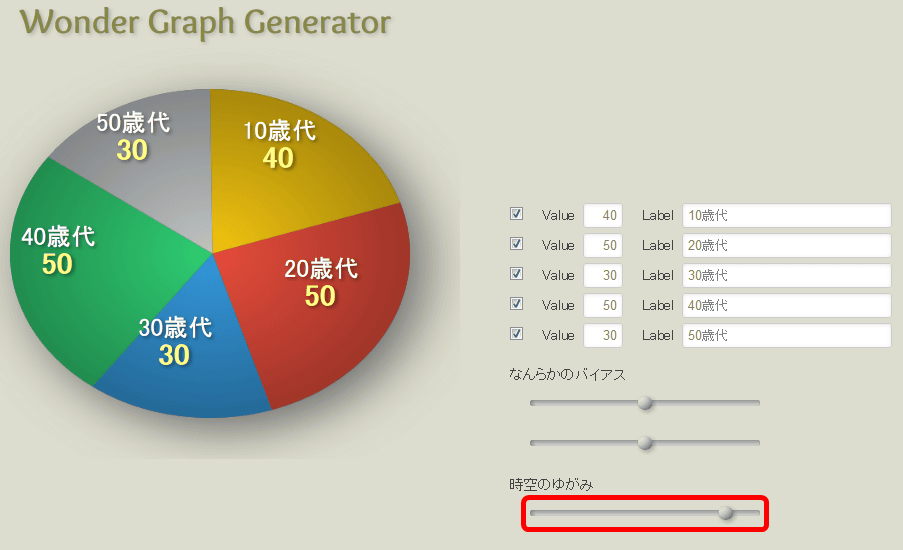
Changing the adjustment bar to the right side changes to a horizontally elongated elliptical shape. With such a feeling, it is possible to create a pie chart that can freely express the intention of the producer.
For example, in order to create a graph showing "20s age bigger", it is OK to bring both the "some bias" adjustment bar to the left. Both the "20s" and "40s" values are 50, but obviously the "20s age" receives a bigger impression.
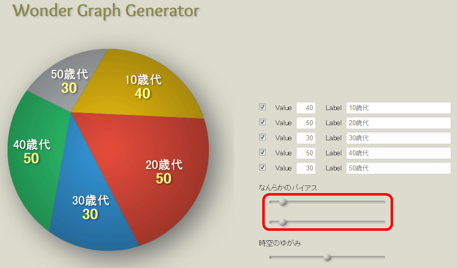
Graph that the upper bar of 'some bias' is on the right and the lower bar is on the left gives the impression that "40s" and "30s age" gets bigger impression than other items.

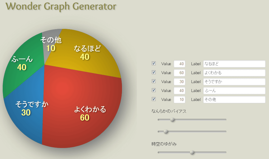
In the same way you can also create a graph like the one below.

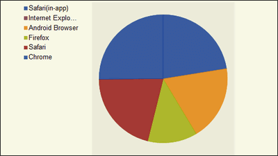
The pie chart shifted centerIt has been used even on TV news programsAs it seems, it seems necessary to look at the impression operation due to such bias and spacetime distortion.

Related Posts:


in Web Service, Posted by darkhorse_log