"Young Adults Then and Now" shows how people of 18 to 34 years old have changed in the past 40 years
From the population and income it has been made visible how people living in the United States from 18 to 34 years of age live "living alone", "living together with their family", "without marriage experience"Young Adults Then and Now"is. Since it is possible to see detailed data classified into the whole country, state, county, etc., I saw "What is the actual state of New Yorkers that I often hear about?"
Young Adults Then and Now - Census Explorer
http://census.socialexplorer.com/young-adults
First, click the green "Explore!" In the top image.

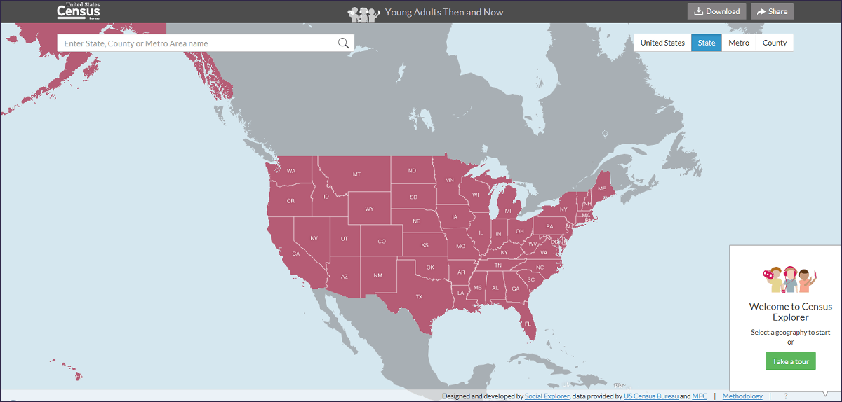
Then, the world map focused on the United States was displayed.
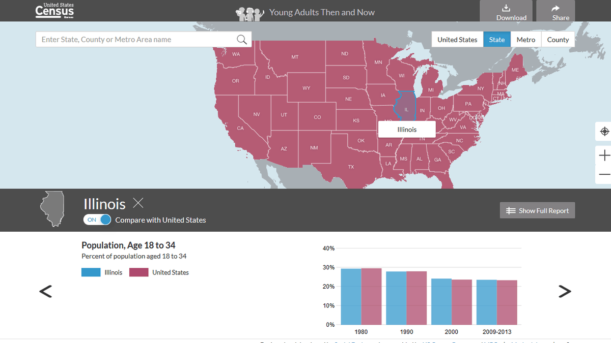
Since the United States is divided into states by state, when you click on the section called "NY (New York)", a graph appears in the lower half of the screen. This is a graph showing the trend of the population from 18 to 34 years old. Blue graph is New York data, purple is the whole USA. In both cases the population is declining and you can see that there is a declining birthrate.
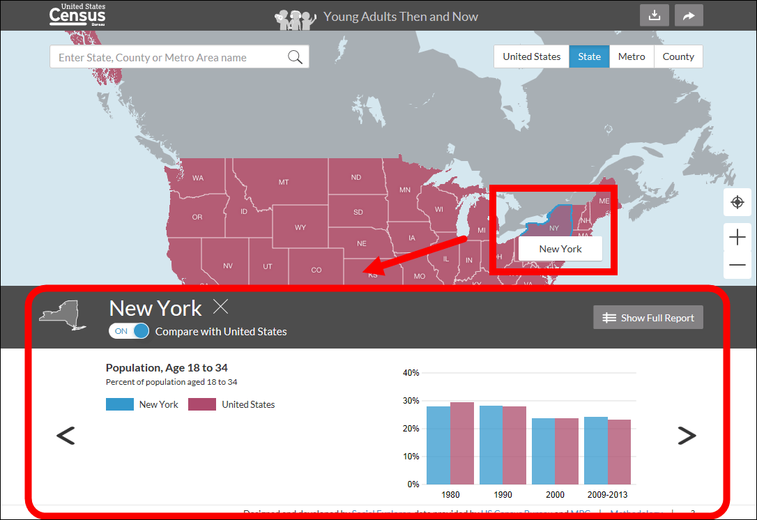
Since there is a button "Compare with the data of the whole country of America" on the graph, if this button which is turned on in the default state is turned off, data of only New York is displayed.

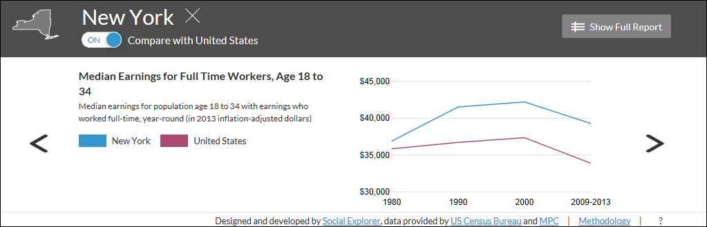
The transition of median income of full-time workers from 18 years old to 34 years old feel as follows. Whether it looks as a whole in the United States or New York alone, it increases from 1980 to 2000, and thereafter it tends to be decreasing, but you can see that New Yorkers are more profitable at all times.
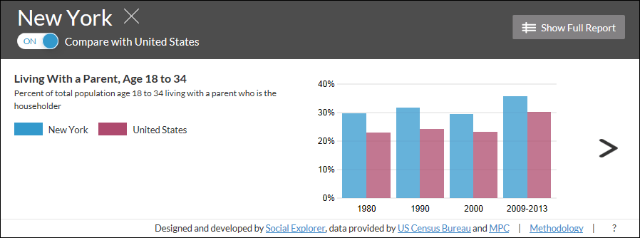
It is 18 years old to 34 years old who live with their parents like this. Perhaps the proportion of New York is higher than the whole of the United States may be due to the high rent.
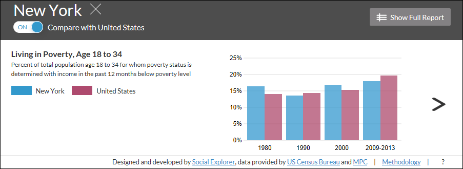
The proportion of 18 to 34 years old who is said to be poverty was many in New York in 1980, but now it is about 17% less than the whole USA.
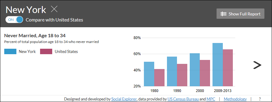
New Yorkers who have never been married are about 70% in 2013. It is around 65% in the whole USA.
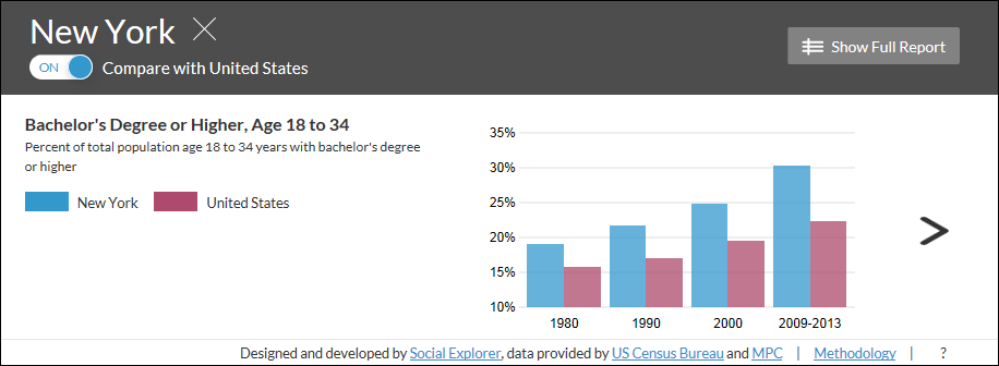
There was a considerable difference between the whole of America and New YorkBachelor's degreePercentage of people who have.
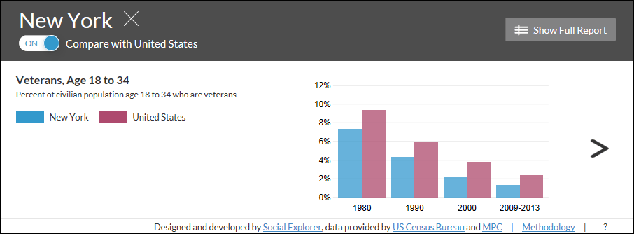
The number of veterans is decreasing overall, the percentage in New York is considerably less than 2%.
If you click "Show Full Report" in the upper right ... ...

The graph will be listed and displayed as a list.

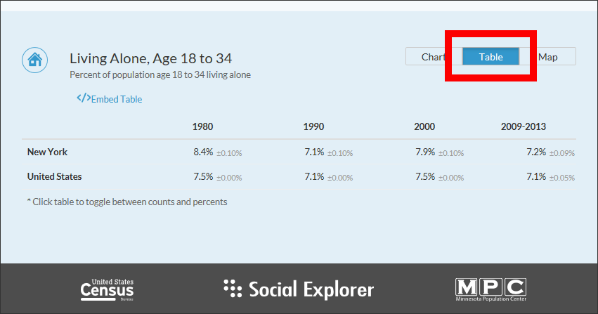
The display method of each data can also be changed. Although it was "Chart" before, if you click "Table", detailed numerical changes are displayed in an easy-to-understand manner.
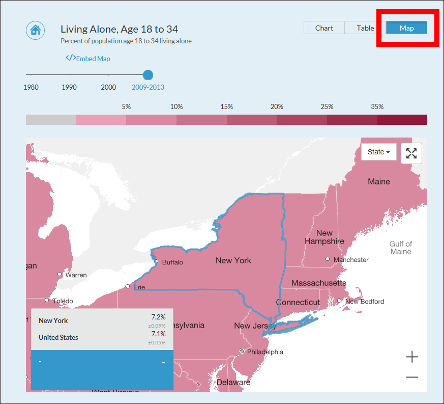
When clicking "Map", both the map and the numerical value were displayed without a graph.
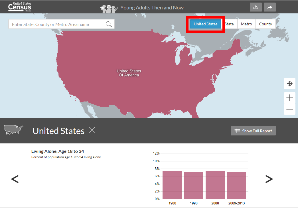
In addition, it is possible to display maps and data of the entire United States on top page as well as those classified by province.
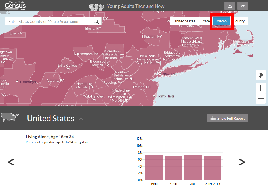
When you click "Metro", data according to the subway classification.
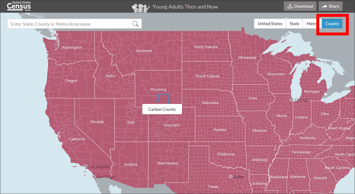
"County" can display data for each county.
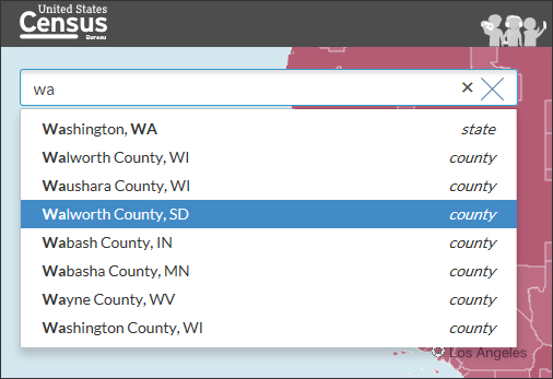
It is OK even if you display data of a specific area from the search field.
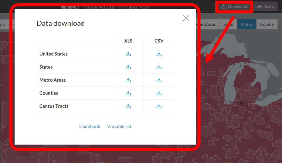
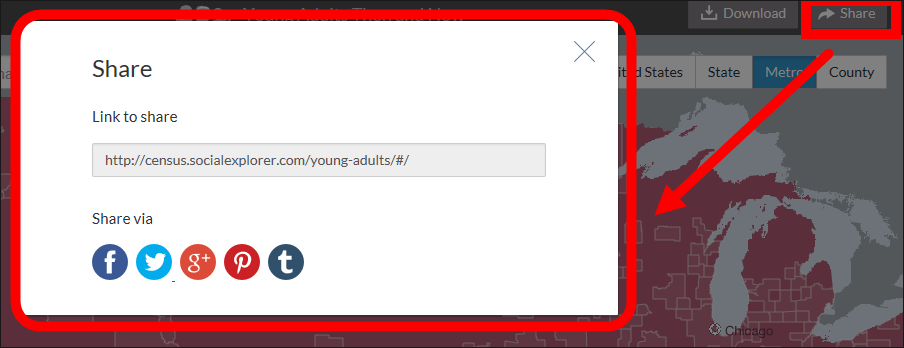
You can also output data in XLS format and CSV format by clicking "Download" on the upper right of the screen.
In addition to link pasting, share button of Facebook · Twitter · Google+ · Pinterest · Tumblr was also prepared.
Related Posts:


in Web Service, Review, Posted by darkhorse_log