Illustrate what kind of activity people are doing at any time of day

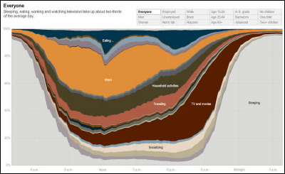
There seems to be a diagram showing what kind of activity people are doing at any time of the day. Detailed classifications such as sex, age group, number of children, etc. are also done, so you can see what kind of people, what time period, what percentage and what kind of activities are doing.
Details are from the following.
This figure shows what people are doing in what time of the day.
■ Sort by gender
male. You can see that there are more people (oranges) working than women.
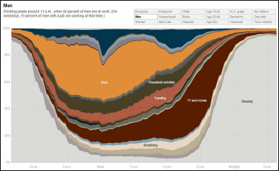
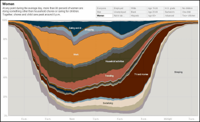
Female. Many people spend time on housework (Moss Green) compared to men. It also shows that more people are using time for education (gray above orange) than men.
■ Classified by age
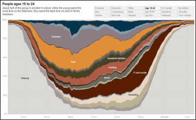
People between the ages of 15 and 24. Because there are many students in this age, you can see that many people spend time studying compared to other age.
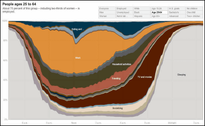
25 to 64 years old. There are also things called working height and there are quite a lot of people working in the daytime.
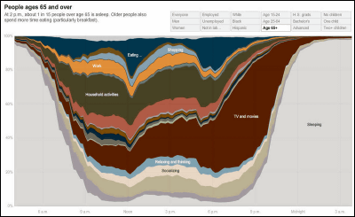
After 65 years old. There are also a few saying that it is after retirement and there are very few people working, and more people are using time for social activities (white) and leisure (under white).
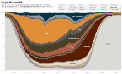
■ Classification by Number of Children
A person without children. There are few people who work unexpectedly. On the other hand, you can see that many people enjoy watching TV (brown) other leisure.
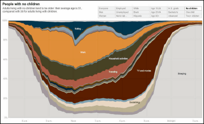
A person with one child. Many people are working firmly in the daytime because they have children and need money. It also shows that the time of care for family members is increasing.
A person with two or more children. There are some people who spend time on housekeeping etc.
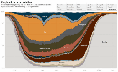
You can see other figures (people type etc) from below. You can also view detailed data by hovering over the graph.
How Different Groups Spend Their Day - Interactive Graphic - NYTimes.com
Related Posts:
in Note, Posted by darkhorse_log


