HNWIs can live 10 to 15 years longer than the poor

By Sacha Goldberger
The difference in lifetime due to the difference between rich and poor is the result of previous studiesIt has been made clearHowever, the latest research revealed that the difference is not 2 to 3 years but 10 to 15 years. The average life expectancy of people located in the poorest in America is almost equal to the values of Pakistan and Sudan. In urban areas where the income gap is large, on the other hand, the unexpected survey result that the disparity of life expectancy is small is also known.
For life expectancy, money matters | Harvard Gazette
http://news.harvard.edu/gazette/story/2016/04/for-life-expectancy-money-matters/
Poor New Yorkers Tend to Live Longer Than Other Poor Americans - The New York Times
http://www.nytimes.com/2016/04/11/upshot/poor-new-yorkers-tend-to-live-longer-than-other-poor-americans.html
The relationship between life expectancy and income in the 40-year-old in the United States is as follows. Looking at the graph of men, you can see that there is a difference of 15 years in the difference in life expectancy between the layer with the least income and the layer with the most income. On the other hand, the difference between the two in women is 10 years, which is considered to be due to the influence of smoking.
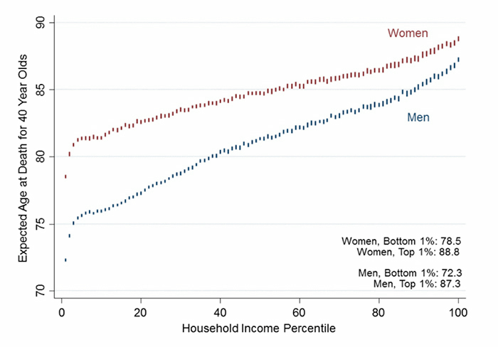
Harvard economists David Cutler and Raj Chetty investigated the relationship between 1.4 billion records of the Internal Revenue Service of the United States of America from 1999 to 2014 and the life expectancy, not only the above facts, but also New York and Those living in wealthy cities such as San Francisco turned out to be longer life expectancy than people living elsewhere, even poor people. Even though the reason is not clear, those who live in wealthy cities, even in poor circumstances, exercise more than people living in rural areas of the provinces, and a small percentage of drinking and smoking It is thought to be. Also, as one of the possibilities, there are many immigrants who are healthy compared with native Americans, and assistance for poor people to live healthier is high due to high taxes.
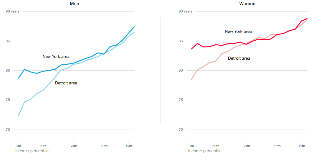
New York is known for the big difference between rich and poor, but there is less disparity in life expectancy than other cities. Moreover, when comparing 2001 and 2014, the disparity in life expectancy in New York tends to become smaller despite the widening gap between life expectancy in the whole country.
Looking at the difference in life expectancy of Detroit in New York and the southeastern state of Michigan by gender, it is like this. The lower the income, the more the difference in the mortality rate with the urban area is growing.
Also, while the life expectancy of wealthy people has been growing with the progress of the times, the average life expectancy of poor people has only been slightly increased. "Americans may increase their retirement age because their longevity has been extended", but this is only applicable to some people, poor people who live longer for longevity living people are society Guaranty disability pension and over 65 years old targetedMedicareThere is a possibility that inequality may occur because less time is gotten.
Also, based on another survey, The Washington Post visualizes how much the mortality rate varies depending on race and sex.
A new divide in American death: Statistics show widening urban-rural health gap | The Washington Post
http://www.washingtonpost.com/sf/national/2016/04/10/a-new-divide-in-american-death/
First of all, this is an increase / decrease in the mortality rate of people aged 40 to 44 between 1990 and 1995. The red graph shows black, the graph with pink shows Hispanic type, the blue graph shows white people, you can see that the mortality rate rises roughly like the same feeling.
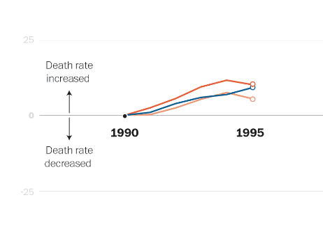
However, the graph changes greatly in the process until 2014. Despite the decreasing tendency, despite the fact that the black and Hispanic mortality has decreased by about 45%, the white mortality rate is only 1% lower than in 1990.

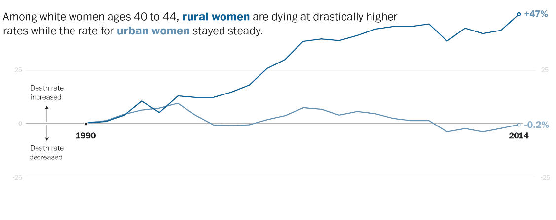
Furthermore, when the above white graph is displayed by gender, it is like this. We can see that the dark graph shows female, the light graph shows male, and the death rate of women is increasing.

Furthermore, if women are divided by "women living in rural areas (dark graph of color)" and "women living in urban areas (thin graph of color)". The death rate of women living in the country is extremely high.
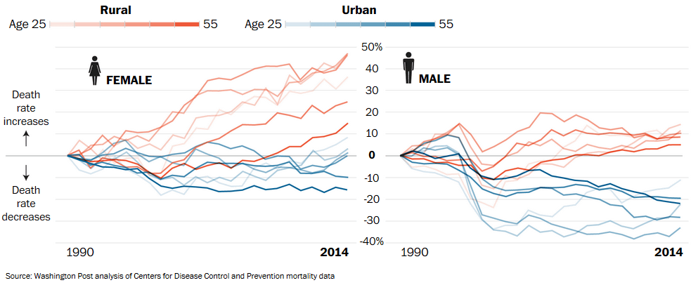
The following graph shows how much the mortality rate will change in age, gender, and place of residence. A reddish graph shows rural areas, a bluish graph shows people living in the city, and as the color of the graph gets darker the age will rise. Both males and females have higher rural death rates than city death rates, but women have seen a significant increase in the relatively young generation's mortality rate, particularly from 25 to middle age.
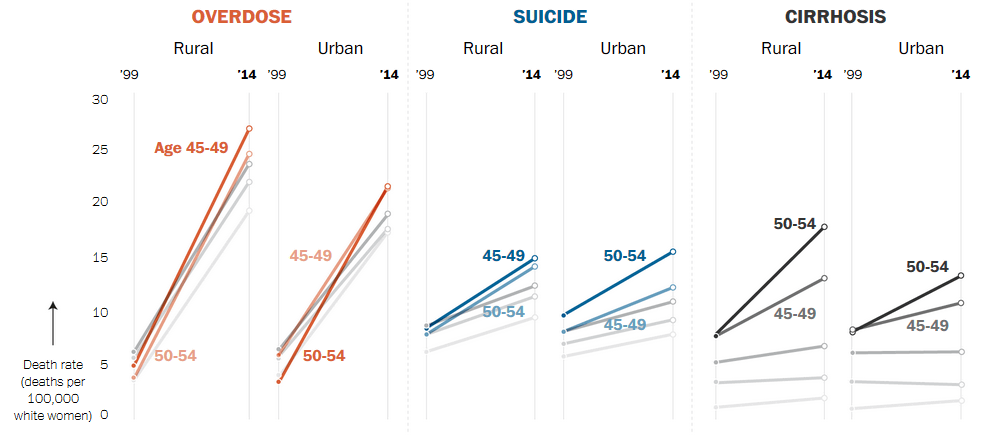
Furthermore, the graph below shows the cause of the death of White women in the country / city. Overdose from the left, suicide, liver cirrhosis has become. The proportion of deaths in rural areas by overdose is generally high and the increase in mortality rate is remarkable between the ages of 45 and 49. On the other hand, in urban areas, the proportion of women aged 50 to 54 dying by overdose increases It is. This trend can be said to the same with suicide and the trend of increasing liver cirrhosis is also very high, so it seems that a large amount of drinking may lead to a high death rate.
Dr. Ashish Jha of the International Health Organization of Harvard University said, "The gap between rich and poor is not necessarily bad, and how to build public health infrastructure is a future subject."
Related Posts:


in Note, Posted by darkhorse_log