Better UI designs and UX conditions that I have learned from examples and user tests
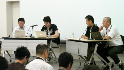
UI design refers to designing information devices and webs based on ease of use, comprehensibility, comfort for users, Yuki Kogawa of NHN Japan Co., Ltd., which manages Han Game, Taking in the UI design, I talked about efforts to make the game more interesting.
Learn from user's behavior Game UI design
NHN Japan Creative Marketing Center Marketing Design Office / UX Design Team Kokogawa Yuki. Thank you.

I will present about the game UI design which learns from user's behavior. I joined our company in 2011 and have been designing WEB service as a UX designer. Since 2012, we mainly do UX related to smartphone applications and games.

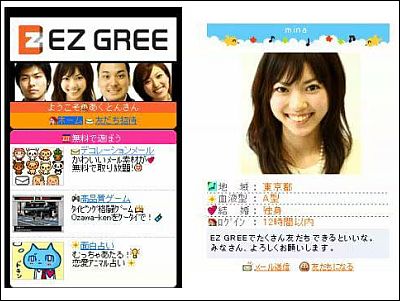
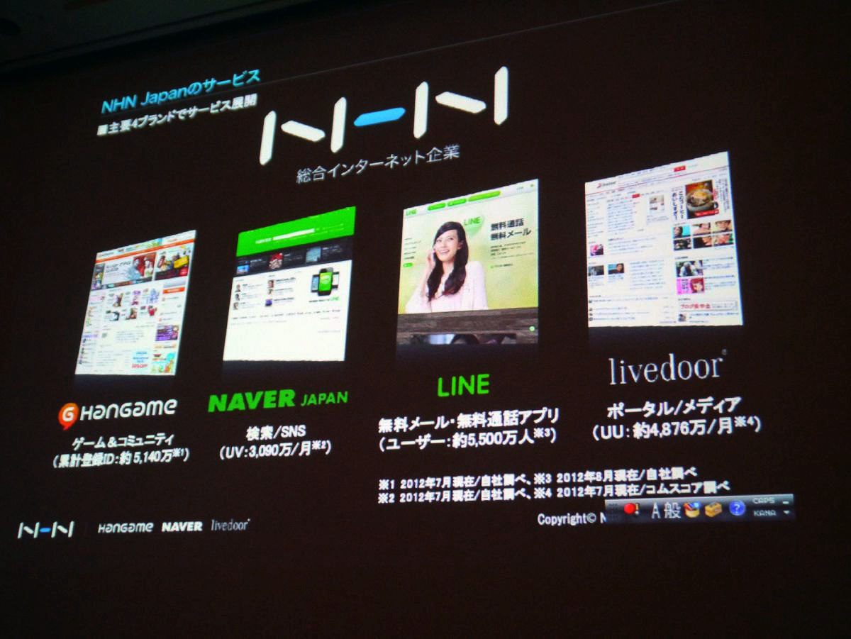
I will introduce our service. We are deploying four main brand services, from the left to the online gameHan game. Search siteNAVER JAPAN, The summary is also famous. Free Mail, Free Call AppLINE. Of portal mediaLivedooris.
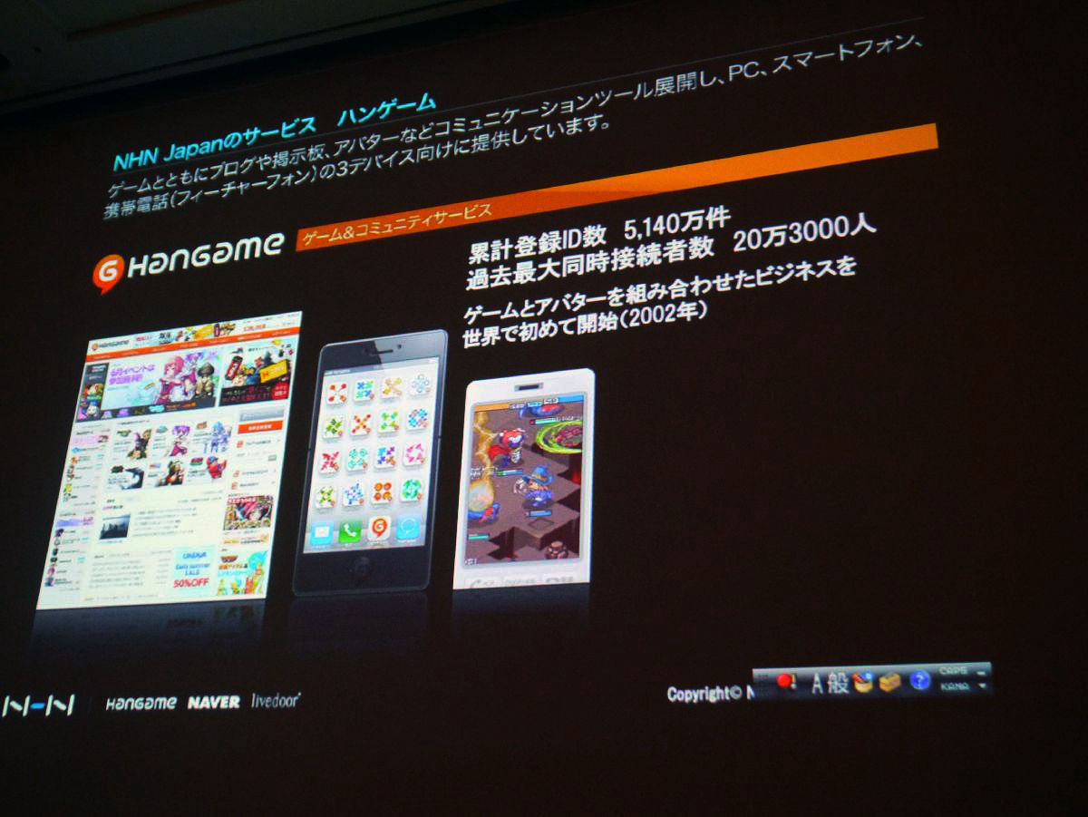
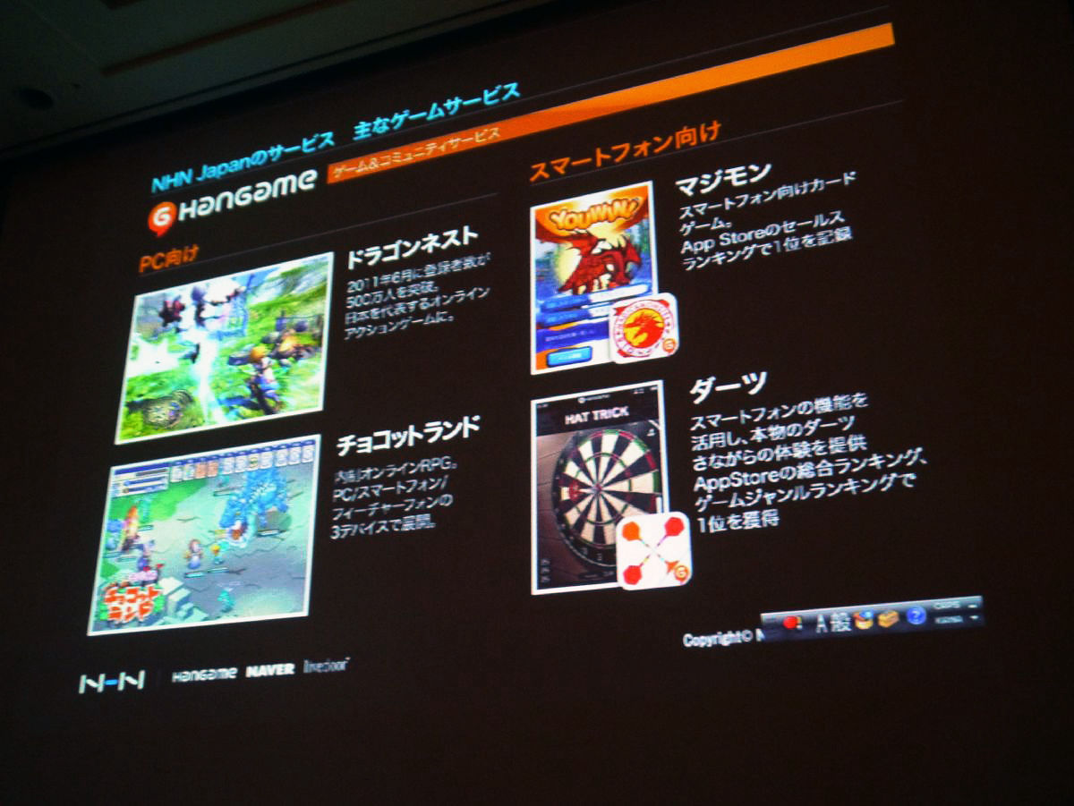
I will explain a little more concretely about Han game. We offer it for 3 devices such as PC, smartphone, mobile phone. The cumulative number of registered IDs is 51.4 million, the largest number of simultaneous users in the past is 200,000. We launched business combining game and avatar for the first time in the world.
For PC as main game serviceDragon NestIn June 2011, it is becoming Japan's leading online action game where the number of registrants exceed 5 million people. Below thatChocotto land. Right is Magimon for smartphones, lower is darts playing with motion like throwing smartphone. Today I will introduce examples of UX in such games.
First, I will explain the concept of UX and UXD. As a general concept of UX, there are things that users are satisfied or dissatisfied, or emotions of experience such as pleasure and comfort are worthy.
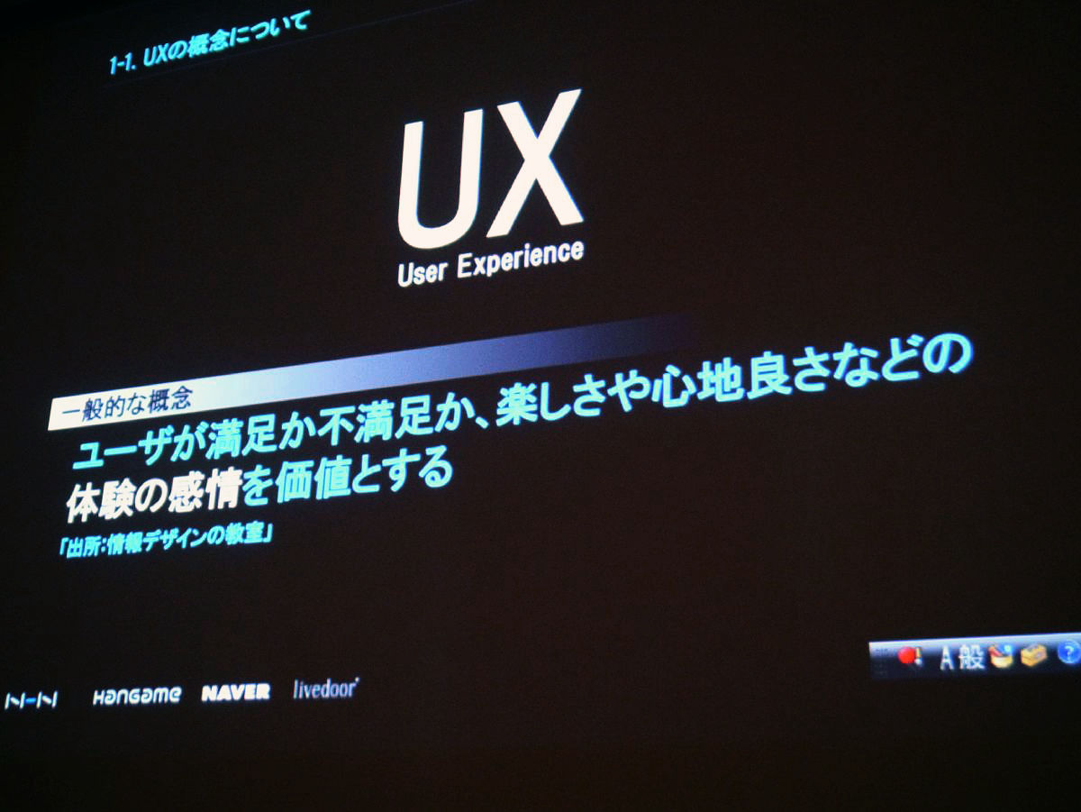
With UXD, by adding elements of design to it, it will be something to design information equipment, webs, etc. from ease of use, understandability, comfort. The keyword of user satisfaction NO.1 often comes out, but I will say that concept.

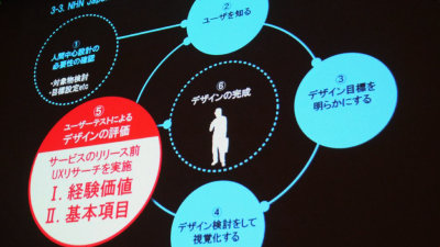
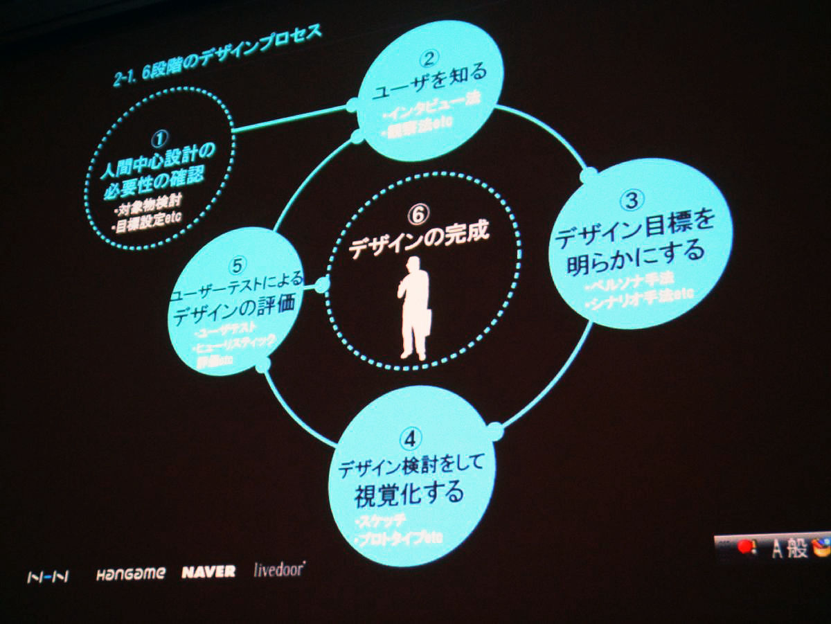
It is UXD's design process. I'm thinking about a six-step design process and users are standing in "Completion of design" of 6, but this is the process of how to propose something satisfying to this target user. So if I say that the user is not fun with 5, I will repeat the process 2, 3 again.
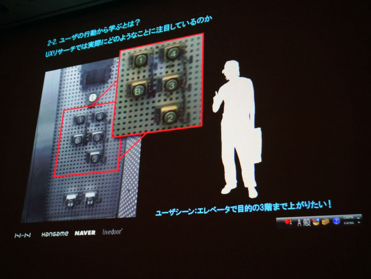
What is learning from user's behavior? We are doing UX research, but I will introduce it using one example. This is what I took, but it becomes a button of an elevator. I think that you will notice the strange part, but the buttons are looking like the N of the alphabet. Normally it is designed so that the line of sight rises upwards in zigzags, but it is an example of whether these differences may result in "difficult to use" or "feel stressed". We will learn from user actions what ease of use lies in.
So what is the role that our UX and games should play for our customers?
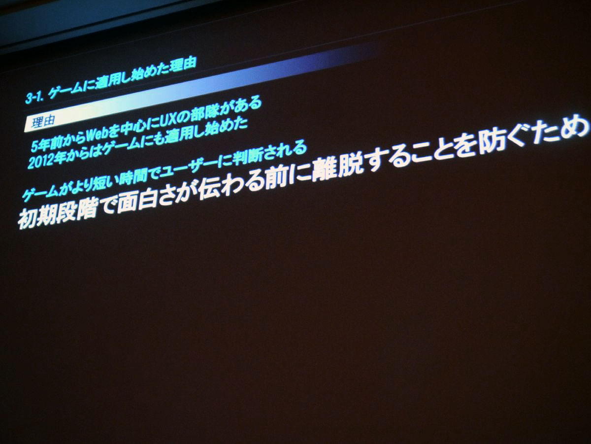
That is why I began applying UX to games before that, but five years ago there was a UX specialty force centering around the web. We decided to apply it to games from 2012, and to offer more easy-to-use services. There is a place where the game is judged to the user in a shorter time, designing so that fun is transmitted in the initial stage, the purpose is to prevent from leaving.
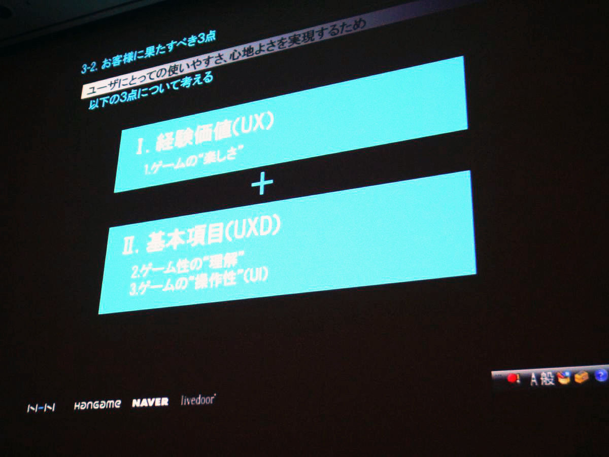
What is the ease of use, comfort for users? I summarize three points. The first one is experience value. Experience value is not the value of the service itself but the value obtained by using the service. For example, enjoyment of a game is experience value.
Next, an understanding of game character. It is also important to have you understand what kind of game it is.
Lastly the operability of the game.
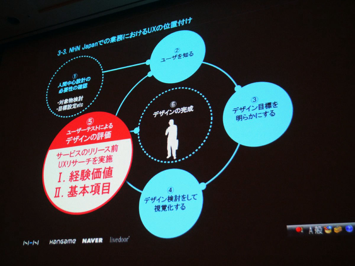
As a position of UX in our company's work, we are focusing on "Evaluating design by user test" in 5. We conduct UX research prior to the release of the service, checking whether it is worth experience and whether the basic items are cleared.
So, I will introduce examples of UX research so far.
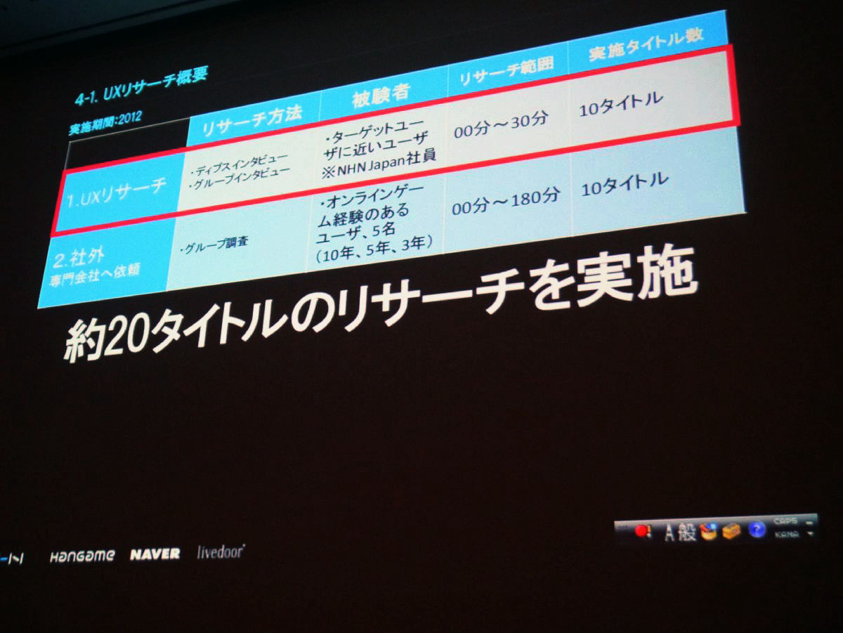
UX Research will be outlined. The implementation period is implemented in two patterns from 2012. Research carried out inside the red framework is done by a depth interview (1: 1), group interview.
Another one has asked a specialized company outside the company to evaluate whether the title is interesting or not. We have carried out about 20 titles of research so far with these two methods.
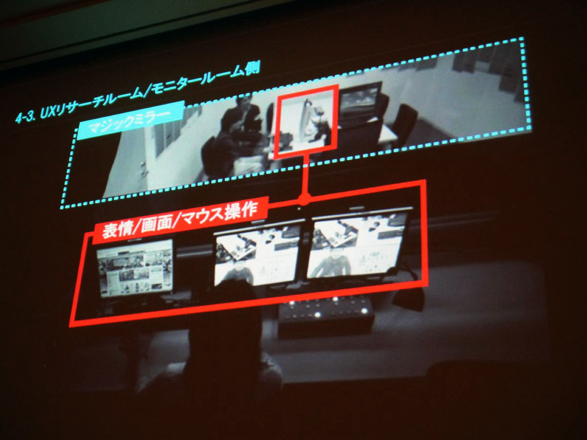
It is an image from the monitor room side of the UX research room inside the company. The room is partitioned by the Magic Mirror, and the state of the tester playing in the back of the image is checked with three monitors on the front, expression, screen movement, mouse operation and so on.
UX As the whole system in the research room, the left is the system in the research room, but up to seven people can be tested. Simultaneous testing of smartphone and PC is also possible. Through this system, I actually observe what you are playing in the monitor room.
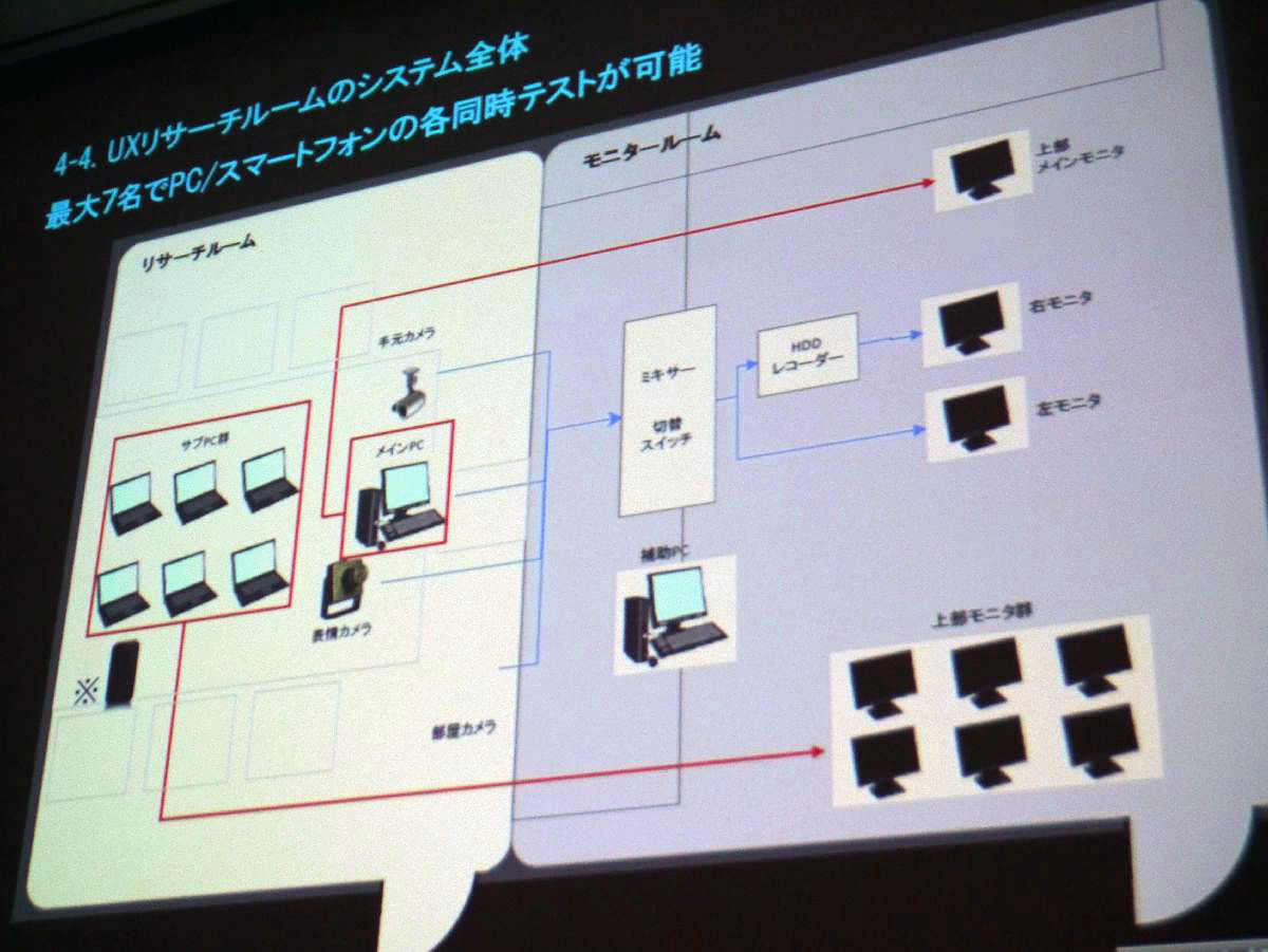
As an advantage of in-house research, it is possible to extract and confirm tasks in real time. There are designers, directors, developers, etc. who were involved in the game in the monitor room and tell the researcher "Why did these problems happen here?" And confirm with the tester.

I will introduce concrete examples so far.
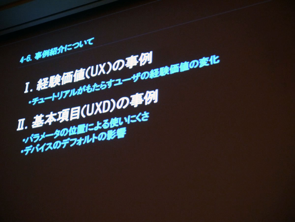
First of all, what is the change in user experience value that the tutorial brings as a case of experience value?
Secondly, as a case of UXD, we introduce the difficulty of using parameters depending on the position of parameters and the difficulty of using the device due to the default influence.
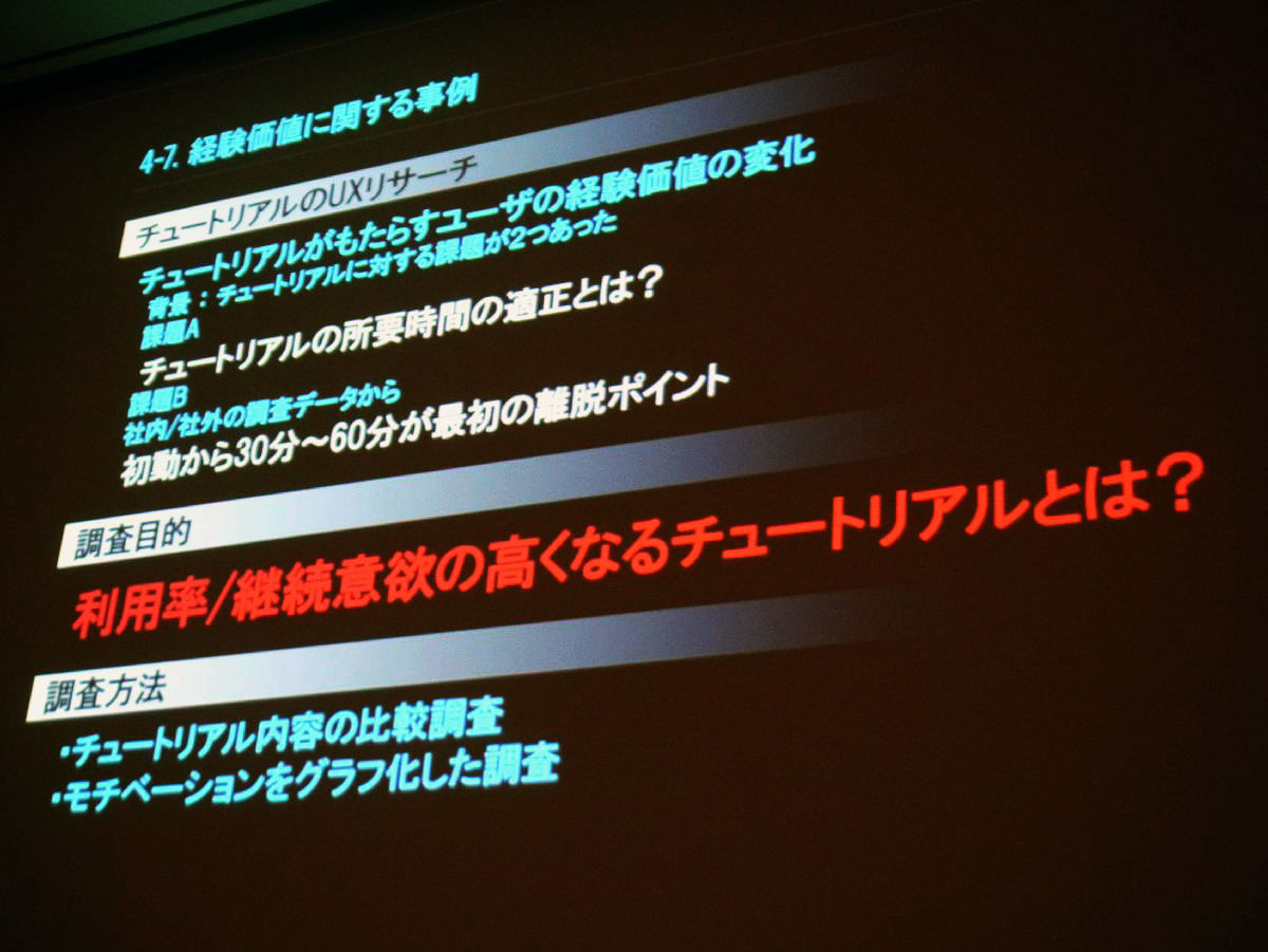
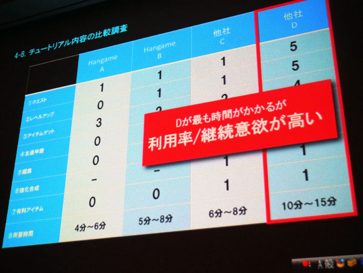
We conducted a UX research on the tutorial as a case on experience value. There have been two challenges to the tutorial as a change in the experience value of the user that the tutorial brings. One is how much is the time required for the tutorial? There was a problem that 30 to 60 minutes of initial movement from research was the first exit point.
From these two tasks, I investigated what tutorial it is all about with a tutorial that increases the utilization rate and willingness to continue. As a survey method, we compare tutorial content comparison, and investigation to graph the user's motivation.
This is a comparative study table of the tutorial, but the horizontal axis is our company's title A, B and the competitors' titles C, D. The vertical axis shows the contents as a tutorial. Numbers indicate how many times the contents of the tutorial comes out. The bottom is the time it takes to finish the tutorial. The time required by our company's title is about 4 to 6 minutes, and about other companies we classify games of 6 to 15 minutes. There was a hypothesis that it might be better to finish in a short time for our tutorial. When actually asking which one I wanted to do the most in playing 4 titles, I got a result that D was the most time consuming rate continuation rate was high both.
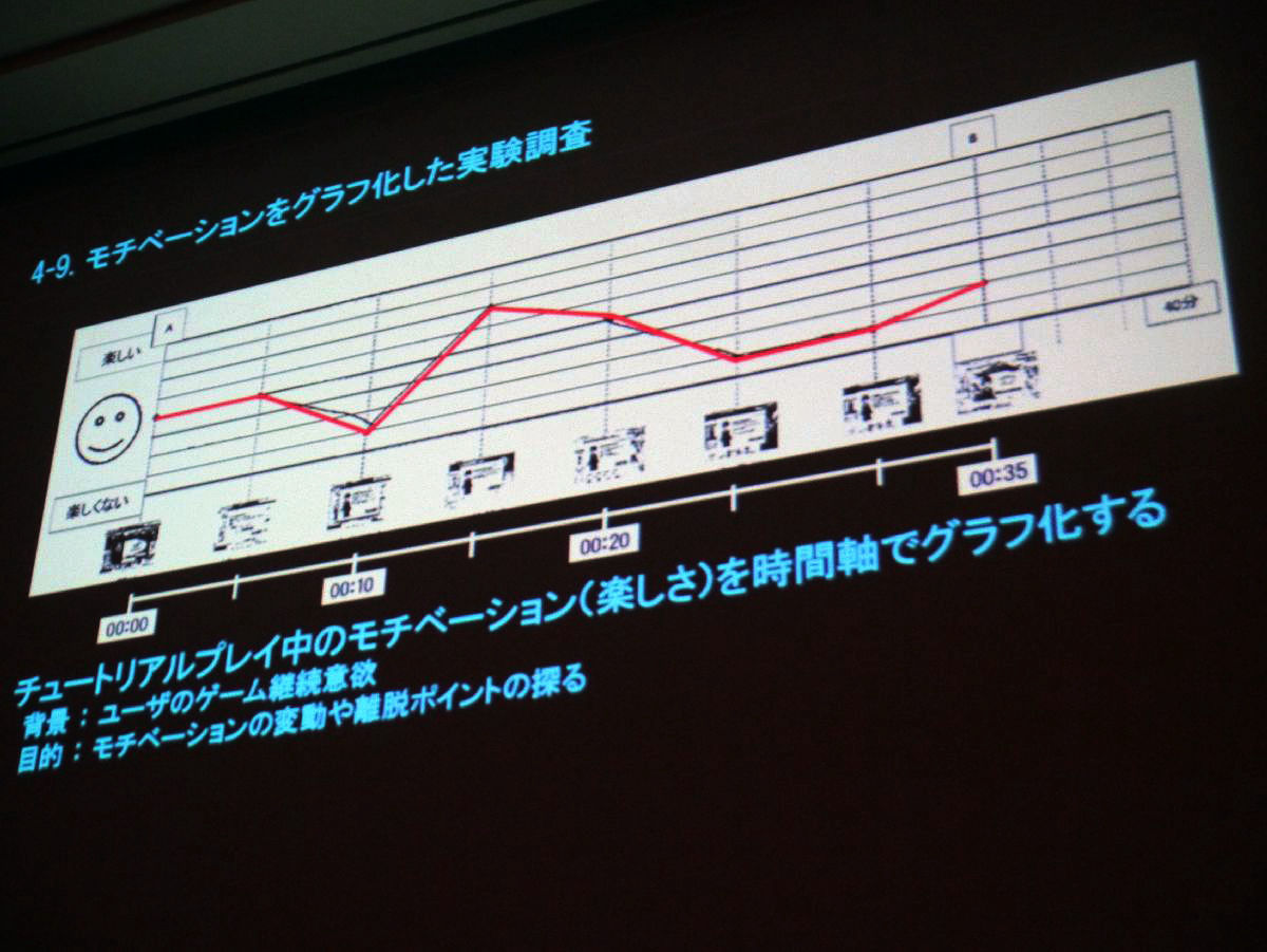
The other is an experimental study that graphs motivation. On the horizontal axis is time, mapping each step, and at this time, it is an experiment that intuitively graphe contents of what your feeling went up or down.
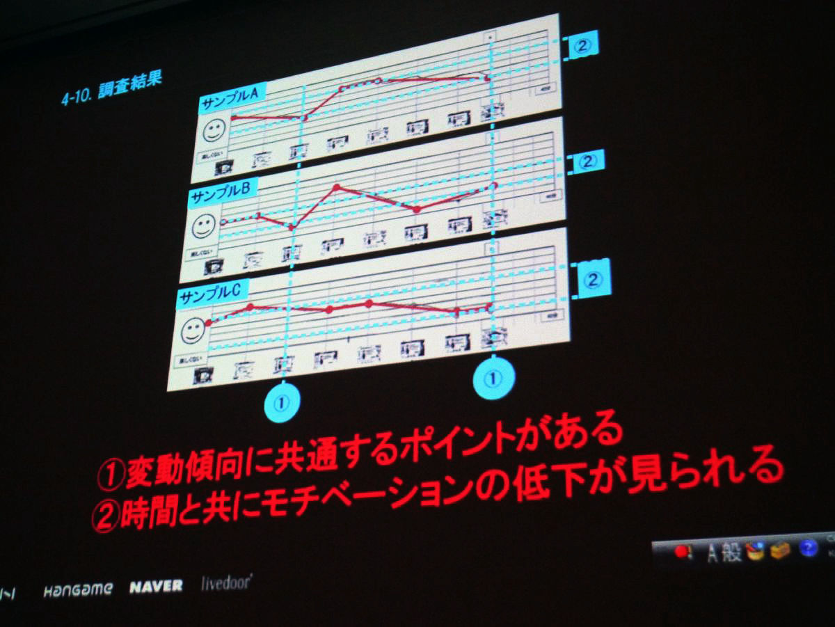
As a result of this survey, two trends were seen when samples A to C were taken. One is that there is a common tendency to fluctuate like a vertical line. It is said that the feelings of people fall here.
The second thing is that a decline in motivation can be seen over time. It is content that pleasure is decreasing when comparing start and goal.
It is a hypothesis obtained from here. From the results of the survey, it seems that the influence by time length, the relation is small. The second thing is to cover the contents of the game and convey fun.
As a hypothesis, it is said that tutorials must also communicate the experience value.

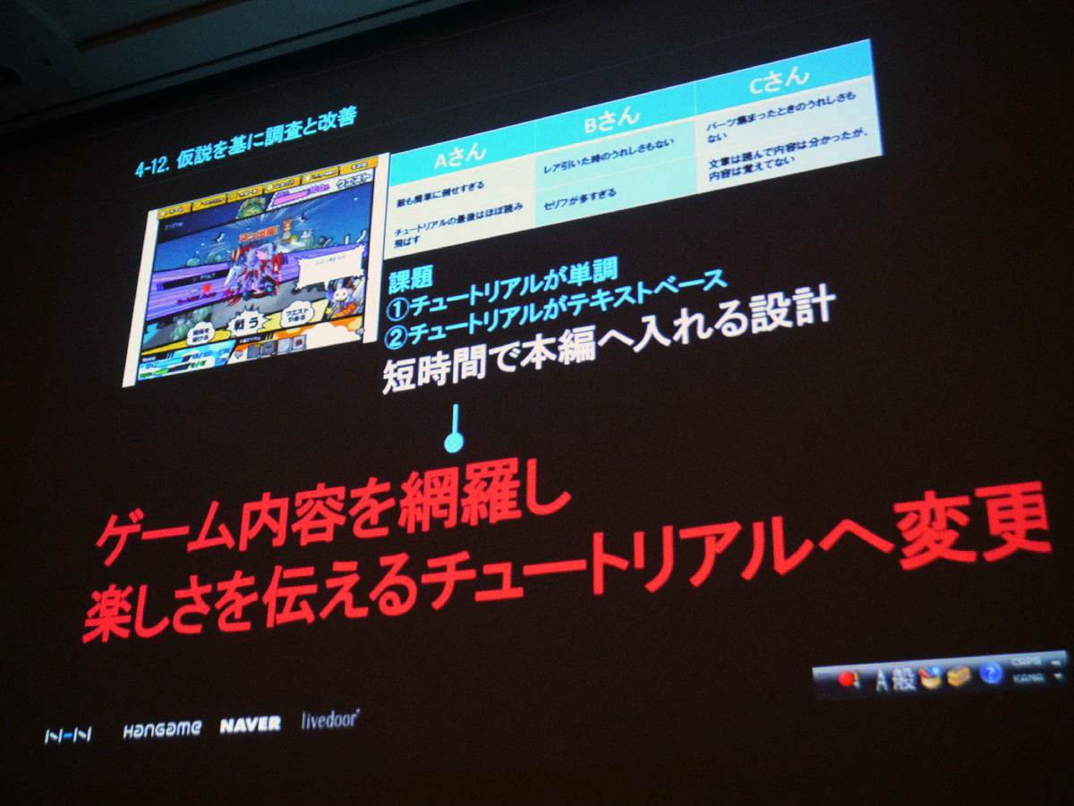
Based on this hypothesisToy PlanetWe did UX research before the release titled " At this time, as the opinion of three testers, there are things such as "you can easily defeat the enemy", "It is not pleasant to pull a rare card", "It is not pleasant even when the parts gather" In the first place the tutorial was monotonous There was a challenge. As a second opinion, there were things such as "just reading the end of the tutorial almost" "too many words", and there was a problem that it was not so good on a text basis. Since it was designed to be in the main part in a short time, we decided to change to a tutorial covering the contents of the game and telling fun.
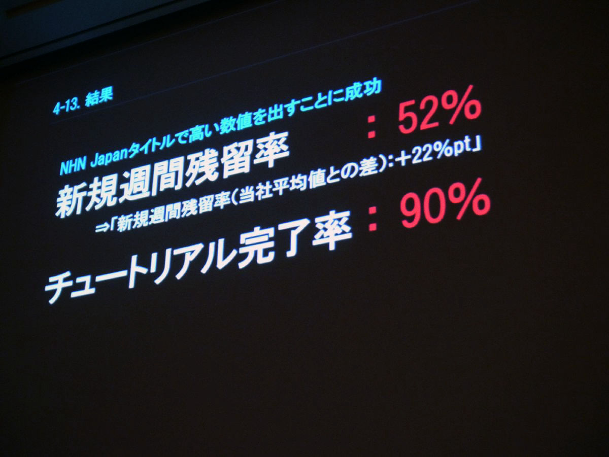
As a result, we succeeded in putting out high numbers in our title. New weekly residual rate is 52%. Tutorial completion rate is 90%.
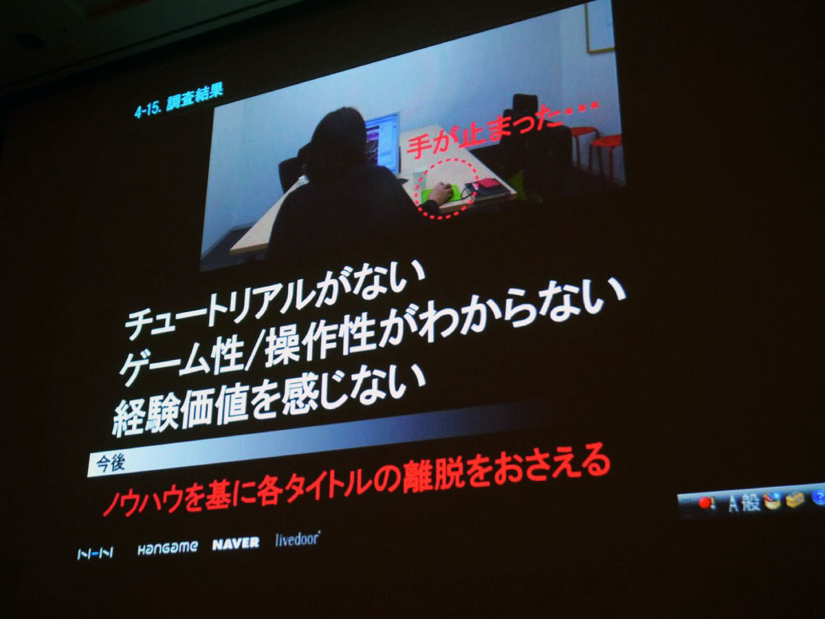
Based on previous examples, I was also researching titles that have already been released, and there was a title that the new weekly residual rate was 28%, but I understood the game nature as a problem of this title Two opinions came out that there was no such thing, but understanding of operability was not made.
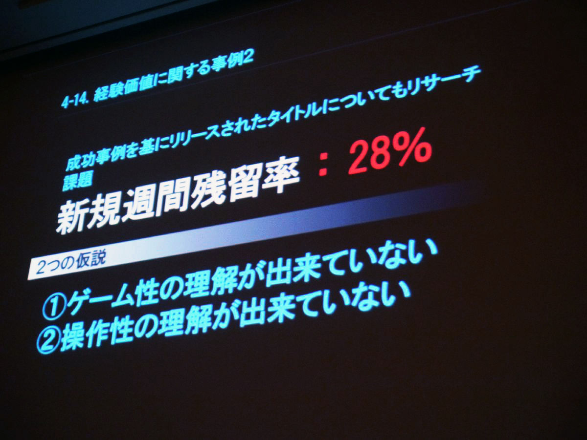
So, when you actually do research, you did not have any tutorial in the first place. So, it is the content that experienced value is not understood for the first person in the place that I do not know the game nature and operability.
I will continue to suppress the departure of each title based on know-how, and I will continue to offer high quality tutorials.
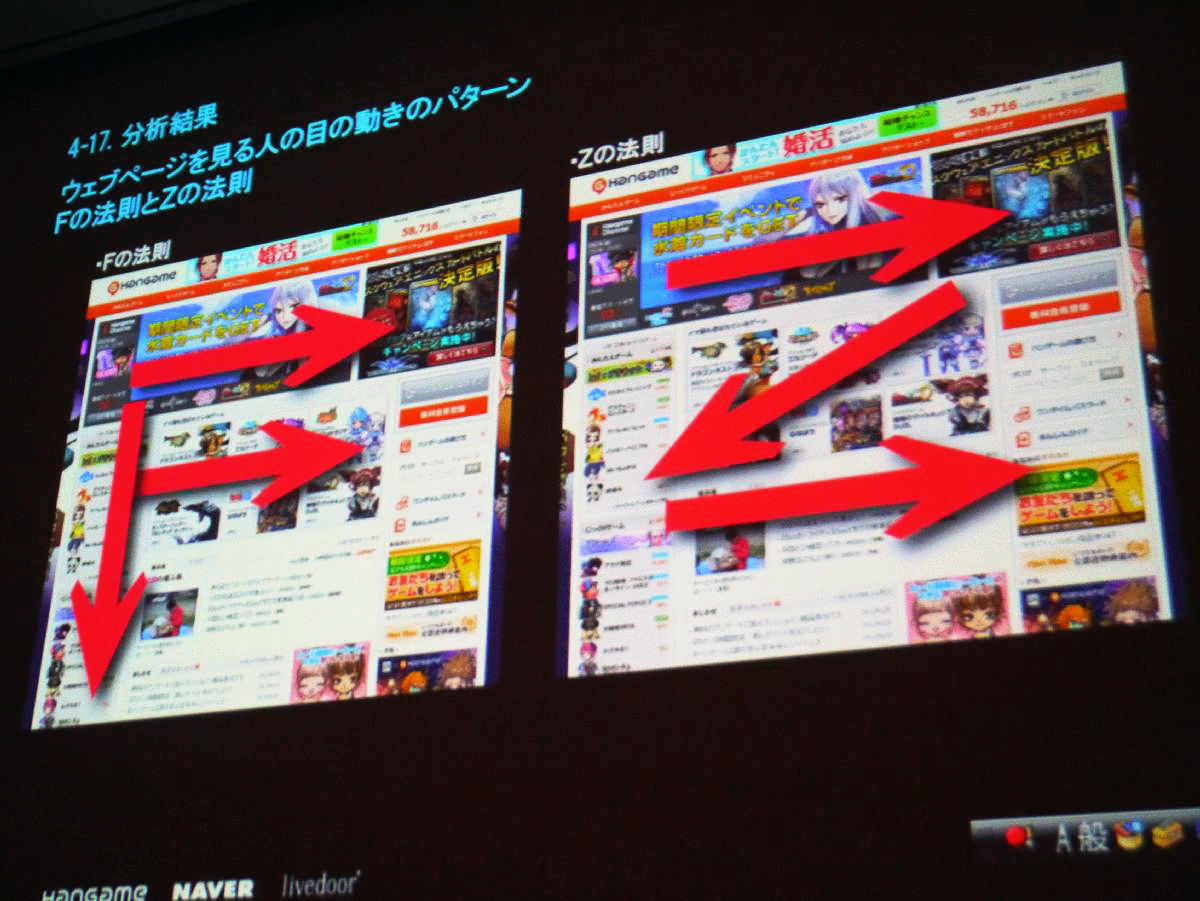
Here are some examples of basic items. It is a case of UX research of PC game. Although it is an image of the screen, please think that it is the screen of the game which digests certain physical strength and advances the game. When designing the screen in the first place, it was designed so that your eyes will flow from right to left. As I am researching, the position of the parameter is closer to the right side, so the opinion that "the line of sight is flowing and feeling bad" came out.

First of all, we analyzed what kind of opinion comes out. Although this is a famous story on the Web, it seems that F's law and Z's law are related. It is a law that flows like writing F and Z of the alphabet are easy to use as a human eye.
So, from the right to the left of the game you saw earlier, it is an analysis that neither applies.
Next is the case of UX research on smartphone game as the second example of basic items. This is the result of an application with a clock and gaming functions, but the location of the default watch in the original device is largely affecting ease of use.
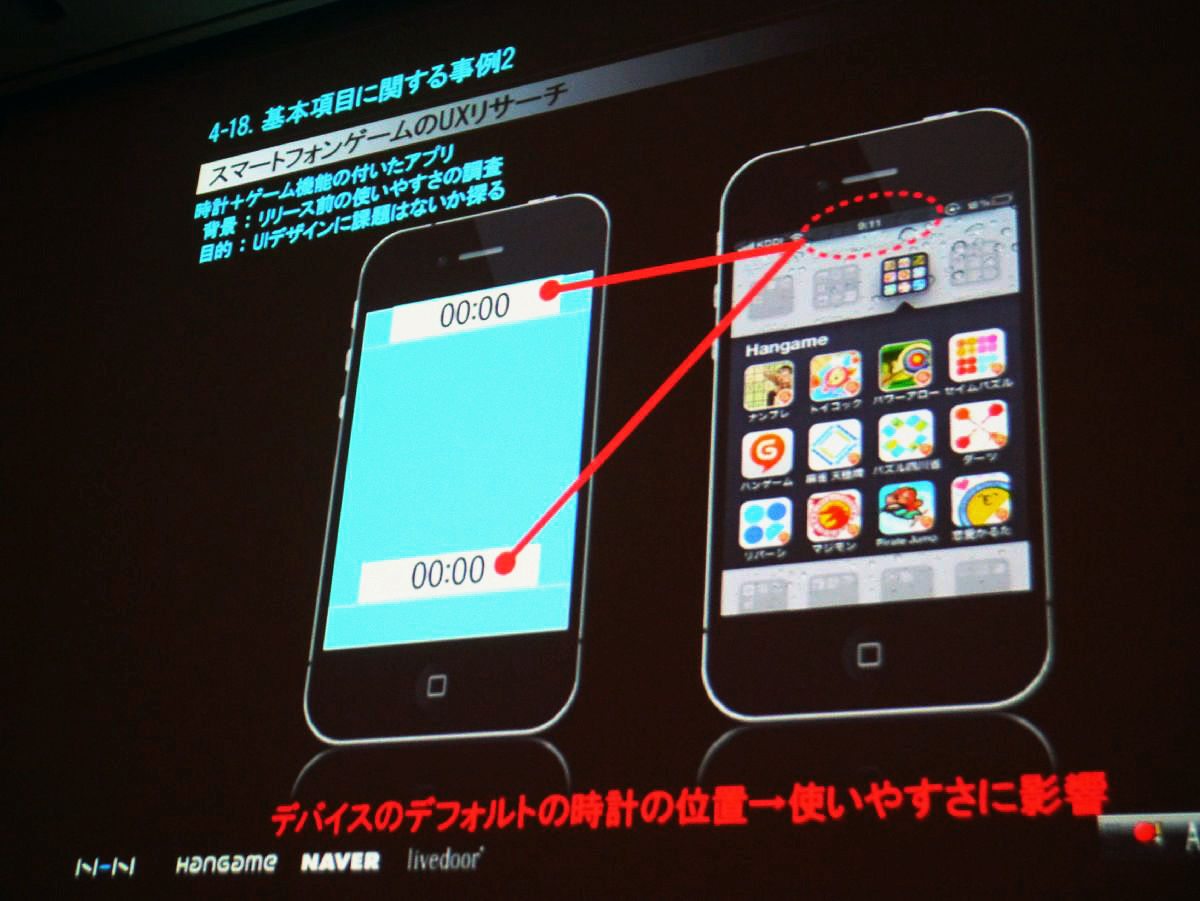
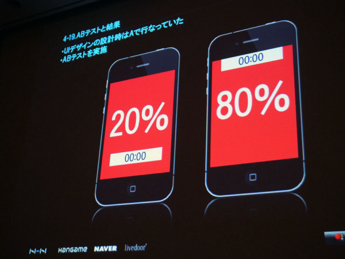
The first design of the UI design was designed with the clock on the left on the bottom, but we carried out the AB test inside the company from the story saying that the upper one is easier to use while conducting survey design. Result The result that 20% and 80% ratio is easier to use comes out. I think that it is a result that feeling discomfort and stress when feeling down when I launch the application usually watching the top always.
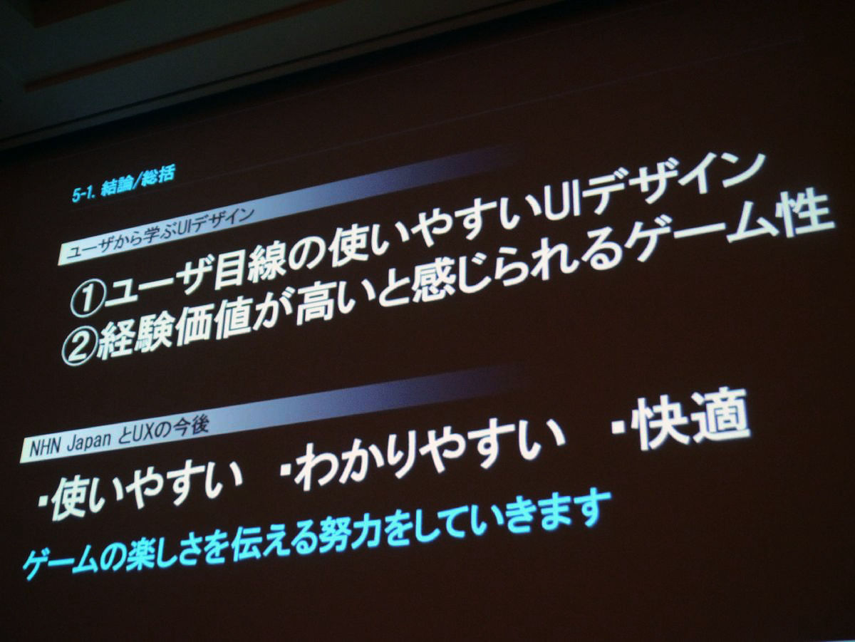
It is a conclusion and summary. As a UI design to be learned from users, I think that it is possible to make user-friendly UI design easy for the user's eyes. So, by analyzing what the user is asking for, what kind of UI can be used more easily? I also think that it is important that game experience feels high in experience value.
In the future of our company and UX, we will make efforts to communicate the enjoyment of the game from ease of use, comprehensibility, comfort.
Related Posts: