12 incorrect usage which tend to do in Photoshop

PhotoshopAlthough it is convenient software, there are things such as mistakes, misuse, and abuse that are often too useful because they are too useful. It is not a target of ridicule because you are doing these things, but because it tends to commit such mistakes Photoshop beginners · beginners are a list of points to watch out for.
None of these may be only obvious from the person who masters Photoshop, but it is also true that everyone was the first time "the first time", so I made these mistakes If you see a user who is doing it, it might be a good idea to encourage your progress while paying attention so as not to hurt your opponent's heart.
The 12 incorrect usage which tend to do in Photoshop are from the following.
12 Common Photoshop Mistakes, Misuses and Abuses | The Design Cubicle
· 1: Inappropriate selection method

Photoshop users who are lacking in experience with many newcomers tend to use the "automatic selection tool" and "lasso tool" to select the background or object in the image. In fact, "Pen tool" is superior in terms of accuracy. Pen tool is a pretty tricky tool for new users, but once you master it, perfectly enough to think about using other tools.
· 2: Add effects to the body's font

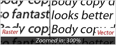
Photoshop has various effects (such as layer effects and filters) to process text, but do not apply them to large amounts of text, especially the text of sentences. They should originally use InDesign · Quark · Illustrator etc. That's because the text that looks clear on Photoshop is not clear as it is actually printed. In that case, let's use vector-based software, not raster-based software like Photoshop.
· 3: use a 7-color gradation

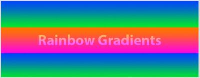
You should refrain from abusing the rainbow gradation. For exampleclick hereThen you can understand the destructive power of the dazzling gradation of seven colors, the bad reason, all of it. Instead of making incoherent color gradations, try to use a gradation from the light color to the dark color with the same color.
· 4: I think that "K = 100" is "black"

When thinking with CMYK instead of RGB, many novice designers tend to think that if it is set to "K = 100" it will become pure black. But this is not black, it just gets dark gray. In order to make so-called pure black, rich black, you can set "C = 90 M = 60 Y = 30 K = 100".
• 5: Overuse of filters

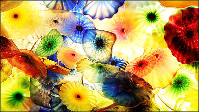
People who experienced Photoshop for the first time are obsessed with filters and tend to use them as they try. Using a filter is fun and easy, but I can not show you to a professional yet experienced person. In other words, using too much filter means you will show you like an amateur.
· 6: Create a logo in Photoshop

Although there are pros and cons, you should still use vector-based software like Illustrator. If it is a vector base, you can create a logo with a clearly distinct outline at any time, no matter how large or small.
· Printing at a resolution of 7: 300 dpi or less

Many new users fall into a 72 dpi trap. This is not a problem in handling images only on the web, but it is not suitable for printing. Approximately 300 dpi will suffice, but again you should maintain the minimum resolution required for printing with your printer. Also, it is impossible to forcibly make an image already created at 72 dpi with a resolution of 300 dpi because it is pixel based (it will be impossible to enlarge even if the resolution is matched).
· 8: Do not learn shortcut keys

Learning shortcut keys is essential. In addition to increasing the workflow by saving time to work, many tools require various shortcut keys to use more functions. By selecting "keyboard shortcut" from "Edit", you can define more easy-to-understand keys yourself.
· 9: Do not use layers and groups

New users in Photoshop ignore layers, but I often see them regretting that later. If you use a layer, editing will be easier, moving, copying and deleting will become a vaccine. Layers and their grouping can be very useful, especially if you are creating huge PSD files or if you are a web designer. Layers save time spent on projects and reduce headaches.
· 10: Failure of black and white conversion

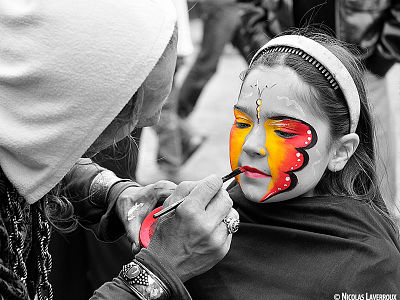
This is a common mistake in experienced designers and it is a mistake to choose "image" → "color correction" → "lower saturation" in order to convert to black and white. Black and white in this procedure will result in a "black and white image without life". Correctly use "image" → "color correction" → "channel mixer". By checking "monochrome" of the channel mixer and sliding each channel, quite lively black and white conversion is possible.
· 11: heavy use of bevel, embossed, drop shadow

There are many uses of bevel, embossed, drop shadow as one that is very similar to rainbow gradation and filter overuse. There are clear reasons to use those effects, no problem if used sparingly.
· 12: Do not use guide and grid well

Although it may be unbelievable, many designers do not use Photoshop guides and grids, they are putting in "eye observation". However, it is better to use guides and grids.
Related Posts:
in Note, Posted by darkhorse


