Firefox 2 interface may be changed
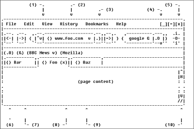
It will be an interface like the above.
Details are as follows.Google Groups: mozilla.dev.apps.firefox
First move the reload button from the current independent button to the beginning of the address bar. In the Japanese version, the menu which is "moved" is renamed to "history". RSS and "move" buttons are also housed in the address bar. It also makes it easier to switch to other search engines so that the search bar can be remodeled to make it more appealing.
Indicator showing page loading is progress meter style and easy to understand. Then put the button to search the bookmark into the personal bookmark toolbar. Likewise put the home button in the personal bookmark toolbar.
The close button of each tab is displayed only on the tab which is basically active. This seems to make it easier to see the page title for background tabs. Also, the tab is fixed width. And the status bar should be hidden by default.
...... What are the merits?
Related Posts:
