An expert explains how to create stylish buttons using CSS's '@property'

Firefox version 128, released on July 9, 2024, supports the CSS '@property' syntax, making it possible to use the '@property' syntax in all major browsers. Web engineer Ryan Mulligan posted a blog post about an example of a design that can be achieved using '@property.'
CSS @property and the New Style
The demo Mulligan showed was a button animation like the one below.

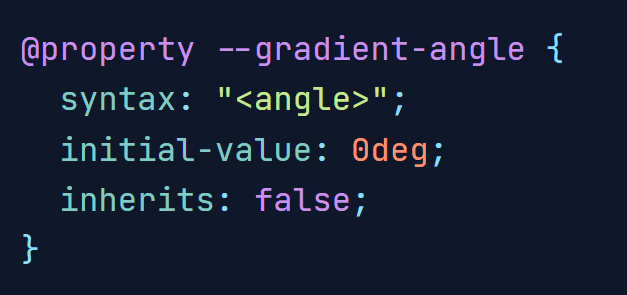
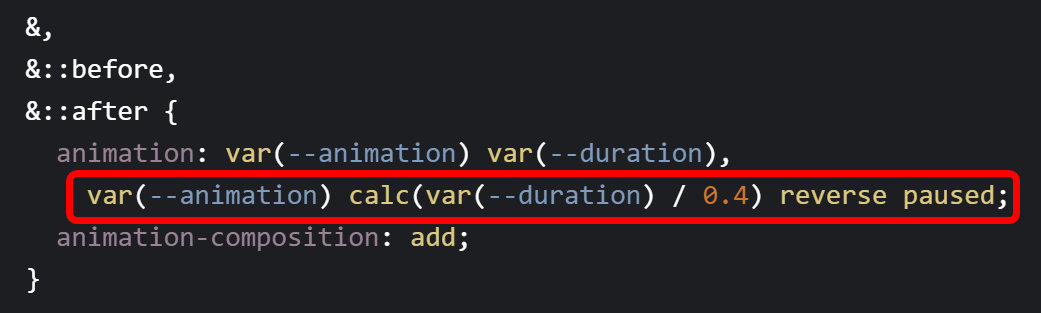
First, Mulligan explains how to create a looping light around the button by declaring a custom property called '--gradient-angle' and stating that the custom property can have a value of 'angle', that its initial value is '0deg', and that it cannot be inherited.
I was able to create a rotating animation by instructing
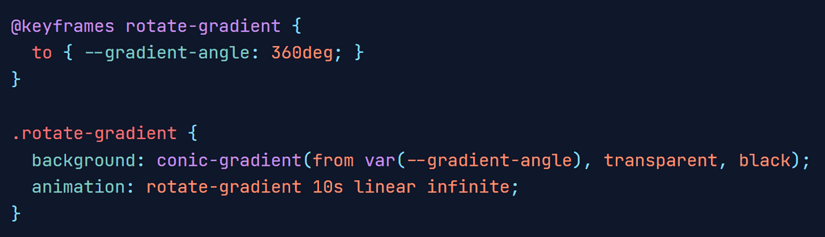
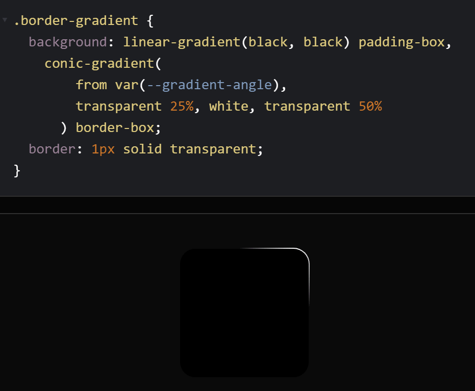
As shown below, a white light effect is prepared with
Mulligan also uses additional custom properties to make the button glow only when you place the cursor over it, and to make the button glow inside. It's also important to set 'animation-play-state: running' here.
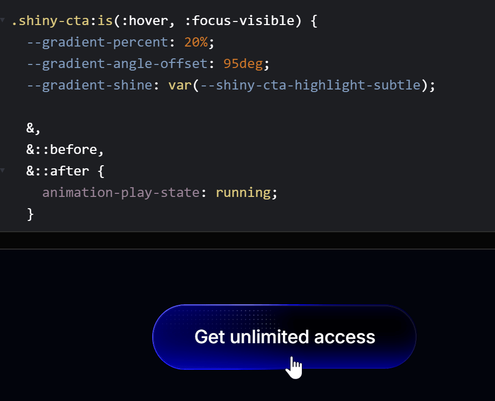
When setting a rotating animation, by setting a reverse slow animation in the 'stopped' state, the animation will slow down when you move the cursor over it with the effect of 'animation-play-state: running'. Using this technique, you can make the animation slow down or return to its original speed while maintaining the playback position when you move the cursor over or remove it.
A demo of the button and the full CSS code are available on CodePen , so be sure to check it out if you’re interested.
Related Posts:

in Software, Web Application, Posted by log1d_ts