What is the difference between a good graph and a bad graph?
There are various types of graphs used to visually represent data, such as bar graphs, pie charts, and histograms. Chenxing Li, a postdoctoral researcher at the University of Georgia's Center for Applied Genetic Technology, explained which data should be shown in which graphs.
GitHub - cxli233/FriendsDontLetFriends: Friends don't let friends make certain types of data visualization - What are they and why are they bad.
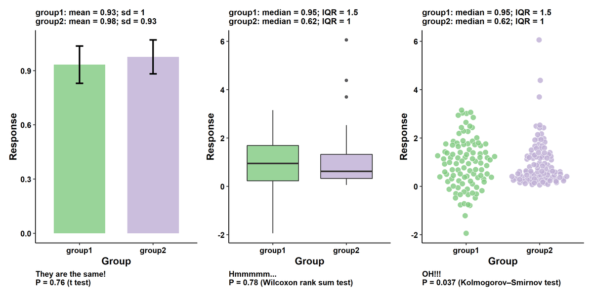
◆1: Bar graph
If you use a bar graph (left) to show the mean, variance, and distribution of data, you will not be able to understand the distribution of the data. To avoid this, it is recommended to use boxplots and scatterplots.
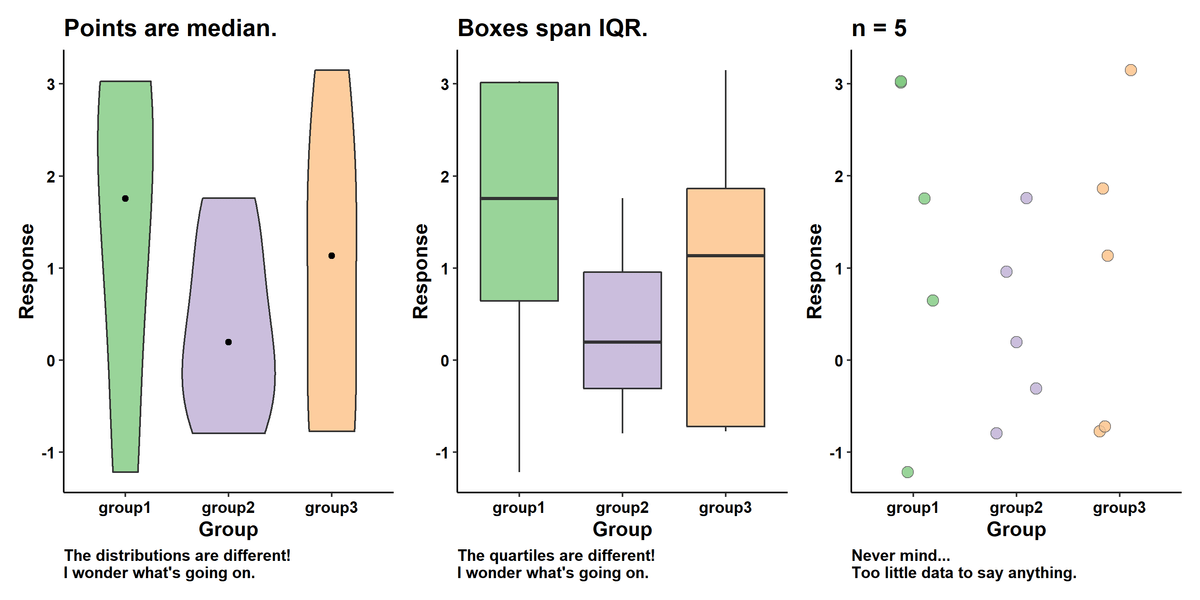
◆2: Violin plot when sample size is small
Lee points out that a violin plot, which shows the distribution of data as a curve, becomes meaningless when the sample size is small. Distributions and quartiles can vary widely when sample sizes are small, even if the underlying values are similar. Distributions and quartiles are meaningful only when the sample size is large.
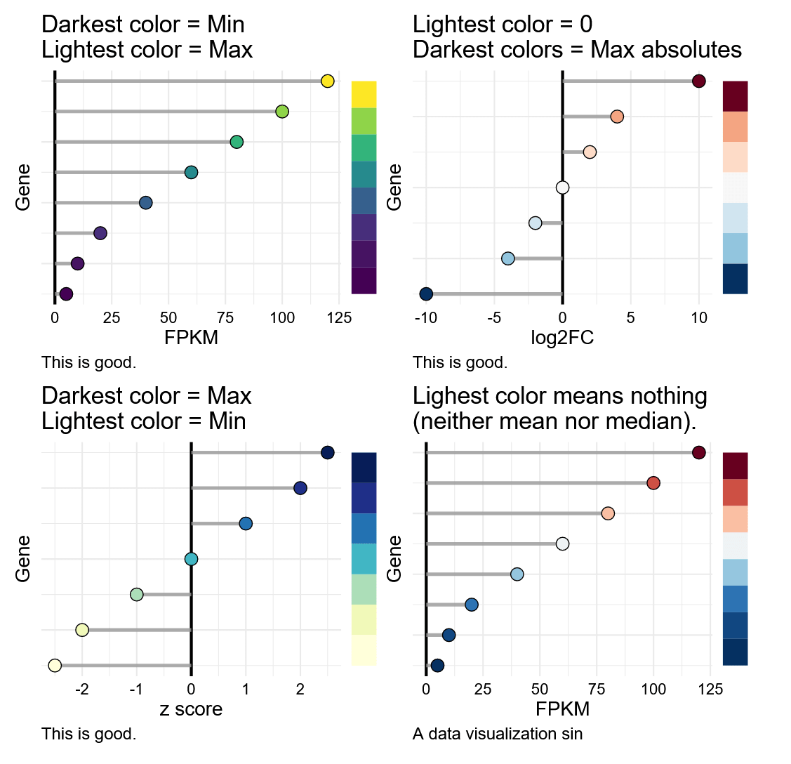
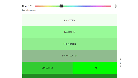
◆3: Color scale
A graph where colors are arranged in a line from dark to light, with one side representing the maximum value and the other representing the minimum value (upper left and lower left), or 0 or the average value is shown as a light color, and the color becomes darker as the numbers expand. The graph (upper right) is a good graph. The graph on the bottom right is considered a bad graph because the spread of numbers and the transition of colors do not match.
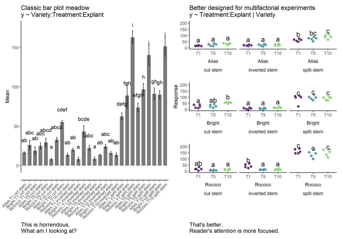
◆4: Large number of bar graphs
Especially in multifactorial experiments, the graph on the right is visually clearer than the graph on the left.
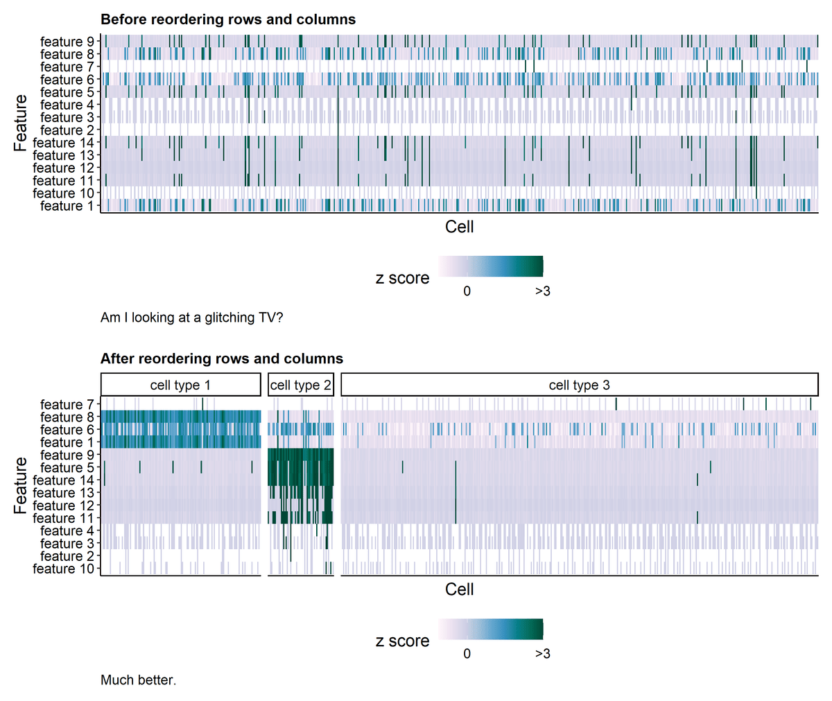
◆5. Heat map
When creating a heat map, Mr. Lee says, you should sort the rows or columns and summarize the data like the graph below.
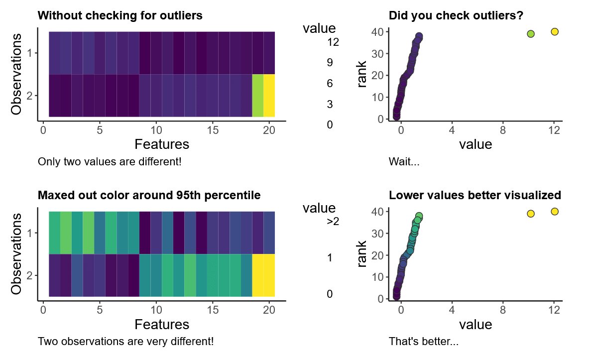
◆6: Heat map with outliers checked
If you don't check for outliers in your heatmap, the two pieces of data may look similar overall. But if you max out the color scale at the 95th percentile, you can distinguish between the two.
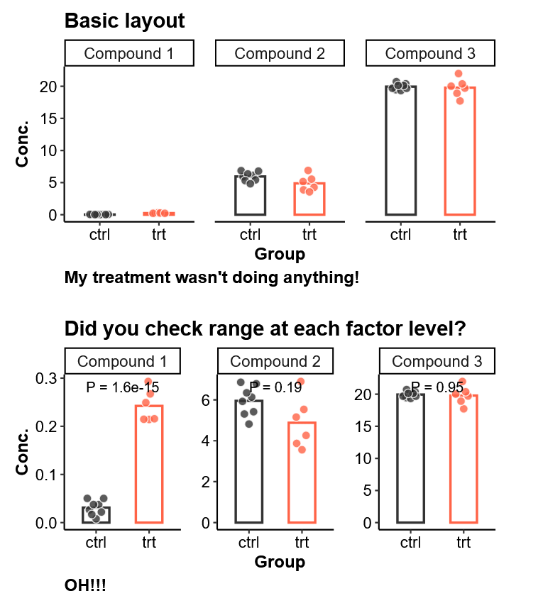
◆7: Check data range
A graph assuming an experiment in which three compounds were measured in a control group (ctrl) and a treated group (trt). In this experiment, it was observed that Compound 1 had a strong effect on the treatment group, but the extent of the effect cannot be understood unless you visualize the graph by considering the range as shown below.
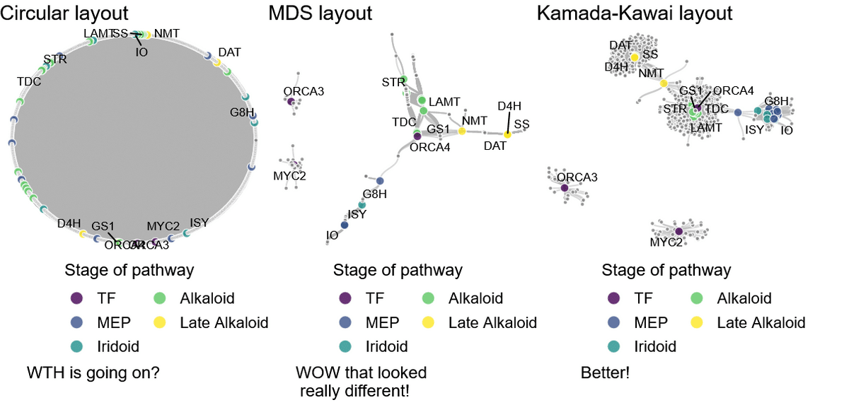
◆8 network graph
The appearance of network graphs, which are visualized by connecting scattered nodes, changes greatly depending on the layout.
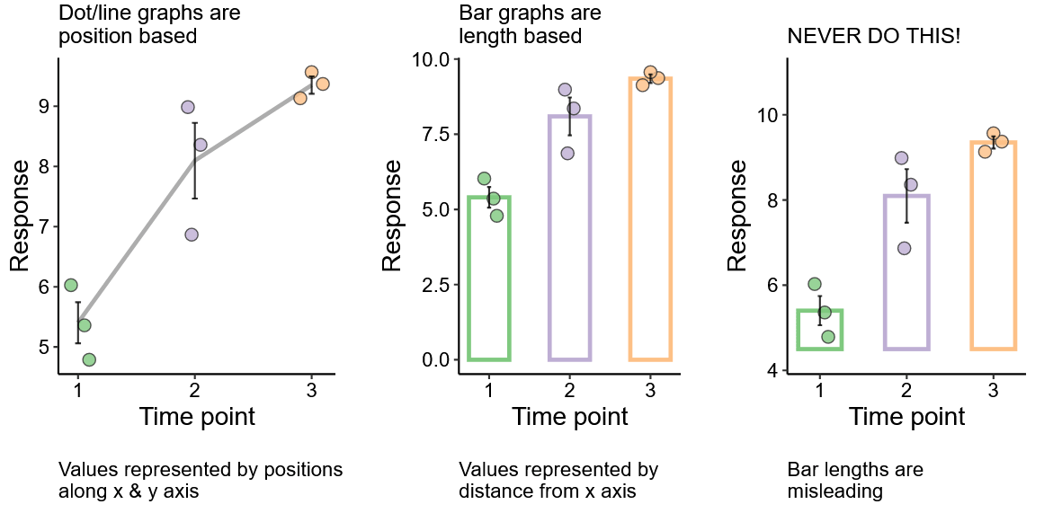
◆9: Confusion between position-based and length-based graphs
It is important to avoid confusion when presenting both point graphs with values based on position and bar graphs with values based on length. For example, the graph on the right below is not based on '0', and the length of the bar at Time point '2' appears to be about 3 times the length of the bar at '1', but it is actually about 1.6 times the length of the bar at Time point '1'. is.
◆10: Pie chart
It is commonly used when visualizing fractional data, and the sum of the fractions usually equals 100%. Pie charts are great for showing the size of data, but it's difficult to compare data. In that case, you can use a bar graph instead.
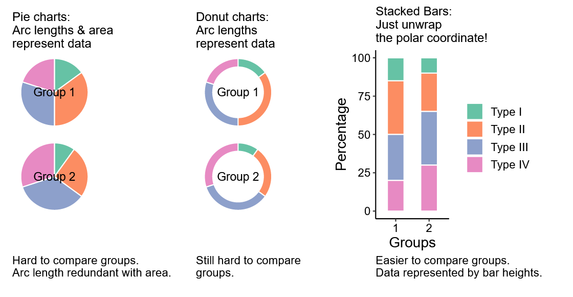
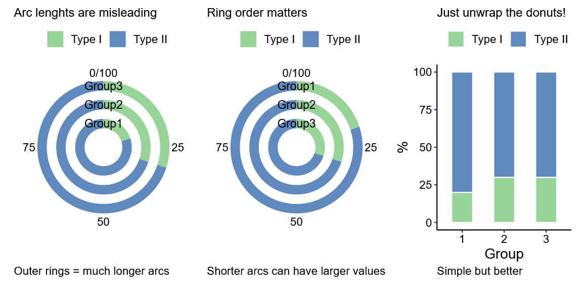
◆11: Concentric donut graph
If you show data using a concentric donut chart, the inner data will appear smaller and the outer data will appear larger. It is clear at a glance when shown in a bar graph that there is not as much of a difference in the data as you would see in a pie chart.
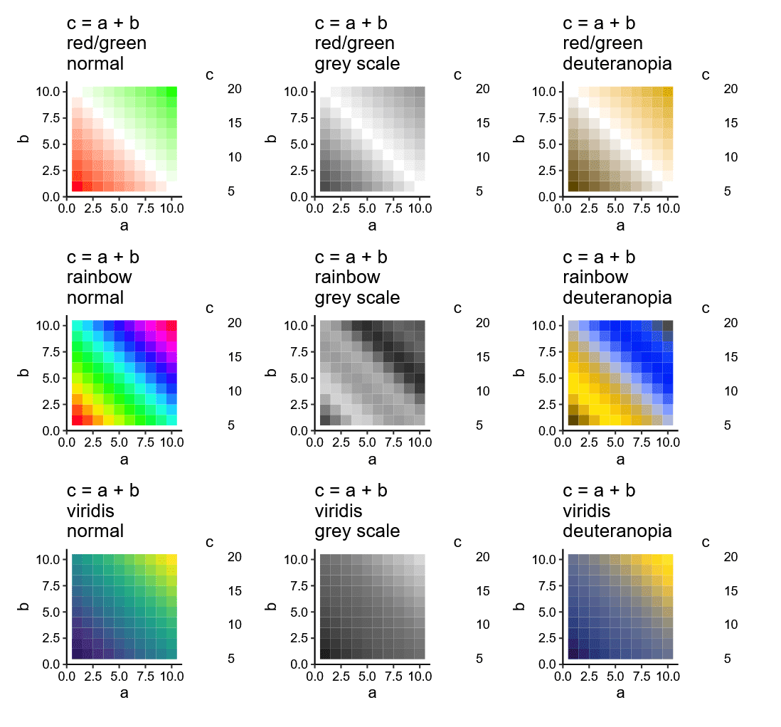
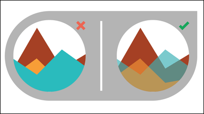
◆12: Red, green, rainbow scale
It is estimated that 1 in 16 men and 1 in 256 women develop red-green color blindness. Therefore, it is best to avoid using colors that are difficult for people with color blindness to see. Furthermore, you need to be careful when printing a rainbow-colored scale, as it will be completely incomprehensible if printed in black and white.
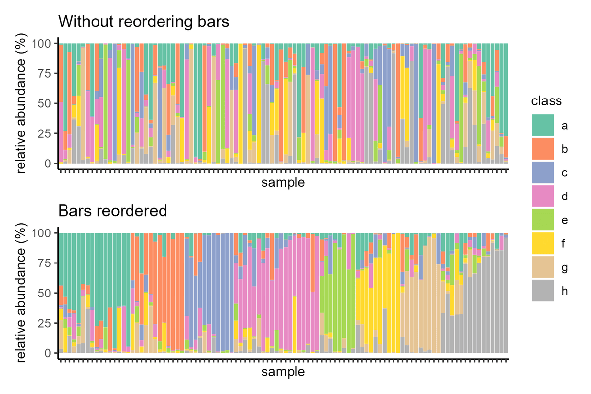
◆13: Sorting stacked bar graphs
Stacked bar charts are useful for visualizing ratio data, but when you have a large amount of sample data, it's important to sort it in an orderly manner to visually show what's more or less abundant.
Related Posts:


in Design, Posted by log1p_kr