What is the reason for the argument that pie charts should be avoided for data display?

Pie charts are often used to show percentages of a whole. However, Professor Adrian Barnett, a statistician at the Queensland University of Technology, and researcher Victor Ogwoma argue that ``pie charts should not be used to display data'' and explain why.
Here's why you should (almost) never use a pie chart for your data
A pie chart is a graph that divides a circle into segments and shows percentages using the central angles. A perfect circle (360 degrees) is 100%, 180 degrees is 50%, and 36 degrees is 10%. In compulsory education in Japan, students learn how to read pie graphs in the fifth grade of elementary school, so most people should be able to read pie graphs.
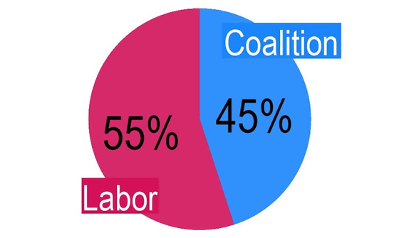
For example, below is a pie chart showing the support rate of Australia's major political parties, the Labor Party, and the Conservative Coalition of the Liberal Party and the National Party. Looking at the pie chart, you can see at a glance that it is a close race, although Labor's approval rating is slightly higher.
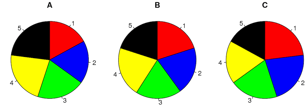
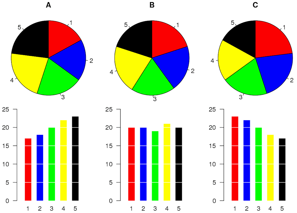
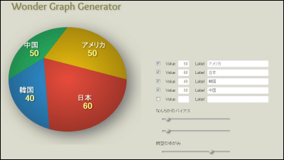
However, when there are three or more categories, it becomes difficult to understand the size of the percentages in the pie chart at a glance. For example, the three pie charts below display five categories, but the size of each category cannot be determined just by looking at them. If the numbers and angles in a pie chart do not correspond, there is a risk that the viewer will believe the wrong data.
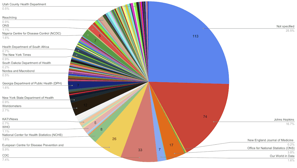
Pie charts also don't work well when displaying a large number of categories because you can't tell which pie represents what category. Also, if the sectors are divided into many colors, it will be difficult for people with color blindness to distinguish between them.
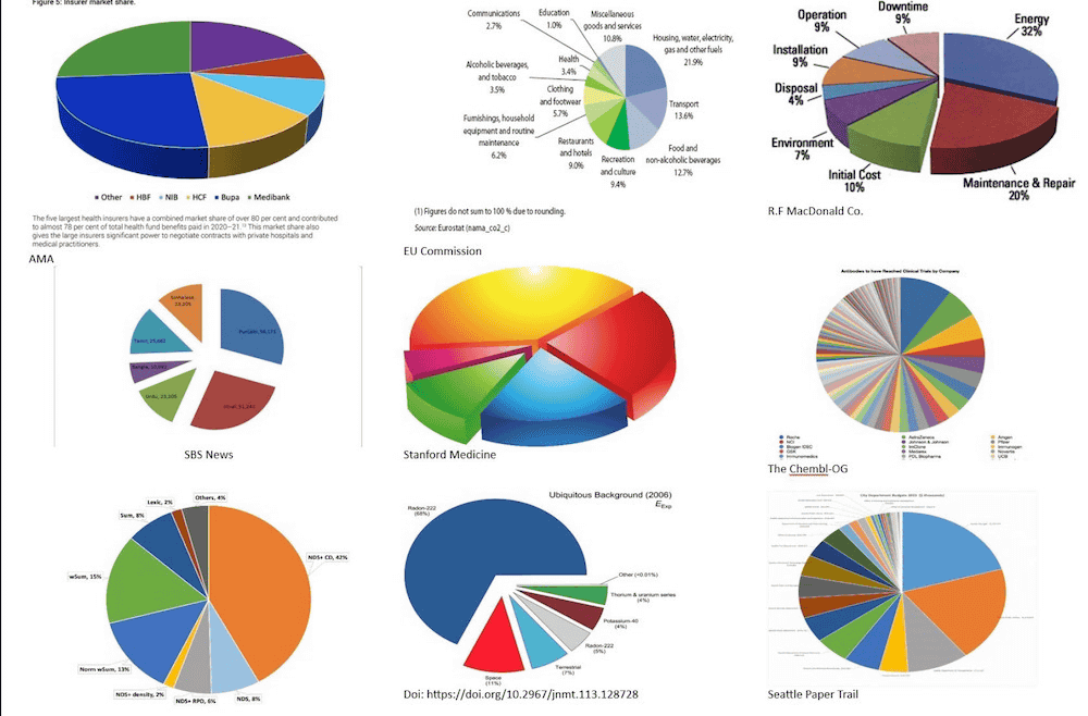
There are ways to display a pie chart three-dimensionally or to look down at it from an angle, but since the angle looks different due to being slanted, it cannot be said that the data is being displayed correctly.
Professor Burnett et al. ``Statisticians have criticized pie charts for decades, but if pie charts are so bad, why are they used so often?'' 'It's difficult.'
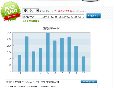
Professor Barnett and his colleagues suggest using bar graphs instead of pie charts. A bar graph is much easier to understand than a pie chart because you can compare the slight size of categories by the length of the bars.
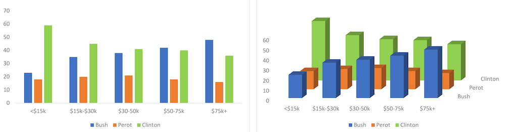
However, Professor Barnett and colleagues say that it is better not to display bar graphs in 3D. Below is a bar graph dividing the number of voters in the 1992 US presidential election by household income. The 2D version on the left is very easy to read, but in the 3D version on the right, the length of the bar graph and the scale of the vertical axis do not match, making it difficult to decipher the numbers.
'Every time we look at a pie chart, we think of two possibilities: The person who created the chart didn't know what they were doing, or It's possible they know what they're doing and are intentionally trying to mislead.'
Related Posts:


in Science, Posted by log1i_yk