Beware of dual axis charts

Dual-axis graphs, which have two y-axes, are useful because they allow you to see different data at a glance. However, this graph has many problems, and Datawrapper, a data visualization tool, explains why dual-axis graphs are misleading to readers and what kind of graphs should be used instead.
Why not to use two axes, and what to use instead
What is a dual axis graph?
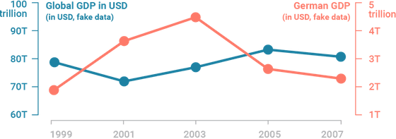
Dual axis graphs are often used to handle two data sets with different sizes. For example, the following dual axis graph shows the trends in world GDP (left y-axis) and Germany's GDP (right y-axis). Note that the numbers are dummy data.
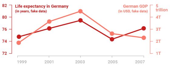
It is also sometimes used to plot different types of data, such as life expectancy and GDP for Germany.
◆Dual axis graph problem
As you can see, dual axis graphs are sometimes used to show data of different types or sizes, but they have a big problem: because the scale can be determined arbitrarily, it is possible to intentionally mislead the reader.
For example, below is a graph released by the World Bank showing world GDP (left y-axis) and German GDP (right y-axis) from 2004 to 2016. At first glance, the graph looks fine.
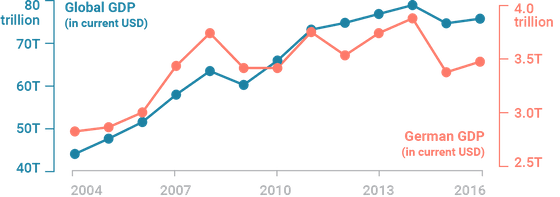
But there's a catch to the above graph: the proportions are different. This becomes more obvious when you extend both y-axes all the way down.
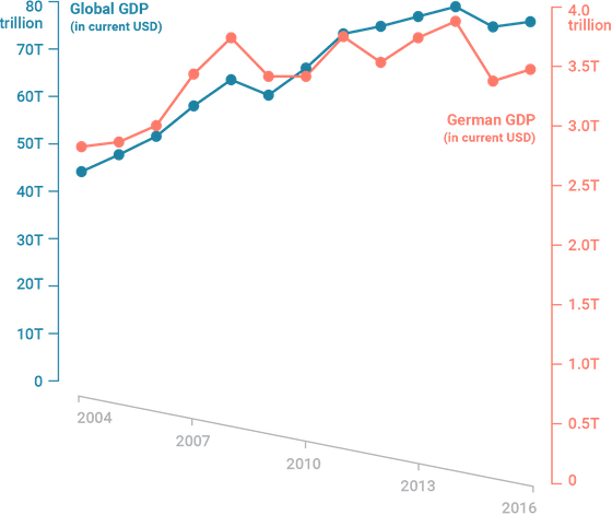
In this dual axis graph, it appears that the world GDP and the German GDP were growing at the same pace until around 2014. However, during this period, the world GDP grew by about 80%, while the German GDP growth was only about 40%, giving the impression that this is far from the truth.
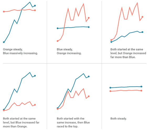
The problem with dual-axis graphs is that you can create a variety of graphs by changing the ratio of the two y-axes.
So, does this mean that it is okay to align the baselines? Not necessarily. In this case, at first glance, it may seem that 'Germany's GDP was higher than the world's GDP until 2011, but in 2011 it was on par,' but of course this is incorrect.
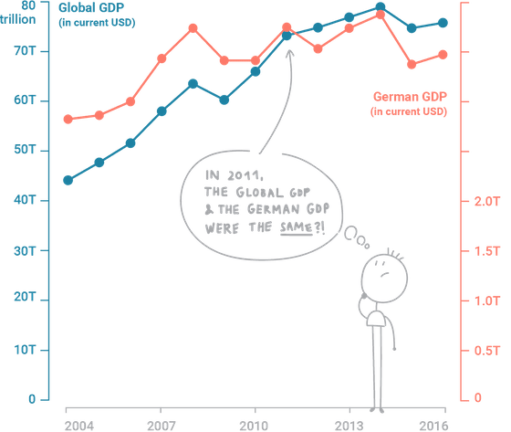
'Humans have a tendency to associate similar things with each other, and data is no exception, so people compare lines and points, forgetting that the scales are different,' Datawrapper said.
This is borne out by experiments. In a 2011
Alternatives
To avoid these problems and make the graphs easier to understand, Datawrapper offers the following alternative:
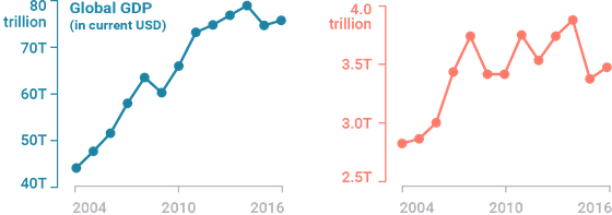
The first is side-by-side charts. This is a simple way of saying 'If the problem is that two lines are confused, then let's separate the graphs.' The advantage is that you can set two y-axes for the two graphs, so you don't have to worry about differences in values. On the other hand, the disadvantage is that they take up space.
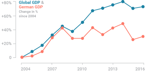
The second type is indexed charts. These are graphs that show relative changes without absolute numbers. If absolute numbers are necessary, you can use labels to show them. However, this is only effective if the numbers increase or decrease at a similar rate. For example, it is important to note that it does not make sense if one number increases by 5% while the other increases by 10,000%.
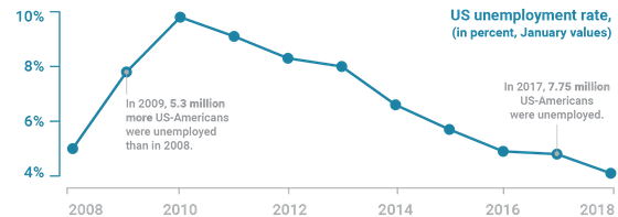
The third is to selectively graph the data you want to include, and use labels to indicate the less important data. This is primarily useful as an alternative to dual-axis graphs that show absolute numbers and percentages of the same data. For example, the following graphs the unemployment rate in the United States over time, and labels the absolute numbers at important points.
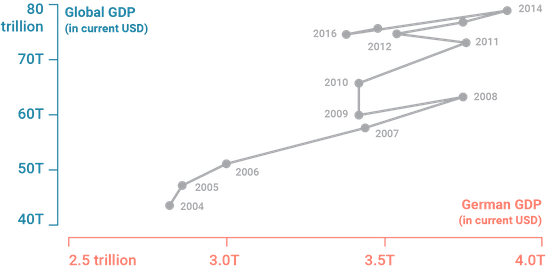
The fourth is the linked scatter plot, which plots one data type on the x-axis instead of time. It's not the most intuitive graph, but it can make your data more striking depending on the topic you're talking about.
Of the four alternatives, the first two will usually produce accurate and easy-to-understand graphs, so Datawrapper said, 'If you're dealing with two different data, we strongly recommend creating two graphs or using an index chart.'
Related Posts:
in Design, Posted by log1l_ks


