How to use color scales to understand in order to visualize data in an easy-to-understand manner
The type of graph is important to show the meaning of the data in an easy-to-understand manner, but the color coding is also an important factor. Color coding can indicate that the data is of the same type or is not relevant, but data visualization expert
Which color scale to use when visualizing data --Datawrapper Blog
https://blog.datawrapper.de/which-color-scale-to-use-in-data-vis/
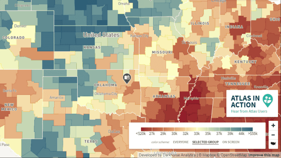
Color-coding the graph is an important point for visualizing the data in an easy-to-understand manner. For example, when color-coding the unemployment rate for each state in the United States, if you want to show the difference in the numbers of each state on the map, it will be in the form of 'displaying with similar colors and different color densities'.
On the other hand, when displaying the transition of unemployment rates in New York and Texas as a line graph, it is easier to understand if the two graphs are not similar colors but completely different colors.

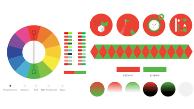
◆ Color scale by hue
As mentioned above, the color of the graph helps people understand the information. At this time, the hue is especially important. Hue is something that even a 5-year-old child can understand the 'difference', so use it when multiple data are out of order.
And when using hues, it's important to first 'give each hue a different lightness so that it works in grayscale.' Different brightness makes the difference more noticeable and easier for people with color blindness to understand. In addition, there is no need to be particular about the originality of the color palette, and you can use the existing color palette creation service.
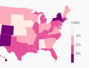
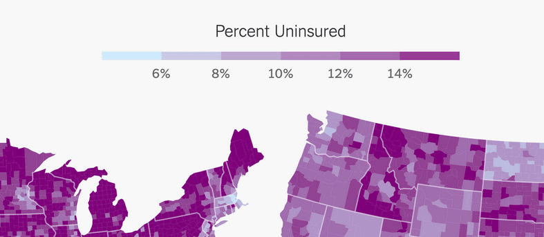
◆ Continuous color scale
On the other hand, if there is an order or magnitude in each element of the information to be visualized, a 'continuous color scale' that shifts from light to dark is recommended. Basically, a continuous color scale uses one hue such as 'light blue to blue', but using two hues such as 'light blue to purple' emphasizes the contrast and makes it easier for the reader to distinguish between the two. There is a merit that it becomes. Also note that which data corresponds to which color of the gradient changes the reader's perception of that value.
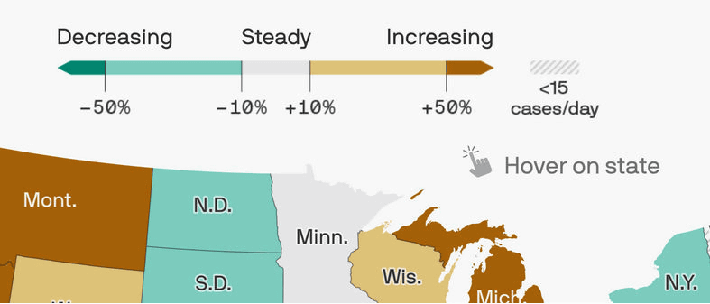
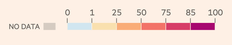
◆ Double-ended color scale
Apart from the continuous color scale, there is also a 'double end color scale' that creates a gradation in two directions.
It has a bright median in the middle, with different hues becoming darker or lighter towards both ends. It is suitable for showing the survey data of the
◆ Highlight & de-emphasis
There are also color coding such as emphasizing the particularly important parts of the color scale, and conversely unemphasizing the relatively less important parts such as 'other' and 'no data'.

Below is a color chart that emphasizes China.

Also, this is a color coding that distinguishes the 'no data' category from other hues by graying it.
As mentioned above, color coding of graphs is important, but on the other hand, 'which color scale is used for which graph' is not clear, and it often depends on the case and situation.
Related Posts:


in Design, Posted by darkhorse_log