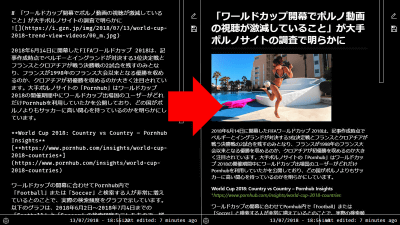
'Unclutter' that makes it easier to read by excluding messy display from articles
Not only does it eliminate unnecessary displays such as induction to join paid members, but it also makes it easier to read articles by switching to dark mode and adding highlights ' Unclutter ' of extension for Google Chrome and Mozilla Firefox I used it to check how much the article became easier to read.
Unclutter — Reader Mode for Chrome & Firefox
GitHub - lindylearn/unclutter: A modern reader mode and article library for your browser.
https://github.com/lindylearn/unclutter
Unclutter — Next-gen Reader Mode Chrome Web Store - Extension
https://chrome.google.com/webstore/detail/ibckhpijbdmdobhhhodkceffdngnglpk
Unclutter — Modern Reader Mode – Get this Extension for Firefox (en-GB)
https://addons.mozilla.org/en-GB/firefox/addon/lindylearn/
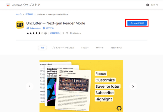
In order to use it in Chrome this time, access the above distribution page and click 'Add to Chrome'.
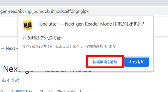
Click 'Add extension' to complete the installation.
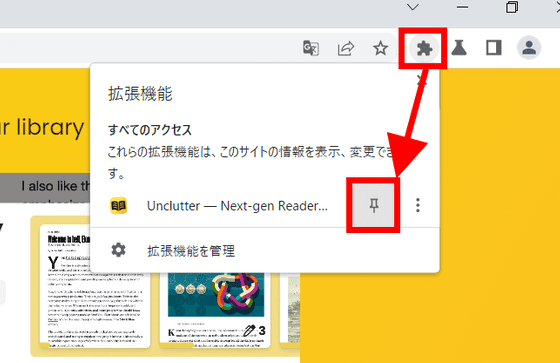
If you don't see the icon in the toolbar, click the 'Extensions' button and then click the pin mark to the right of 'Unclutter'.
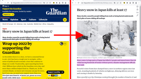
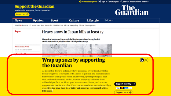
On Unclutter's official website, The Guardian was listed as an example of a site that makes it easier to see, so I will pick one article from The Guardian and read it. First, the following is an article before using Unclutter. It's not unreadable, but it's hard to read because the bottom half of the screen is filled with prompts to subscribe.
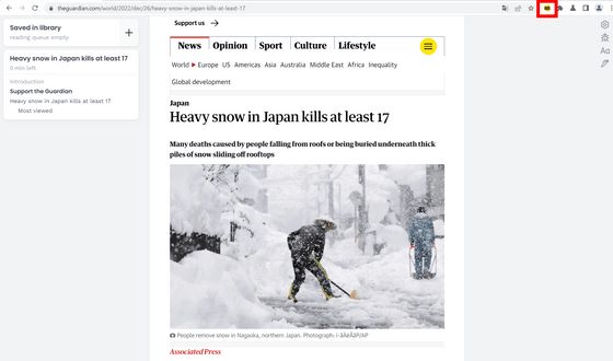
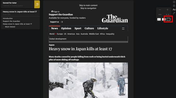
And the following is the screen when Unclutter is enabled. The display prompting subscriptions and thumbnails of related articles have disappeared, making the display very clean.
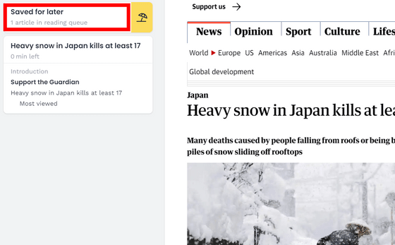
You can save the article by clicking the button in the red frame.
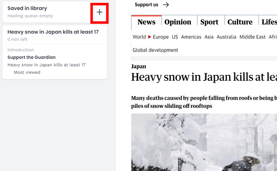
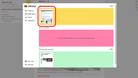
The saved article can be displayed from the red frame button.
I tried to display the saved article below.
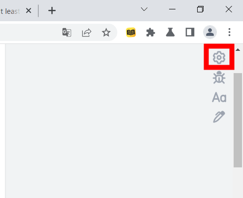
Among the buttons lined up in the upper right, the top button is for opening the settings.
The setting items are as follows. At the top is a toggle switch for whether or not to automatically activate Unclutter when reopening an article that has been opened once, and an input field for specifying the site to automatically activate Unclutter.
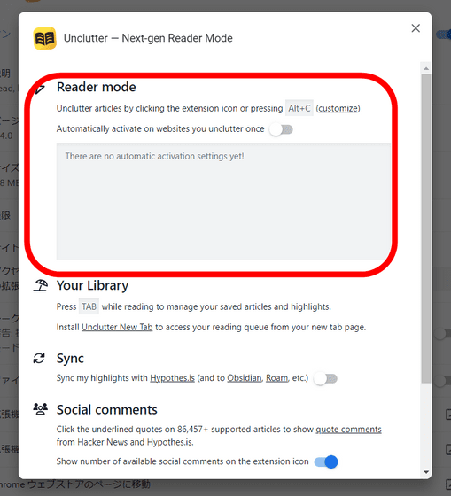
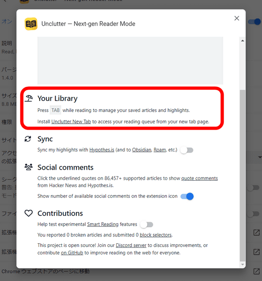
The second explanation is that if you press the 'Tab' key while browsing an article, you can display the article saved by the above article saving function.
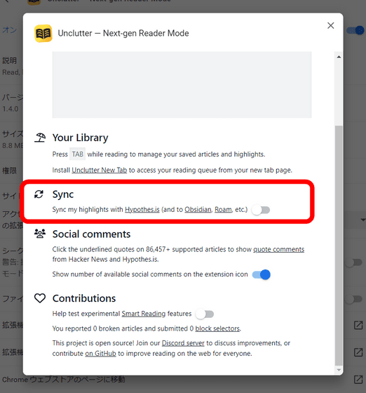
The third is a toggle switch for sharing the highlight function described later with the comment sharing service
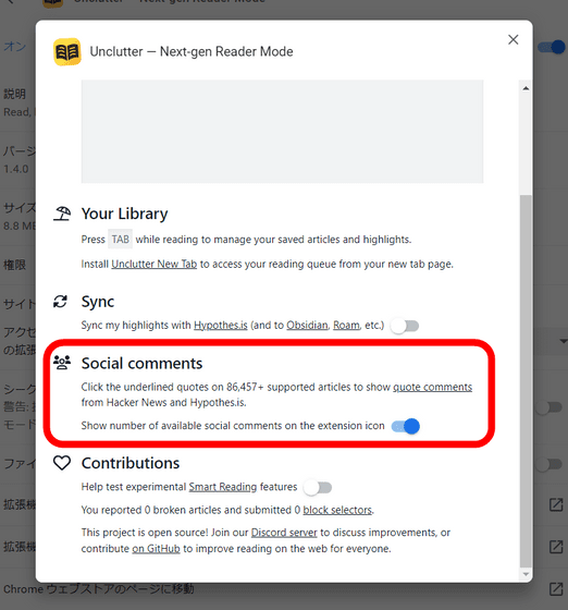
The fourth is an explanation of the
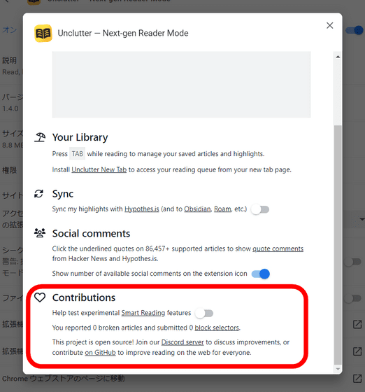
The last is a toggle switch for whether or not to cooperate with the test of the function experimentally.
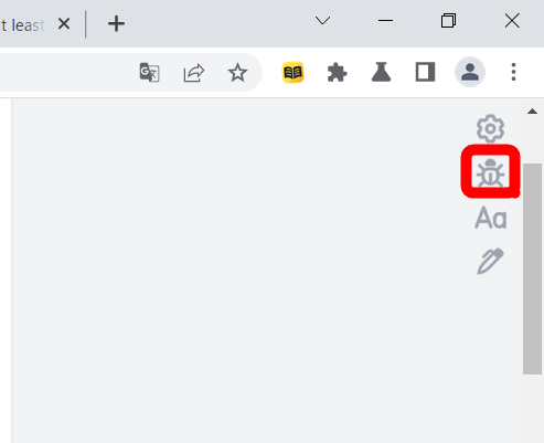
Returning to the article, the second from the top of the buttons in the upper right is the button for reporting bugs.
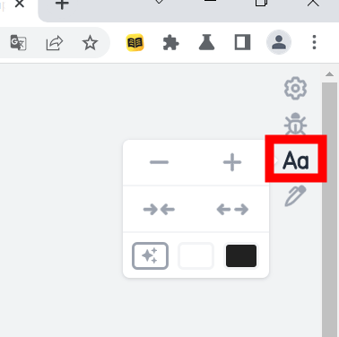
The 'Aa' button is for adjusting the display of articles. The balloon button is a button that changes the size of the text, the display space of the article, and the color of the background from the top. You can also switch to dark mode from here.
Try dark mode and it looks like this.
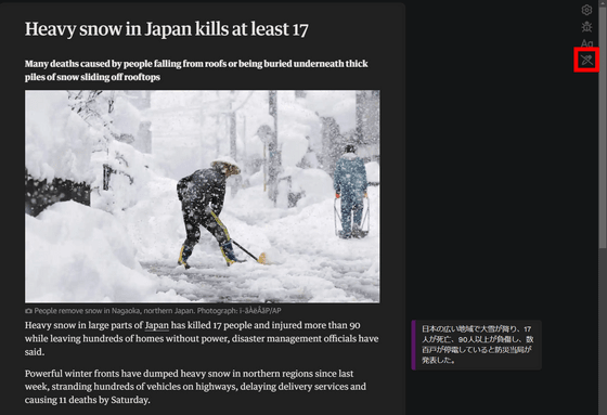
When you select an article, you can add a comment by highlighting that part.
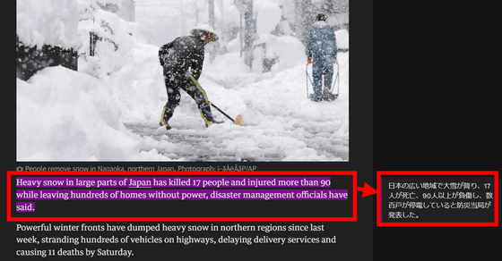
You can switch the highlight display / non-display from the red frame button.
Related Posts:
