'Google Chrome 104' stable release, implement Region Capture function to make screen sharing convenient
Version 104.0.5112.81 (Windows version, macOS version / Linux version 104.0.5112.79), the latest stable version of the web browser 'Google Chrome', has been released. A Region Capture function that trims web screen sharing has been implemented and supports Media Queries Level 4. In addition, the Shared Element Transitions function has started an origin trial.
◆Region capture function
By using the Region Capture function, you can trim and capture only the necessary part from the tab screen and delete the part that you do not need to share remotely.
As an example, consider the case of sharing the screen of a 'web application with built-in video conferencing' as shown in the figure below.
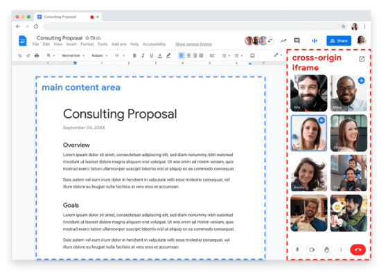
In this case, it is not necessary to share the screen of the part of the video conference surrounded by the red dotted frame. It is also possible. In such a case, by using the Region Capture function, you can cut out and share only the 'information to be shared' surrounded by a blue dotted frame. This example is a bit extreme, but there are many situations where screen sharing of the entire browser tab could lead to unnecessary information being shared. It can be said that
◆ 'Media Queries Level 4' compatible
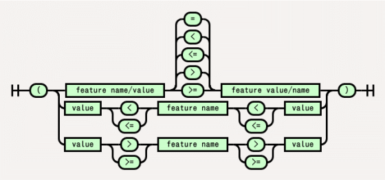
Media queries are an essential design technique for modern web design that assumes responsiveness . The Media Queries Level 4 specification now allows inequality and Boolean values to be used to specify media feature queries, making them easier to understand.
New syntax for range media queries in Chrome 104 - Chrome Developers
https://developer.chrome.com/blog/media-query-range-syntax/
For example, to specify the minimum viewport width, a traditional query would look like this:
[code]
@media (min-width: 400px) {
// Styles for viewports with a width of 400 pixels or greater.
}
[/code]
If we write this using the Media Queries Level 4 syntax, it will look like this:
[code]
@media (width >= 400px) {
// Styles for viewports with a width of 400 pixels or greater.
}
[/code]
Also, the conventional description of the maximum viewport width is below.
[code]
@media (max-width: 600px) {
// Styles for viewports with a width of 600px or less.
}
[/code]
This can also be written like this:
[code]
@media (width <= 600px) {
// Styles for viewports with a width of 600px or less.
}
[/code]
The difference between the two becomes clearer when these width specifications are compounded. Previously, it was described as follows.
[code]
@media (min-width: 400px) and (max-width: 600px) {
// Styles for viewports between 400px and 600px.
}
[/code]
This is the Media Queries Level 4 syntax, which makes it very clear and easy to understand.
[code]
@media (400px <= width <= 600px) {
// Styles for viewports between 400px and 600px.
}
[/code]
Also, in the conventional description, such a complicated description was necessary ......
[code]
@media (min-width: 20em), not all and (min-height: 40em) {
@media not all and (pointer: none) {
// Styles for complex conditions.
}
}
[/code]
Applying the concept of Boolean values allows us to write this concisely. Here, the state where the pointer is none is 0 (=false), and the state that is not none is non-0 (=true). It is important to be
[code]
@media ((width >= 20em) or (height < 40em)) and (pointer) {
// Styles for complex conditions.
}
[/code]
◆Shared Element Transitions
The Shared Element Transitions feature will start an origin trial . While native apps are easy to smoothly transition between various views, web apps have relatively high hurdles for screen transitions, and depending on the situation, there is a tendency to display a blank space for a moment between transitions. Shared Element Transitions is a mechanism for providing smooth screen transitions for web applications.
The sample code below shows how to perform screen transitions in a web application consisting of a single page.
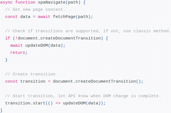
First, get the page context and check if Shared Element Transitions are supported. If it is not supported, it will update the page as usual, but if it is supported, it will create a transition object and start the screen transition through the start() method. This API can know the timing when the DOM change is completed by the function passed as an argument. Shared Element Transitions uses CSS animation internally, and various effects such as fade-in and slide-in can be used as a form of screen transition.
◆ Other updates
・Delete U2F security key API
Changed to block iframes from navigating to the file system
・Set the upper limit of Cookie Expires/Max-Age attribute to 400 days (previously almost unlimited)
・Add object-view-box to CSS property and provide a means to simplify the trimming procedure for img elements, etc.
・Fullscreen Capability Delegation function: Delegate the authority to call requestFullscreen() to another window
・Provision of multi-screen window arrangement function and full-screen companion window
・Put Web Bluetooth API under control of permission policy
Fixed default allow list for 'legacy' client hint sets ('dpr', 'width', 'viewport-width' and 'device-memory') on Android
・Provision of 'Web bundle' that efficiently loads multiple resources at once
Added property 'overflow-clip-margin' to specify how far an element's content can be painted before being clipped
・Provision of a mechanism for exchanging non-sanitized non-canonical data between web applications and native applications via the OS clipboard
・Enhanced color management in WebGL canvas
In addition, 'Google Chrome 104' includes 27 security bug fixes .
The next stable version of 'Google Chrome 105' is scheduled to be released on August 30, 2022, local time.
Related Posts:
in Software, Posted by log1c_sh
