New Human Interface Guidelines for Apple App Developers
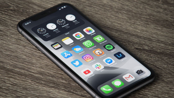
Manufacturers of operating systems such as Apple and Google have created and published guidelines that summarize how to build designs for developers who release apps for their platforms. Apple's Human Interface Guidelines summarize how users can easily use content and features by choosing words, images, and designs, which is helpful not only to developers but also to many. It contains a lot of content that becomes.
Inclusion --Foundations --Human Interface Guidelines --Design --Apple Developer
◆ Design
A simple and intuitive experience is at the heart of a well-designed app. To design an intuitive experience, start by researching people's goals and ideas and presenting content that will resonate with them.
Empathy is an important tool in this study. Because it helps people with different perspectives understand how they react to the content and experiences they create. For example, you may find that the words and images that appear in your app have unintelligible or unintended meanings from a certain point of view.
The guidelines state that when examining your app from different perspectives, you should avoid looking for content that can be offensive. The reason is that while no app should contain offensive material or experiences, harmless apps are not always the right apps.

◆ Choosing words
Simple words make it easier for anyone to understand your app. Carefully review the text in your app to see if the developer's tone or words exclude people. The following is an example for writing a direct, easy-to-understand, comprehensive text.
・ Let's consider the tone of the copy from various angles. The style of writing conveys as much as the words you use. Communication styles vary from app to app, but you should be careful not to send unintended messages. For example, a lofty style can make you think it's an app that only highly educated people can use. Focus on being clear, direct, and respectful when looking for the right style for your app.
・ It is also necessary to pay attention to how people are called. In general, it is effective to call directly using expressions such as 'you'. Indirectly calling it a 'user' can cause the user to lose familiarity with the app. Also, consider using the word 'us' to describe an app or company. Otherwise, these words may be interpreted as insulting or disrespecting a person.
• Avoid using jargon and technical terms and define them correctly when used. Using jargon and technical terms simplifies the text, but it helps eliminate people who don't know the meaning of the term. If you really want to use it, you should clarify the definition of the term so that it can be easily searched. Even if you know the definition of technical terms in a sentence, it is easier to read and translate if you express it in plain language.
・ Colloquial expressions should be replaced with plain expressions. Many colloquial expressions are culturally relevant and can be difficult to translate. To make matters worse, some colloquial expressions have malicious meanings that developers do not know. For example, 'peanut gallery' (meaning a person who makes insignificant criticism) or 'grandfathered in' (a term used to mean vested rights, but at the same time also meaning the past provisions of the United States that deprived blacks of their rights). All expressions originated from oppressive contexts and still exclude people. Even if the colloquial expression has no exclusive meaning, it can eliminate everyone who does not understand it.
・ If you want to add humor, you need to think carefully. Humor is very subjective and, like colloquial expressions, it is difficult to translate from one culture to another. Incorporating humor into your app risks confusing people who don't understand it, frustrating people by repeating it, and insulting people who interpret it differently.

◆ Familiarity
Familiar apps do not require specific skills or knowledge to use and provide a clear path to deepening your understanding over time. Whether your app has a lot of powerful features or performs a simple task, here are two ways to make it familiar.
・ Present a clear and easy-to-understand interface. Apple has published designs for
-Incorporate a method to learn how to use the app. The first-time launch experience of the app allows new users to interact step-by-step, while giving experienced users immediate access to the content they need. This also has its own guidance .

◆ Gender identity
Throughout history, cultures around the world have recognized self-awareness and expression that transcends the dual differences between women and men.
By avoiding unnecessary references to a particular gender, everyone will feel welcome to the app. For example, users may specify their own gender and publicize the personal pronouns they want to use in the form of 'he / his' or 'she / her', but the developers also follow this idea in the text. You may want to insert words such as 'his or her' that do not specify gender. However, even if you don't dare to use personal pronouns, you can create sentences that are gender agnostic by using alternative expressions such as 'user'.
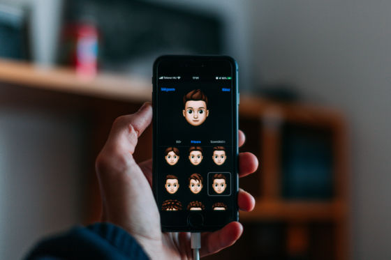
Also, avatars and emojis are examples that do not require reference to a particular gender. To welcome everyone, it's about providing the tools you need to create avatars and emojis that accurately describe you. If you need to draw a general person, use images of people regardless of gender and emphasize the message that the general person is a 'human' rather than a man or woman.
Most apps don't need to know the gender of a person, but if the app needs this information for health or legal reasons, it offers comprehensive options such as non-binary and rejection. You should consider that. In this case, you can also allow you to specify the pronoun to use so that you can express it appropriately when you need it.

◆ People and settings
Representing human diversity is one of the most important ways an app can welcome everyone. If a user recognizes that someone in the app or related material is similar to them, they are less likely to feel excluded and more likely to benefit from the app.
When creating sentences and images that express people, you should try to describe the characteristics and behaviors of various people. For example, in the case of a fitness app, you can post exercise demonstrations by people of different races, shapes, ages, and physical abilities. If you need to portray a general profession, you should avoid stereotypical expressions such as male doctors only, female nurses only, and so on.
Also, review the settings and things to show. For example, showing a wealthy life may make sense in some scenarios, but is unwelcome in others, and the app may seem anachronistic. Apple recommends displaying places, homes, activities, and items that are familiar and familiar to many, where they make sense in the app.
◆ Avoid stereotypes
Everyone has prejudices and stereotypes, often unknowingly. And it's hard to discover how they affect your thinking. The goal of this design is to be aware of your prejudices and generalized thinking that it can influence your design decisions.
For example, consider an app that manages access to various family accounts. If this app uses the definition of a stereotyped family with a wife, husband, and children, it is possible to tell the user such stereotypes in a copy or image. In this case, the app will exclude everyone with a family that is different from its definition.
The assumptions for this app may seem obvious, but it's important to realize that not all assumptions are so easy to find. For example, to confirm your identity in the future, 'What was your favorite subject when you were in college?' 'What kind of car did you buy for the first time?' 'What did you think when you first saw the rainbow?' Consider an app where you need to select a security question like this.
From one point of view, these questions refer to mundane events, but they are all based on experiences that not everyone has. Using context-specific experiences to convey something is meaningless and virtually excluded for everyone who does not share that context. As an alternative to the culture and ability-specific questions above, 'What is your favorite hobby?' 'What was your first friend's name?' 'What qualities best describe you?' The guidelines state that we should refer to a more universal human experience, such as 'Are you?'
Since general theory cannot reflect the diverse perspectives of human beings, deciding on a design based on stereotypes and assumptions will inevitably lead to exclusion. By avoiding assumptions and instead including the whole, it is possible to create a useful experience for everyone.
◆ Accessibility
People use accessibility features such as
It's also important not to assume that you don't want to use the app because of some obstacle. Such assumptions can be designed to limit the users of the app. On the other hand, if you focus on making each experience of your app accessible, everyone will benefit from the app in a way that suits them.
Each disorder is versatile, for example, visual impairment can range from amblyopia to total blindness, including color blindness, blurred vision, photosensitivity, and peripheral vision impairment. Everyone can experience a disability. In addition to the disabilities that many people experience with age, there are also temporary disabilities such as short-term deafness due to infections and situational disabilities such as deafness on a noisy train. Everyone can be affected by the timing.
When designing content that welcomes people of all abilities, avoid using images and words that exclude people with disabilities, take a people-first approach, and recognize it as simplicity. It is necessary to consider giving priority to ease. Apple has published a separate guideline in this regard.

◆ Language
People expect to customize their device by choosing a language and choosing values such as date, time, money to suit the region. Also be aware of how colors are used when localizing your app and related content. Colors often have strong cultural implications, so it's important to see how people react to a particular color in each region they support. For example, white is associated with death and sadness in some areas, and innocence and peace in others. If you use color as a means of communication, you need to confirm your color choices so that each version of your app tells you the same thing.

In publishing these guidelines, Apple said, 'Like all designs, the design of the app we've focused on is a repetitive process that takes time to get it right. What other people think through that process. Please test your assumptions about what you feel and be willing to evolve your knowledge and understanding. '
Related Posts:
