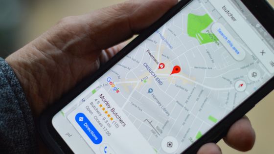
The 'Air Quality Index', which indicates the degree of air pollution, is now displayed in the app version of Google Maps.
The Google Maps app for Android and iOS now displays the
Google Maps for Android, iOS now shows air quality (AQI) ―― 9to5Google
https://9to5google.com/2022/06/08/google-maps-air-quality/
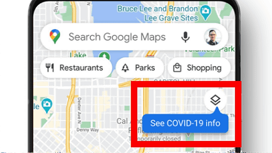
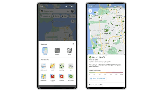
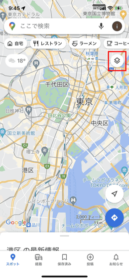
Easy to use, tap the filter icon at the bottom of the search bar.
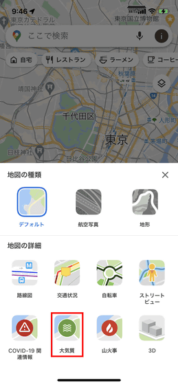
Tap 'Air quality' from the map details
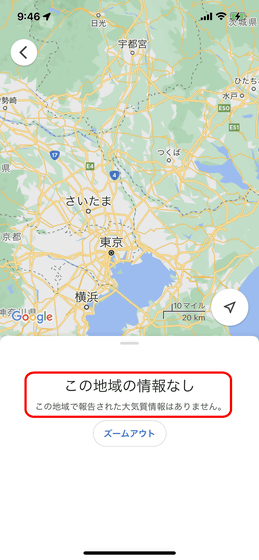
However, at the time of writing the article, there was no area in Japan where AQI could be displayed.
In the corresponding area, a wavy line icon color-coded with numbers is displayed on the map as shown below. The icon is roughly displayed in green if the AQI is good, yellow if it is acceptable, and red if it has a negative health impact.
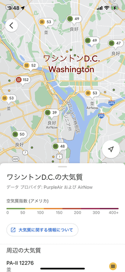
You can also check the AQI for each area by tapping the icon.
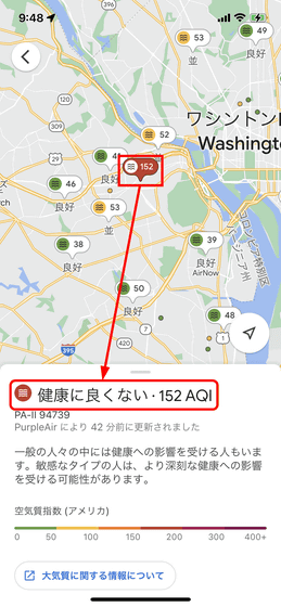
The AQI is displayed in the range of 0 to 500, and in the case of the United States, it is based on the data of the Environmental Protection Agency and Purple Air .
At the same time, a 'Wildfire' layer has been added to Google Maps. No information was added to the feature at the time of writing, but it seems likely that it will provide smoke data provided by the US National Oceanic and Atmospheric Administration (NOAA) within the next few months.
Related Posts:
in Software, Smartphone, Posted by logu_ii
