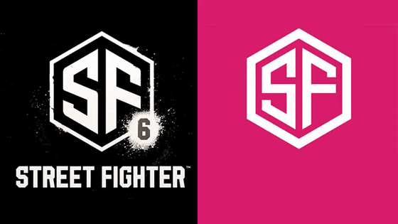
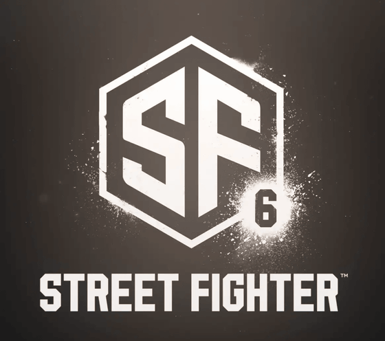
It was talked about that the newly announced 'Street Fighter 6' logo looks exactly like the logo sold for 10,000 yen.
On February 21, 2022, Capcom announced the decision to produce '
Street Fighter 6's New Logo Looks Like A Piece Of $ 80 clip art
https://kotaku.com/street-fighter-6-vi-capcom-graphic-design-logo-sf6-sf5-1848573656
Street Fighter's official Twitter account has released a movie of Street Fighter V's final downloadable content (DLC) characters Luke and Ryu confronting each other, announcing the decision to make Street Fighter 6.
'Street Fighter 6' production decision # StreetFighter6 pic.twitter.com/PiABJAQABu
— STREET FIGHTER (@StreetFighterJA) February 21, 2022
Street Fighter 6 is one of the most popular game series to date, and the logos for each series are as well-known as the characters in the game. In addition, the logos of each series have a consistent design, 'adopting flashy, martial arts and artistic fonts,' said Kotaku, an overseas game media.
The logos from the first series that appeared in 1987 to Street Fighter V that appeared in 2016 are as follows, and have a clear continuity.
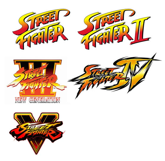
However, the Street Fighter 6 logo has been redesigned to look stylish as follows: 'The beautiful and combative fonts are gone, they look like studio logos,' Kotaku said. 'The Roman numerals are gone, and a'6'is displayed instead.'
After seeing this new logo, Ars Technica's Aurich Lawson said, 'The Street Fighter 6 logo is sold on Adobe Stock for $ 80.' 'I found it by searching for'SF'on the stock site.' I just rounded the corners of the logo and added the number '6'. '
The new Street Fighter 6 logo is $ 80 on Adobe's Stock site
https://t.co/SViXFjElou pic.twitter.com/yOzYePaYfV — Aurich (@aurich) February 21, 2022
I don't even know what to say. I knew it was generic but I didn't realize it was this bad. They searched for 'SF' on a stock logo site and rounded a couple corners and added the 6
I cannot
Below is a logo that is very similar to the Street Fighter 6 logo sold on the stock material site Adobe Stock. It is sold overseas for $ 80, but in Japan it is sold for 10,318 yen.
SF FS Letter logo design vector template Stock Vector | Adobe Stock
https://stock.adobe.com/jp/images/sf-fs-letter-logo-design-vector-template/422995611?prev_url=detail&asset_id=422995611
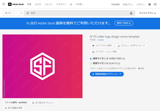
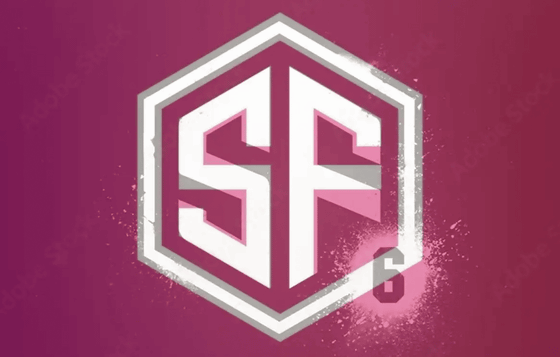
When comparing the two side by side, there are also minor differences such as the thickness of the outer border and the line of the character SF being different, and the corners of the character SF being partially chamfered.

In addition, the Street Fighter 6 logo is overlaid in white and the logo published in Adobe Stock is overlaid in gray as follows. You can see that not only the line thickness but also the horizontal lines of the letters S and F are processed diagonally.
Related Posts:
