Former Google employee tells the story behind the 'UI redesign that happens in Safari on iOS 15' that was planned in Chrome but was finally abandoned

Introduced in June 2021,
Chrome Home
https://read.cv/cleer/1R6eDCnOEDMDlRjMDbq8
Googler details why Chrome killed its iOS 15 Safari redesign --9to5Google
https://9to5google.com/2021/07/25/google-chrome-safari-ios-15/
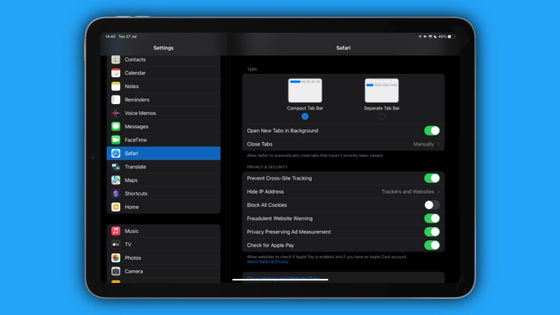
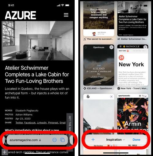
Safari, which will be included in iOS 15, will undergo major changes to the tab bar design. The changes are briefly summarized in the following articles.
Summary of useful functions of 'iOS 15' that Apple did not explain at WWDC --GIGAZINE
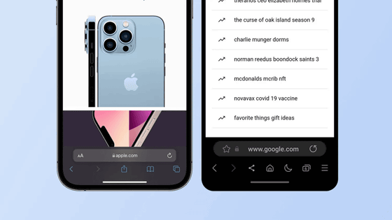
Apple explained that this change to place the URL field etc. at the bottom of the screen is 'to maximize the space on the screen so that it does not interfere with scrolling or searching.'
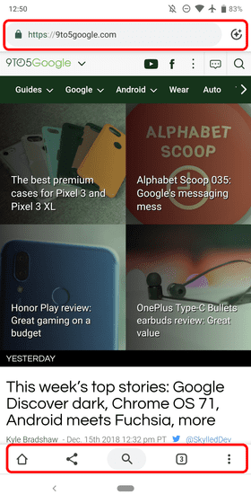
According to Google designer Chris Lee, Google was trying to make similar changes in a project called 'Chrome Home' in 2016. If you look at the Chrome Home screen that Lee published on his blog, you can see that the URL field and tab buttons are certainly contained at the bottom of the screen.

This change can be broadly divided into two parts: 'Since the terminal has become larger, change the UI so that it can be operated with one hand' and 'Since Chrome's functions have increased, the three buttons at the bottom of the screen are no longer enough.' I had an intention. However, it was decided that a major change in the design of Chrome would cause confusion for users, so it seems that the adoption of Chrome Home was finally postponed.
“This idea became popular internally and quickly became a top priority for Chrome's development, but it's gaining enthusiastic support from the technical community,” said Lee. Meanwhile, some of our main target audience has complained that it's confusing. Chrome is designed for billions of users at different tech levels. That's why we came to the conclusion that Chrome Home isn't satisfying for all users. '
Related Posts:
