The controversial 'UI change in Safari on iPad' is now an option in the latest beta
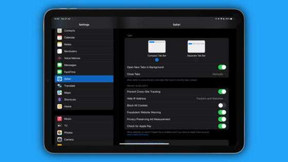
On July 27, 2021 local time, Apple released beta 4
What's new in iOS 15 beta 4? Safari changes, Focus tweaks, and more --9to5Mac
https://9to5mac.com/2021/07/27/whats-new-in-ios-15-beta-4-safari-changes-focus-tweaks-and-more/
Apple's controversial Safari redesign is now optional in the latest iPadOS 15 beta --The Verge
https://www.theverge.com/2021/7/27/22596478/apple-ios-15-beta-safari-tabs-compact-optional
'Tabs' are now a common function in browsers, but in Safari for iOS, tabs are stored in the icon part at the bottom right of the screen, and in Safari for iPad OS, tabs are displayed side by side at the bottom of the search bar. For example, how to manage tabs differs depending on the browser.
In the new iPad OS 15, the management method of this tab has been changed, and the tabs are grouped on the left side of the search bar at the top of the screen as shown below, which was unpopular as 'difficult to handle'.

However, in beta 4 of the iPadOS 15, this tab UI change will be offered as an option, and
Beta 4 on the iPadOS 15 returns to the traditional design, with Safari tabs lined up below the search bar.
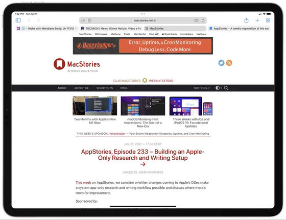
In addition, it is possible to change the tab UI to a new one from 'Safari' in 'Settings'.
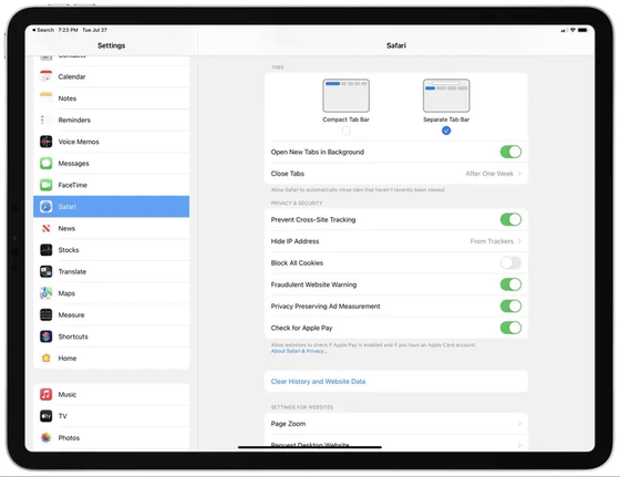
Other new changes made in iOS 15 Beta 4 include:
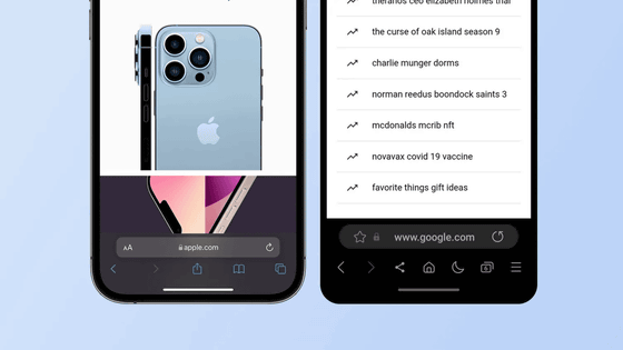
In Safari on iOS 15, it is possible to manage tabs with the 'tab bar' displayed at the bottom of the screen. Beta 4 adds a new share and reload button to this tab bar. You can also display bookmarks by long-pressing the URL bar.

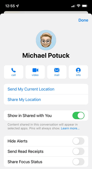
In the Phonebook app 'Contacts', a new option called 'Share Focus Status' has been added to each contact.
Shortcuts has a new “Return to Home Screen” action in iOS 15 developer beta 4 – this has been long requested from the community and is great to see! Pic.twitter.com/8E3ZB7FIYX
— Matthew Cassinelli (@mattcassinelli) July 27, 2021
The changes made in iPadOS 15 Beta 4 are as follows.
Added a new huge widget for podcasts.
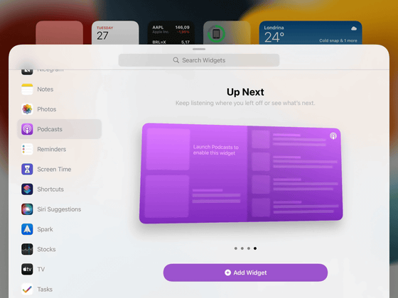
Added an option to disable notifications when sharing screens. The camera icon at the bottom right of the lock screen has been adjusted and the shutter button has been removed.
Related Posts:
in Software, Smartphone, Posted by logu_ii
