UI design prediction of "iOS 12" that is about to appear soon will be "perfection that seems to be true"?
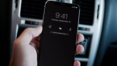
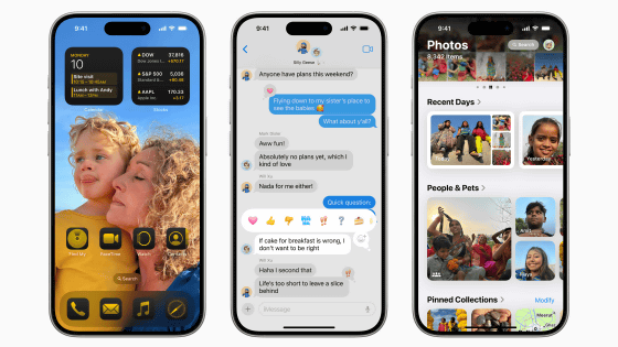
Apple's developer conference to be held from June 4, 2018 "WWDC 2018"Is expected to be announced, the latest OS for iPhone / iPad is"iOS 12"is. It is not clear what type of OS will be, but multiple designers have released the concept image and it is the perfection degree that seems to be "It really is like this?"
How iOS 12 could revamp the lock screen with shortcuts, always-on mode, more | 9to5Mac
https://9to5mac.com/2018/05/27/ios-12-lock-screen-concept/
New iOS 12 concept offer up refreshed Lock screen, App Bar, Guest Mode, Face ID tricks, and more | 9to5Mac
https://9to5mac.com/2018/03/02/ios-12-concept-app-bar-guest-mode-more/
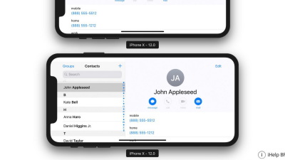
Brazilian Apple related mediaiHelp BRHas released a concept image centered on the lock screen of iOS 12.
The concept image by iHelp BR is characterized by the shortcut icon of the application being arranged between the lock screen clock and notification as follows.
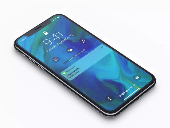
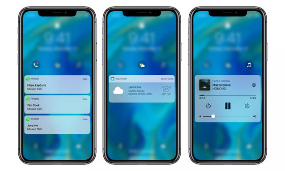
The number of application icons that can be placed on the lock screen is up to four, and 3D Touch enables you to access functions quickly.
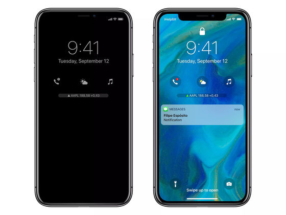
Also, Galaxy series "Always on Display"Like the function, the" clock display at sleep "which uses the super power saving characteristic of the organic EL display has been proposed. The concept image on the left of the image below is an image of the clock display function when sleeping.
In addition, there is also a proposal to store the display at the time of volume adjustment in the upper left corner on the screen though it is not the lock screen.
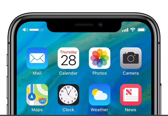
Also,BehanceIn the concept image of iOS 12 that was released at the moment, erase the application name from the application icon on the home screen ......

It is proposed to display weather information by swiping the top of the lock screen from the top to the bottom.

Also, a lock application is proposed that allows users to decide on their own that "Face ID (or Touch ID) authentication is required when using a specific application". Because there are many applications with information about private, such as photo apps and message applications, "Application for locking function" may be pretty useful if it appears.

The idea that the volume control bar is displayed at the top of the screen is also. Even in the concept image of iHelp BR, as was the case with the volume control bar, there are many designers who are not satisfied with the method of displaying a gimmick and a volume adjustment in the center of the current screen.

It is also proposed to add a guest mode for emergency situations so that standard applications such as cameras, phones and Safari can be used even without authentication.

In addition, like the iPad's app launcher, the idea of adding an application bar to the right side of the screen so that it can be quickly switched to a specific application is popping out.

In addition, these are concept images only and it is unknown how Apple's interface improves with iOS 12 at the moment. However, iOS 12 is "Focus on stability and performanceIt is said.
Related Posts:
in Software, Smartphone, Design, Posted by logu_ii
