A movie explaining the font design of the arcade game by a professional font designer is on sale
Older arcade games such as '
The 8-bit arcade font, deconstructed-YouTube
The font design is unique due to the curved lines, and readability is the top priority.
However, the fonts used in arcade games from the 1970s to the 1990s were different.

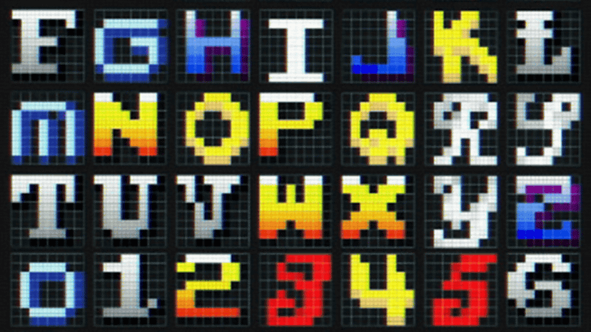
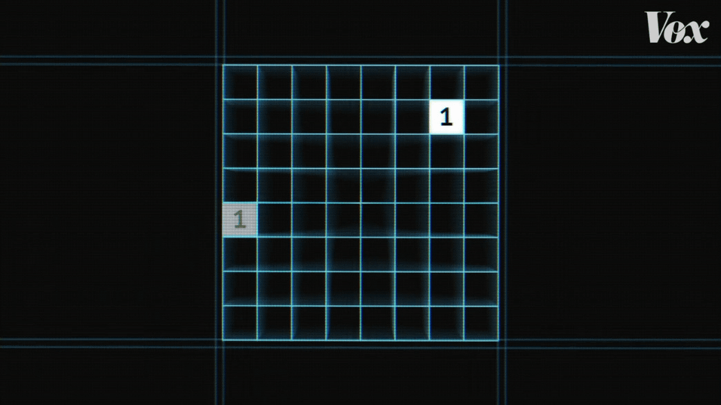
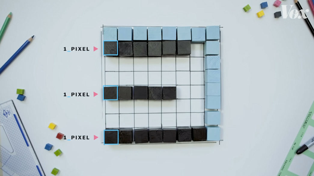
In order to save the amount of data, it was necessary to consider readability and originality as well as the constraint that it must be designed within 8 × 8 squares.
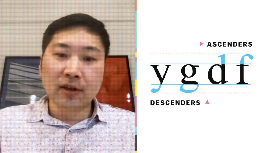
Mr. Toshi Omagari, who explains the fonts in the movie, is a designer who worked on many fonts for arcade games.
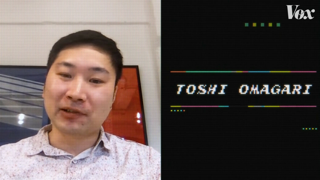
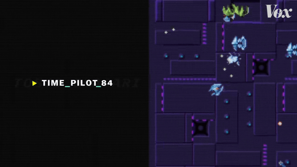
In the past I created the fonts used in games such as Time Pilot '84 .
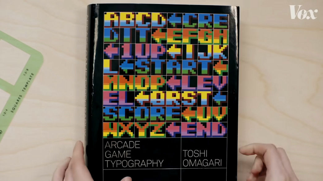
In addition, a book '
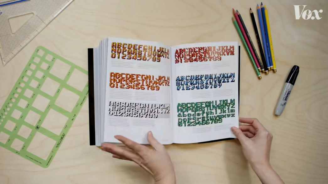
The contents of the book look like this.
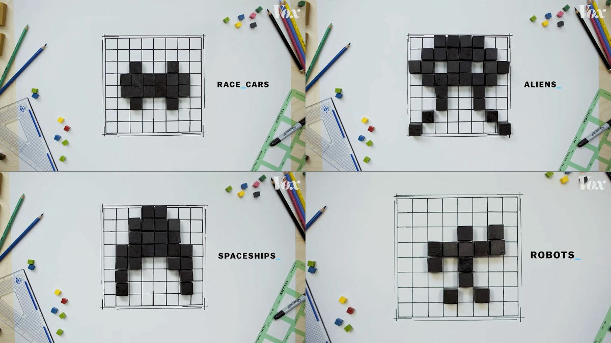
Also, in the arcade games from the 1970s to the 1990s, not only fonts were designed with 8x8 squares, but ...
Cars, aliens, spaceships, robots, etc. were also designed on 8x8 squares.
There are many fonts for arcade games, but among them, the fonts used in

The font of Sprint2 is the same as the font used in the arcade game '
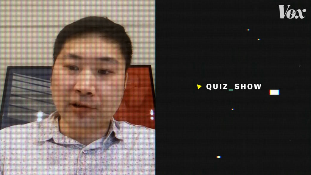
The fonts used in Quiz Show and Sprint2 are

In addition, the Quiz Show font was designed with a space for one square on the upper and right sides to allow space for each character.
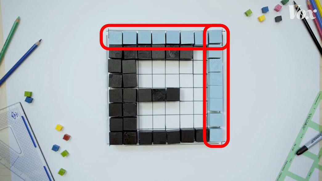
In addition, the width of each stroke of the character is 2 squares.
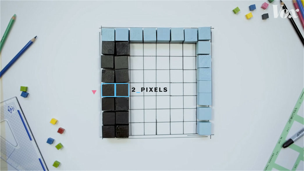
The vertical width is designed to be 1 square.
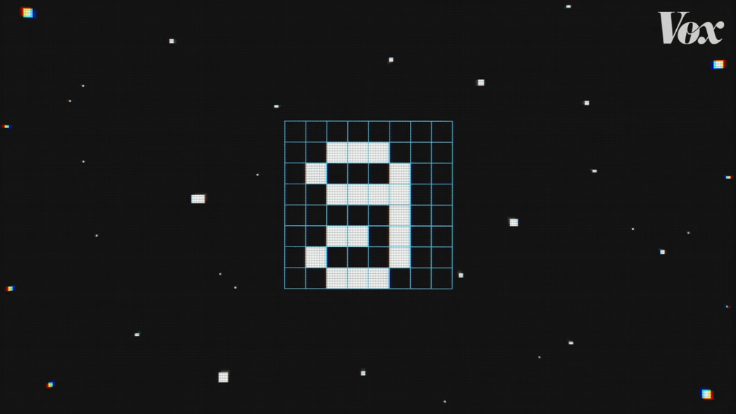
Also, the Quiz Show font has some of the ingenuity in the design of 8. If you design 8 according to the rule that the width of one stroke is 2 squares and the height is 1 square, the design will be as follows ...
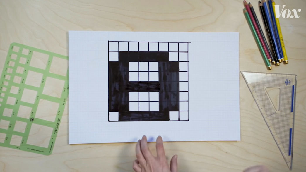
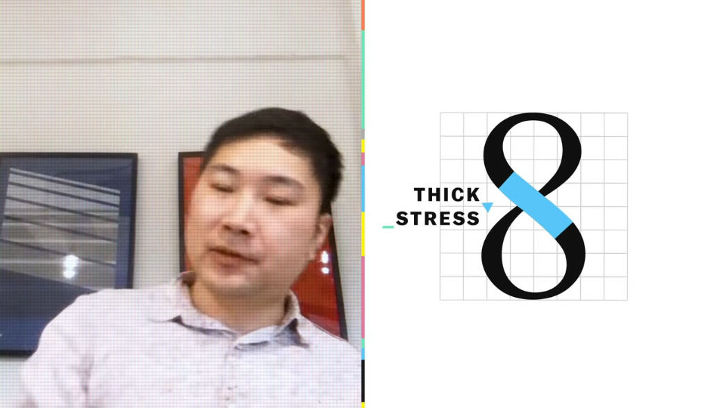
As a result, 8 fonts have the following designs.
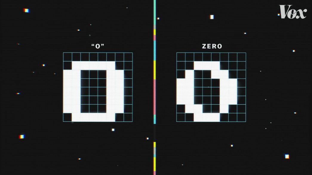
Also, attention is paid to the drawing of O (o) and 0 (zero). The left O (o) has a line-symmetric and point-symmetric design, and the right 0 (zero) has a point-symmetric design.
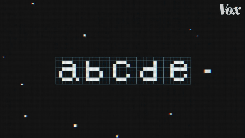
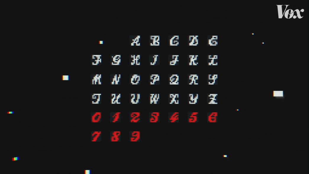
The design of the lowercase alphabetic font is based on the game that appeared in 1983,
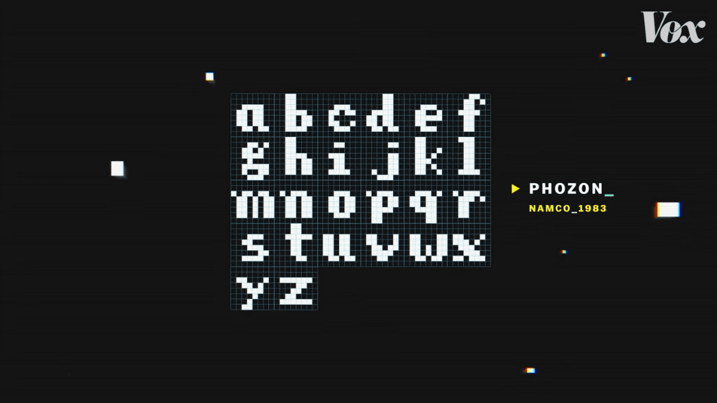
It started to be created from the
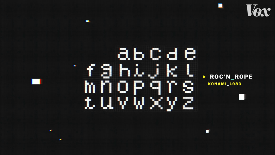
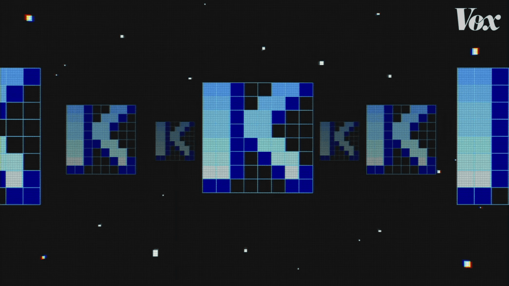
According to Omagari, the lowercase font was not used in the Rock and Rope game, and there was a lowercase font as unused internal data.
What's more, Omagari says there are some problems with the design of the fonts that remained in Rock'n Rope. For example, letters b and d look smaller than letters a and c, and the size balance is poor.
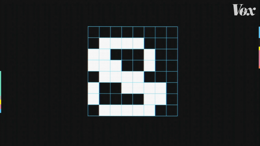
Omagari pointed out that there are problems with g ・ i ・ t.
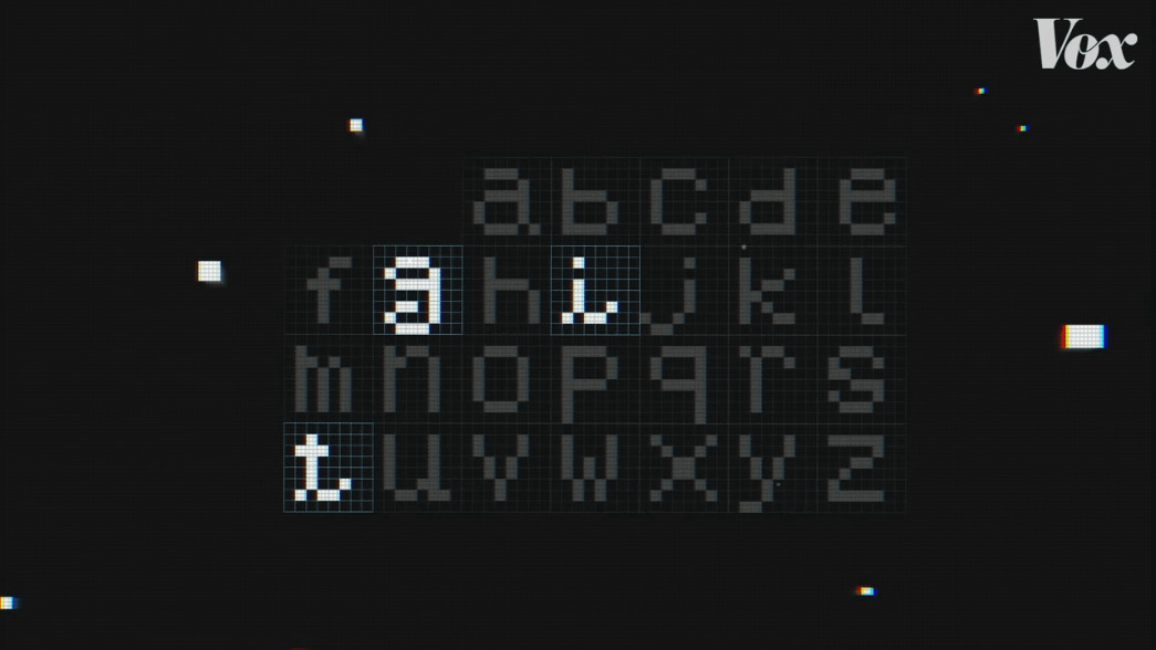
As for g ・ i ・ t, the
For example, the position of g is slightly higher than other characters.
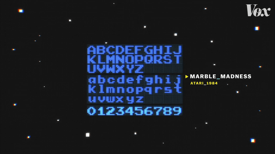
In terms of lower case design, Omagari says that the design of the font used in
Since the 1980s, as the performance of arcade games has gradually evolved and the number of expression methods has increased, the number of fonts with multiple colors and the addition of features such as shadows and frames have also increased.
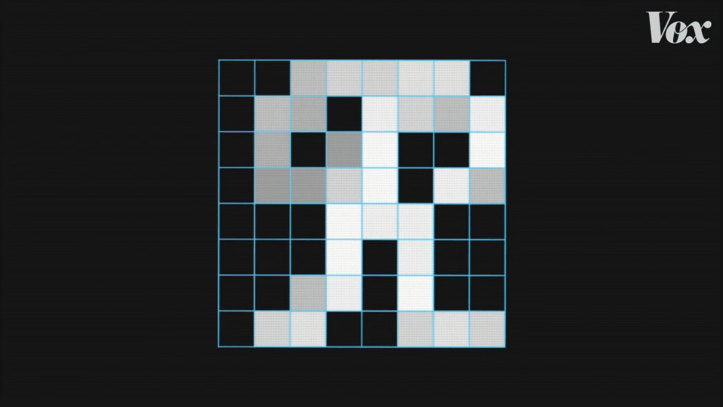
Among the many fonts, Omagari's favorite is the font used in
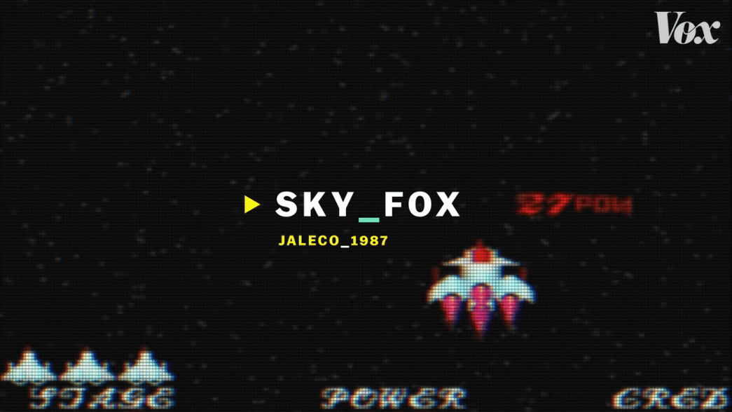
Sky Fox used fonts with cursive characteristics.
Mr. Omagari commented that 'how to use gray is wonderful', and that the use of gray is devised so that the letters look thinner.
Due to technical limitations in the arcade games of the 1970s and 1990s, a wide variety of fonts have been designed on an 8x8 grid.
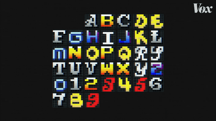
“It's a very small grid, but the possibilities are endless,” said Omagari.
Related Posts: