Learn from NASA's manual Eleven rules to make easy-to-read typography
Many documents such as emergency response manuals are placed in the cockpit of the aircraft, but many cases occurred in the 1980s, such as manuals are hard to read and can not be dealt with in emergency situations, and can not be read at all during night flight. Therefore, NASA thoroughly investigates past literatures etc. in order to write easy-to-read documents, and uses it for the manual of cockpit and flight decktypographyMake a manual of. In the survey report, the rules for making readable typography are summarized, and it can be used also for the current web design.
(PDF file) ON THE TYPOGRAPHY OF FLIGHT DECK DOCUMENTATION - Flight-Deck _ Documentation.pdf
http://ti.arc.nasa.gov/m/profile/adegani/Flight-Deck_Documentation.pdf
◆ 01: Sans serif is easier to read than fonts with serif
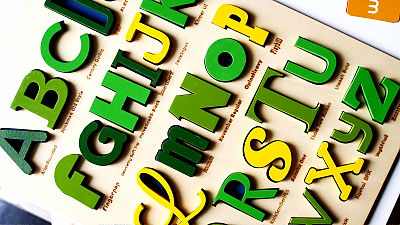
Sans serif body is simpler and cleaner than font with serif to level the bottom of character such as Roman body, so it is easy to read
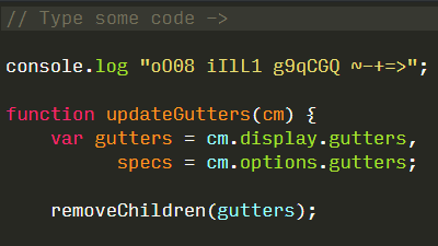
◆ 02: To make it easier to read, do not use fonts with similar characters
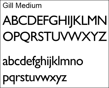
The most readable one among the sans serifs is Gill-Medium, and those with similar characters such as Hutsura and Helvetica are not used because they are difficult to read.
◆ 03: Do not print important documents in dot matrix format
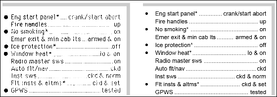
The dot matrix method which creates gaps between dots is not used because it is hard to read if the space between characters is small.
◆ 04: Long sentence is lower case

When reading lowercase letters, the eyes caught the whole word at once, but in the case of capital letters, the eyes catch one letter one character in order so that the reading speed falls at a stroke.
◆ 05: When writing a word in capital letters, make the first letter of the word larger than the others
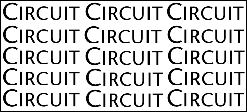
Inevitably, if you wish to capitalize a word, you can make it easier to read by making the first character slightly larger than the others.
◆ 06: Do not reduce the height of lowercase letters such as "o" "x" and "c" written in important documents to less than 0.1 inch (about 0.25 cm)
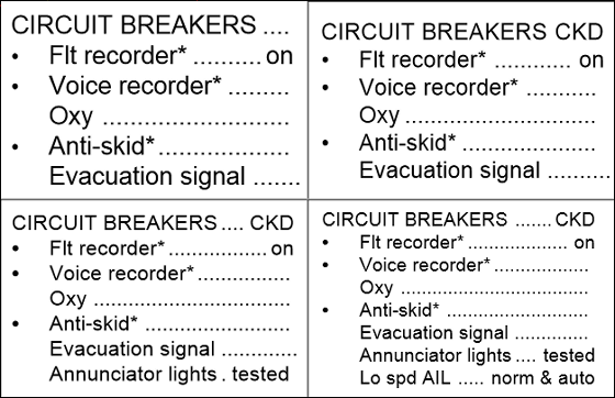
Characters such as "q" and "b" that are prototypes protruding above the basic typographic characters, such as "o", "x" and "c", are not readable if the height is set to 0.1 inches (about 0.25 cm) or less I will. Also, the ideal font size for important documents and instructions is 0.14 - 0.20 inch (about 3.55 - 5.08 mm).
◆ 07: When the reader's eyes and the document are 90 degrees, the ratio of the height and the width of the easiest readable font is "5: 3"
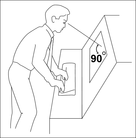
When NASA examined a number of data books, it is said that the ratio of the height and the width of human readable font was 5: 3. However, only when the reader's eyes and documents and screens become 90 degrees.
◆ 08: 25% to 33% of font size between lines
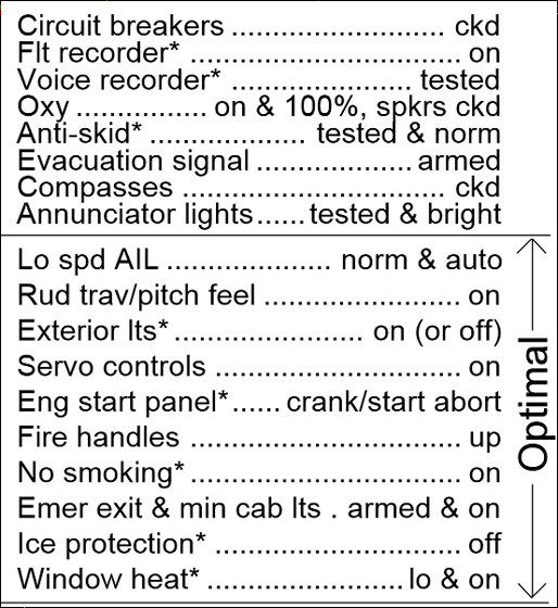
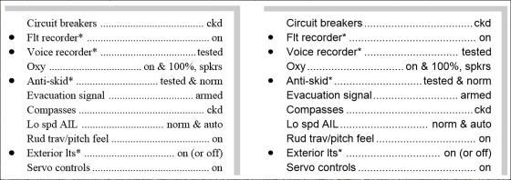
Miles TinkerMr.'s book "Legibility of Print"According to line spacing is 25 to 33% of font size, it is easiest to see.
◆ 09: Character spacing is 25% of font size
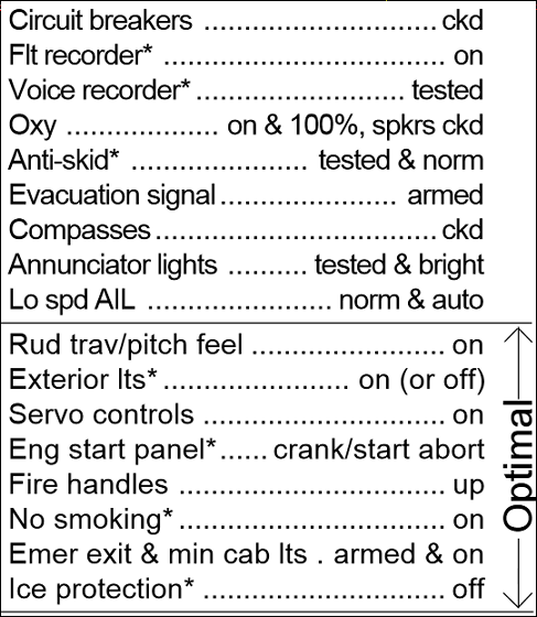
Keeping the character spacing at 25% of the font size makes it easier to read.
◆ 10: It should be avoided to use italics in a long sentence
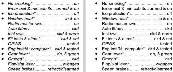
According to Mr. Tinker's experiments, the research results show that the speed of reading italics is 2.7% slower than when reading Roman bodies of lower case, 96% of the participants in the experiment said that "italics are better than Roman bodies It is also hard to read ". Also, it seems to be easier to read if you use different typefaces such as "bold".
◆ 11: The document to be read in the cockpit is made up of "page background: white letters: black" or "background: yellow letters: black"

When Tinker reads documents of "background: black letters: white" and "background: white letters: black", reading speed, eye movement, visibility by eye angle, etc. are digitized and measured, "Background: white Characters: black "documents outperformed much higher numbers. Since it is assumed that documents are read from all angles in the cockpit, it is better to make page structure of "background: white character: black".
Also, the composition of "background: yellow letters: black" is suitable for documents to be read in the cockpit that gets dark at night flying, because the illuminance is high, but "illuminance is low: background: dark red / green / blue letters: black" It is not suitable.
For upper case letters and lower case letters, fonts with sans serifs and serifs etc, it is difficult to use it as it is in Japanese typography, but line spacing, letter spacing, page color composition, etc. can be used for making easy-to-read documents must.
Related Posts:
in Note, Posted by darkhorse_log
