The design deck "The Design Deck" review which can understand the design strategy and the history of typography etc. while playing games
Cards designed in atmosphere like orthodox fantasy RPGVarious designs and designs have appeared on the cards, but the creative cards on which the cards are written on one card, such as design strategy, commentary on the design concept, history of typography, famous designer's sayings, etc. "The Design Deck"is. While enjoying the game as a playing card, I was playing cards that I could get interesting knowledge about design, so I actually tried purchasing it.
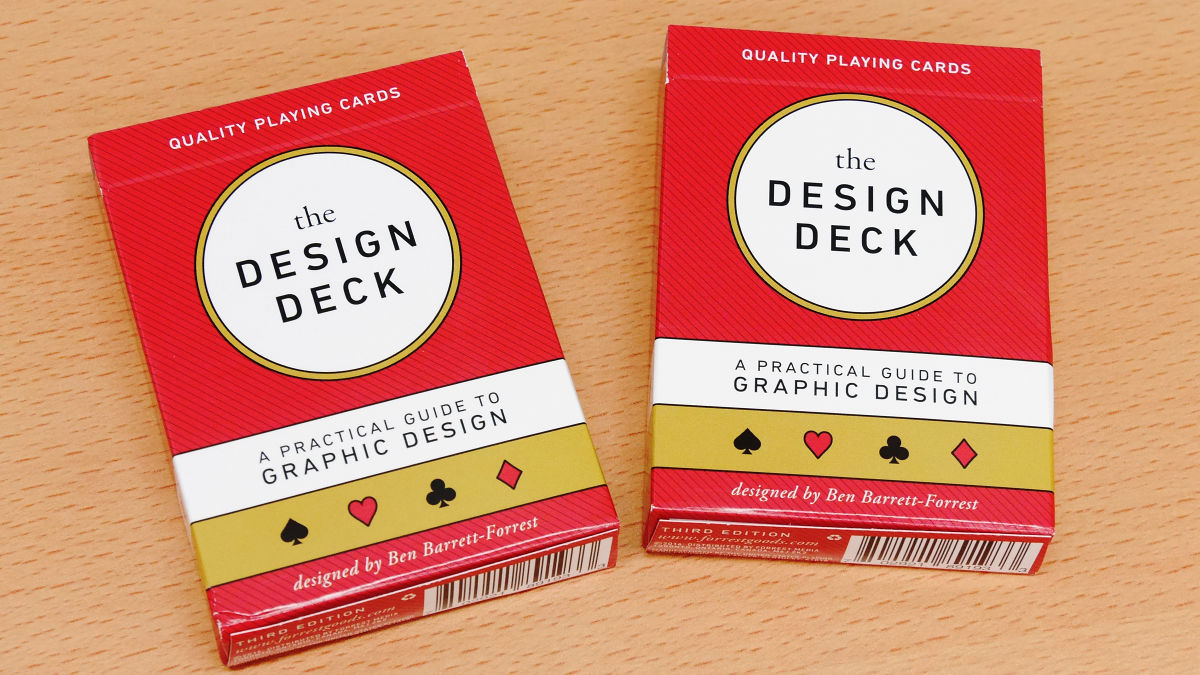
The Design Deck
http://www.forrestgoods.com/
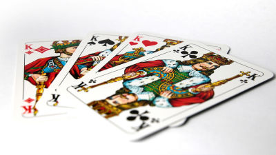
The Design Deck package is a gorgeous design of red and gold.
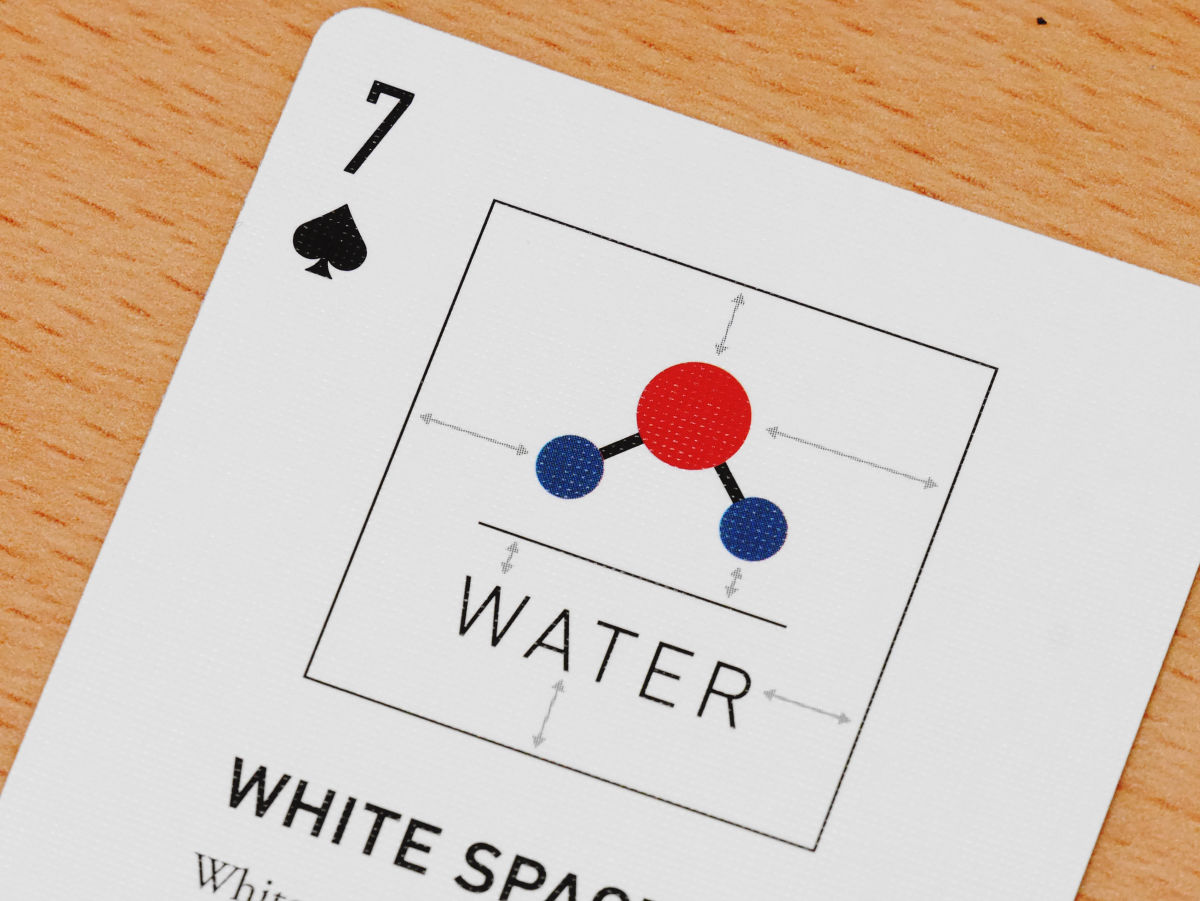
When I tried to open the box, I got the message "Do not BE AFRAID OF WHITE SPACE (Do not be afraid of the margin)" at once.

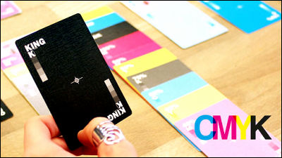
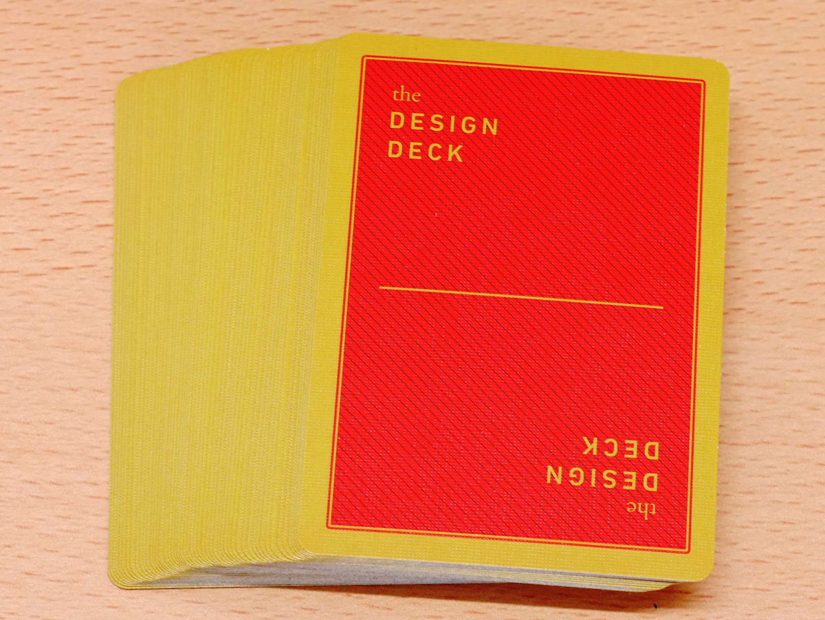
This is the back of the card.
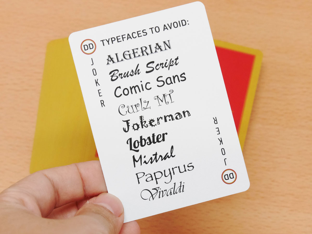
Turning one sheet with Perry was a joker. By saying "typeface to avoid"AlgerianYaJokermanThere are lots of decorated letters with strong assertions such as, etc.
There are two jokers in the set, the second joker is "sin on design", "shadow dropped too much", "too many kinds of letters" "the space between letters is too narrow / Widget too ", if you inadvertently pull the joker out without bubba, words that seems to be stingy are lining up.

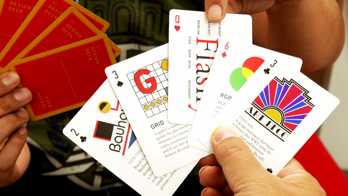
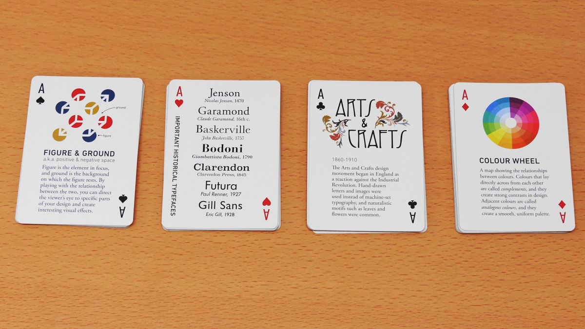
The Design Deck includes strategies for improving design, commentary on design terms, famous designer's maxims, design principles & concepts, information on typography, name of typeface, history of design movement, information on well-known designers I am clogged. When looking carefully, it is roughly divided, the spades cards are centered on design principles & concepts, heart cards are information on typography, Clover cards are information and glossaries of design prominence and well-known designers, diamond cards are color And the explanation of important terms in terms of design.
So I will look at the spade card.
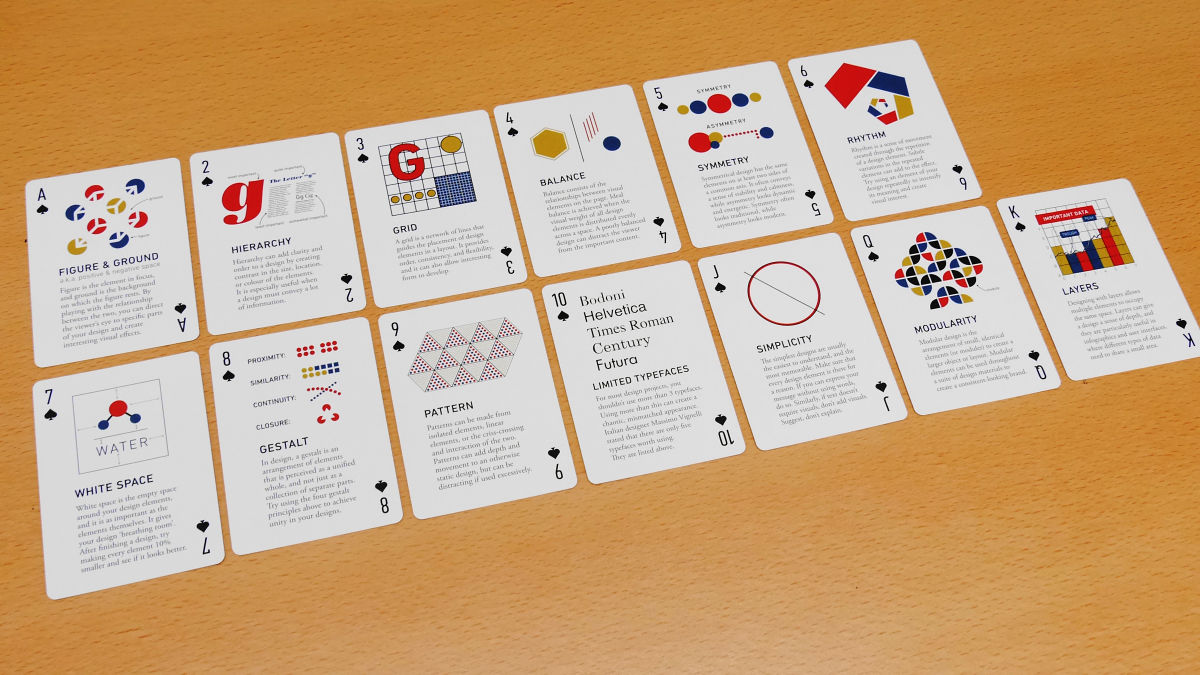
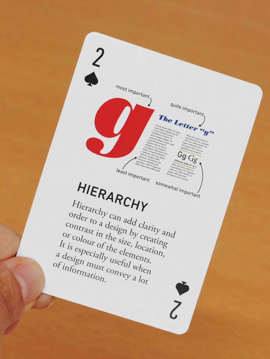
For example, in Spades' 2, "Hierarchy (Hierarchy)" is explained. It is hierarchy making it possible to understand at a glance where the important thing is written by adding contrast to elements such as size, position and color of contents. Unlike art, design is "a means of efficiently communicating information", so if you succeed in building a hierarchy you should be able to tell what you want to convey with design power.
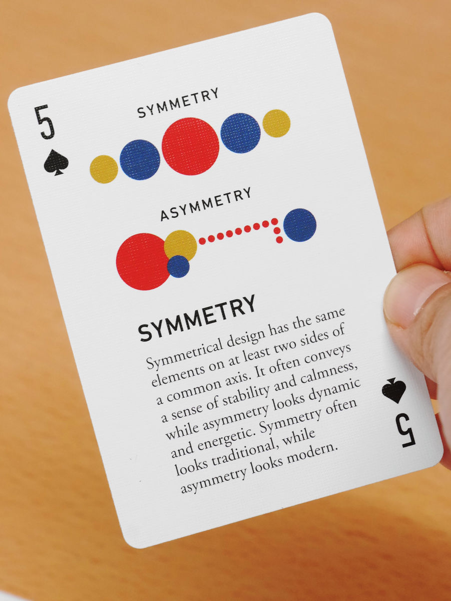
Moreover, 5 of the spade is about "symmetry (symmetry)". This also includes a commentary on the terminology, "Design symmetry shows stability and calmness, asymmetry (asymmetry) gives a dynamic and energetic impression" design strategy is written.
In order to prevent the design from becoming chaotic, the advice of "letting the type of letters to be three" or ...
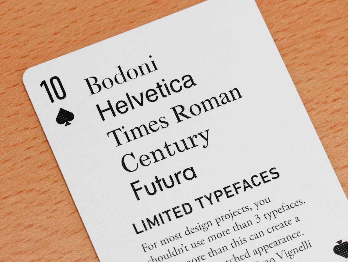
There are also tips to make the content have the correct margin, "make the size of all the elements 10% smaller after the design is completed" and check "see better".
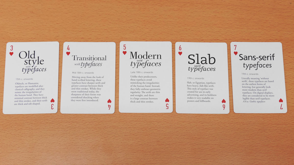
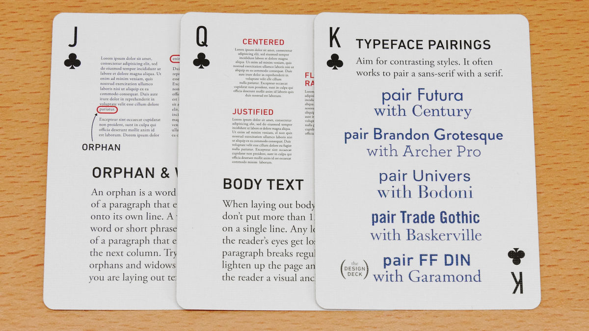
Next I will look at the heart card. Heart 's cards mainly refer to typography.
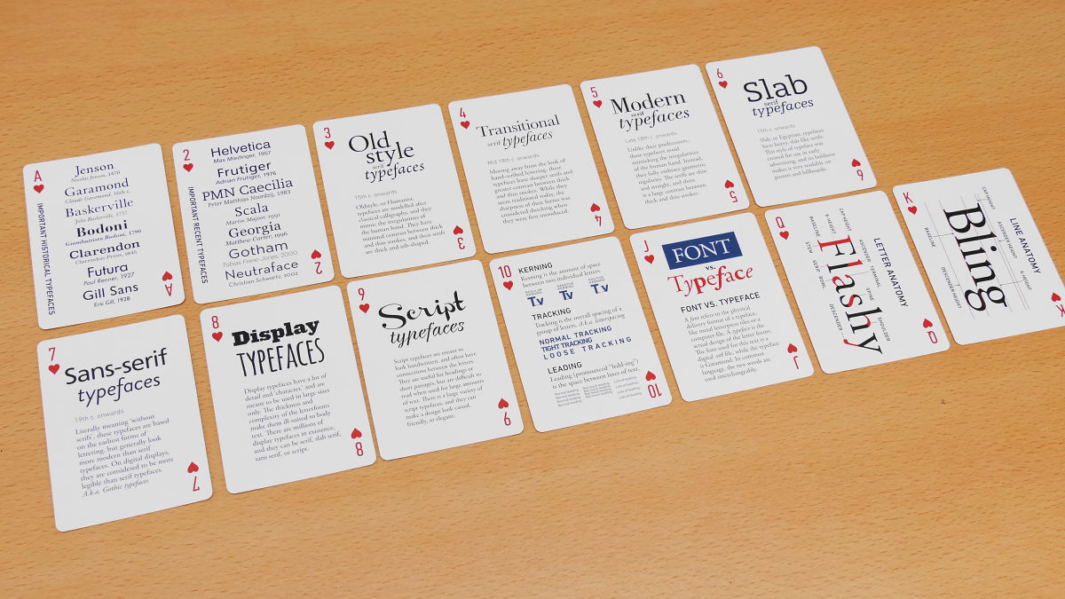
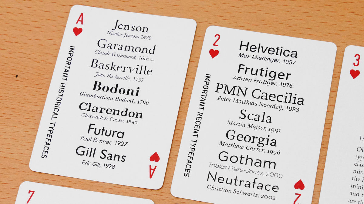
The following two cards are historically famous type faces and names of creators' names. "Jenson" designed by Nicola Jenson in 1470 and "Helvetica" which is often used as easy-to-read sans serif fonts.
Also, from the 15 th century to the 19 th century, it was explained how the font changed. When the publication was handwriting or letterpress printing, a smooth streamline serif font was used, but you can see that the sans serif font with a striking impression is becoming mainstream as it goes through the times.
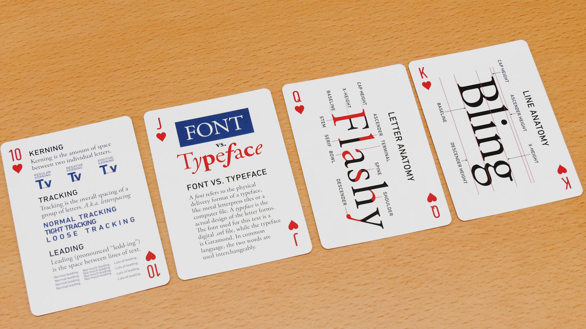
Instead of the text, there are also explanations of terms such as "Display Typefaces" which are supposed to be used with large character sizes at key points, and "Script Typefaces" in a handwritten atmosphere.
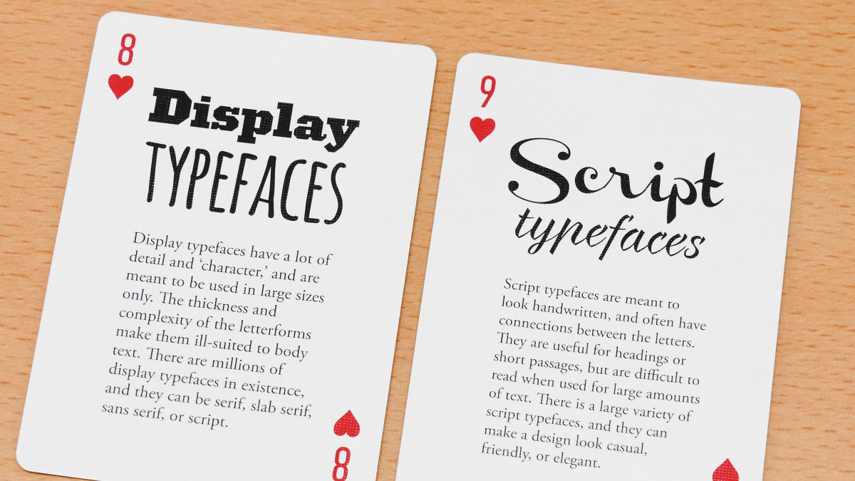
"Kerning" which dramatically improves the appearance of characters, The difference between the font and the type face, the name of each part of the character design, etc. are also very interesting and it seems to be slowly reading with the game getting caught.
Clover's card looks something like this.
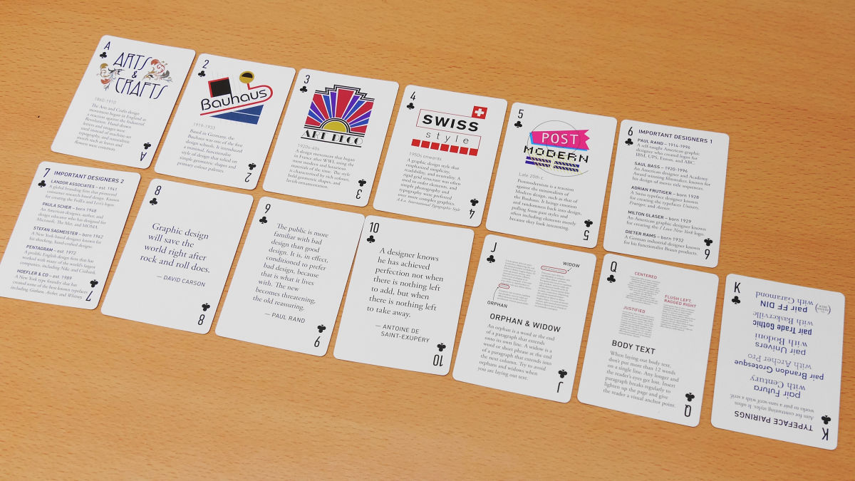
From 1 to 5, commentary on the prosperity of design. 1 is an epidemic of handwritten design caused by the reaction of British industrial revolution, 2Legendary art school "Bauhaus" disappeared in only 14 yearsGerman movement centering on, 3 is FranceEarl Deco, 4 isFlat designIt is written about the movement that happened in Switzerland as a forerunner of the movement, and just by watching the illustration, the atmosphere of the movement that happened in each country is transmitted.

Also, from 6 to 10, a list of names of historically important designers, "People prefer bad designs because they are familiar with designs that are bader than good designs in their daily lives, It is because the new thing is a threat, "the designer's saying and such are written.

In addition, there are tips to keep only one letter or one clause on the last line when you divide the text into paragraphs, a card that explains the tricks to fit in a maximum of 12 characters per line Also.
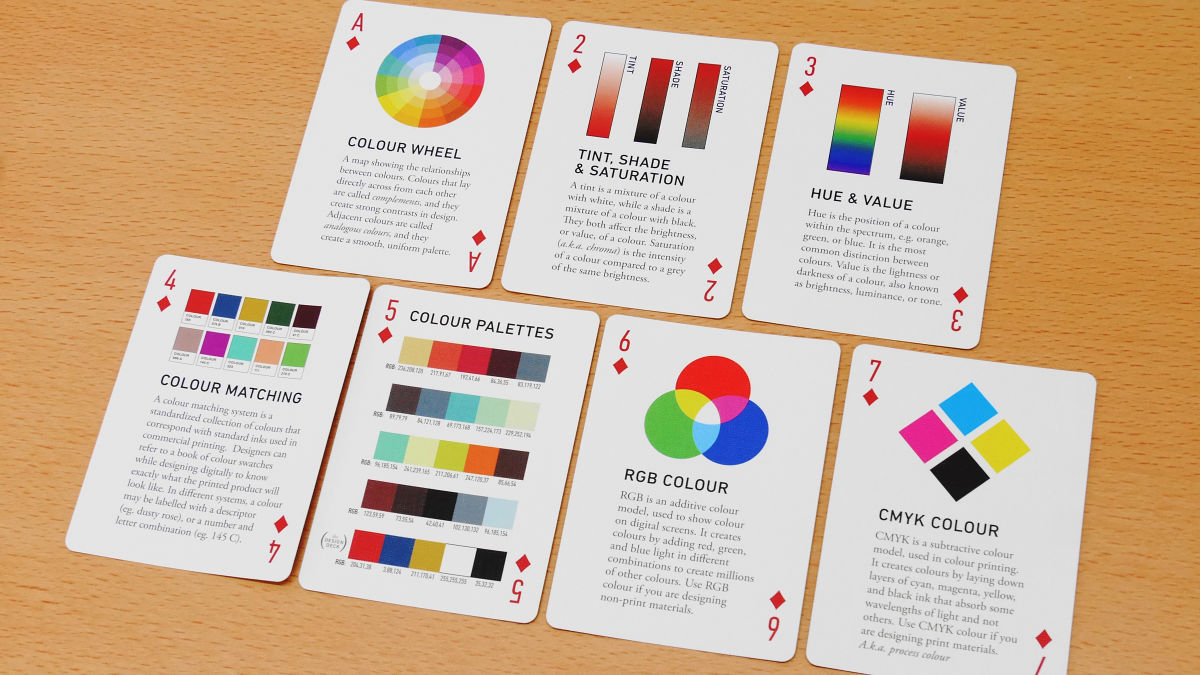
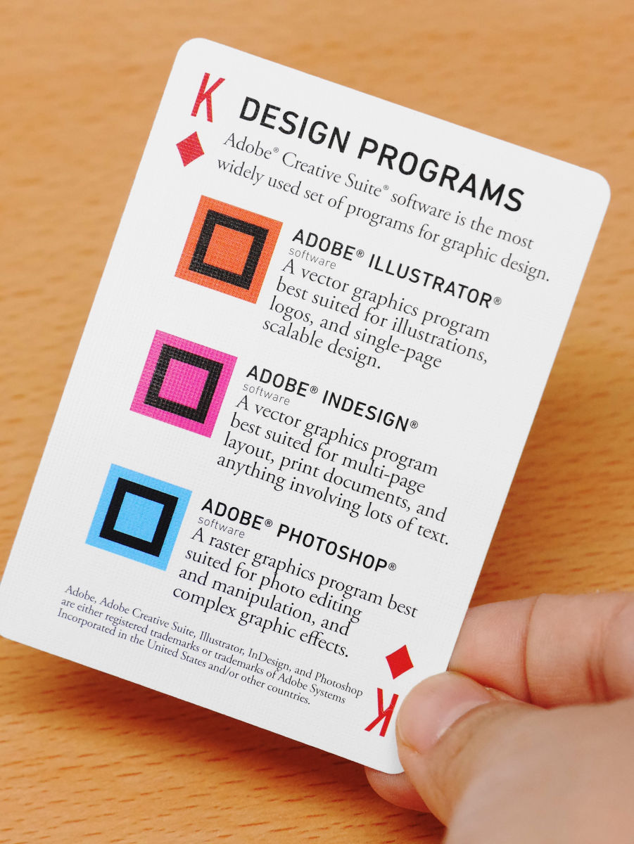
Diamond cards were written about information on color and about designing.
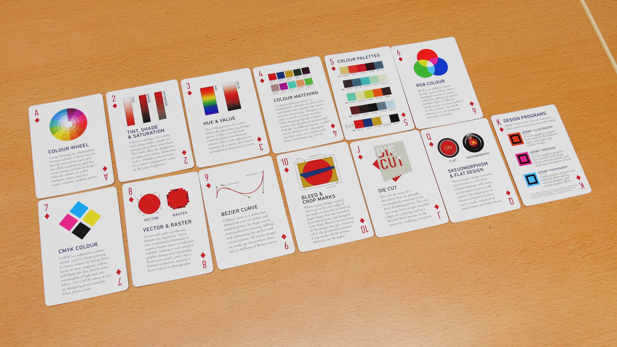
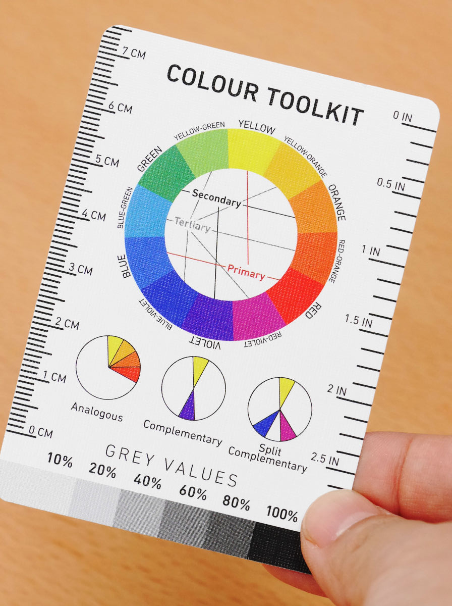
Commentary on each term such as color wheels, "tint" with white added to color, "shade" with black added, "tone" with gray added, color palette etc.
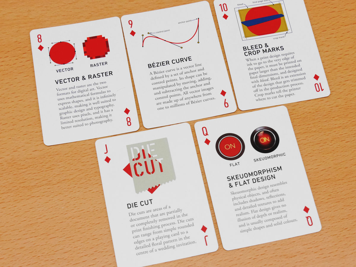
Further about the difference between vector & raster and Bezier curve.
Lastly the difference of design software etc was written.
In addition, spare cards were not white blanks, etc., but a guide of color tool kit and typography was written exactly.
It is no longer a "card" rather than a "book" rather than a volume of information, even if you are looking at it carefully can be enjoyed very much. If you play card games between designers, you can also put in meaning as "You give me this card!" Also, it seemed likely to skim the card with the game getting caught.
Although The Design Deck is $ 19.9 (about 2100 yen), it is 17.9 dollars (about 1870 yen) due to sale at the time of article creation.
The Design Deck - Purchase The Design Deck
http://www.forrestgoods.com/shop/the-design-deck

Related Posts: