Google designers are publishing design guidelines such as Google icons
The icons of Chrome and Gmail are simple, and it is distinctive that they are designed to make it easy to understand what the icon shows by just using it. Google's graphic designer Roger Odon said Google's icons and logo design guidelines that could be said to be such a company secretBehanceIt is open to the public.
Google Visual Assets Guidelines - Part 1 on Behance
http://www.behance.net/gallery/Google-Visual-Assets-Guidelines-Part-1/9028077
Google Visual Assets Guidelines - Part 2 on Behance
http://www.behance.net/gallery/Google-Visual-Assets-Guidelines-Part-2/9084309
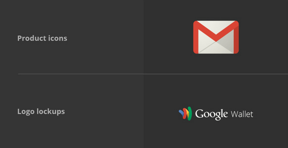
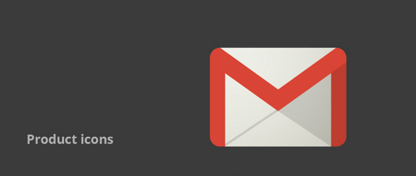
Product icon and logo lockup
The product icon is simple, modern, friendly and varied in design. Some of the product icons may contain letters, but they can also be figurative, symbolic designs to show the purpose of the icons.
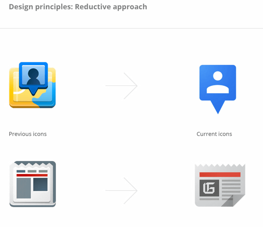
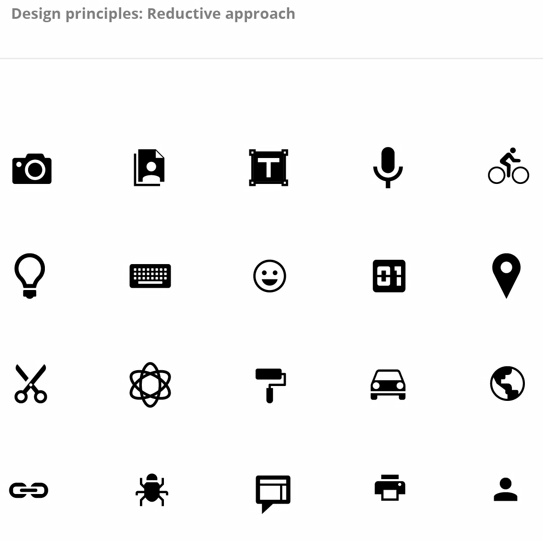
The principle of icon design is roughly divided into four, one isRemoving wasteful thingsis. The icon displayed on the left is the icon previously used, the icon on the right is the icon currently used in 2013.
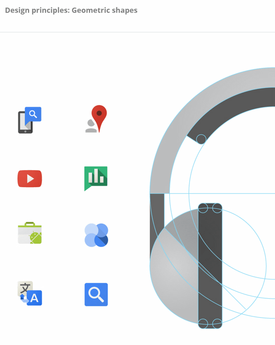
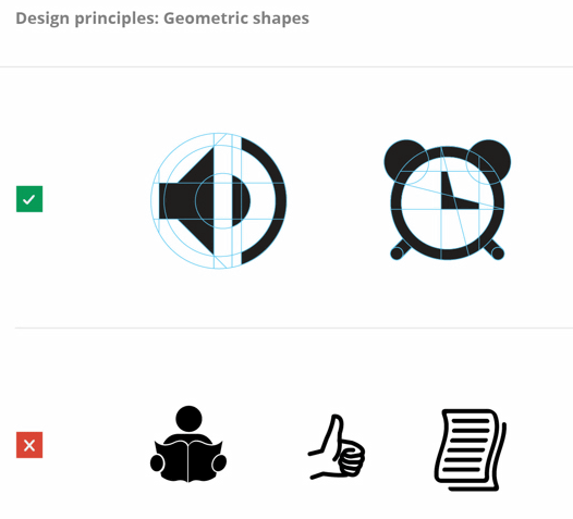
Principles of the second icon design are circles, triangles, rectangles, etc.Geometric figureUse of.
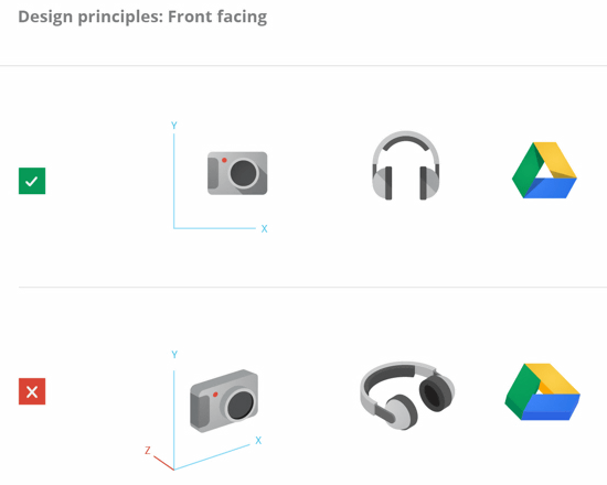
The third one isFacing frontThat.
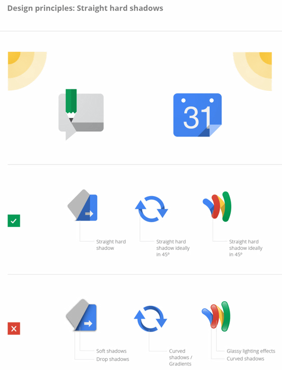
The principle of the last icon design isUse linear and dark shadowsis.
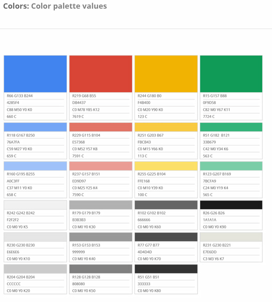
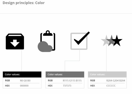
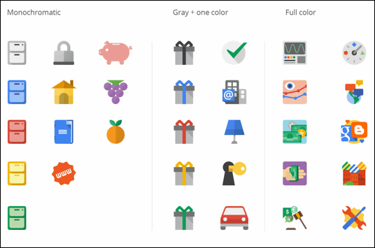
Icon design color scheme is like this.
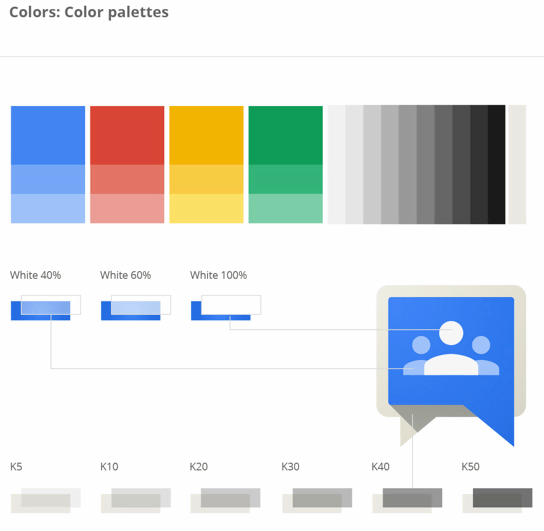
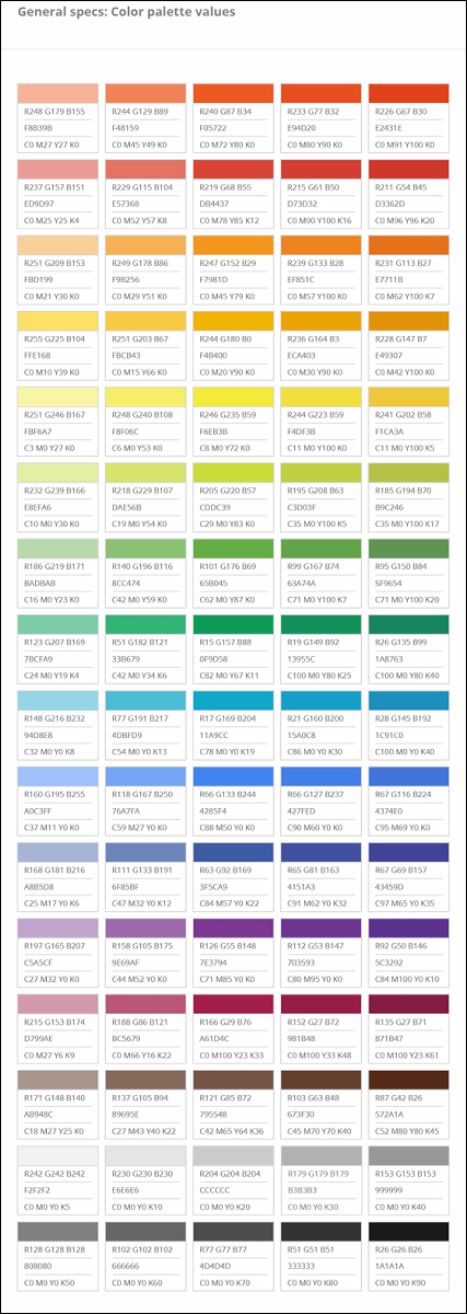
The color scheme sample is as follows.
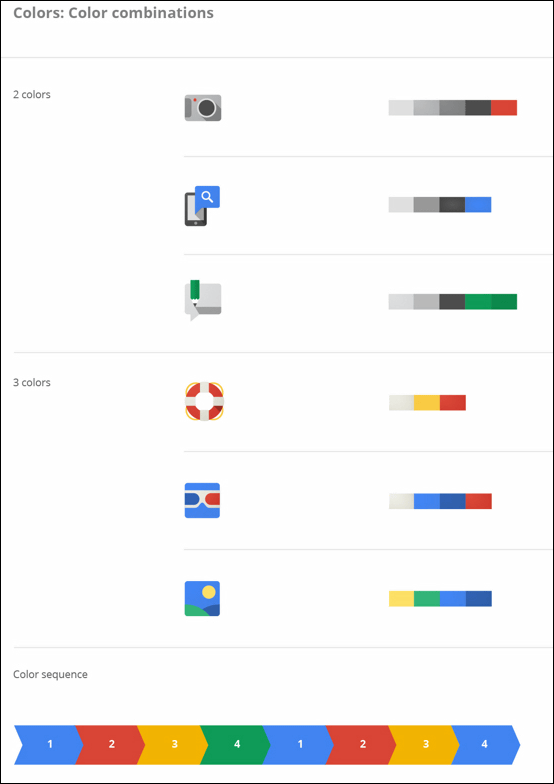
The color combination of the icon design is basically two colors or three colors.
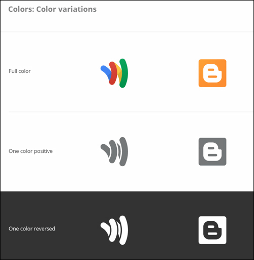
Color variation is like this.
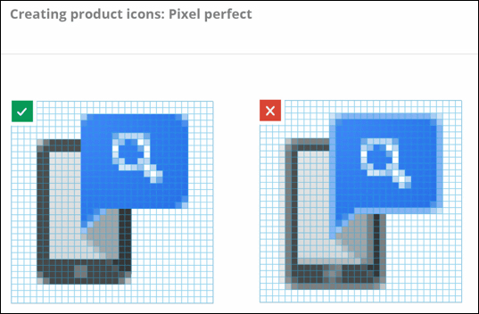
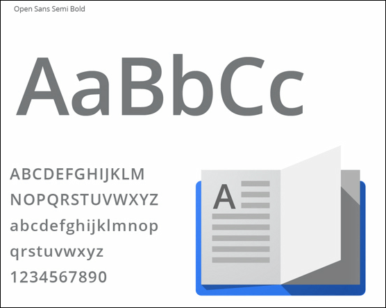
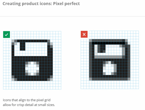
The product iconPixel PerfectIt is finished.
I was conscious of the pixel perfect used for product designtypographyI feel like the following.
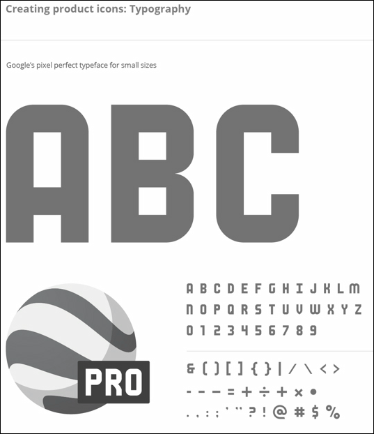
Open Sans Semi Boldfont
The shape of the product icon is square, circle, rectangle, or it is a complicated combination of several shapes.

When I adjust the size of the 32px icon to 16px, it looks something like this.
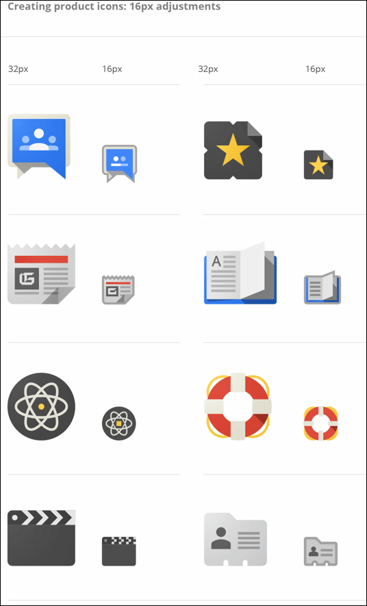
The icon on the left is a bad example, the one on the right is the right one.

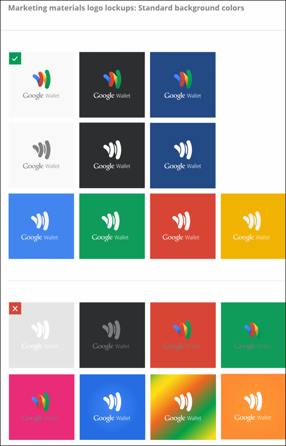
Logo lockup is usually a combination of product icon and name.
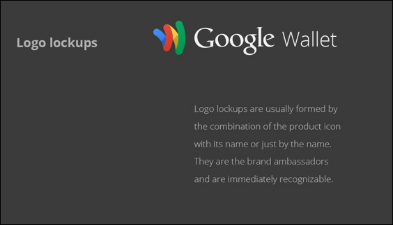
Google WalletThe logo isProduct icon·Google Logotype·Product nameIt is a design combining the three elements. The font uses Open Sans.
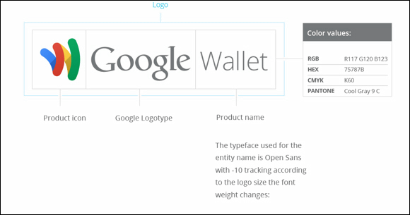
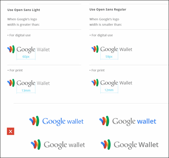
Depending on the size of the logoOpen Sans LightWhenOpen Sans RegularI use different
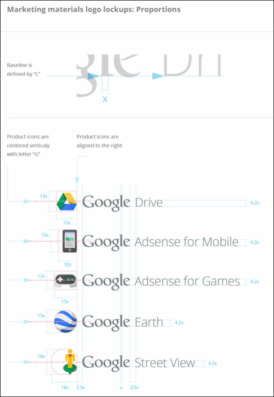
The bottom of typography is alwaysLIn the form of product icon centered on GoogleGIt is aligned with the center of the letter.
The color variation of the logo looks like the following.
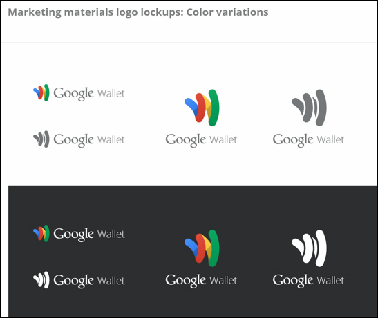
Logo background color
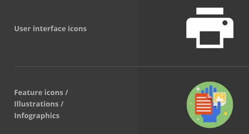
User interfaceicon·Feature icon· Illustration · About infographics.
The user interface icon represents a command, a file, a device, or a directory, and the trash can, print, save, etc. are also included in the user interface icon.
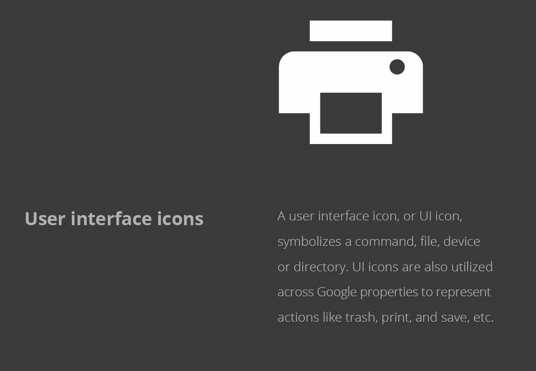
To the simple design which cut off extra parts like the product icon.
The principle of design is to use geometric figures. This area is similar to the product icon design.
User interface icon color scheme.
Just like a product icon to pixel perfect.
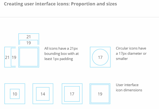
All user interface icons have an inner box and 21px with 1px marginBounding boxDesigned to. Circular icons are less than 17px in diameter.
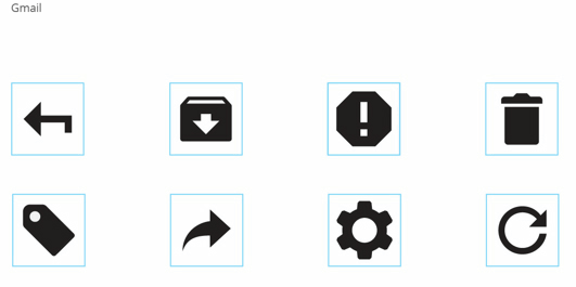
G Mail icon collection
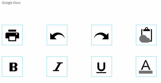
Icons used in Google Docs
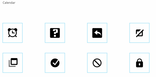
Calendar icon collection
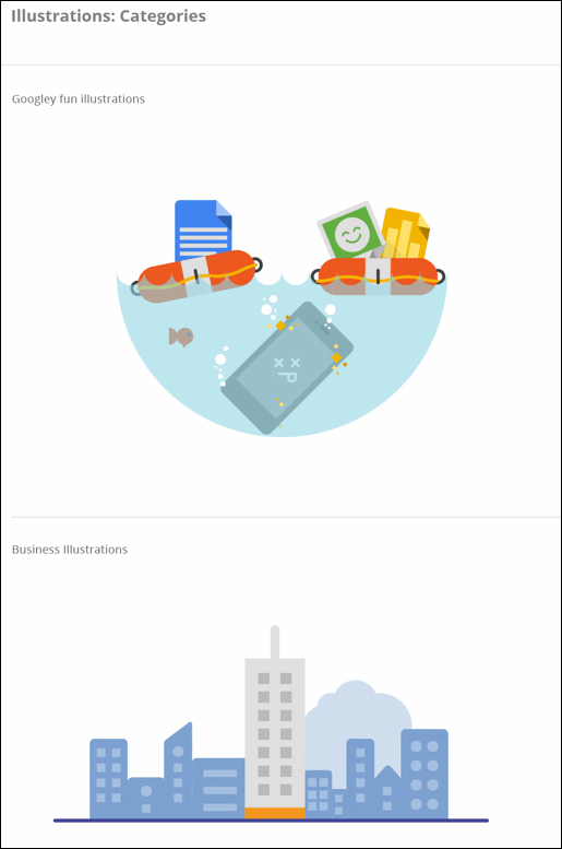
Feature icons and infographics are included in the illustration category. Illustration is friendly and modern, and exists to support reading context from graphics.
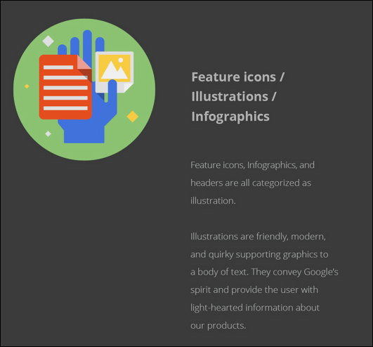
Illustration includes "Google fun illustrations"When"Buisiness Illustrations"there is.
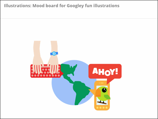
Google fun illustrationsMood boardIt is like this.
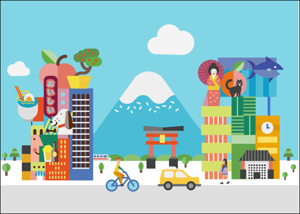
This is like an illustration designing Japan and Japanese and Mt. Fuji are drawn.
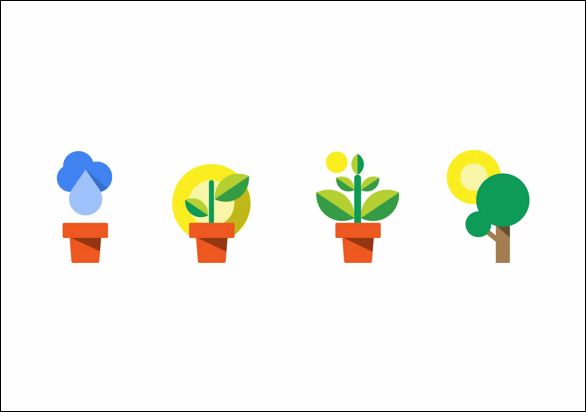
Simple expression of plant growth
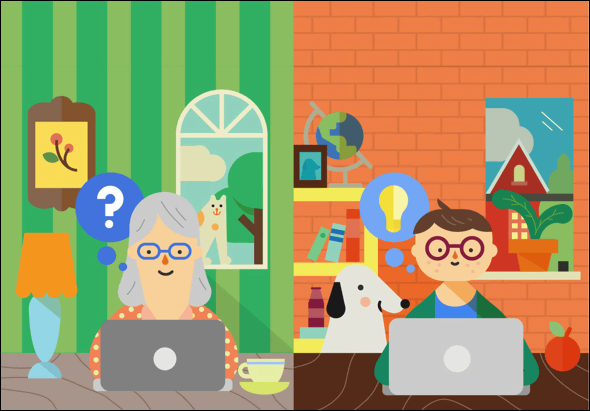
Landscape with parent and child PC
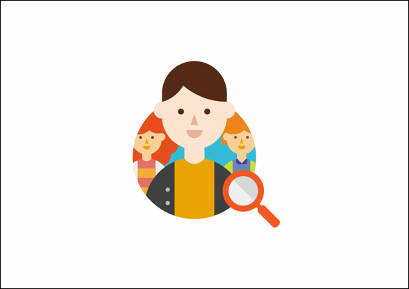
The eyes, nose, mouth and outline of the person seem to be all the same design.
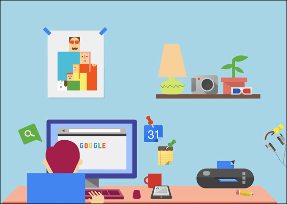
The boys' room is like this, the design which is based on the flat but the depth is felt.
Is it a circus or something?
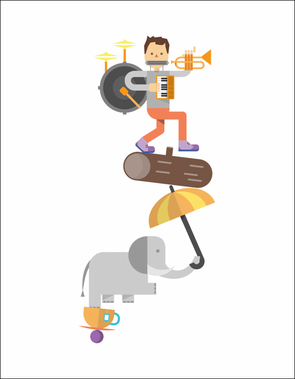
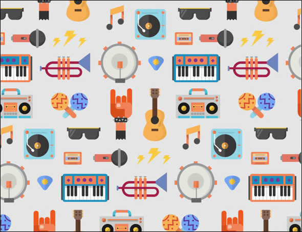
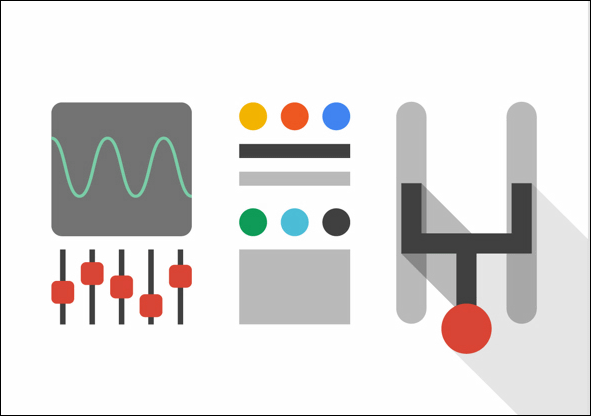
Many instruments
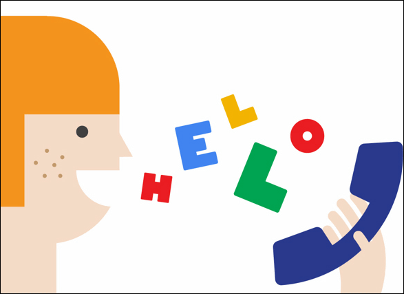
A girl who calls "Hello". Good place to express everything with simple straight lines, curves and colors only.
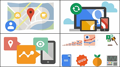
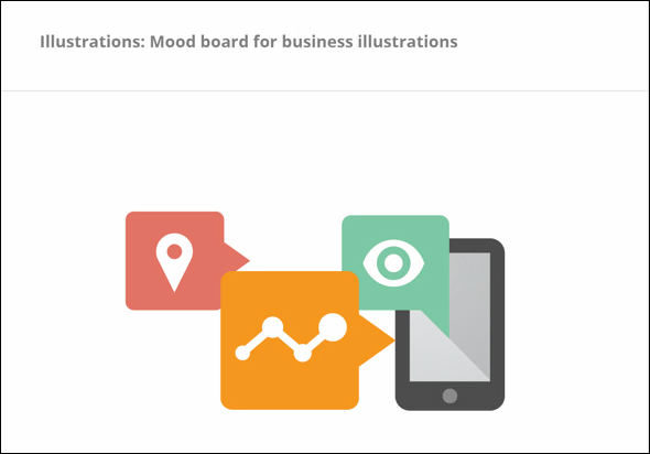
Business illustration mood board
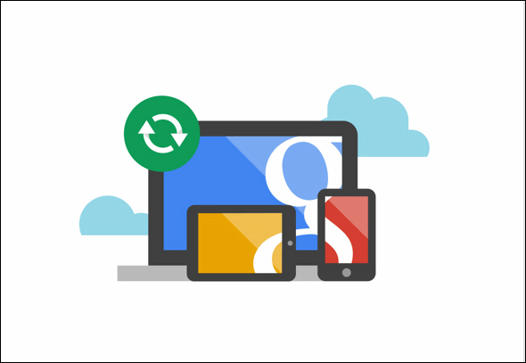
Information can be accessed and used by all of smart phones, tablets, desktops and laptops.
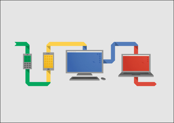
Express that all Google services are synchronized and accessible from any device using three device icons etc.
An airplane cockpit design
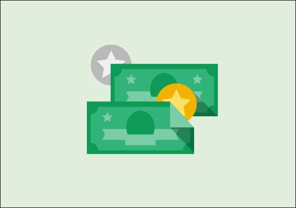
Cute drawn money
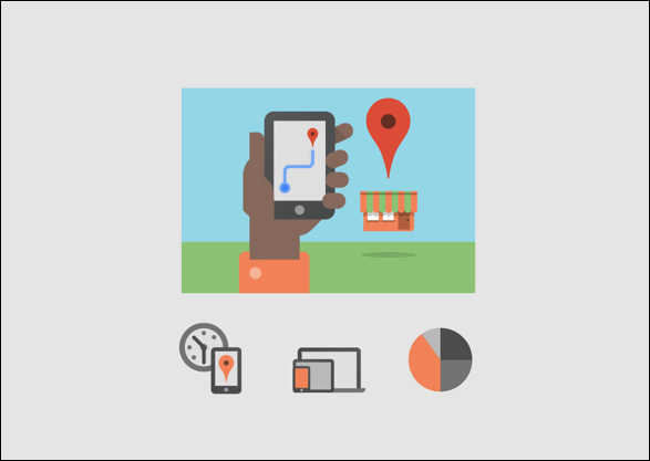
Familiar Google Maps
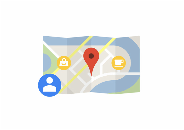
Where I am looking for a destination on my smartphone
The size and color of feature icons are as follows.
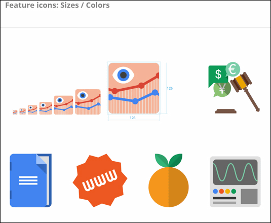
The feature color sample of the feature icon is as follows.
Related Posts:
in Design, Posted by darkhorse_log