Until you can hear the sound, feel the atmosphere, until the manga `` Ameamefurefuresoyanode '' logo is created
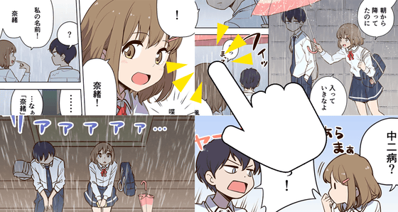
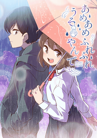
In the boy-meets-girl manga '
[Free manga] candy candy touching episode 1 episode 'rainy girl and rain man'-gigazine
https://gigazine.net/news/20200403-ameame-furefure-usoyande-01/
We asked
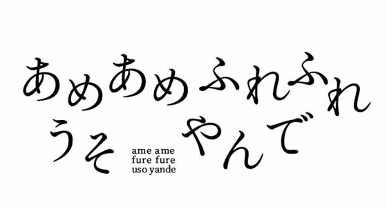
The 'AmeAme' logo has a rough proposal in a slightly special form. Because at the time of logo creation, it was not decided whether the title would be in the form of only hiragana, 'Ameamefurefuresoyanode', or it would be kanji mixed with 'Rain and rainfurefurure lieyande'. Therefore, we proposed 'Hiragana Logo Design' and 'Kanji Logo Design' respectively, and decided to decide on the title logo while determining the official title based on the feeling of the logo.
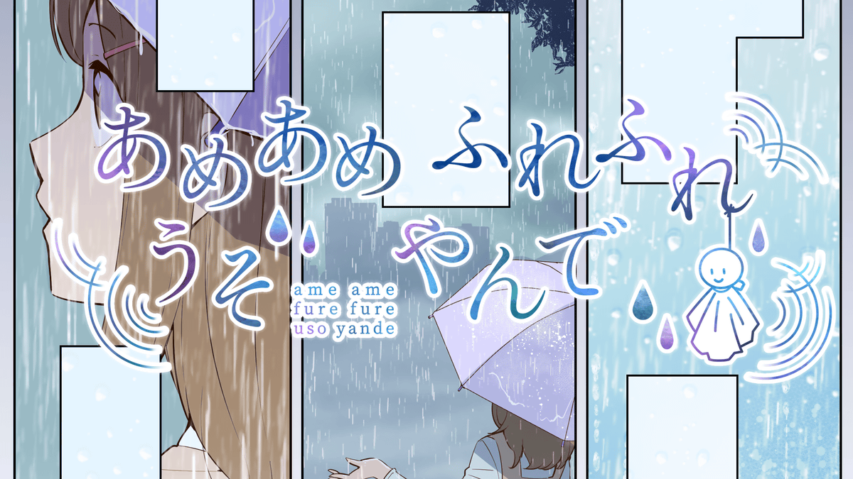
Hiragana version and Kanji version of rough A plan. aoya 'I thought about being closer to serious. I felt that the atmosphere of the story was moist, so I created it with a simple and calm image without much jerking. I personally like having a space between them. ''
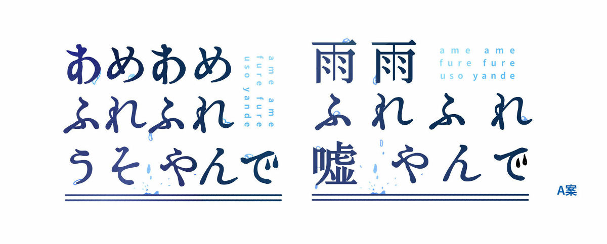
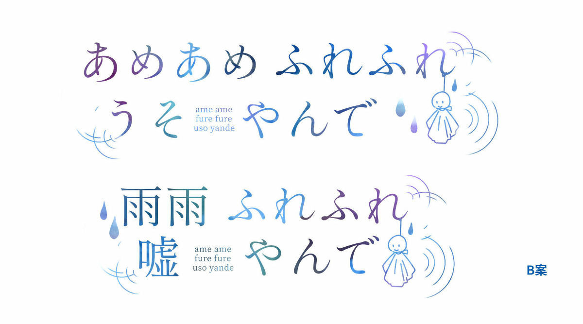
Plan B with vivid gradation. aoya 'The idea of' A 'has become tough, so it is a simple and calm atmosphere, aiming for a slightly calm atmosphere. I added the motif of Teru Teru Shabu. '
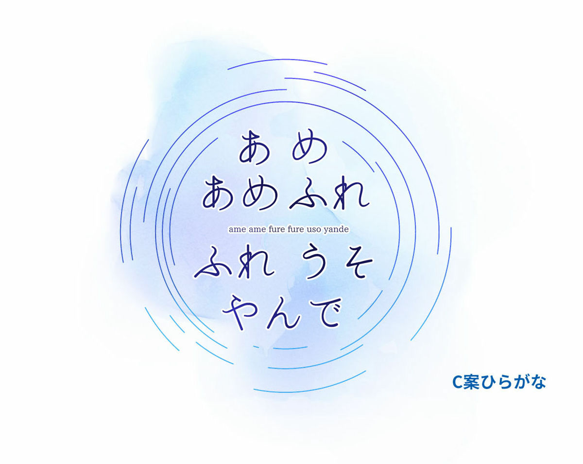
Plan A and Plan B had the same design but different versions of Hiragana and Kanji, but Plan C had different designs proposed for Hiragana and Kanji. C Hiragana is a stylish design that is rounded and can be used for anything. aoya 'Unlike Plan A and Plan B, Plan C was created with a slightly different kind of feeling. The Hiragana plan is an image in which the title is floating in the ripples of water. It will be a round image I created it with consciousness like that '
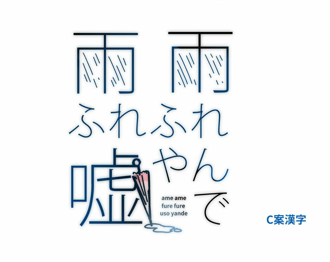
C-kanji is a mature design that looks like a drama or movie. aoya 'I thought about a design that could only be expressed in kanji. I tried to create an atmosphere like a downpour in' rain. 'Unlike the Hiragana plan, this one was conscious of a square silhouette I will. '
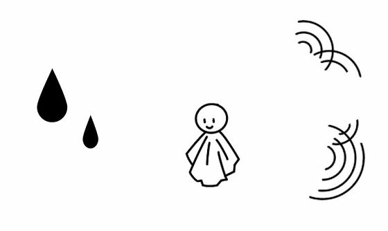
After examining all of the proposals together with the original and drawing staff, they agreed that they would particularly like Plan B. The icon of the Teru Teru shabu is so favorite that the opinion 'I want you to adopt it regardless of the design' appears. The official title of the manga was decided as 'Ameamefurefuresoyanode' because 'I thought the Hiragana plan was good overall'. In addition, I asked for re-tweaking that it may be a bit thin when it is overlaid on the cover of a manga, etc., so fine-tuning it, and adjusting the character spacing because hiragana increases the number of characters.
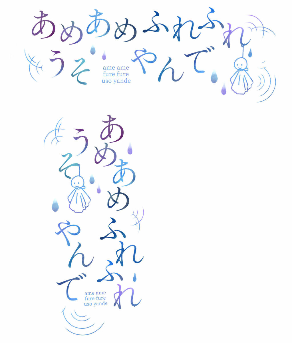
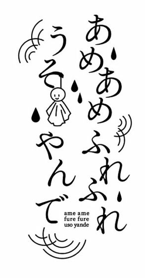
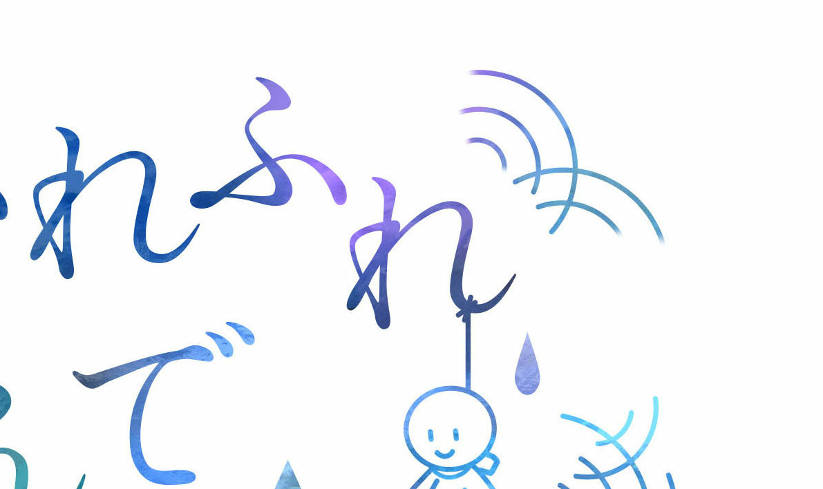
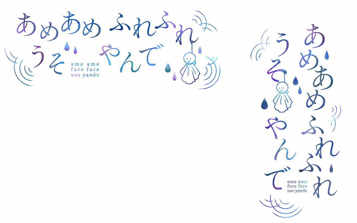
Final decision proposal. aoya 'I will also create a vertical version of the rough with the decided B plan. At the same time, I am also working on the retake you requested. If you arrange the letters vertically and vertically, you will have a little lonely space, We increased the motif of water drops. ''
aoya 'I will make a finished version based on the rough. For the time being, I will type letters based on the rough. This time I wanted to make the color a gentle color like watercolor, so until the shape is completed, it will be solid black It's not an individual character, but an image that paints the whole color. ''
aoya “The approximate position of the characters has been determined. I am still lonely because there are no motifs.”
aoya 'I will create a motif. The ripple motif is a little longer with the goal of fading out the end of the line later.'
aoya 'I have placed the motif. The terrible shaven that I created first was a bit too thick and floated, so I adjusted the line to be thin.'

aoya 'I also made a vertical version. In fact, the vertical part is slightly longer at the protruding part of' so 'to hang the shaved shaven.'
aoya 'From here, I'll change the software to an illustration creation software. I will apply a gradation to the picture as if it were a color. I will add a purple accent to the blue-dark blue-light blue gradient. Was put in. '
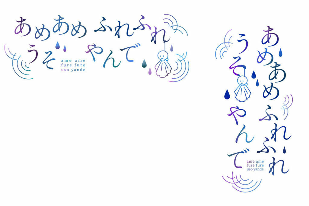
aoya 'I will apply an effect to increase the overall watercolor effect. It is hard to understand, but the left side of the image with the effect has a rough texture, like a little watercolor paper.'
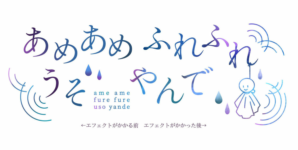
aoya 'Finally, we're going to fade out the edges of the ripples. At the very end, the width of the fade-out is slightly longer.'
aoya 'Completion!'
The first episode of 'Ameamefurefuresoyanoide' using such a title logo can be read from the following.
Rainy Day
Related Posts: