What happened when a company's new logo was criticized for looking like briefs?
Our Logo Looks Like Underpants: A Case Study in Internationalization
https://blog.rjmetrics.com/2013/10/09/our-logo-looks-like-underpants-a-case-study-in-internationalization/
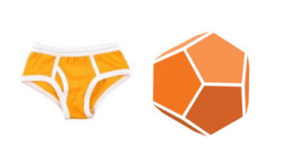
Here's the new logo that RJMetrics created.

A few weeks after unveiling their new logo, RJMetrics was met with the following tweet:
'Why does RJMetrics have a Y-front logo?'
@RJMetrics Why is your logo a pair of Y Fronts?
— Stephen Johnstone (@stitges) September 3, 2013
Robert J. Moore, CEO of RJMetrics, had never heard the term 'Y-front' before, so he didn't understand what it meant at first. However, he noticed that many people pointed out that the RJMetrics logo looked like a Y-front in other tweets, such as 'RJMetrics' tweet was displayed as an ad. Their logo looks like a Y-front.'
@RJMetrics just appeared as a promoted Tweet. Their logo looks like Y-fronts.
— Ant (@antinbath) September 4, 2013
'Your logo looks like a Y-front?'
@RJMetrics hi... is your logo supposed to look like a pair of 'Y' fronts??
— Richard Parry (@Pazzzer69) September 7, 2013
'The logo looks like a giant Y-front. Is this intentional?'
@RJMetrics I've just noticed that your logo looks like a giant pair of orange Y-Fronts - Is that intentional?
— Michael Bolton (@MichaelBoltonA) September 11, 2013
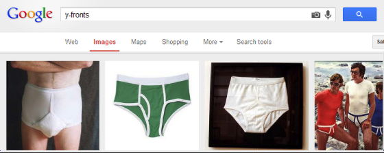
Then I Googled 'y-fronts' and discovered that it was a word that referred to briefs.
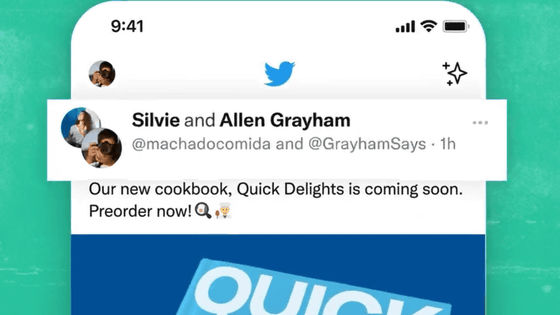
RJMetrics used a Promoted Tweet to unveil the new logo, and some of the thousands of users who saw the tweet pointed out that it looked like orange briefs.
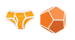
Unfortunately, no one at RJMetrics thought that the logo looked like a briefcase while they were designing it. Also, if you take a quick look at the profiles of Twitter accounts tweeting that the logo looks like a briefcase, you'll see that they were all British place names, such as London, Aylesbury, Gloucestershire, and East Sussex, so it's not like people from every country were tweeting that the logo looked like a briefcase.
Moore was surprised that only people in the UK were saying that the logo looked like briefs, even though he had promoted the tweet worldwide. So he used Google Surveys to ask 1,000 randomly selected people in both the US and the UK.
The question was, 'What does this object look like to you?'
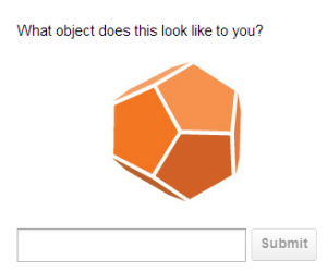
The most common answer in both countries was a 'soccer' or 'soccer ball.' The second most common answer was a 'geometric shape,' such as a dodecahedron. Only 0.2% (2 out of 1,000) of Americans and 2.6% (26 out of 1,000) of British people said Y-fronts or underwear.

Moore discovered and read an article called '
The RJMetrics logo features an upside-down Y, which reminded me of Y-Front, a company that also has a 'Y' in its name.
The white background made the edges of the logo look like rubber bands.
・The American underwear manufacturer Jockey became established and underwear came to be called 'Jockey,' so there were few responses for Y-front in the United States.
- Y-fronts (briefs) are a more common underwear style in the UK than in the US
- British kids often say things like, 'I think you're wearing Y-fronts,' and it's possible that Y-fronts are deeply ingrained in the British psyche.
It's unclear whether these are correct or if there are other factors at play, but Moore writes that 'the Y-front seems to be unique to the UK,' and that 'when RJMetrics created the logo, there were no British people on the team, so we missed this entirely.'
After that, it was quickly shared within RJMetrics that 'the logo looks like orange briefs,' and it is becoming an unspoken understanding that wearing orange underwear is an RJMetrics enthusiast.

Unfortunately, the change in the logo did not have any marketing benefits, so RJMetrics changed the logo to make it look more like a dodecahedron by thinning the white lines.
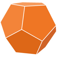
After making this change, we again used Google Surveys to ask British consumers, 'What does this logo look like?' As a result, only four out of 1,000 people answered 'Y-front (brief)', so the effect of the logo change was clearly felt. In addition, Moore wrote that the number of people who answered 'the logo looks like a soccer ball' and the number of people who answered 'the logo looks like a geometric iron shape' were about the same as the number of people who answered 'the logo looks like a geometric iron shape', and that the shape was recognized more correctly than the original logo.
Moore said the lessons he learned from these experiences were: 'Every day there is something new to learn, and you can never be disappointed by the experience.'
Doing business internationally means testing all new images and terminology internationally too
Thousands of new people interact with our business every month, so strangers have no qualms about pointing out mistakes.
Hackathons can be a great resource for initiating new ideas and proving concepts, but they should not be used to avoid due diligence for big business decisions.
Testing a new logo on a large, global audience is just a few clicks away with Google Surveys
Related Posts:
in Design, , Posted by logu_ii
