What is the overseas response to the PlayStation 5 logo design?
Prior to
Sony reveals new PS5 logo, which looks familiar-Polygon
https://www.polygon.com/ps5/2020/1/7/21054766/sony-new-ps5-logo-holiday-2020-release
Jim Ryan, President and CEO of Sony Interactive Entertainment (SIE) , which engages in the game-related business in the Sony Group, announced the PS5 logo design.
Today, SIE President and CEO Jim Ryan will take part in a Sony-sponsored conference ahead of the International CES 2020 home appliance trade show in Las Vegas, and will advance the PlayStation 5, which will be launched during the year-end sales season this year. We looked back on various specifications and functions, and unveiled our logo design for the first time! # PS5 pic.twitter.com/3srKmM5GwZ
— PlayStation Official (@PlayStation_jp) January 7, 2020
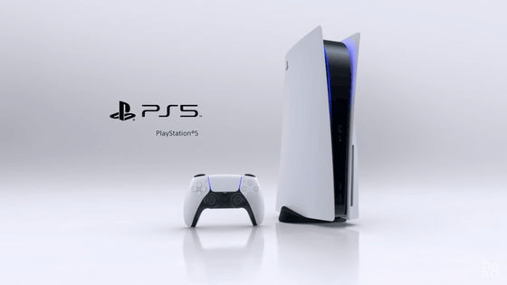
The logo design of PS5 that Sony unveiled for the first time is as follows.
![]()
Regarding the new logo design of PS5, overseas game media Polygon pointed out, 'Everyone is joking about logo design.' The reason is not only that the logo is formed with white text on a black background, but also that the font typeface used for the logo has not changed since PS4.
It is obvious that the evolution of the logo design from PS4 to PS5 was not so big, but Ryan CEO who announced the logo said, 'I am happy to be able to show the new logo for the first time!' It has been pointed out that this has led to more Internet users' attention.
A tweet saying 'Sony's lead graphic designer must have come up with the PS5 logo design in this way!', A video that shows how to delete 4 of the PS4 logo and enter 5 in the same typeface Attached.
Sony's lead graphic designer coming up with the # PS5 logo #SonyCES pic.twitter.com/7xOJXBWHCF
— Chris trenary (@bagel_chris) January 7, 2020
In the tweet, 'We're fit for the PS5 logo font,' the font used for the PlayStation 3 logo represents 'PlayStation 5'.
The PS5 Logo Font we deserve pic.twitter.com/p4SCG94oOI
— Pan-Pizza: Watch Seis Manos Netflix (@RebelTaxi) January 7, 2020
An ironic tweet saying 'The brand new PS5 logo is amazing. It must have taken several years (design).'
Great to see that totally new # PS5 logo.Must have taken ages. # PlayStation5 pic.twitter.com/OFLQdVFRQ5
— Dan Grabham (@dangrabham) January 7, 2020
'Forget about the new PS5 logo! I will leak ideas from the Sony design team about the evolution of the next four generations of PlayStation logos,' tweeted, and the logo design change from PS4 to PS5 will continue in the future After that, we released a predicted image that the logo design would change like this.
Forget the PS5 logo reveal, I have an exclusive leak from Sony's design team of their ideas for the evolution of the PlayStation logo over the next four generations! Pic.twitter.com/p4vakgphAx
— Andy (@ _kou42_) January 7, 2020
In the tweet that the PS5 logo is revolutionary, the PS5 logo has been rewritten to piss.
PS5 logo is revolutionary pic.twitter.com/ncn6xBswVf
— Cyranek (@Cyranek) January 7, 2020
'Jim Ryan said, 'I'm glad to show you the new logo for the first time!' ...' in a tweet saying 'I don't know what to expect.' The image of a man with a facial expression is attached, and it seems as if he speaks for the expression of many users who saw the PS5 logo.
Jim Ryan at CES: we're excited to share our new logo for PS5 pic.twitter.com/v6pS4nSm2B
— Liam Allen-Miller (@RSSLiam) January 7, 2020
In addition, a tweet summarizing the logos from PS2 to PS5 (the PS3 logo is of a new design) says, 'Some people point out the badness of the PS5 logo design, but it looks like usual.'
People talking about how bad the PS5 logo is ... but it ... looks like how it always has ... lol.pic.twitter.com/Z3JX0ShvNb
— Jade☄ (@Wildbergerrrr) January 7, 2020
On Reddit, an overseas bulletin board site, a GIF image that turns the PS4 logo into a PS5 logo has been posted to point out that 'is the PS5 logo created this way?' In response to this GIF image, it was pointed out that `` It seems like you lost the font but you need to add new characters '' or `` On the contrary, it is very reasonable, fit and perfect correction (lol ) 'And a statement stating that' consistency is important ', and a request to the Xbox that' if Microsoft consoles have this level of consistency '. Note that the PS5 logo in the GIF image is slightly different from the actual PS5 logo.
Sony Designing The PS5 Logo: gaming
Although it is a PS5 logo that is often strictly evaluated overseas, some Japanese users trace the successive PlayStation logos and make subtle changes such as `` It seems that the rounded atmosphere has changed compared to PS4 or earlier '' Some people point out.
I immediately traced the PS5 logo.
— Seiji Miyazawa | Third Floor Lab (@onthehead) January 7, 2020
Although it was not a high-resolution image, I didn't know much about the details, but it seems that the atmosphere of the rounded corners has changed compared to before PS4.
Later, S became a little longer in PS4, so it seems like it has returned to its original shape. '4' has a large space in the upper left, so I feel like stretching the horizontal bar of S and packing 4 to the left. pic.twitter.com/QdsG3oWQ1N
In addition, opinion that it is not necessary to change ……
The # PS5 logo, as expected, is said to be 'a little more twisted' or 'ordinary', but if you twist it, you will be told that 'it's extraneous', so don't take it for granted.
— RB Taiputsuhi (@Tai_Consa) January 7, 2020
I think this logo is 100 points. There is no need to change. You don't look interesting because you're not interesting.
Some say it's simple and good.
I think this is simple and good without the PS5 logo going in a strange direction pic.twitter.com/MMDsFKj5CE
— ???? Kusa ???? (@ MaskedRider_913) January 7, 2020
Familiar designs seem to be well received in Japan, and the reaction is the opposite of overseas.
Related Posts: