Design change of Google search results, where and how has it changed?
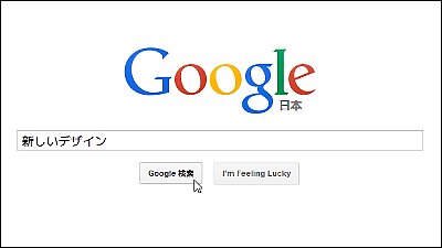
In the mobile version of Google search, the new design was tested, such as removing the underbar attached to the search result link, but the top designer of Google searchJon WileyHe announced that he changed the design of the desktop version as well. The text of the search result is displayed larger, and the display method of the advertisement label is also changed.
Jon Wiley - Google+ - You may have noticed that Google Search on desktop looks a ...
https://plus.google.com/+JonWiley/posts/AuUAQCWJpki
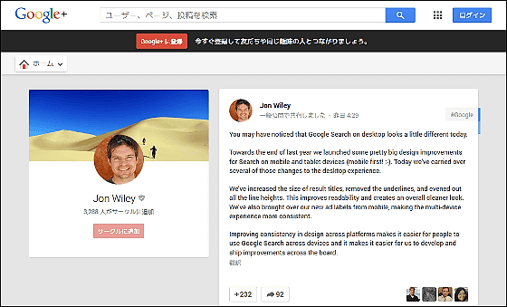
According to Jon Wiley, he changed the design of the search result page of desktop version of Google search to "a clear look with emphasis on readability". It was unified into the same design as the mobile version, the underbar was removed from the link, the text size increased and the advertisement label was changed. The following are new designs.

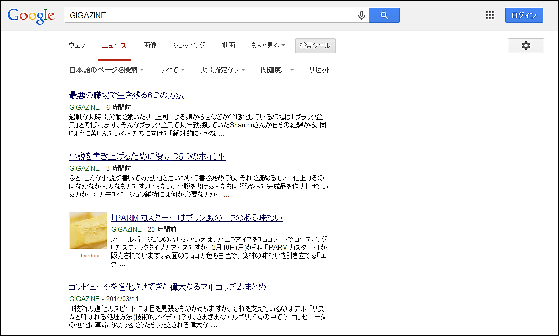
In addition, it seems that under items such as "news", "shopping", "books", etc. other than "web" have underscores and advertisements are displayed as old designs.
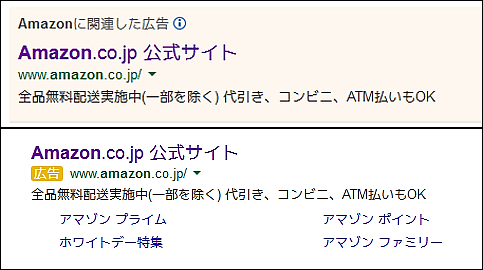
Below is the comparative image of the old design on the top and the new design on the bottom. The advertisement label has a pink undercoat disappearing and becomes white, with a yellow label written "advertisement".
On Wiley's Google+ page, a lot of comments on the whole are received, and in addition to this, "Although the white spaces have become easy to increase, it seems weird if there is no underline under the hyperlink ...... Some people said, "Typography in Firefox is strange! Well, somehow I got used to the sudden design change of Google ...". Based on this feedback, Mr. Wiley commented, "Although it may not be easy for everyone, I want to make Google Search easy to use for many people."
Related Posts:


in Web Service, Design, Posted by darkhorse_log