"Little UI Details" summarizing some tips on UI visual design
TightenYaLaravelSteve Schoger who was in charge of designing@ steveschoger), A moment summarizing the tips on visual design by "Little UI Details"Has been published.
Little UI Details
https://twitter.com/i/moments/880688233641848832
When adding white text on a bright background color, adding a shadow slightly will not only make the characters easier to see but also pops.
Adding a subtle shadow to white text when on a bright background not only makes it more legible but helps it 'pop' more.pic.twitter.com/p9rudeFxvP
- Steve Schoger (@ steveschoger)June 29, 2017
Adjusting the hue by 10 to 20 degrees in both directions makes the gradation look more vivid.
Make your gradients appear more vibrant by adjusting the hue by a few degrees (10º or 20º max) in either direction.pic.twitter.com/Op 8 Wrme 3 V 4
- Steve Schoger (@ steveschoger)June 26, 2017
StripeIt really likes to hover the button a little bit when hovering over the button on the site of the site. When you mouse over the button, the button moves up one pixel and the drop shadow is loaded.
Really love the hover state on Stripe's website. 1px shift up with the increased drop shadow spread.pic.twitter.com/bC7y6pji23
- Steve Schoger (@ steveschoger)June 23, 2017
Applying a slight vertical offset to the box shadow makes it look more natural.
Giving your box shadows a slight, vertical offset helps to make them look more natural.pic.twitter.com/WcPsK8yFwu
- Steve Schoger (@ steveschoger)20th June 2017
Aligning text is an easy way to clean the design and make the content easier to see.
Aligning text is an easy way to clean up your design and make your content much more scannable.pic.twitter.com/KhUT510kW1
- Steve Schoger (@ steveschoger)15th June 2017
Pure gray text is always invisible in colored backgrounds. The easiest way to fix it is to add the hue of the background color to the text.
Pure gray text always looks "off" on a colored background. A quick fix is to saturate your text with a bit of the background hue.pic.twitter.com/eKxW4jSSs8
- Steve Schoger (@ steveschoger)June 12, 2017
If you are using a more prominent icon than text, set it to be slightly brighter than the text if the icon is inactive.
If I am using icons that have more weight than the text, I typically make the icons slightly lighter than the text for inactive statespic.twitter.com/nlqB3Q2uNg
- Steve Schoger (@ steveschoger)June 8, 2017
Using icons such as arrows and checkmarks instead of standard bullets, you can make visual interest in unordered lists.
Using a generic icon like an arrow or a checkmark instead of the standard bullet is a great way to add visual interest to unordered lists.pic.twitter.com/hE5BEKEpqh
- Steve Schoger (@ steveschoger)June 7, 2017
You can add vibrancy to your design by adding a line with a thickness of 4 to 6 pixels at the top of the site.
Adding a hint of color (4 to 6px) to the top of your hero is a simple trick to bring more liveliness to your design.pic.twitter.com/cdwzjRh5NN
- Steve Schoger (@ steveschoger)June 6, 2017
It changes to a nice appearance by using a two-color gradation.
Using a 2 color gradient also adds a nice touchpic.twitter.com/4EVxntQoq 5
- Steve Schoger (@ steveschoger)June 6, 2017
Instead of drawing a key line between the title and the body, this is shown by slightly changing the contrast of the background color.
A technique I've been using lately on panels to distinguish the titles instead of a keyline is using subtle contrast:pic.twitter.com/RWOcPZR 8 Xh
- Steve Schoger (@ steveschoger)June 5, 2017
In addition to size and thickness, using color and contrast is the best way to create a printed hierarchy.
Along with size and weight, using color and contrast is a great way to create typographic hierarchy.pic.twitter.com/TkIMj39Urj
- Steve Schoger (@ steveschoger)June 2, 2017
If not decided it is best to use a 16px font 1.5 lines high for body copy.
If in doubt, 16px font with 1.5 line height is pretty good safe for body copy.pic.twitter.com/s2opWaBT0l
- Steve Schoger (@ steveschoger)June 1, 2017
Text in bold text may sometimes be difficult to read. Consider adjusting the character spacing to give room for breathing even in the text.
Quick tip: All-caps can sometimes be difficult to read. Consider using letter-spacing to give your text a little more room to breathepic.twitter.com/FCQk0vrZE 9
- Steve Schoger (@ steveschoger)May 31, 2017
Technique to make a stylish map even without graphic design skills.
How to make a stylish map with no graphic design skillspic.twitter.com/CluMrSpSSX
- Steve Schoger (@ steveschoger)July 6, 2017
The key line not only splits the content, it also makes it easier for the decoupled content to connect more easily.
Keylines are not only great for dividing content but also making disconnected content feel more connected.pic.twitter.com/Hdx8gTJbJf
- Steve Schoger (@ steveschoger)July 5, 2017
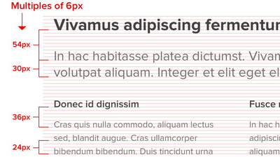
Defining the spacing with multiples is an excellent way to get a vertical rhythm.
Using multiples to define your spacing is a great way to achieve vertical rhythm and offer a formula to justify your choicespic.twitter.com/0MCNFaZVrS
- Steve Schoger (@ steveschoger)July 13, 2017
Picture with low saturation + bold color scheme + CSSBlend mode(blend-mode: multiply) is best for enhancing the contrast between the hero banner and the text.
Desaturated photo + bold color + blend-mode: multiply. Great for hero banners and creating high contrast for text.pic.twitter.com/1BqHw5oyKL
- Steve Schoger (@ steveschoger)July 20, 2017
The overlapping of elements on a page is a great way to make depth and encourage users to scroll
Overlapping elements on a page is a great way to create depth and encourage users to scrollpic.twitter.com/kD9gGUDH 5y
- Steve Schoger (@ steveschoger)July 31, 2017
Negative secondary action buttons work better than normal buttons.
A subtle link for negative secondary actions many works better than a big bold button.
- Steve Schoger (@ steveschoger)August 2, 2017
(Just make sure you have a confirmation step!)pic.twitter.com/lqjBovKA1z
By creating a hierarchy for buttons it is possible to make the button you want to be pressed more prominently.
It's all about creating hierarchy. You want your primary button to stand out much more than your secondary / danger actions.pic.twitter.com/H3pPzWt7fo
- Steve Schoger (@ steveschoger)August 2, 2017
Design may be busy when there are too many boundaries.
Too many borders can make a design look really busy. Here's a few ideas that are a bit more subtle:pic.twitter.com/JEIrjAS5YL
- Steve Schoger (@ steveschoger)August 16, 2017
The two-column form layout is ideal for organizing meaninglessly long forms and filling a wide screen with suitable size forms and text
This two-column form layout is great for organizing long forms and filling wider screens without using awkward long form fields.pic.twitter.com/KbErS8hJHM
- Steve Schoger (@ steveschoger)September 7, 2017
Related Posts:


in Design, Posted by logu_ii