The secret story of the development of "The Legend of Zelda Breath of the Wild" that is touched by a secret part of Nintendo's excellent game is fascinating
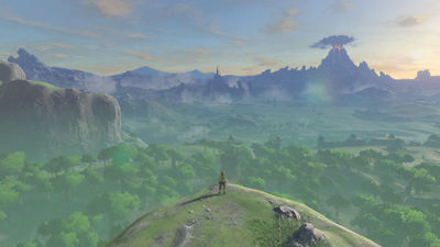
On March 3, 2017Nintendo SwitchIt was released at the same time "The Legend of Zelda Breath of the Wild"Received a lot of praise from the overwhelming high degree of completeness, Nintendo reveals its development secret story, it is very interesting content.
It is Japan's largest conference for game developersCEDEC 2017Among them, Nintendo talked about development secrets of "The Legend of Zelda Breath of the Wild". In the lecture made by Nintendo, from the mouth of the developers involved in the development of the Legend of Zelda Breath of the Wild, a wide range of contents such as project management, 3D graphic art, tool / debugging, sound, UI, field level design etc. He seems to have been, is a production manager of Capcom who participated in thisMatt WalkerHas tweeted about the lecture and it is getting to know a part of interesting contents.
The Legend of Zelda In Breath of the Wild, task management is performed using the following management tool integrated into the game, so that waste in work such as "a different person performs checks at the same place" It seems that it can be omitted.
They are integrated with their tasks by integrating their management tools with the game, so you would not get get people doing the same work twice.pic.twitter.com/ZZsMNSlSZh
- Matt Walker (@ gypsyOtoko)October 3, 2017
In addition, there is also a tool called "Field Task View" that you can see by visually seeing how far progress progresses in the whole of Hailar's Earth. For these developer tools, Walker says, "It is a great tool that multiple developers can exchange ideas on each other about their tasks"Sayis.
There's readily available by clicking on that sign. There's also a "field task view" that was set up for higher level items.pic.twitter.com/Y6jvT7yNSV
- Matt Walker (@ gypsyOtoko)October 3, 2017
And in the field design "Triangle law"Is hidden. For example, by arranging triangle mountains, it is possible to let the player choose one of the two routes of "crossing the mountain" and "detouring".
They explain that using triangles carries out 2 objectives - gives players a choice as to whether to go straight over the triangle, or aroundpic.twitter.com/RPAGk54XGD
- Matt Walker (@ gypsyOtoko)October 3, 2017
Furthermore, by placing a different destination behind the mountain, we will be able to offer the pleasure and pleasure of the search naturally to players.
and it obscures the player's view, so designers can utilize them to surprise players, make them wonder what they'll find find the other side.pic.twitter.com/0ECKE 6 oUv 6
- Matt Walker (@ gypsyOtoko)October 3, 2017
In addition, since the triangle object has the effect of guiding the line of sight to the tip portion, further players can be guided by arranging important elements in the game such as a kog or a shrine.
There's also variations that can be be more visually interesting, to perk the player's interest. Korok seeds are usually found in in.pic.twitter.com/TEcDFwycBB
- Matt Walker (@ gypsyOtoko)October 3, 2017
Nintendo is able to master triangles of different size separately for use, use a large triangle like a mountain as a landmark, a medium sized triangle as a shield for landmarks and routes, and a small triangle as a tempo of adventure A pattern that was incorporated as an element of play to change.
They have 3 different scales that they utilize this principle with as shown here - all to achieve different objectives.pic.twitter.com/FjmNvP0w8l
- Matt Walker (@ gypsyOtoko)October 3, 2017
Of course, not all elements on the field are triangles, but rectangular ones are also used. The triangle is used to gradually reveal the destination etc., but in the case of the rectangle it seems to be effective to completely hide something from sight. As an example, what is introduced in the slide is "trees" which are countless on the field, and remembering when finding mushrooms and bee nests in the shadow of trees, it is true that the rectangle " It is understood that it is used for.
They also used rectangles as shown here. Instead of gradually revealing something, rects are good for completely hiding something from sightpic.twitter.com/oqSp5oMxwv
- Matt Walker (@ gypsyOtoko)October 3, 2017
The slide below shows how extensive the triangle and rectangle are applied in the field design.
You can get an idea for just how widely this concept was applied in this image.pic.twitter.com/ecGGSBfnDn
- Matt Walker (@ gypsyOtoko)October 3, 2017
"Seeker Tower (tower)" that appears during the game is a building for getting a map, so it is so important that you can not keep climbing if you see it. The slide below shows that many triangles are skillfully used in the road when the player heads to the tower.
I skillfully hide the buildings behind it with rocks and mountain skins, and the figure is gradually visible.
Note how the structure in the distance is slowly revealed.pic.twitter.com/hyOFHg7v76
- Matt Walker (@ gypsyOtoko)October 3, 2017
As we go further closer, a tower appears as if drawn from the back of a rectangular building.
Finally, the structure hides the tower in the back, so there's this chain of interest - hill -> bridge structure -> tower.pic.twitter.com/E3lTOKWYrD
- Matt Walker (@ gypsyOtoko)October 3, 2017
Meanwhile, measures taken to skillfully guide players are given to the Legend of Zelda Breath of the Wild.
The following image is a heat map with the route actually moved by the test play participant on the game map. Before any measures are taken, there are many movements along the way on the field, most players adventure on the land of Hyrule with a similar route, but you have not visited many lands I understand. On the other hand, if you look at the heat map after adding measures, you can see that the adventure routes for each player are considerably disjointed and that every corner of the field is broken.
The first map images show 2 heat maps - showing what paths players originally traversed in playthroughs, and then the second map .. ..pic.twitter.com/Bp1X11Gd7H
- Matt Walker (@ gypsyOtoko)October 3, 2017
In order to improve the stage before the measures, when placing a game event between the points with the tower on the field as a point, it seems that Nintendo thought that "Has become just good salt plum!"
how much more well distributed that became after they made this specific change.pic.twitter.com/sNcF 0 bxp 71
- Matt Walker (@ gypsyOtoko)October 3, 2017
However, it seems that this has resulted in the problem that "the feeling of being carried out is strong", "the feeling of one road" can not be denied, "the experiences are separated by people in a bad sense".
Players felt they were being guided, that the game was too linear, and people were having completely different experiences, in a bad way.pic.twitter.com/jEJG4tspWM
- Matt Walker (@ gypsyOtoko)October 3, 2017
Thus, placed between the development team point the object that has the "attraction" as attract players and the point (tower and the tower). This "attraction" of that object with a will, a pattern that points to a small shrine and the demon of the nest, something so that the benefit of the players, such as Umayyad.
placing structures of varying visibility / importance in dffrnt places, leading players in different directions and to get sidetrackedpic.twitter.com/5HKLpUosOe
- Matt Walker (@ gypsyOtoko)October 3, 2017
The strength of the ability to attract players for each element seems to vary depending on size and purpose.
You can see in this image how the different structures rank in visibility - naturally drawing player's attention, and in "objective".pic.twitter.com/xlTargVRHf
- Matt Walker (@ gypsyOtoko)October 3, 2017
Besides that, in the UI design of the game "measures are easy to grasp, do not make it noticeable" measures ... ...
Coallescing information so there are not many places players would have to look.pic.twitter.com/YfIrPgNRjK
- Matt Walker (@ gypsyOtoko)October 4, 2017
Points cautioned in the design of the title screen are also summarized.
For the title menu they chose to make proper use of empty space instead of making the selections large.pic.twitter.com/EZDtLnAszG
- Matt Walker (@ gypsyOtoko)October 4, 2017
Furthermore, we adopt "Zelda White" which is slightly more yellowish than ordinary white color, and adopts it not only to the UI of the game but also to the package, thereby giving a sense of unity.
To help unify the UI they adopted a color they called "Zelda White", which has a bit of yellow. Used in the package and logo as well!pic.twitter.com/anoF4wYrqN
- Matt Walker (@ gypsyOtoko)October 4, 2017
In addition, Japanese fonts displayed in the shrine in the game, etc., in Katakana is "Logo G BlackIn Kanji, fontworks'Raglan Punch"Has been adopted.
Font - they prioritized borderless, simply colored text with zero frills. The overseas fonts were custom made, but for Japanese they usedpic.twitter.com/2hXI92 HMSd
- Matt Walker (@ gypsyOtoko)October 4, 2017
Besides, consideration is given so that information that does not need to be constantly seen in the UI design is displayed only when necessary ... ...
UI Design - direction was was only display information when necessary, which gives the screen more breathing room.pic.twitter.com/psuGrb3GTL
- Matt Walker (@ gypsyOtoko)October 4, 2017
We succeeded in reducing the "feeling of pressure on the screen" that occurs when the UI is displayed all the time.
The Pro HUD was actually created because (presumably) No A / No E asked to clean up the screen and get rid of the more more UI elements -pic.twitter.com/ra1Jk6THhq
- Matt Walker (@ gypsyOtoko)October 4, 2017
Furthermore, regarding ancient seeker technology, it is designed differently from other items for the purpose of constructing and differentiating the world view.
They designed the Sheikah Slate in tandem with the artists and chose to differentiate its design and give anpic.twitter.com/B115VgdWSM
- Matt Walker (@ gypsyOtoko)October 4, 2017
Although there are no detailed tutorials and few elements displayed on the screen, there are few elements to be displayed on the screen, but not to negate the point of "informing the information" originally of the UI, the important elements are designed to be noticeable and noticeable. One such example is that the heart glows white when the link is damaged, it is designed to "look like high quality with a simple UI"And.
decreasing noticeability by making UI and fonts smaller.pic.twitter.com/2 tHegPsGAi
- Matt Walker (@ gypsyOtoko)October 4, 2017
Also, it seems that screen display at game over is expressed by capturing characters, adding distortion texture, and adding distortion animation.
They created a tool they could use to capture textures and modify as necessary for this.pic.twitter.com/pr1FjsRk4x
- Matt Walker (@ gypsyOtoko)October 4, 2017
Besides, the "pouch" screen that houses items seems to express by capturing the game background, masking the left half of the saved background, and adding a pouch screen there.
to add filters & amp; color adjustments to create UI. Image shows how they composed the gear slct scrn, capturing the env, masking and redrawing.pic.twitter.com/nNZDrgw 0 Le
- Matt Walker (@ gypsyOtoko)October 4, 2017
In addition, because there were only two UI designers, we worked with programmers to create a tool called "LayoutEditor".
Expanding on NCL's proprietary "LayoutEditor" tool in a "data driven" fashion, allowing designers to place and animate screen nodes, andpic.twitter.com/s99i8OAeaz
- Matt Walker (@ gypsyOtoko)October 4, 2017
Normally, UI designers need to wait for programmers to implement data in the game, but it is now possible to check the data created on the game viewer before implementation.
was changed so that the game screens could be previewed on top of each other, over the running game. The game map was split intopic.twitter.com/xsRLw6P7AZ
- Matt Walker (@ gypsyOtoko)October 4, 2017
Also, the map of the game is divided into 120 areas that can be dynamically loaded, it is possible to zoom in 4 stages, and it also needs to be combined with an unopened area, so we needed to make 2344 maps. However, because it was unrealistic in handwriting, it seems that it was created by automatic generation.
they needed to create 2,344 different screens, which would have impossible manually, so the map was procedurally generated,pic.twitter.com/MnCrxWsPeT
- Matt Walker (@ gypsyOtoko)October 4, 2017
Regarding the lecture on Zelda's Legend of Blessed the Wild at CEDEC 2017, we also feature domestic game media.
【CEDEC 2017】 Engineers who supported the creation of "The Legend of Zelda" from behind - GAME Watch
http://game.watch.impress.co.jp/docs/news/1078888.html
[CEDEC 2017] The perfect game world of "The Legend of Zelda BotW" was born only because of Nintendo's development style changed - 4Gamer.net
http://www.4gamer.net/games/341/G034168/20170901120/
Reason why there are few bugs in "The Legend of Zelda BotW" - CEDEC 2017
http://jp.ign.com/cedec-2017/16963/news/botw
【CEDEC 2017】 The world of "open air" was thus made - Report of field level design lecture at "The Legend of Zelda Breath of the Wild" | Gamer
https://www.gamer.ne.jp/news/201709010048/
The "Legend of Zelda Breath of the Wild" has already been reviewed by GIGAZINE. People who say "I do not know well about this work of overwhelming completion" should know what kind of game somehow becomes if you look at the following article.
The overwhelming degree of freedom & completeness of "The Legend of Zelda Breath of the Wild" was destroyed the view of the game that has been cultivated so far - GIGAZINE
Related Posts:

