Why will web designers use "dark patterns" to fall into dark side and deceive people?

ByPatrizio Cuscito
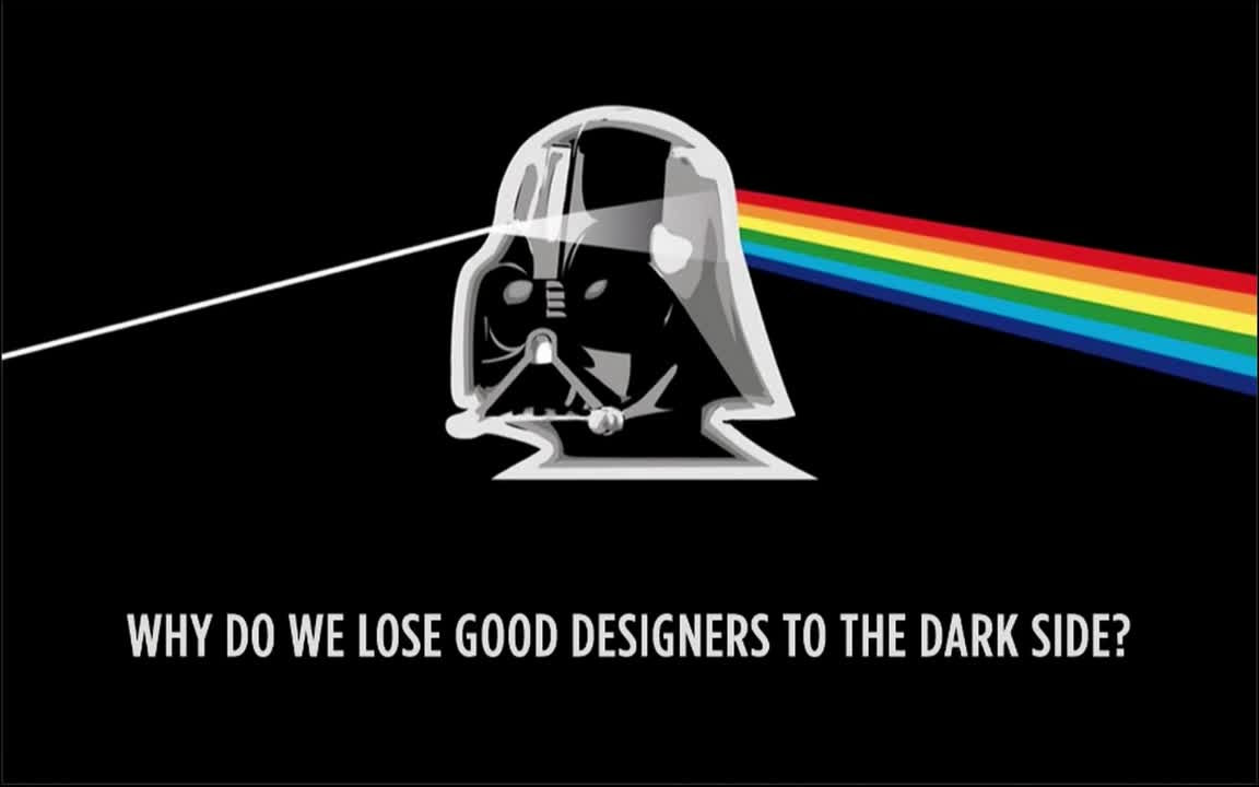
If you are using a website or an application, you may be confused by being arbitrarily manipulated differently from what you intend, but not a mistake, but "on purpose"Dark patternI call it. Whether good designers become malicious designers using dark patterns, the mechanism is released in the movies.
Dark Patterns - User Interfaces Designed to Trick People
http://darkpatterns.org/
What is a dark pattern? You can tell by reading the following article.
Design aimed to deceive users "Dark Pattern" Various - GIGAZINE

The following movie explains why the designer falls on the dark side.
Dark Patterns: User Interfaces Designed to Trick People - YouTube
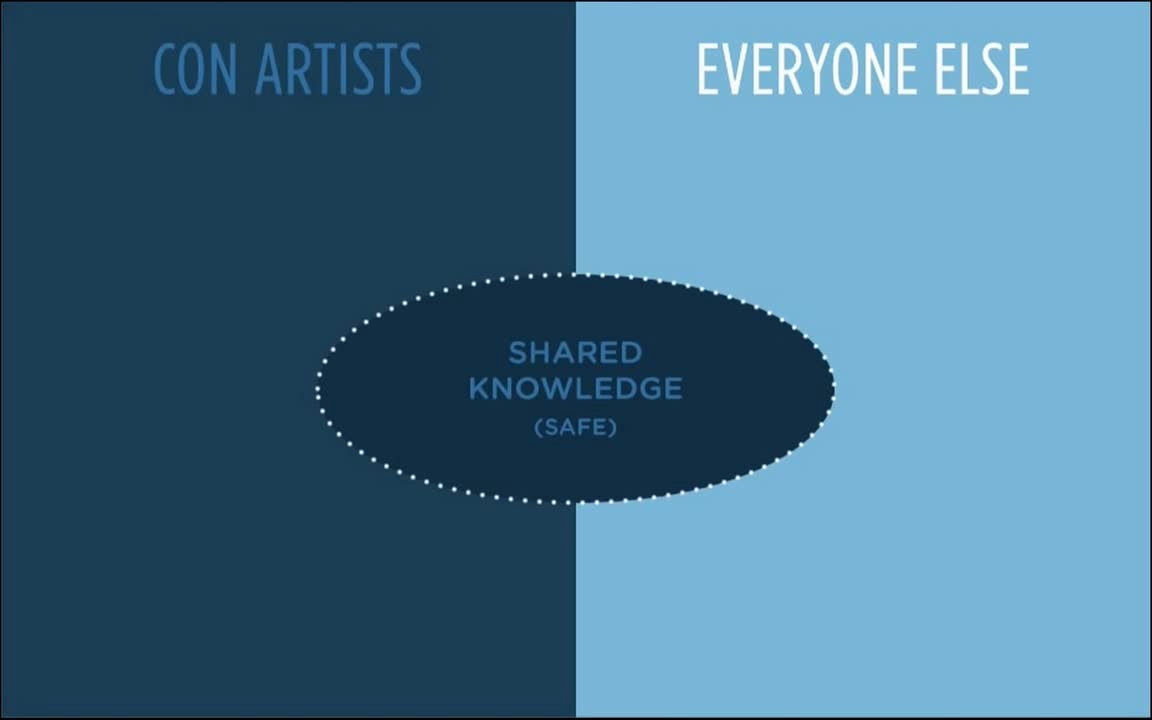
UI consultant'sHarry BrignullIs disclosing the knowledge of the dark pattern not to spread the dark pattern to the world but to share knowledge with many people. By sharing the knowledge of "how fraudsters use it", the purpose is to enable ordinary people to protect themselves from fraudsters using dark patterns and the like.
Designers use the dark pattern to raise the conversion rate, but in the first place, why is a good designer falling into dark side and using dark patterns?
Using imaginary designers, imagine how it fell to the dark side. A designer who entered into a spirit of enthusiasm by having all the UI designs accepted for the interview of the selling airline company that the price is cheap ... ...
On the first day of joining the company, you talk to your boss "Would you like to talk about profits?"
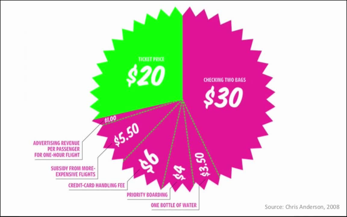
The breakdown of the revenue shown by my boss is that the revenue from the airline ticket fee is part of the whole, and that the airline tickets such as multiple carry-in of bags, purchase fee for drinks and drinks on board and priority boarding fee, It is shown that things other than that are responsible for the majority of revenue.
Therefore, the work imposed on the designer is "Improvement of insurance participation rate", and for that reason it is necessary to improve the web design of the insurance subscription page.

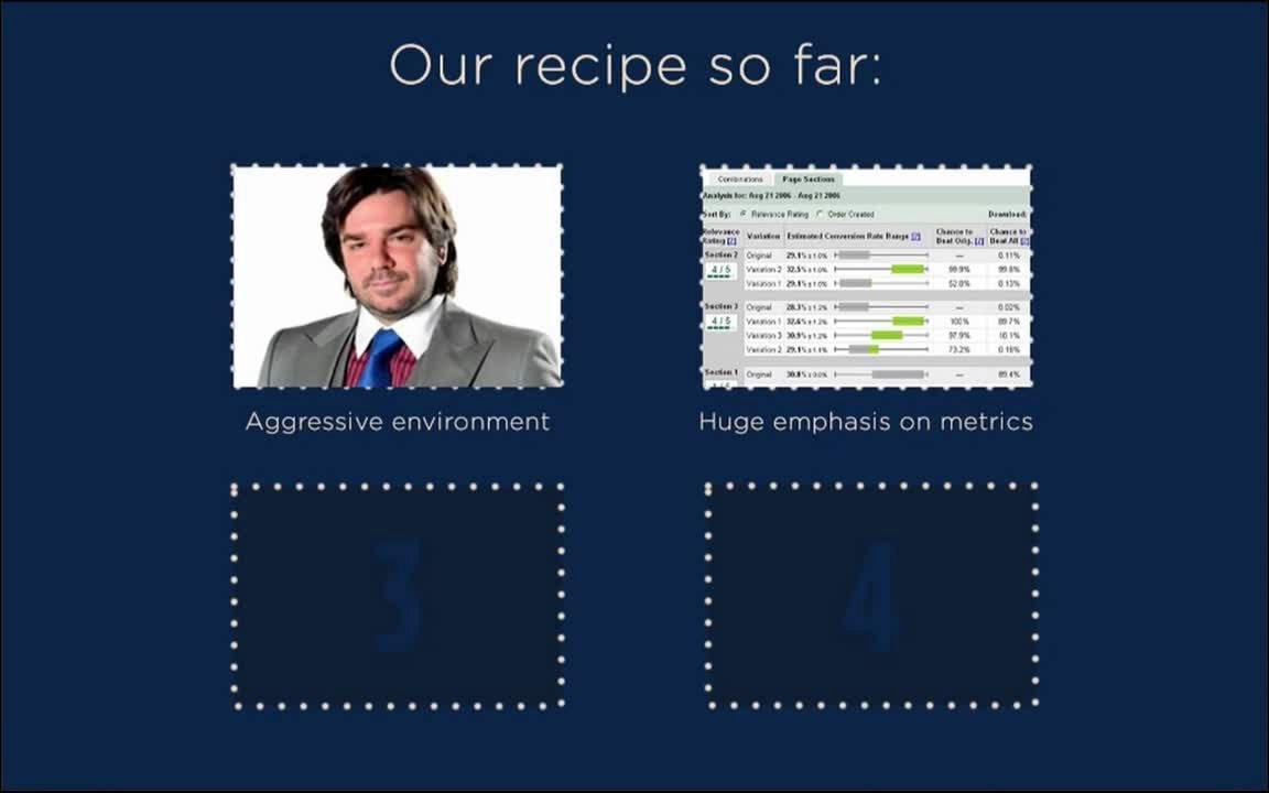
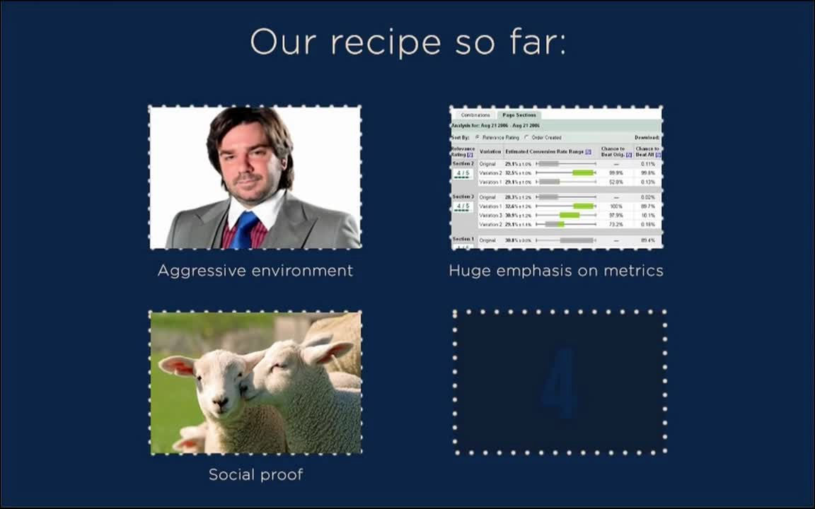
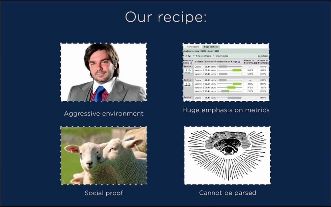
The recipe that creates a designer who uses dark patterns, two of which are "environment with pressure" and "to place too much emphasis on data". With these two materials, designers think that "UI has become superior as anything by numbers."
In order to improve the web design, the designer reads a specialized book written about user's behavior. However, although these documents are interesting, the designer thinks that it is "theoretical" and not a technique to actually improve web design.
So, the designer will see an actual example being done in the real world. The designer sawNational Health Service(NHS)Data on the provision of organs.
The following shows the percentage of people agreeing to provide donation, but the proportion of agreement on the left and right of the graph is very different. Denmark, the Netherlands, the United Kingdom, Germany, etc. have a very low percentage of consent, but the proportion of countries such as Austria, Belgium and France is high.
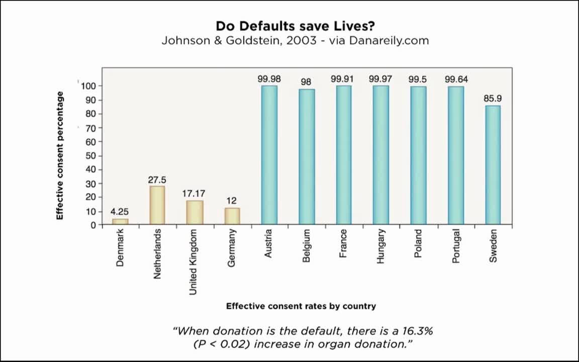
The difference is how to indicate the intention of organ donationOpt-inIs itopt outIt is thought that it is born from whether it is. In other words, when the default state is "not agree", and the country wishes to indicate "intent" to indicate "agree", the proportion of consent is low in the country (opt-in country) that needs to take some action, the default state is " The country that needs to take action at the time of showing "willing to agree" and "not agree" (the country of opt out) has a higher percentage of consent. Although this is data that is not directly related to increasing the insurance participation rate by designers, it is a big survey result showing that "you can change the behavior of people by changing designs and specifications".

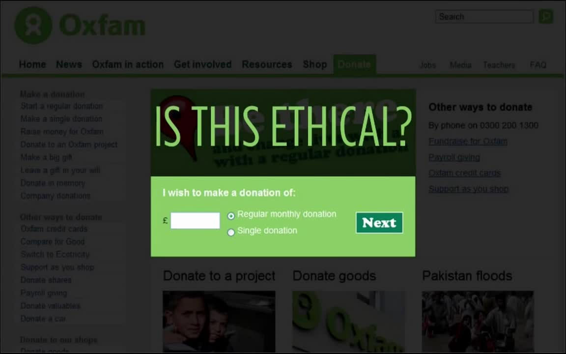
I found out that web design and specifications have great power, I will look at the case. The following are international cooperation groups to solve world poverty problemsOxfamIt's a website, but there is a text field and a check button in the middle of the donation page. Entering the amount you want to donate in the text field, designing that "donation every month" or "donate once" is selected and pressing "Next" will proceed with donation processing. So, is this a moral problem?
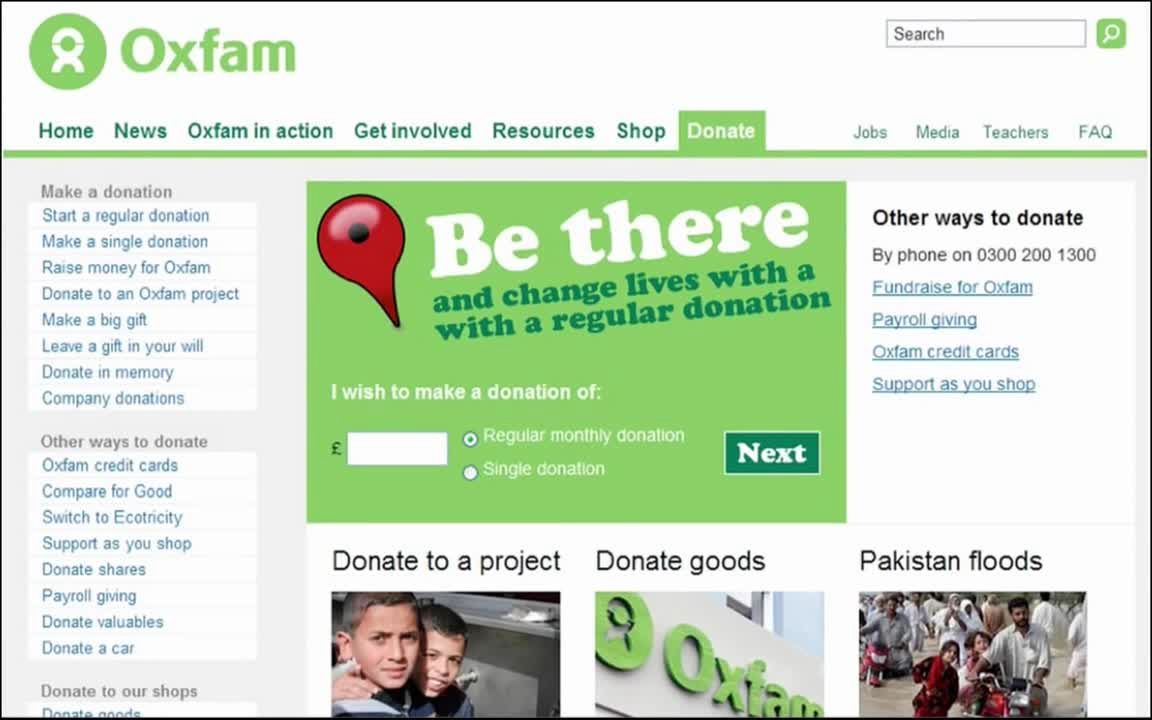
According to Brignull, the text field is small and the options are not hidden, so this UI has no problem at all.
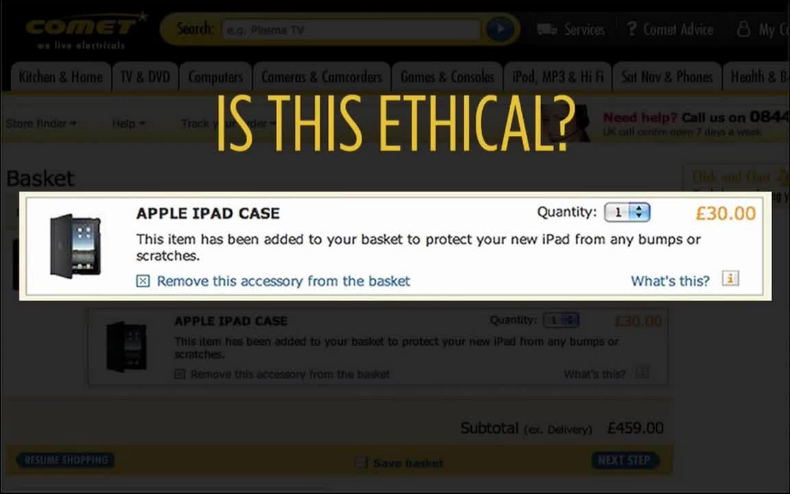
Let's see the next case. Online shopping siteComet OnlineWhen you purchase an iPad with, you will automatically add 30 pounds (about 4300 yen) iPad case under the iPad of 429 pounds (about 61,700 yen), and self-payment amount is 2 459 pounds It is sixty thousand yen).
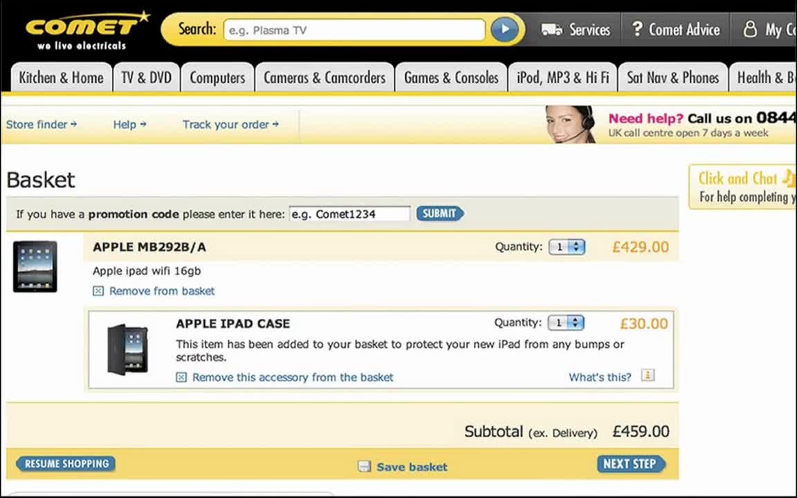
People who are shopping may not be asked "Do you want to add an iPad case to the cart?" And may not conduct payment without noticing the product, so this action is ethically problematic Mr. Brignull says.
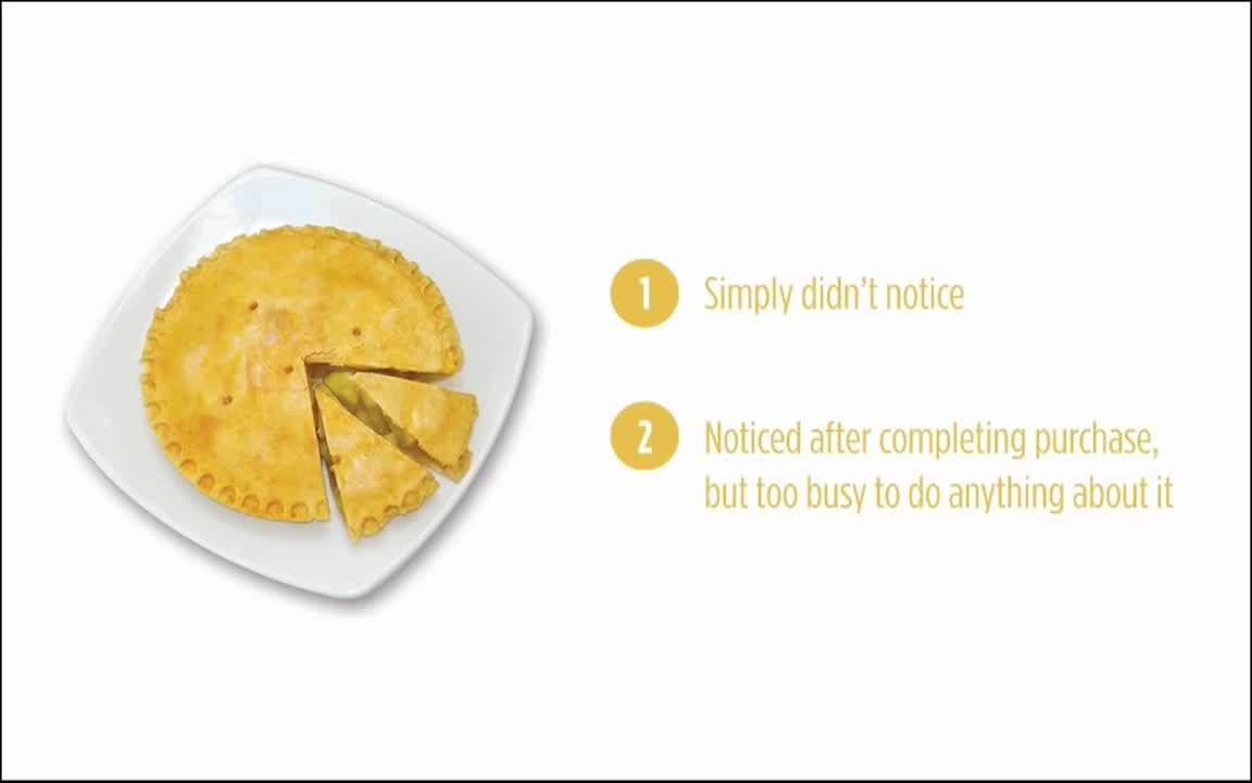
As you can see from the example of Comet Online, the aim of the dark pattern is roughly divided into two categories: "people do not notice", "they are too busy to notice processing after cancellation due to being noticed after purchase".
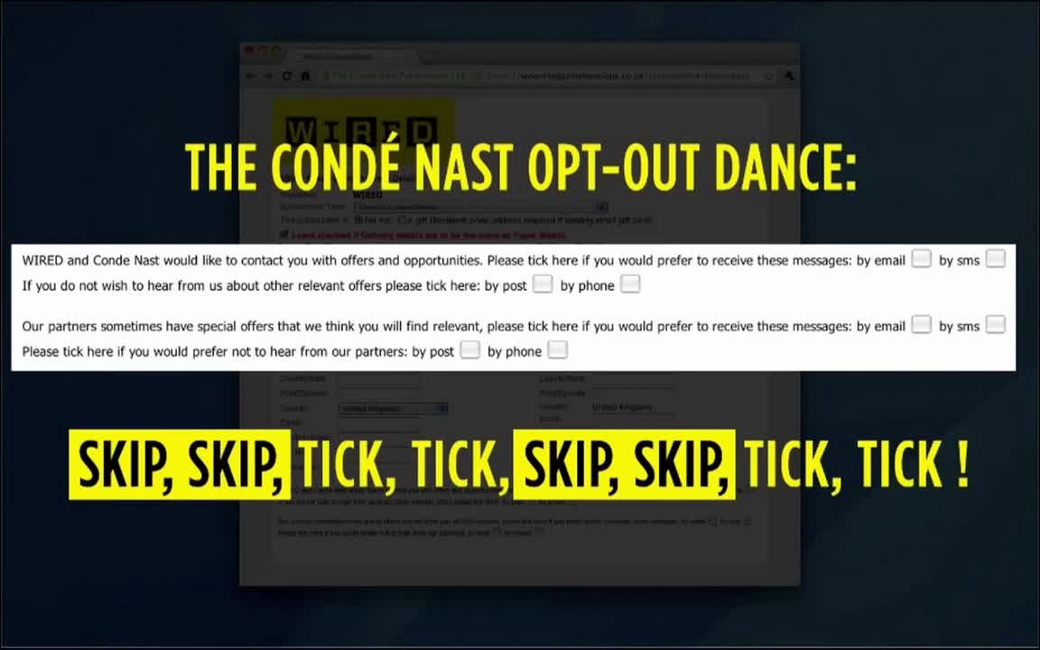
Let's look at another case. This time news siteWIREDSubscription application form.
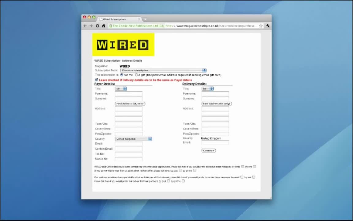
Here, there is a check column to opt-out expressions such as "receive information by e-mail", "receive information with SNS" etc. about what information is sent from the company. This is a cumbersome check, but the options are not hidden.
On the other hand,RyanairI will look at the website of.

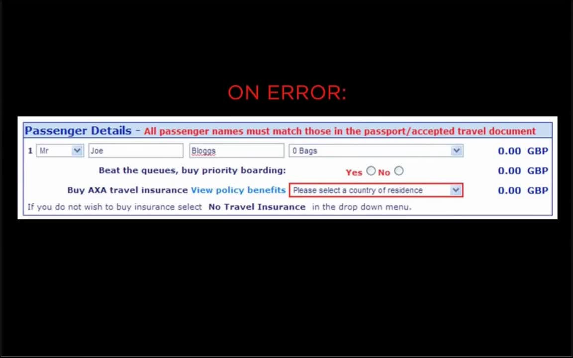
Insurance subscription page ......
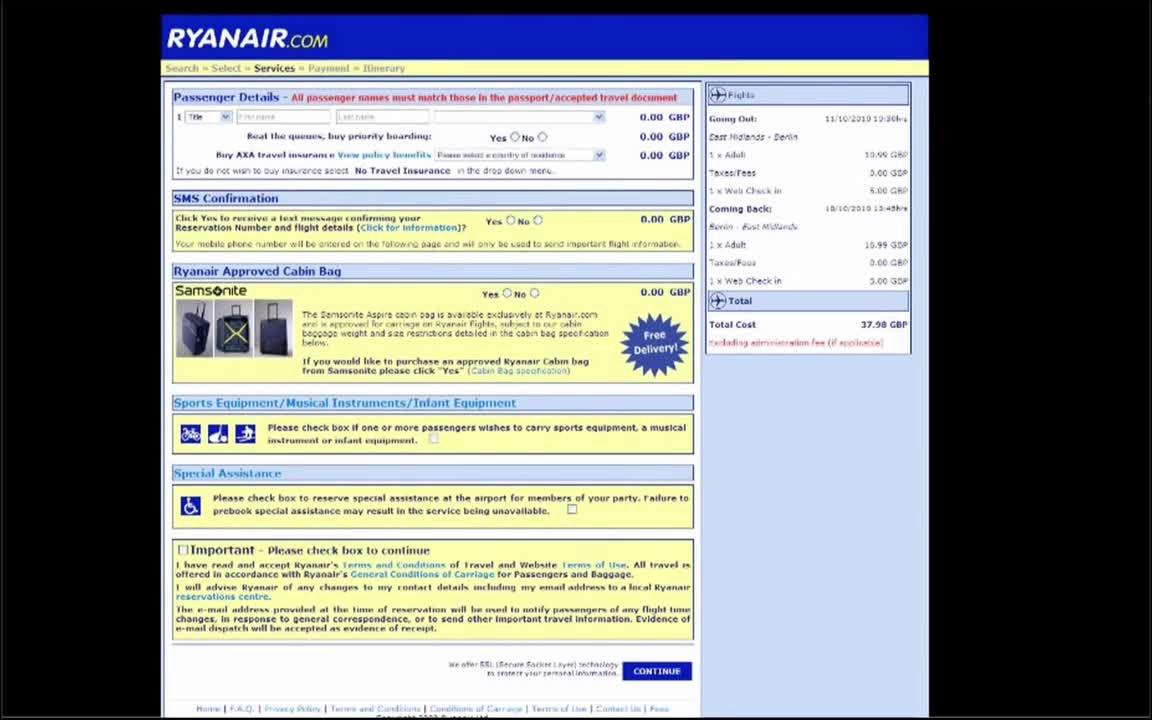
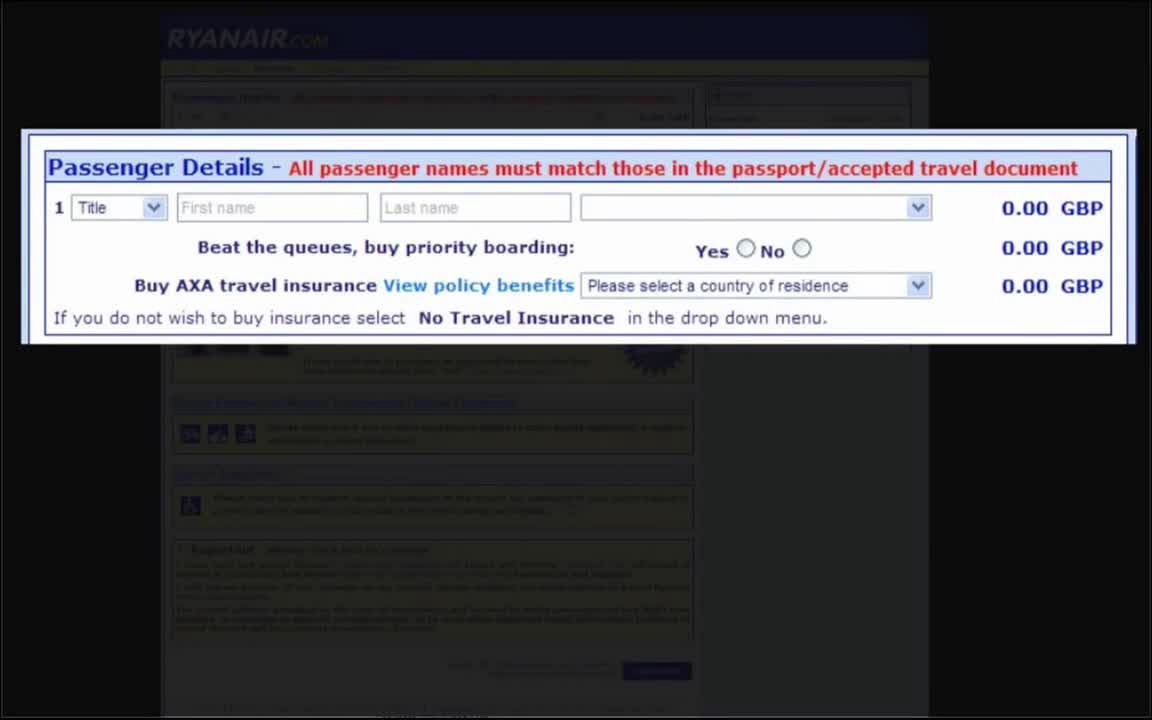
In the column of "Passenger information" there is an entry column for the name of the traveler and a check column as to whether or not to board the priority boat, which seems to be irreverent at first glance.
However, when I opened a drop down menu saying "Please choose your nationality", "No Travel Insurance Required" was lined up between "Latvia" and "Lithuania". They are not arranged alphabetically, and it is a mystery why such a display method is adopted. People who follow the direction "Please pick a country" may choose not to be aware of the option of "Do not put on travel insurance", so you may join the insurance and you can be said to be convincing.
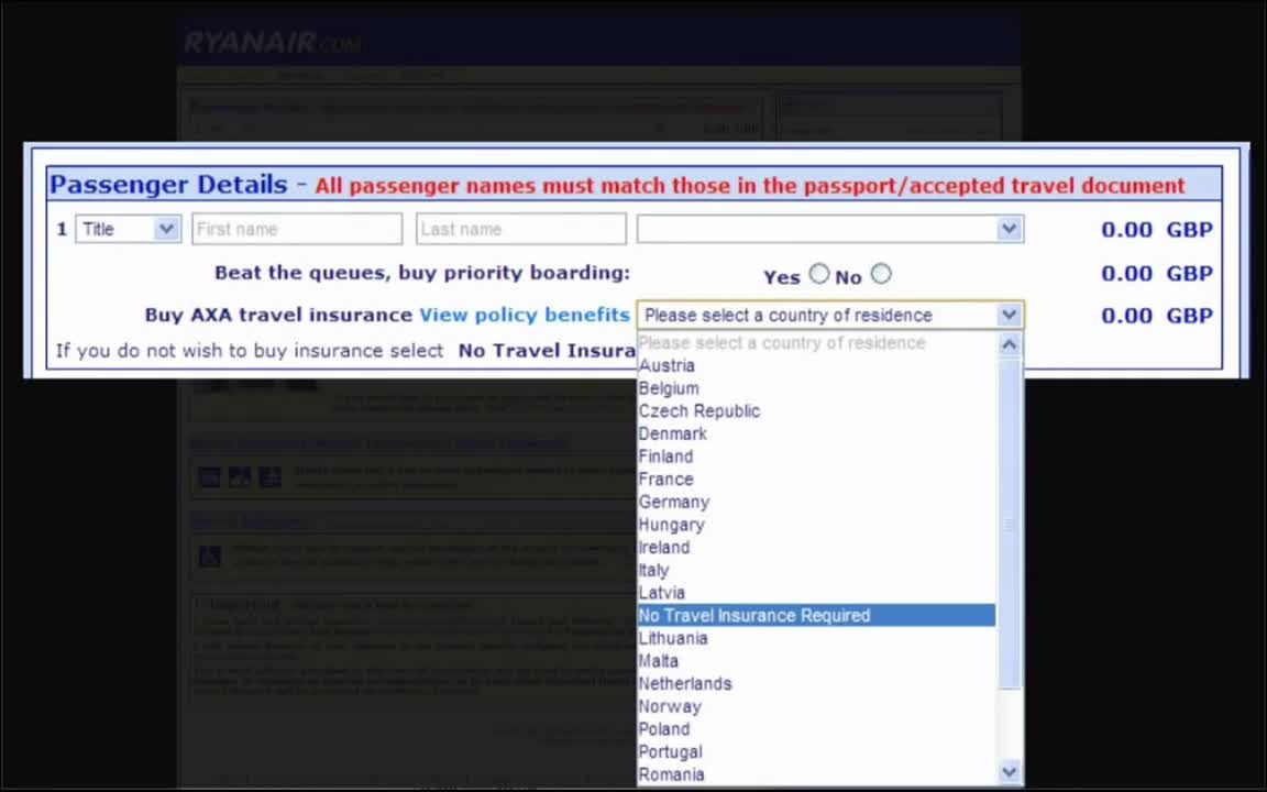
If you do not select anything from this drop down menu, an error will occur and the frame in the menu column will be displayed in red. However, the portion of "Please select" No travel insurance "if not subscribing for insurance" under the drop down menu will not be emphasized in red.
When I return to the story of a fictitious designer, the designer who went to the supermarket with exhaustion thinking about web design for a day thinks "What if the real world is progressing in the opt-out format?" In other words, when pushing the cart and walking, the shop clerk of the shop keeps inserting things into the cart quickly, and the person who shops is required to issue unnecessary things. It is obviously a nuisance act that it is a real world, and in the first place, there should be few people who say, "You can not put things in your carts without permission".

However, in the Internet world, such actions are done by major companies such as Nike and Facebook.
Here, in addition to the element of "the environment with pressure" and "too much emphasis on data" in the head of the designer, the element "being done socially" is added.

From these elements, I've decided to adopt an opt-out type dark pattern on my insurance subscription page. Then, the insurance participation rate doubled, I was able to meet the company's expectations.

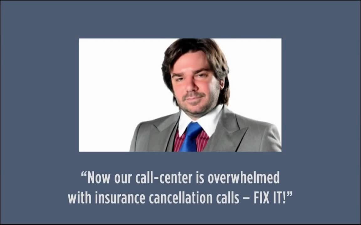
But the next day, when I go to my company, my boss says "Call center has canceled insurance cancel calls like mountains!
And during the meeting to bring back the web design, the designer notices that "the enemies of the dark pattern" can easily cancel and return to the original state ".
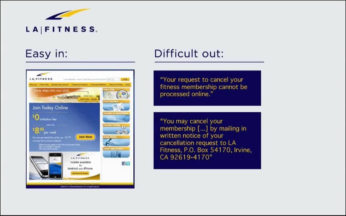
The mechanism that "This is difficult to put in easily" is also used by many websites. For example, in "LA Fitness" at fitness gym, it is very easy to make a member registration and pay fee, but in order to cancel registration, first find a cancel page on the website, It is necessary to write a letter to. Online registration cancellation is impossible.
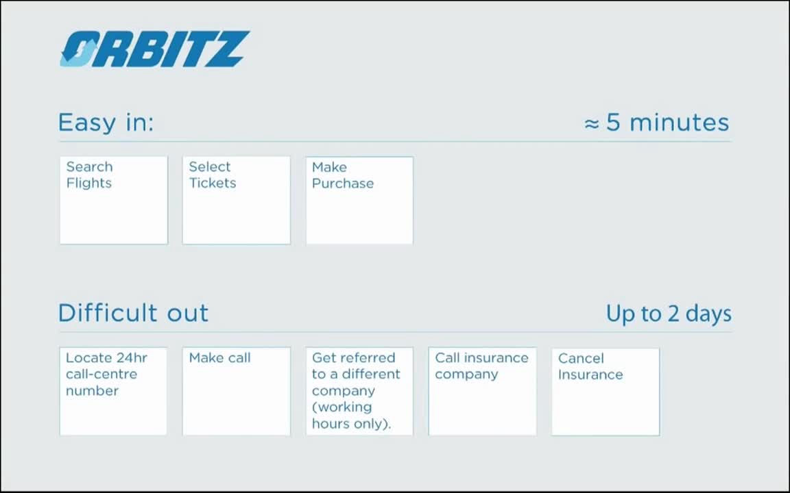
Also, of the travel siteOrbitz TravelIt is easy to search for flights, pick a ticket and purchase it is easy, but it is difficult to find the number of the call center operated 24 hours, call the insurance company, cancel the insurance. It seems convenient that there is a call center operated 24 hours, but when I try to cancel my insurance by calling, I will be told to call an insurance company on weekdays 9 o'clock - 5 o'clock, It is a mechanism to give up cancellation.
Returning to the Recipe table again here, the fourth box is empty. What's going to enter here?
As far as SEO is concerned, unjust SEO and spam is called "black hat", right SEO is called "white hat", and the distinction between what is correct and wrong is clear. But with regard to UI, there is not much debate about the correct UI, incorrect UI.

Why is this happening? If you say, "Because SEO is monitoring and detecting at source code level by Google, but Google does not check for UI," Brignull makes a hypothesis. Since UI is not complete with source code alone, it works on human psychology, so Google's bot can not automatically judge whether it is positive or false. As a result, even those who did a malicious UI design will not be penalized.
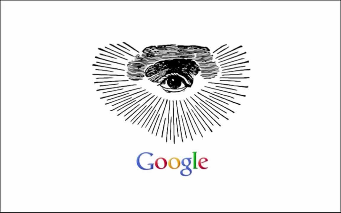
And by having all four elements of "environment with pressure", "too much emphasis on data", "being done socially" and "not being punished by Google detection", UI designers are dark side It falls to become cheat people with a dark pattern.
Related Posts: