How to make online shops that everyone wants to use Summary

ByLouish Pixel
It is said that about 30% of users stop viewing items before purchasing if online shopping sites and apps are not optimized for mobile terminals. For websites and applications that conduct e-commerce, the "User experienceAlthough it becomes a death problem, it is very difficult to make an appropriate display on a small screen. So, software developersNick BabichThinks about how to make "product page easy to tie to purchase" found from my experience.
Mobile eCommerce: Product Details
https://uxplanet.org/mobile-ecommerce-product-details-28feba377a55#.ben2wxbjq
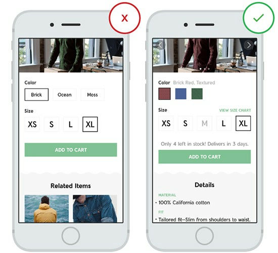
◆ 1: To describe product information and possible options in detail
By listing information comprehensively, users can feel relieved and they are also excited at the same time. Therefore, as a prerequisite to making an online mail-order site · application,Inventory · size · color choice · item description · photo · reviewIt is important to put firmly on.
· To make detailed information of commodity products clear and intuitive
It is important that the sentences that describe the product are those that understand the whole picture and that it is to be understood by reading about details. Therefore, let's avoid the following description.
· Size: "What kind of size is there?" "What size can you get now?" "How big is the specific size of" XL "?
· Color: There must be no visual image of colors to choose. Also, there is only a small image of size that you do not know how to prosper in the real world
· Inventory: There is no information on inventory that can be shipped immediately, there is no shipping option
· There is no description about product details
It is very difficult to display information necessary for product description so that it can be read easily on a small screen of the mobile terminal. However, online shopping siteGiltWe have created an application that meets the above conditionsServices also exist in reality.
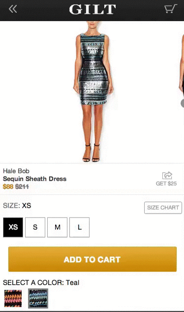
· Reduce the number of times the user inputs characters as much as possible
On the online shopping site, the input form which requires character input induces mistakes on the user side and consumes the user's time. Therefore, on the product page, you should disable as much of the mechanism as possible by letting the user "enter" characters by displaying key buttons. It is better to use a radio button etc. to get users to choose pre-prepared options.
◆ Product photo
Whether it is a PC or a T - shirt, it is not an exaggeration to say that it depends on product photos whether products can be sold or not. And at this time, there are two points of good photo conditions: "giving a wonderful impression" and "communicating information".
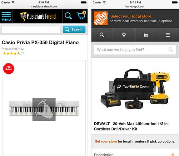
· Use large size photos
In the case of products that users like to know details like clothes, "being a big and high-quality photograph" is particularly important. So, for example in the image below, you can see that the zoom button on the bottom right of the screen is large and the presence is appealing.
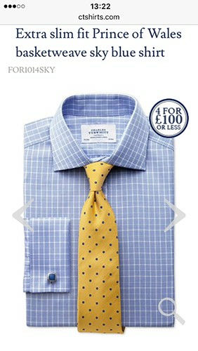
As shown on the left side, it is not good with a blurry image like "I have enlarged low resolution material", it is important to choose high quality images.

When the product photo is enlarged, if it is low image quality, it looks like "low quality thing that the product itself can not bear to make a big picture."

· Allow the user to control the degree of zoom
Pictures of goods tell the user the parts that can not be told by explanation by sentences. If you can only enlarge with preset magnification, you will frustrate the user, so you should be able to change the magnification freely on the user side so that the user can determine from the picture whether or not to purchase the item.

· Prepare a large number of photos
The more merchandise photos you see as reference, the better. However, since you can not post photos unrestricted as a matter of reality, you will use the most noteworthy part of the item and the picture of the part written in the item description for the gallery.
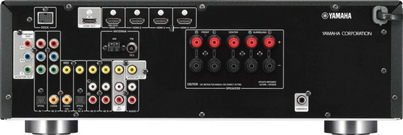
For example, if you sell AV equipment, post photos of the input port on the back, you can tell the user what you can do with the device.
If you want to appeal that the shaving set is of high quality, it is also ant to post the state of manufacture etc.

In addition, at this time, the picture is not displayed by tapping and vertical scrolling, but by swiping it in a format that can be turned over, the photo can be quickly expanded to the user.

By users, there is a habit in the operation method such as "magnify photo with double tap", "magnify image with pinch in". If you show how to enlarge the image, it will be an application site that is easy for users to use.
◆ Price
"Where to display prices" is a candidate for various places from the top to the bottom in the page, but if you have confidence that the price you set is superior to other applications and sites, if you are right under the product photo or product name It is the answer that Mr. Babich derived from the rule of thumb.

If the superiority of the item is in a part not unique in price such as unique, and if we want to suppress emphasis on price, it means that you can display the price after finishing the item explanation.
◆ Availability and shipping
One of the reasons for mail-order sites getting numb is "There are no shipping options and shipping fee information". If information on shipping is not written on the product page, the user will have to find out that information from other pages, and interest will be from the "goods" which should be concentrated originally.
· Display inventory status and shipping status
When the user can obtain the product at a shop or the like near the place where the user is located, the information such as "there are 24 stocks in a nearby shop" is automatically displayed using the position information of the user It is also a point to do. However, doing so that users can choose their favorite reception place at this time.

· Shipping and delivery date
Users expect the timing and cost of shipping to be clear. Whether to take low cost or to take delivery speed is one of the points that users consider when purchasing items.

Therefore, it is ideal if you can choose the option "free shipping" or "delivery at desired time".
◆ Product reviews
In online shopping, people tend to trust others' opinions. Customer reviews are used for users in the following two cases.
· When evaluating the quality of goods. People want to feel relieved that the description on the product page is true.
· When you want to know details other than what is written on the product page, users will rely on customer reviews. The buyer puts the trust in the opinion of this user rather than talking to a store clerk in a real shop.
· Sort the reviews
Let's add a filtering function and sorting function to customer review so that users can obtain "real" information about products.

· Do not hide negative reviews
From a seller's point of view, a positive review is more positive than a negative review, but if all the reviews displayed are positive, the user doubts the reliability of the entire review . In order to correctly inform the user how it is being evaluated as a whole, please also publish a negative review without hiding.

Also, when displaying products, please display the total number of reviews next to the evaluation. This makes the evaluation more meaningful.
◆Bounce rateLower
Even after purchasing a product, show content such as related items and popular items and let the user continue to stay on the site and the application as much as possible. If you are looking for alternatives or items such as items purchased by the user, you should be pleased that related products will be presented on the product page. Please try to make "Osusume" appear at the bottom of the page that will stop at the user's eyes.

Related Posts:


in Note, Posted by darkhorse_log