HP's new logo that was born five years ago will be finally adopted after a while

On April 5, 2016, HP says the world's thinnest notebook PC "HP SpecterWe announced. The laptop featuring a sophisticated design featuring a luxurious feeling of luxury using aluminum and carbon fiber for the housing with a thickness of 10.4 mm has three USB Type-C ports, and the processor has Intel Core i 5 / I7 is adopted. Although it is HP Specter appearance full of both design and functional aspects, in addition to "HP's new logo that was born five years agoIt is the first product to be adopted, it has the feature.
HP's new logo is the awesome one it never used | The Verge
http://www.theverge.com/2016/4/5/11367248/hp-new-logo-spectre-13
"HP Specter" released in April 2016 is the world's thinnest notebook PC with three USB Type-C ports. As HP's Spectre series, "HP Specter 13 x 360Although it becomes a new type notebook PC following the design change, in addition to a big design change, it is talked about that the logo of "HP" engraved on the terminal has also been changed.
In the previous model HP Specter 13 x 360, there was a character "HEWLETT-PACKARD" on the top surface.
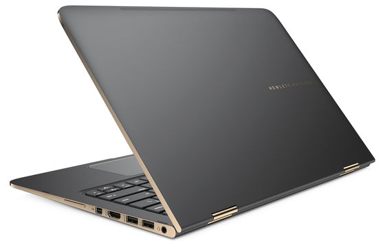
However, HP Specter has adopted a new logo. You can see how the design of the new logo is based on the following HP Specter introduction movie.
The World's Thinnest Laptop - HP Specter - YouTube
This is a conventional HP logo. Even at the time of writing the article is a logo that is used in many things, such as HP's homepage and products other than HP Specter.
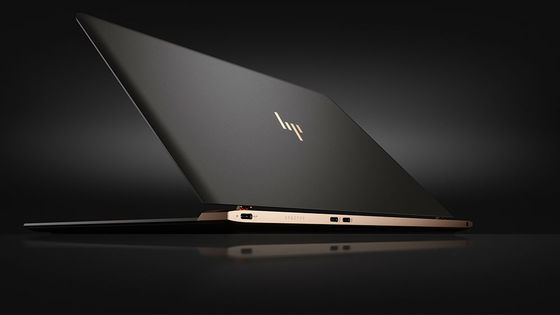
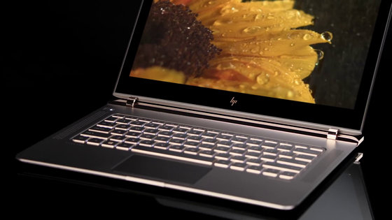
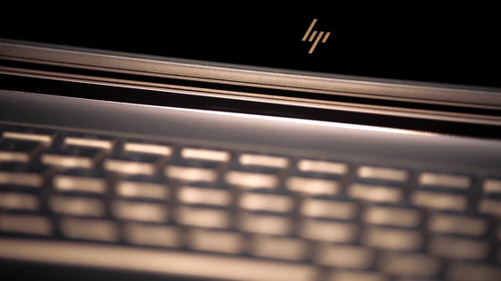
On the other hand, at the bottom of the display of HP Specter is a new logo.
There is also a new logo on the top of the notebook PC.
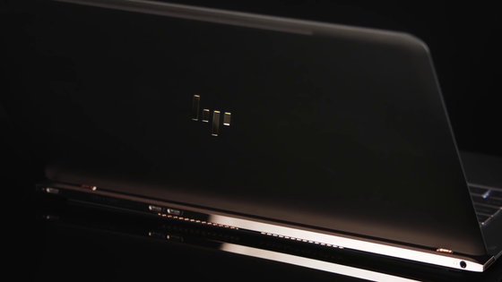
The new logo is just a set of short hatched lines, and if you've seen the traditional logo, you will notice HP's logo, but it is not strange if you do not notice otherwise. According to HP, this new logo is scheduled to be adopted by HP's premium PC brand in the future.
This logo was designed in 2011, about five years ago when HP Specter was announced. I was in charge of design, do branding and design etc.Moving Brands. HP wrote to Moving Brands "Brand identityIt is said that it asked for construction ", and in that it is the new HP logo adopted by HP Specter. In addition, in 2011, HP decided not to adopt this abstract design logo as a new logo of its own brand.
When publishing HP Specter, Moving Brands, who was in charge of design, has released processes and points for designing the logo.
The vision of a brand built for the moving world
http://movingbrands.com/work/hp
According to Moving Brands, the newly designed logo follows the original logo designed by HP founder Bill Hewlett and Dave Packard. I was conscious of designing the new logo at "13 degrees", which means that it represents HP itself, "optimistic about creative spirit and future". Also, on HP, the slope of "13 degrees" is brand identity, and he seems to be deeply involved in the design of graphics, UI, and products, he said that he adopted a design that makes use of it.
You can see how the design of the new logo was created by looking at the following movie.
HP Particle on Vimeo
Original logo, invented by HP founder Bill Hewlett and Dave Packard.
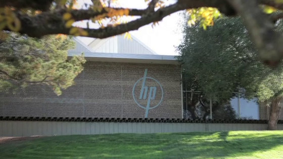
When hand-drawn it looks like this.
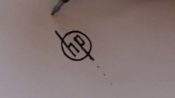
This original logo is tilted 13 degrees from the vertical direction. The new logo makes use of this inclination, and constitutes each element as follows.
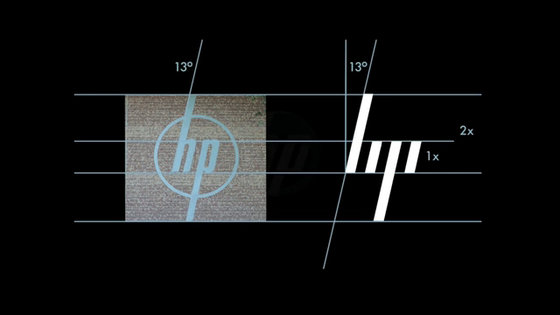
And modeling of the new logo starts for some reason.
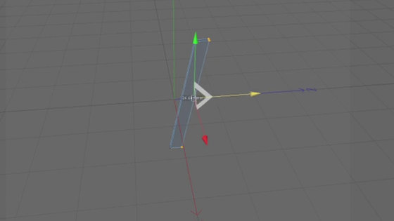
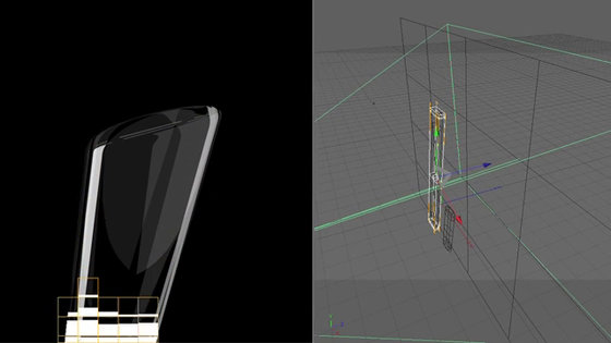
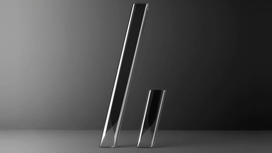
Two slashes constituting the completed new logo.
This is generated in large quantities and it looks like a kind of art.


Ignoring the slope of "13 degrees", the slash that makes up the new logo changes variously.


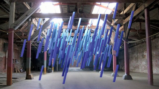
And lastly a slash that got back to 13 degrees again gathered ... ...

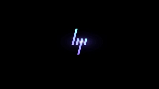
It is the end with the new logo appearing with burn.
Related Posts:


