"Evolve" that you can see how famous corporate logos were like in the past
The logo of companies and services that are often seen on street corner signs, nets, television and the like is an icon that has an important meaning that it is possible to recognize the brand simply by looking at it at a glance without explaining it with letters. At the site "Evolve" you can see at a glance how the company's logo, now known around the world, was a long time ago.
Evolve
http://logoevolve.com/
When you open the site, there are logos that most people have seen.
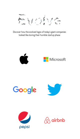
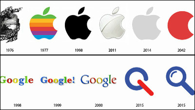
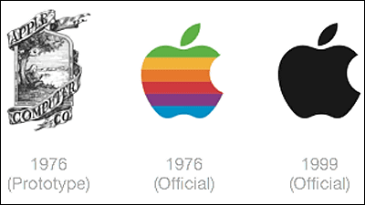
When a mouse is placed on each company's logo, the old logo will be displayed. For example, if you move your mouse cursor over Apple's apple ... ...
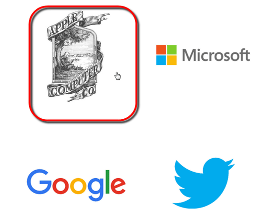
The logo was turned round and the logo at the time of its founding was displayed. In this way, you can see the logo of the latest logo of each company and the logo when it was born.
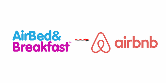
Private residenceAirbnb's old logo, which gets a lot of attention in, seems to be a design that somehow reminds me of a donut shop.
The world's largest net retailer, Amazon is a letter "A" motif logo

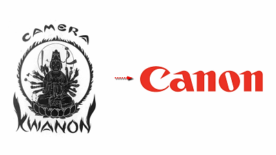
Canon's logo which the person who wrote "coat of arms" rather than "logo" attaches to the company's first prototype "KWANON (Canon)" named "I want to apologize to the mercy of Kannon Bodhisattva" What was done. It was made in 1934, and it was made with motif of Senju Kanon and Fire.

Nonetheless, there seems to be few cases where this logo was used in products, and in 1935, a taste logo leading to the current design is born. The itinerary around here isCommentary on Canon's siteIt is being done.

The Coca-Cola logo looks like a simple font was used.

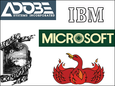
Firefox with a fire fox as its motif, but in the past it used to be a phoenix (fire bird) motif.

Google has gone through a lot of itinerary and now it is in shape.

The character that appeared for the first time in the McDonald's logo was "Speedie" which was born around 1950. Later, in 1968, the logo called "Golden Arch" was born with two arches still used today.

Microsoft seems to be starting with a logo that feels techno.

I can see that the Pepsi logo was a logo of a world view completely different from the one at the moment.

Shell is a shell oil logo motif, but if you do it, you will find it difficult even to recognize old things as seashells.

Like Oculus, it is a relatively inexperienced company and I have noticed the previous logo yet.

Previously PayPal was such a logo.

However, in the case of Twitter, it is so different that it seems suspicious even whether it is the same company. The brand name at the time of its founding in 2006 was "twttr".

In addition to this, you can see logos such as "LEGO", "UBER", "Volkswagen", "IBM" on the site. There was only one in it, there was a brand whose logo had not changed since long ago.
Related Posts:
in Design, Posted by darkhorse_log
