How will the logo of super-famous enterprises change in the future?
The company's logo changes as the times change. Ultra famous corporate logos such as Apple, Microsoft, Starbucks, etc. have also been included in this example, and have reached the present through several changes. That is, there is a high possibility that the logo will change even in the future in the future, but what kind of design would you like to change? Below are the guesses of the logo of the future from the change of the logo as follows.
The past and the future of famous logos | StockLogos.com
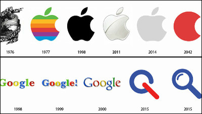
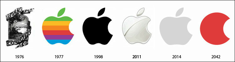
◆Apple
The complicated logo of 1976, "Newton sits under an apple tree reading books", was born again in a simple and colorful manner the following year and became a sophisticated design now after a period of blackness Apple logo that is. In 2014 it became simpler and in the year 2042 we estimate that the right side of the apple will leave a slightly missing aspect. By the way, the reason why the apple is missing is because it is calling "bite (kajiru) and byte (byte)".
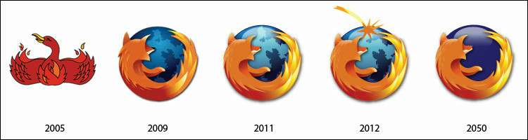
◆Firefox
The logo of the Firefox logo which the basic form was completed in 2009 is now slightly more bright.2012 humanity ruin theoryOn the contrary, next year, a huge meteorite falls to the earth, and in 2050 it is a black joke that life is dying out and becoming a star of death.
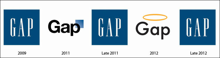
◆GAP
Design drawn in surplus which is regarded as the logo of 2011, last yearIt was blank although announced as "change brand logo"Time design. In other words, this image is a joke that "GAP must return to the original design after suggesting a new logo".
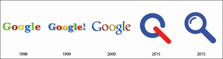
◆Google
Google logo decided on current things in 2000 after coloring and font change. In the future we see that it will turn into a magnifying glass design that appeals more "search".
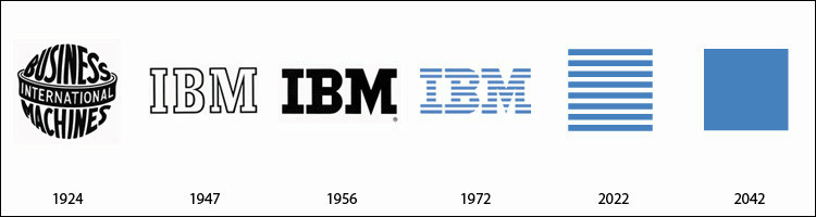
◆IBM
The famous IBM logo that is still in use is a graphic designer in 1972Paul LandIt was designed by. It is anticipated that in 2022, it will emphasize horizontal stripes, and in 2042 it will only be light blue.
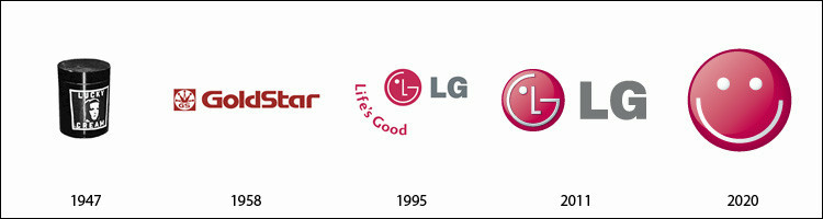
◆LG Electronics
The LG Electronics logo, which has gradually become simpler, is said to be only smile in 2020.
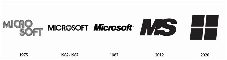
◆Microsoft
Microsoft's logo in which the surplus font is impressive. In the design completed in 1987, it creates a brilliant impression by becoming somewhat diagonally, but in 2012 it is simplified to "MS". It is said that it will be designed to merge with Windows logo in 2020.
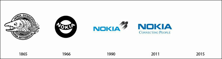
◆Nokia
Since the old Nokia logo has been using light blue from 1990, the ground of the present design is made. The logo has disappeared in 2015, but this seems to predict that Nokia itself will be gone.
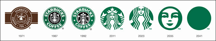
◆Starbucks
The logo design has changed since this spring.Starbucks. As it became a simpler design than before, it is expected that simplicity will proceed further in the future in the future, eventually it will only become yen and green.
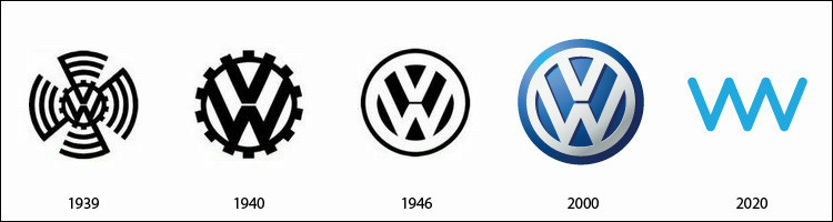
◆Volkswagen
Volkswagen's logo, which had a sarcastic impression, was refined using a combination of light blue and white in 2000, but in 2020 it leaves the circular design and "V" and "W" It seems to be a simple thing combined.
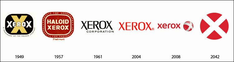
◆Xerox
Xerox logo that has repeatedly changed. The image of red is strong, but I used red in 2004. In 2042 "red" and "X" will emphasize the design will be.
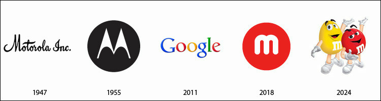
◆Motorola
The end is Motorola.Google bought Motorola last monthSo the logo of 2011 is Google. In 2024, "M & M'SAlthough it is a joke that it acquires, since it uses the same "M", the possibility is low.
Related Posts:
in Design, Posted by darkhorse_log