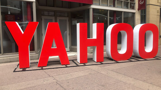
Yahoo, which was shaken by the sale of the Internet department & leaked account information for 3 billion people, changes the logo and tries to restart
American
Yahoo — Story — Pentagram
https://www.pentagram.com/work/yahoo/story
Yahoo redesigns its logo to remind you that Yahoo exists-The Verge
https://www.theverge.com/2019/9/23/20879814/yahoo-new-logo-endless-slide-irrelevance-pentagram
In about 530 billion yen at the time of the rate of the net department from performance sluggish Verizon Communications to sell Yahoo who has the rest of the department that could not be sold and renamed to 'Altaba'.
Yahoo's Internet division, acquired by Verizon Communications, has finally made a new start, and at the beginning of that, the logo that should be called the service face has been changed.
The new Yahoo logo is as follows.
The new Yahoo logo design was designed by Pentagram, an American design company. Yahoo will renew its logo design since
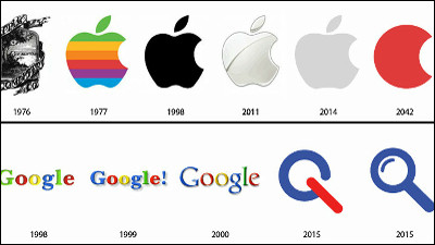
In 2013, Yahoo who changed the design under Mr. Marissa Mayer , CEO at the time, released the following movie so that you can see what the design at that time was in one shot It has become.
Our New Logo!-YouTube
And the logo design for the 2019 edition is as follows. “Yahoo” is strongly expressed with a thicker font.
Yahoo on Vimeo
The Verge pointed out about the 2013 version of the logo: “It was like a startup that lacked personality in design and had just started the first advertising campaign on the subway in lowercase sans-serif .”
On the other hand, the Yahoo symbolic exclamation mark (!) Is used well in the 2019 logo design. According to Pentagram, who was in charge of logo design, in the new logo, “Y” and “!” Are tilted at the same 22.5 degree angle, which expresses positive momentum and excitement.
The exclamation point seems to be used in various ways.
According to Pentagram, Yahoo is planning to release new products and services in 2020, and ahead of that, it seems that the logo that can be said to be a symbol of the brand will be renewed. Yahoo ’s new brand strategy is “to help users find more personalized and customized experiences online” and in line with this, “a simpler and more flexible logo than the previous logo” Pentagram notes that he aimed. For Yahoo, which develops Internet services, the logo is optimized to function in a variety of applications, from small screens such as mobile apps to huge canvases such as huge billboard advertisements.
The logo already on the top page of the overseas version of Yahoo has been changed to a new design ...
The exterior of the company building has also been renewed.
![]()
Yahoo also announced an updated version of Yahoo Mail along with a new logo design. It seems that tabs such as a grocery discount display function were added to the application, but The Verge said, `` Yahoo has revealed that account information for all 3 billion users was leaked in 2013 Would hope that all users have forgotten. '
Related Posts:


in Video, Web Service, Design, Posted by logu_ii