Gmail's new design leaks, revealing the existence of reminder function and e-mail pinning function
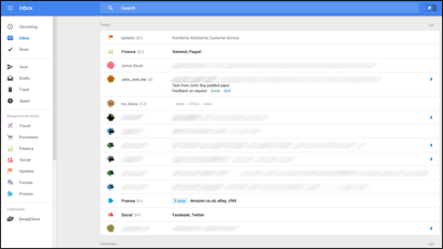
The mail service "Gmail" provided by Google is currently being tested for significant design change,Geek.comIt is clarified by a leak image of.
Google is testing new web-based Gmail features | Apps and Software | Geek.com
http://www.geek.com/apps/google-is-testing-new-web-based-gmail-features-1593555/
Google toying with desktop Gmail overhaul | Ars Technica
http://arstechnica.com/gadgets/2014/05/google-toying-with-desktop-gmail-overhaul/
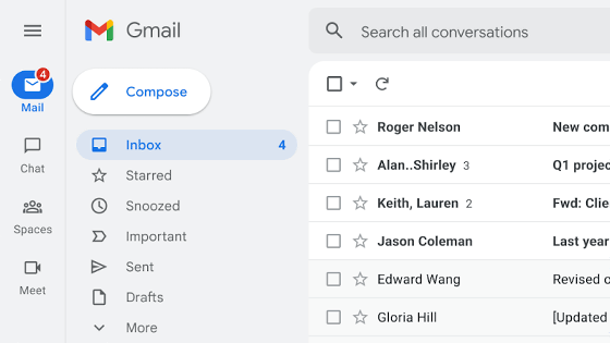
The new design of Gmail (PC browser version) released by Geek.com is as follows. The design is very simple.
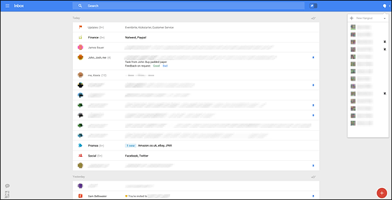
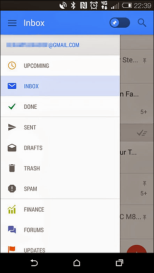
Gmail in April 2014Testing the new version of the mobile versionIt was leaked with screenshots, but the PC browser version of Gmail's design that became clear this time has much in common with the new design of mobile app version Gmail.

The current Gmail designThose adopted from 2011The menu bar is always displayed on the left side of the screen.

However, with the new design, this menu bar becomes hidden, and you can use the menu bar by moving the mouse to "Inbox" at the upper left of the screen.

In addition, a blue bar is displayed at the top of the screen, which includes "Inbox" for displaying menus, a search bar for searching mailboxes, and the "add star" function of current Gmail "Pin" button which is considered to replace is arranged. This pin button is a function to keep mails on the top screen so that important mails will not be buried with mass mails.

There is also a Hangout button at the right end of the blue bar, so you can always communicate with close friends from here.

In addition, an e-mail reminder function etc. are also arranged in the lower right of the screen, and the impression that the ingenuity for not overlooking important mails has been striking.

Geek.com evaluates the new design as "a completely new user interface (UI) designed with various screen sizes assumed," and when using a newly designed Gmail with a smartphone, Inbox "is displayed, but when used with a tablet with a larger screen size" Inbox "and a navigation panel are also displayed, and in the PC browser version, the Hangout button is displayed so that it is displayed. Even there is no guarantee that the design will be changed, not even the date of release, "but if you look at using Gmail of the new UI for a few minutes, you can see how serious it is to change the design," the new design is very good It is revealing that it is what it is.
Android's chief designer Matias Duarte said at the Accel Design Conference 2014, "PC, mobile and wearable device should be designed as one product", and whether it is a smartphone, a tablet or a PC browser version Even though we think that the same design is leaked, it seems likely that the new design of Gmail leaked this time will be adopted for actual Gmail design.
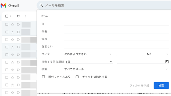
The design of Gmail at that time, which started service in 2004, looked like the following.

Related Posts:
in Web Service, Posted by logu_ii
