Where is the new OS "Android 5.0 Lollipop" new, what do you feel like when thoroughly comparing the old and new UI design
A new OS called "the biggest update in the history of Android"Android 5.0 (Lollipop)"But,Nexus 9·Nexus 6Starting with what appeared in, gradually the number of update enabled terminals is increasing. Unified UI design in Lollipop "Material Design(Material design) "was adopted, not only animation display with guide function but also simple and colorful design easy to understand what kind of thing will happen if you look at it However, compared with the conventional Android 4.4 (KitKat), it is obvious that how the design was changed with such feeling.
Gallery: Android 5.0 Lollipop, before and after | Ars Technica
http://arstechnica.com/gadgets/2014/11/gallery-android-5-0-lollipop-before-and-after/
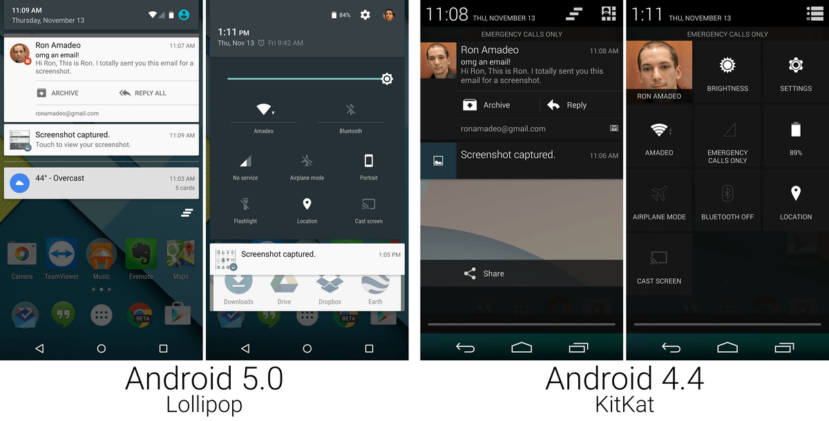
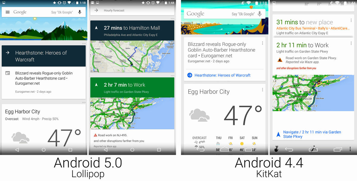
Comparison of lock screen. "Enhancement of notification function" is a major change of Lollipop. With Lollipop you can also display notices such as e-mail on the lock screen.

You can also display alerts while using the app. You can also pull out the notification card from the top of the screen, and swipe further into the specification that comes with the conventional quick launcher.
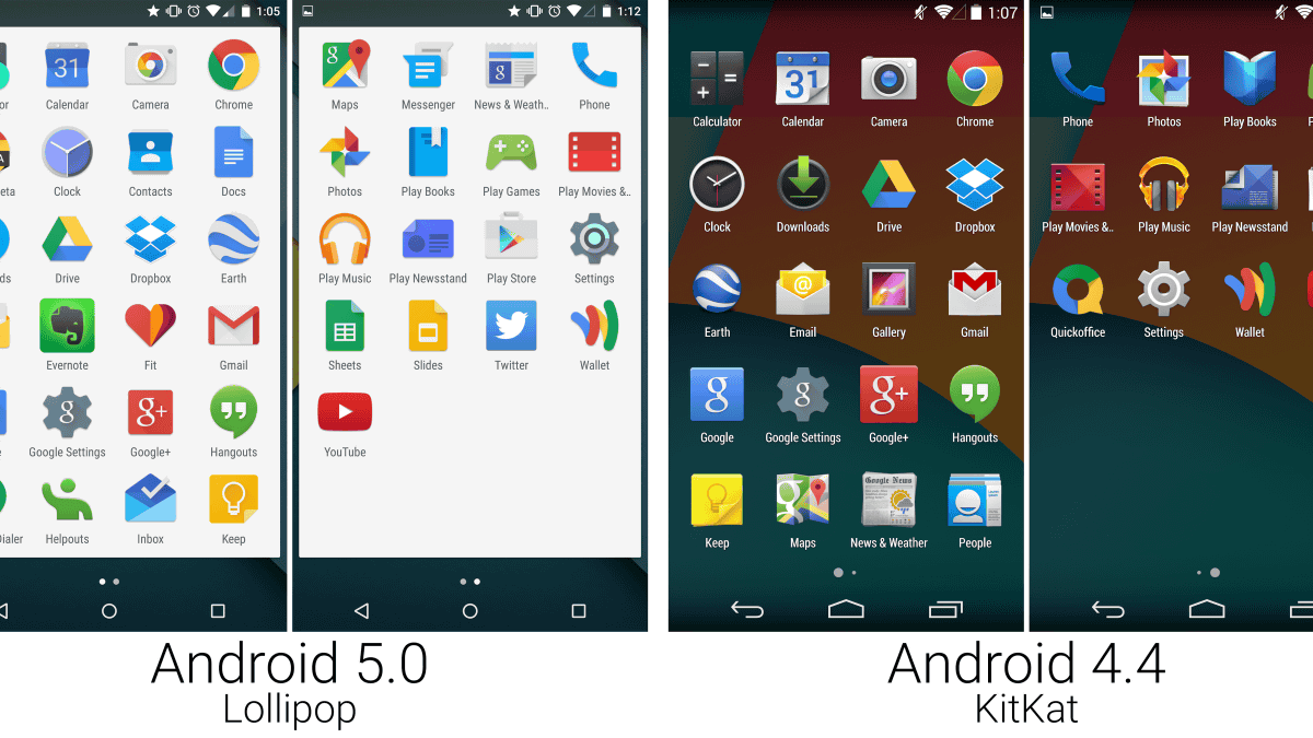
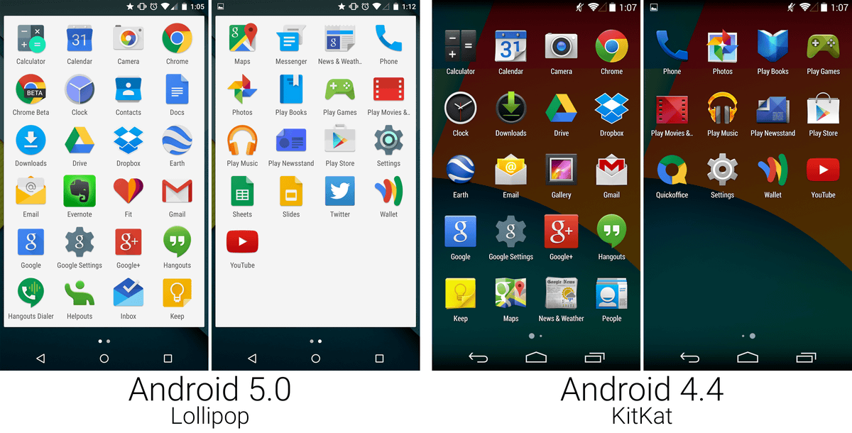
A list of applications that appears by tapping the drawer. In Lollipop the background is white and the icon has changed to a more flat and simpler design.
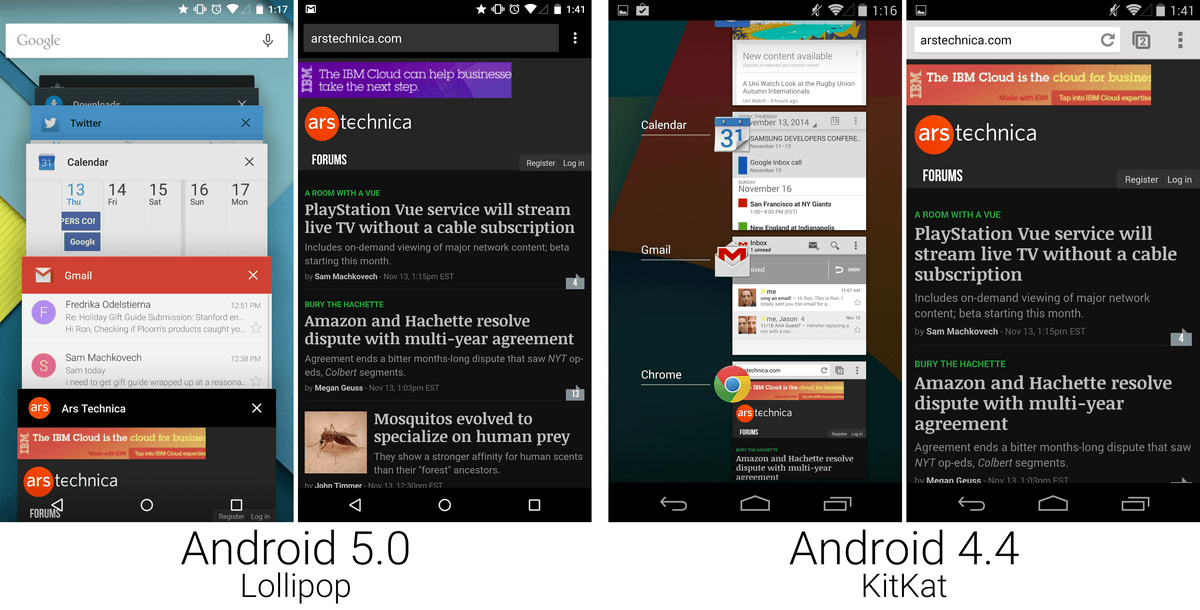
The application history is changed to "Overview", a design where cards overlap. Even if you have a lot of applications open, you can choose out cards to extract cards.
Card design for Google Now app. The image is bigger and the card is changed colorfully overall.
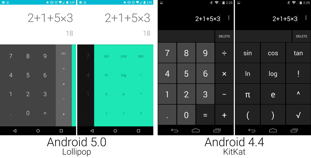
In the calculator application, the number input part is changed to white, the task bar is changed to gray, and the option function is changed to green, making it more colorful and easy to understand.
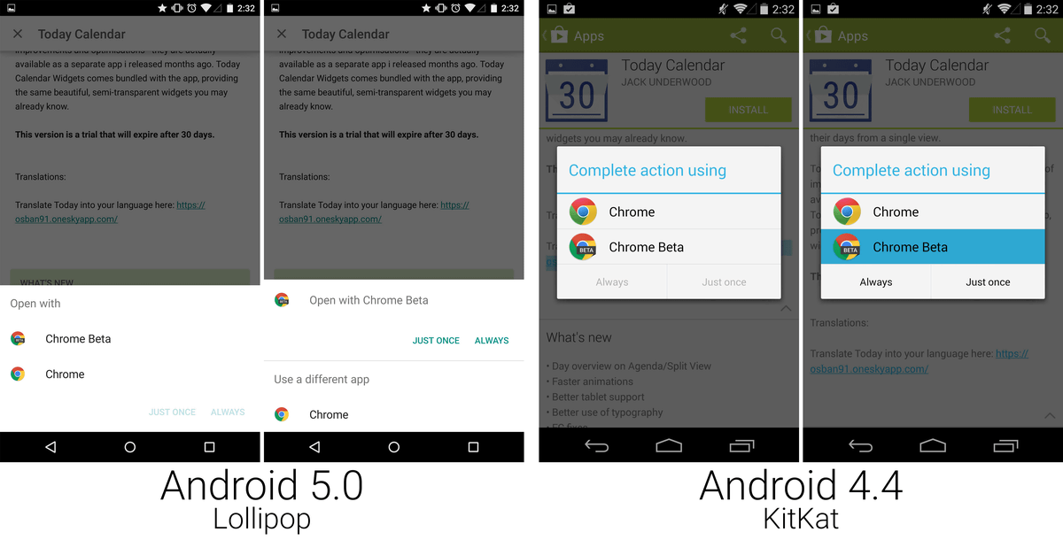
The window for selecting the application to be used called "open with" was changed to the bottom of the screen with Lollipop for KitKat which appeared in the center of the screen.
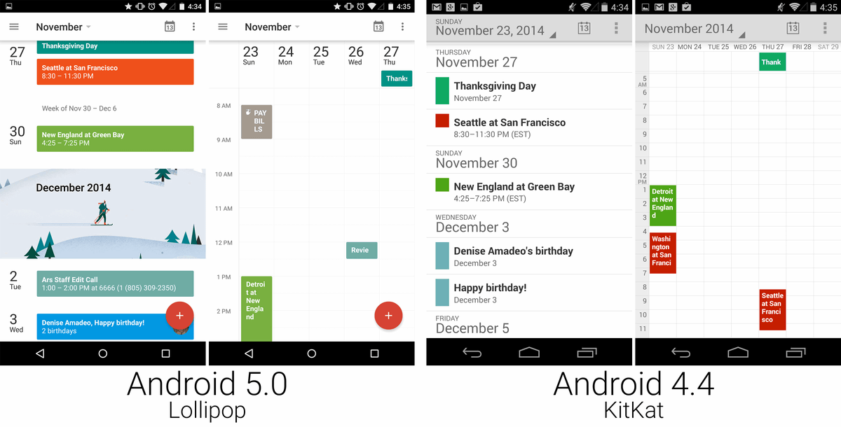
The calendar application inserts a large image image every month, and it can be colorfully selected according to the event contents. In addition, KitKat which displayed 7 days in weekly display mode and succeeded in dramatically improving the viewability by changing to display for 5 days from KitKat.
Google CameraThe design of the application (left) has also been changed. The shutter icon has changed to a huge icon spreading all the way along the screen, making shooting easier. Also, although the layout of the watch application (right) is the same, the icons and letters are big and small, and they are easier to understand.
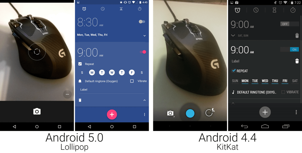
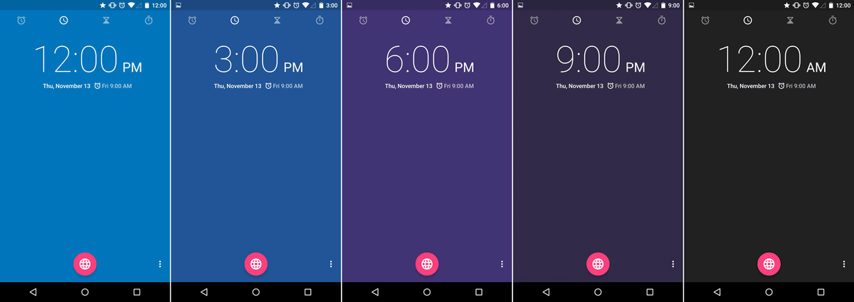
Although it is a modest change, in Lollipop the background color changes with time.
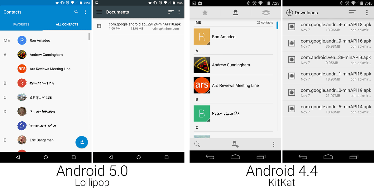
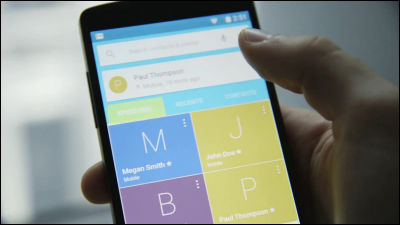
The "contact" design is unusual within the UI changed by Lollipop, and the size of the icon / character is smaller than KitKat. It is Google's decision that this small changed designer can quickly locate the person you want to contact, but I really want to check it.
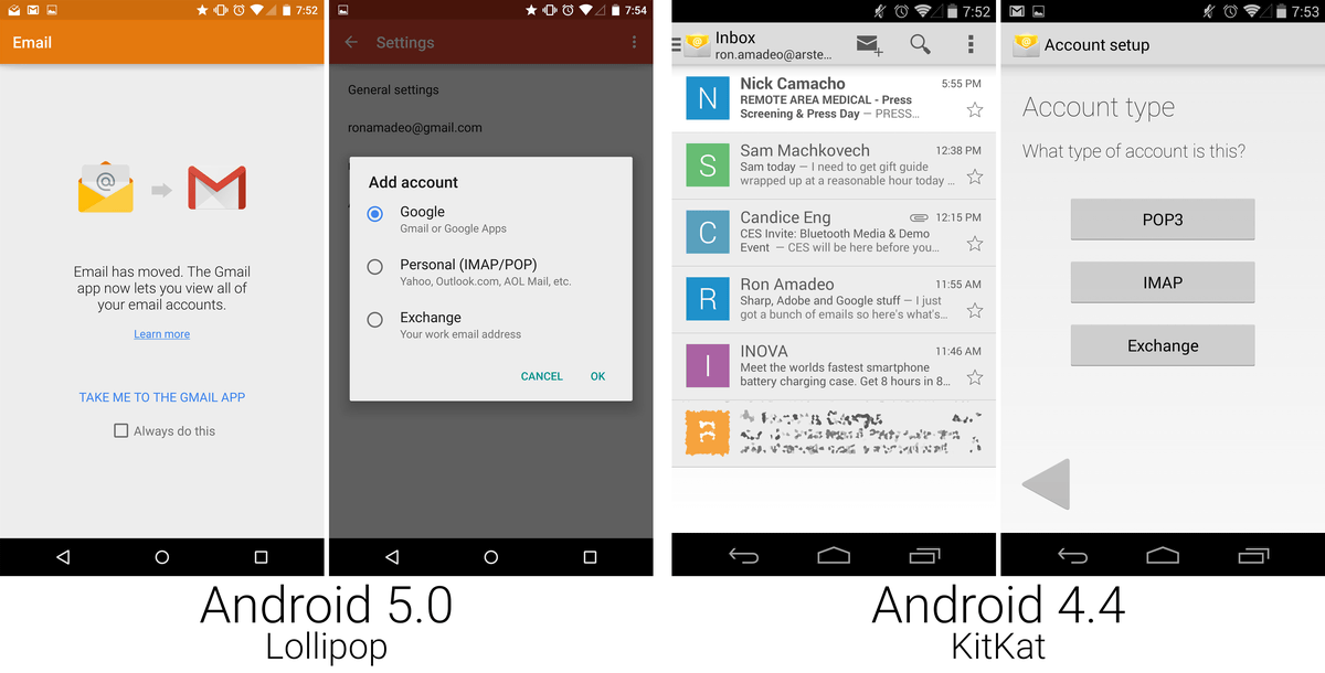
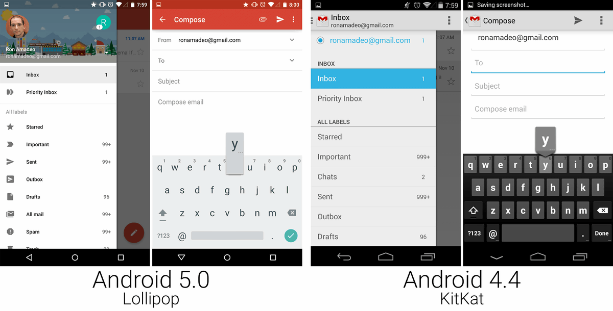
In Lollipop, the standard mail application is integrated with Gmail and disappears. Instead, Gmail is compatible with Pop3, IMAP, Exchange.
In Gmail, the header was changed to red and the area of the white background expanded dramatically. Apparently, in Lollipop "white of background" seems to be a key concept on the design.

Gmail's key input navigation has also been changed to Material Design specifications, keyboard keys are integrated design.
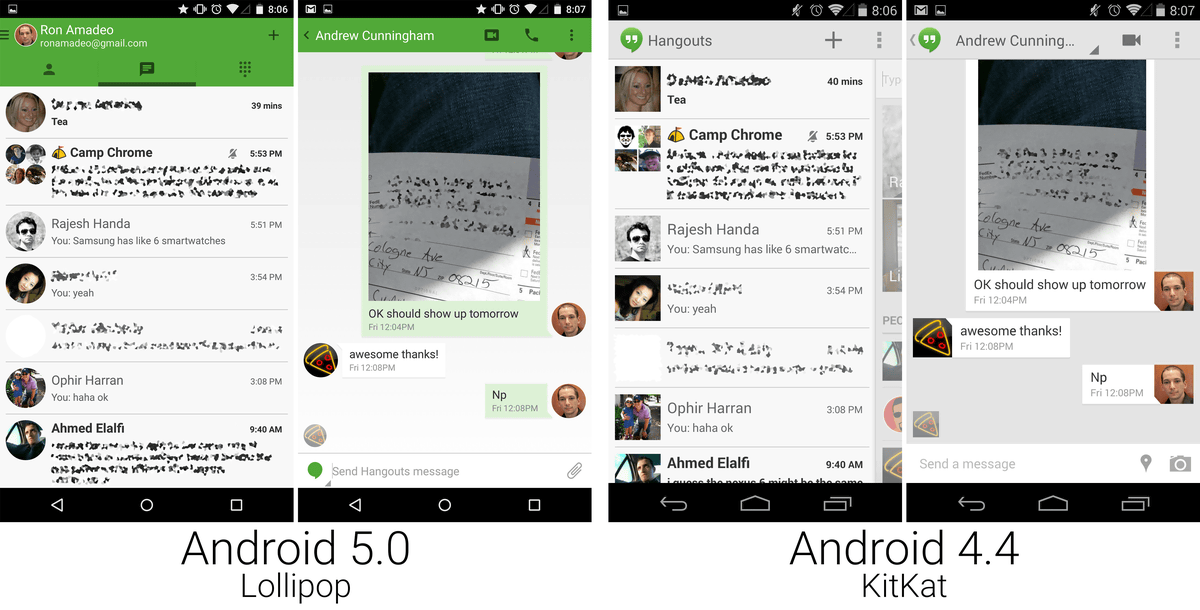
Since the Google Hangouts application has already been made into Material Design at KitKat, it is only a small color change.
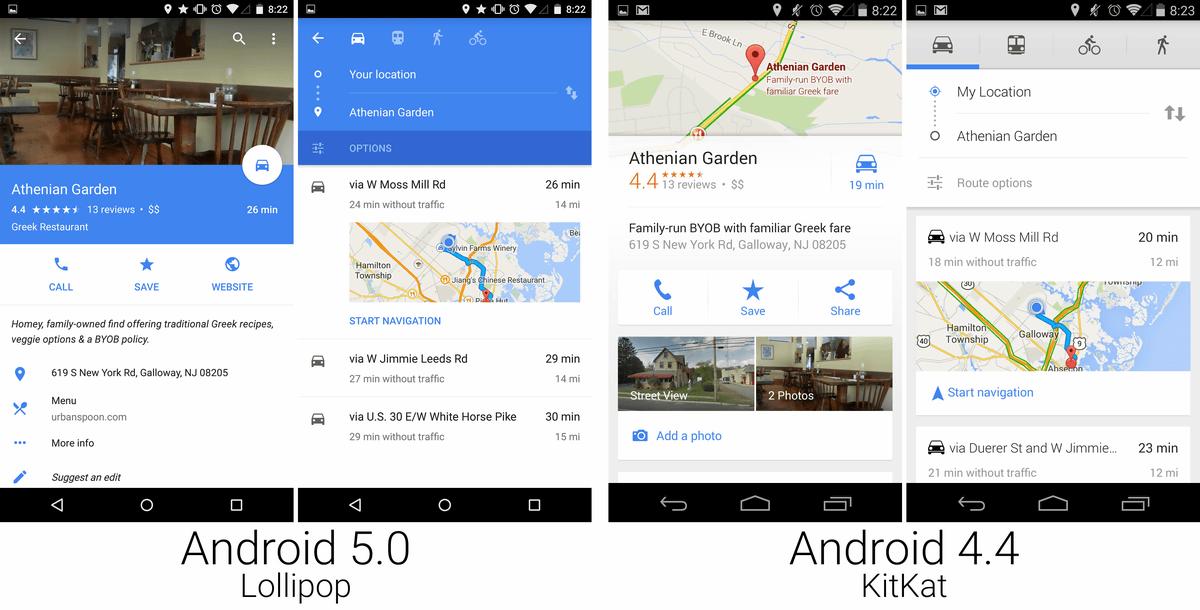
In the Google Map application, navigation icons were separated on different screens, but in Lollipop the specifications have been changed so that they can be displayed on the map by swiping from the left edge of the screen.
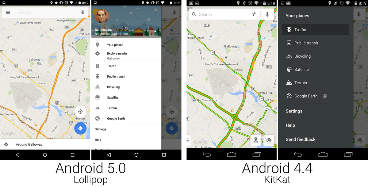
In addition, by using vivid blue color, we succeeded in making map information easier to see and understand. In KitKat, two map previews were displayed in parallel side by side, but this was abolished by Lollipop. It is said that map preview has been changed to specification to display one full screen width at a time.
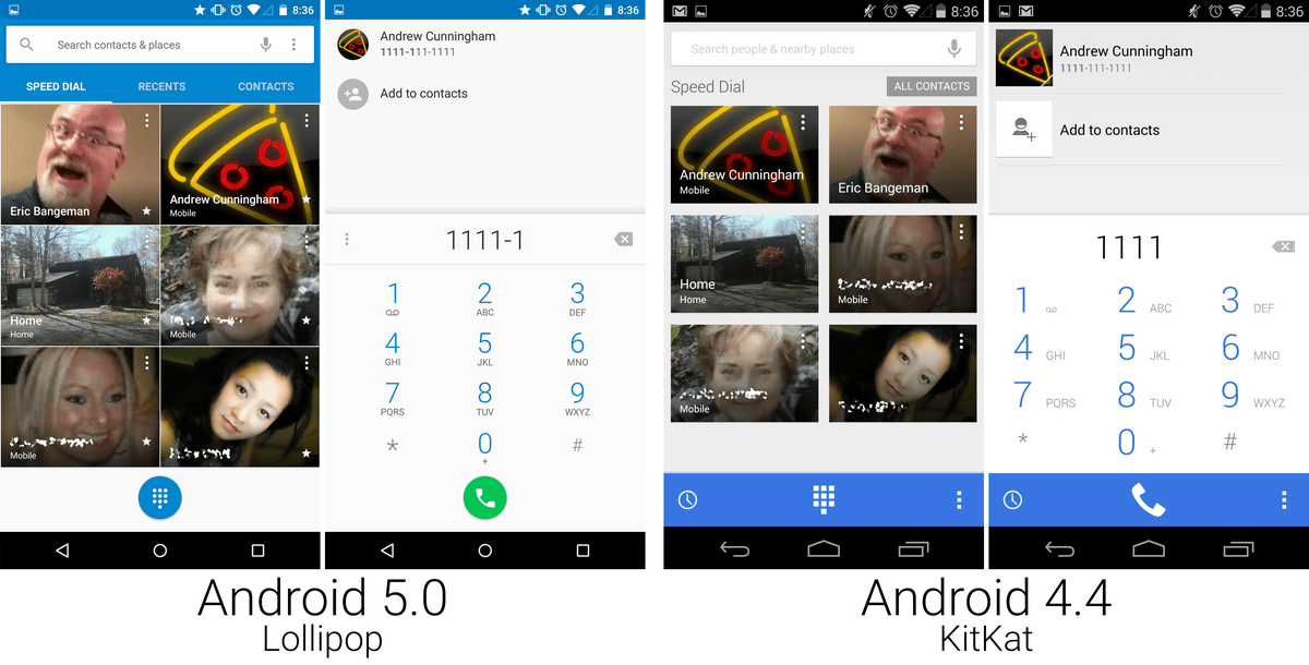
The change of the dial screen looks like this. The image image of the opponent displayed on the grid is larger.
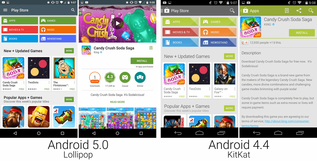
There is no big change in the search screen of the application of the Google Play store, but in the explanation screen of the application alone, the background is changed from gray to white, the explanation written long is driven down the screen, more image images are used more Change to layout to do.
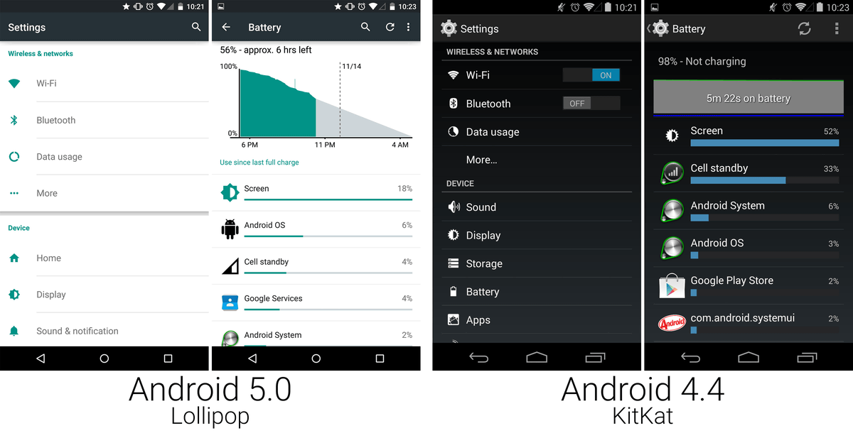
The setting screen is a renewal of the dark color which has been followed from Android 4.0 (Ice Cream Sandwich), and changed to a white background in Lollipop.
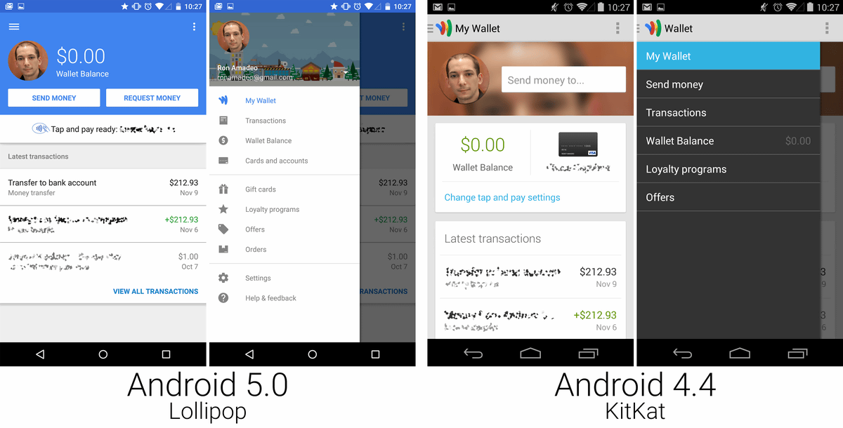
The Google Wallet app has also changed its header to vibrant blue and has been changed to Material Design specification.
Comparing the old and new design like this, Lollipop understands that most UIs are being redesigned to new designs according to the unified concept Material Design. It is interesting to see whether usability is really up by ergonomic Material Design.
Related Posts:

in Software, Smartphone, Design, Posted by darkhorse_log