What is Google's new UX design "Material Design" using animation?
Google's "Google I / O"Many new device and services were revealed, among which the new UX system adopted as" L "of the next Android"Material Design"Was also announced. A new design using animation that unifies Google's platform "Material Design" is what the movie is released to the public.
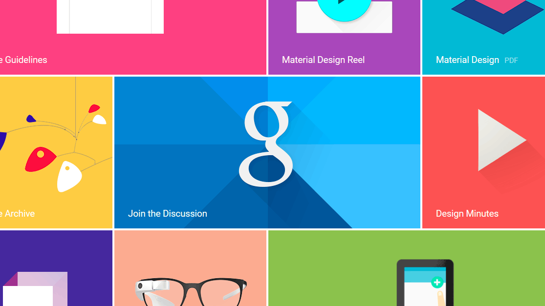
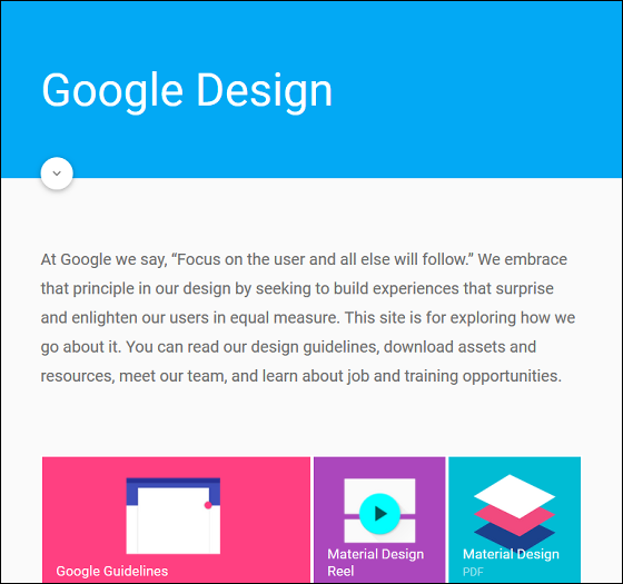
Google Design
http://www.google.com/design/
You can see how Material design is adopted for terminals on the following movie.
Material design - YouTube
For example, in the following inboxes the message is divided into "today" and "yesterday".
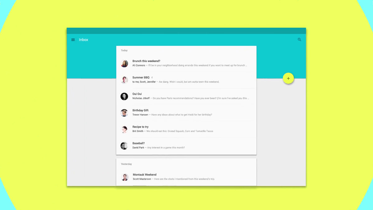
Tap one of them.
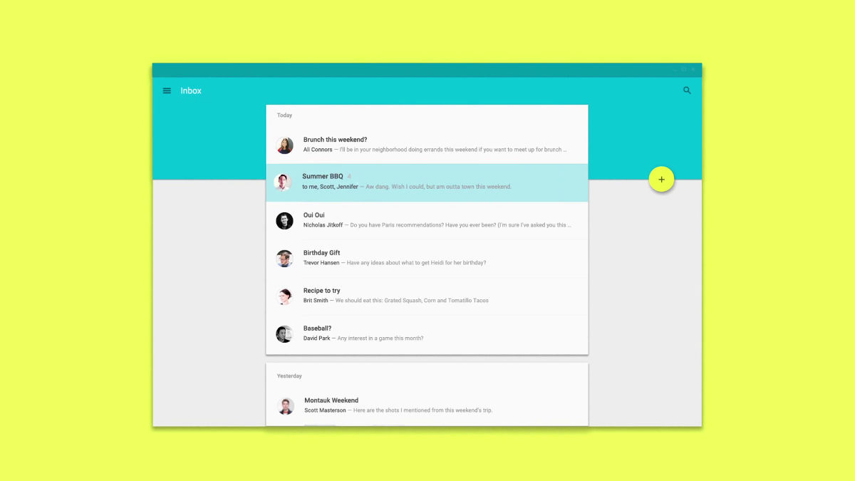
Then the two parties on the summer barbecue were displayed.
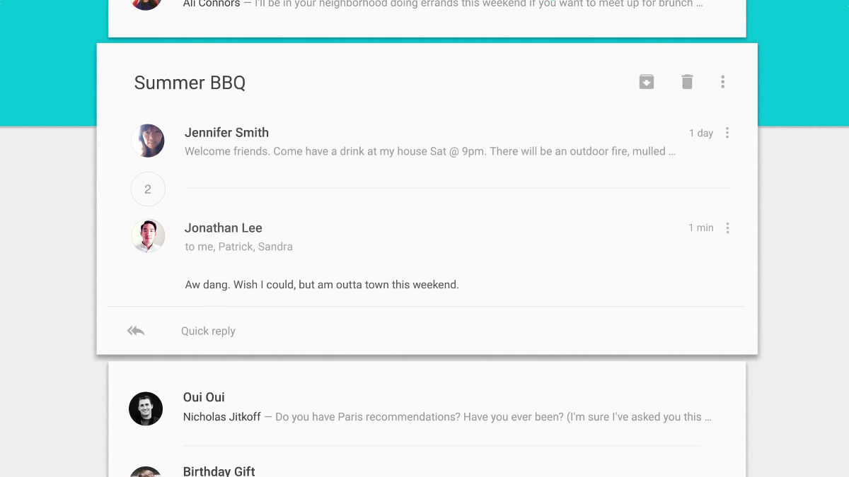
Tap the number "2" in between ... ...
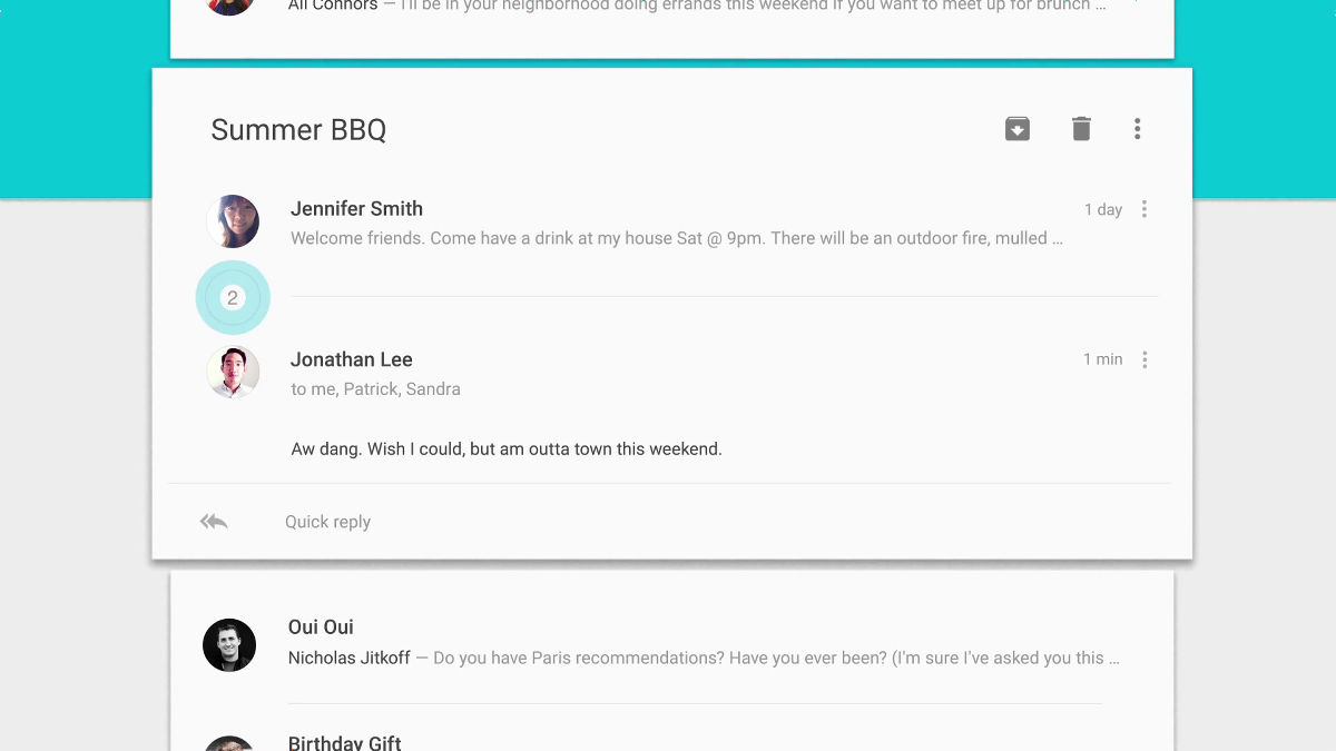
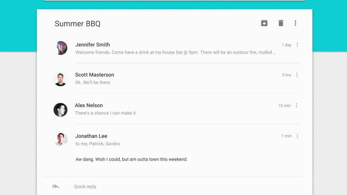
Another person's message that appeared while two people exchanged messages appears.
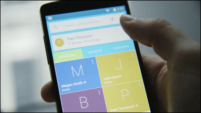
The UI of the phone book is also a card design using a photo, so that information can be grasped simply and intuitively.
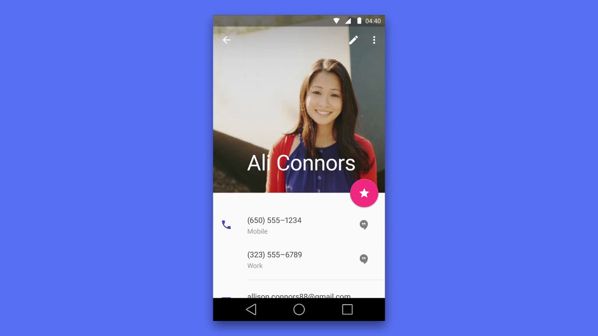
Swipe the lower half of the screen and erase the picture, and see the whole information like this.

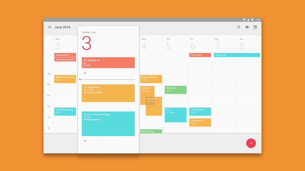
Next, the calendar function. The schedule from the 2nd to the 8th is lining up.
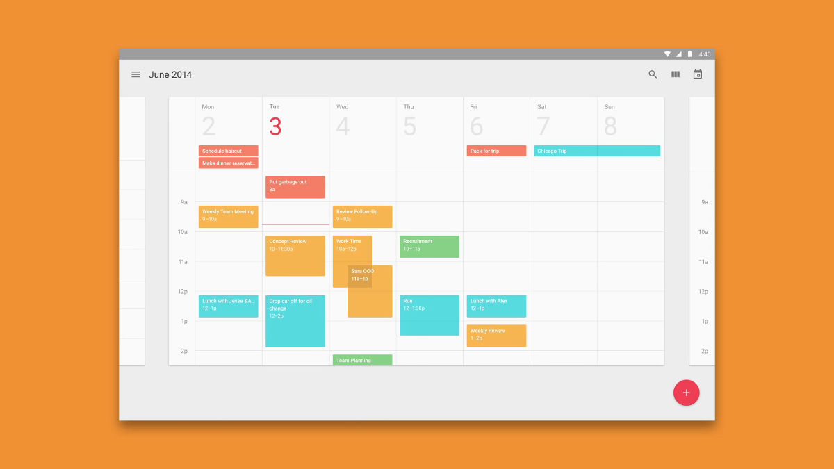
Three days of the schedule will emerge and you can check and edit it firmly.
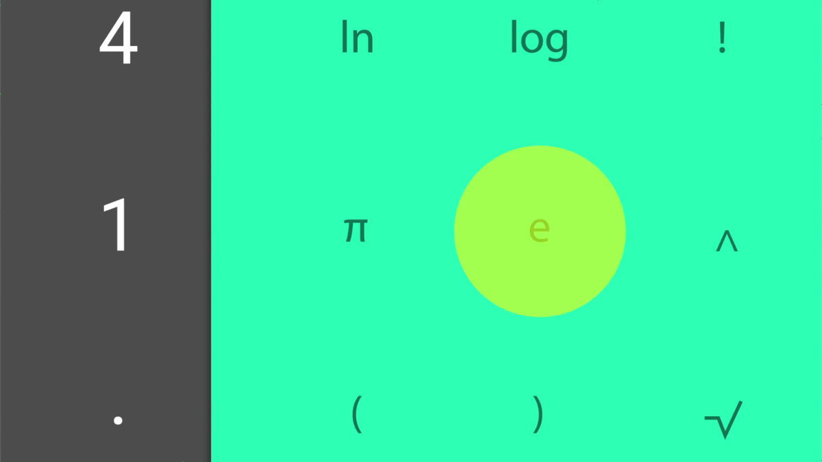
Simple calculator UI.
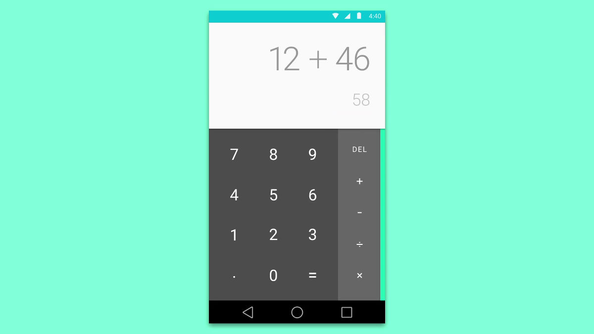
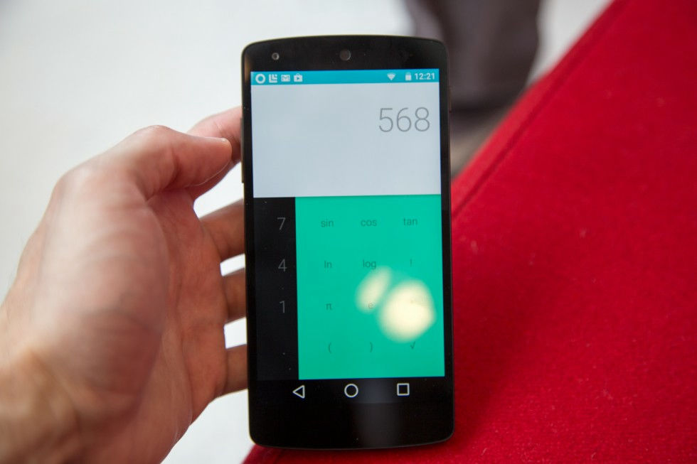
Symbols such as log and π appear from the right side of the numeric keys.
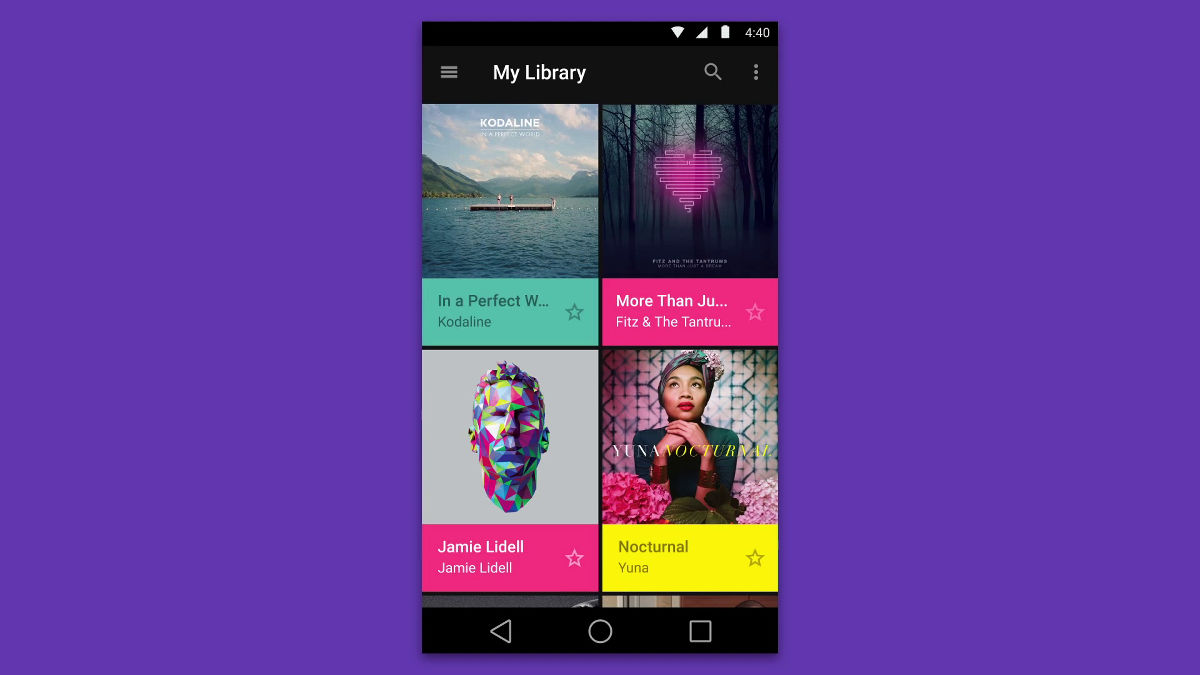
When you open My Library, photos and movies will appear from the bottom ... ...
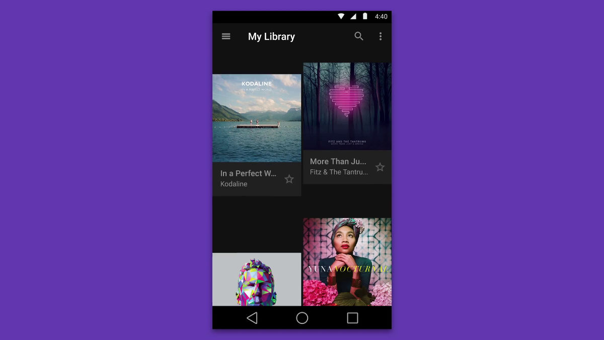
It was arranged cleanly. Each title is displayed colorfully.
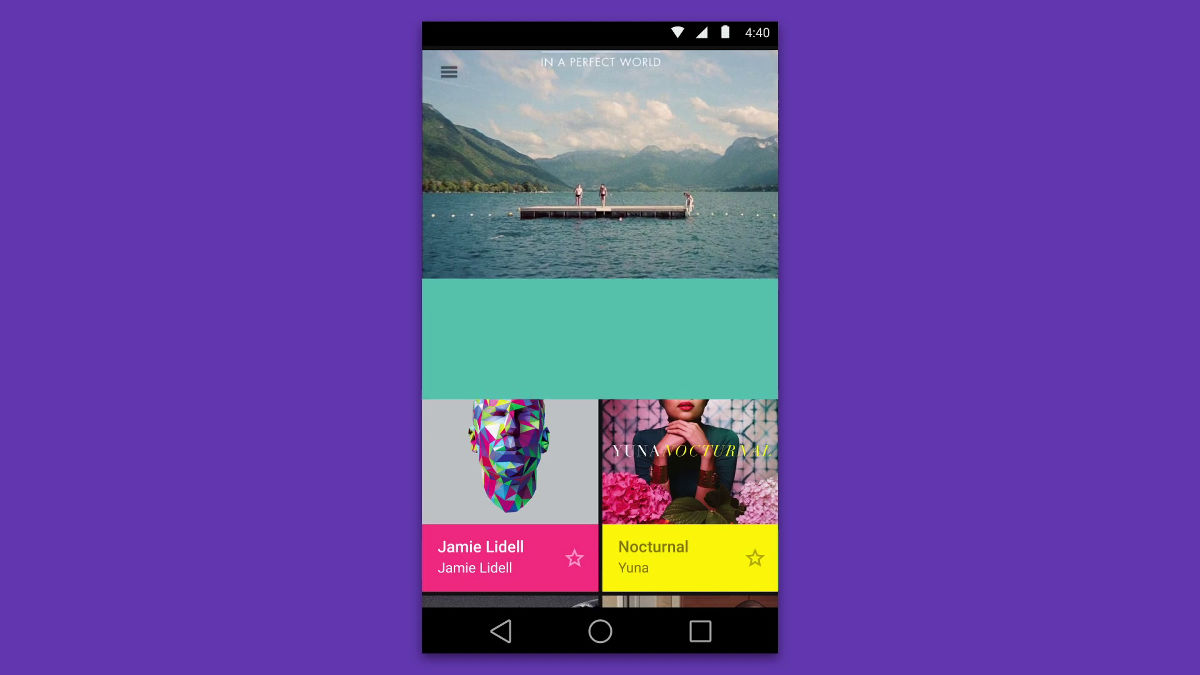
When you open each picture or movie, the screen does not change, but the content is displayed with animation.
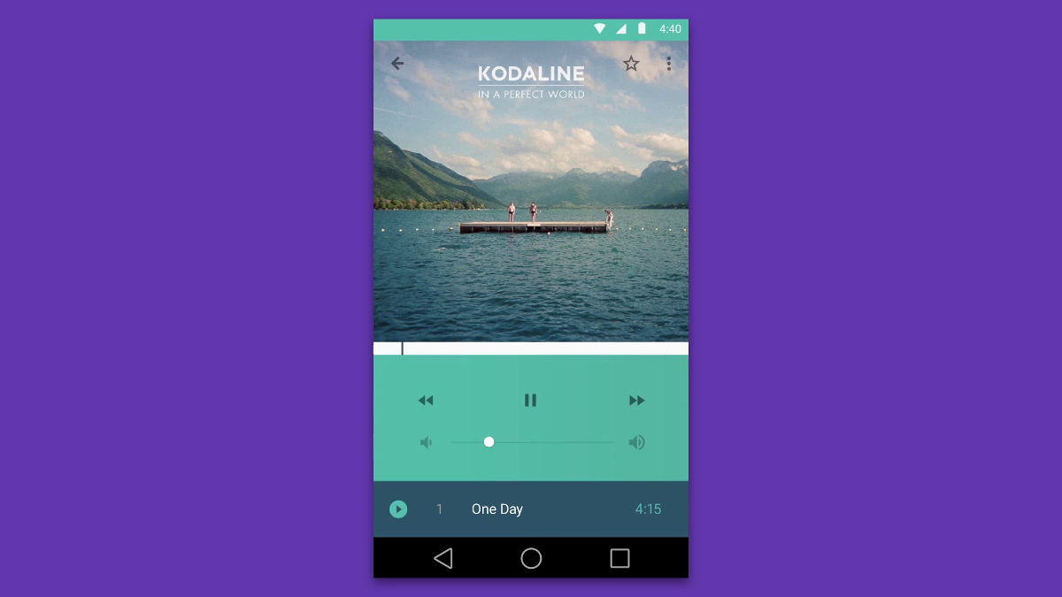
The movie playback screen looks something like this.
It is designed to be all suitable interfaces even if the devices are different.
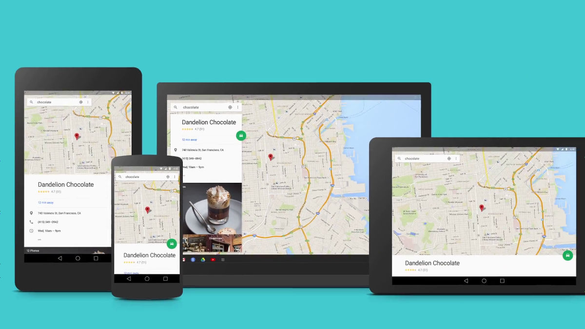
Material design actually appearing on Android L looks like the following.
Android's L release beta in pictures | Ars Technica
http://arstechnica.com/gadgets/2014/06/androids-l-release-beta-in-pictures/
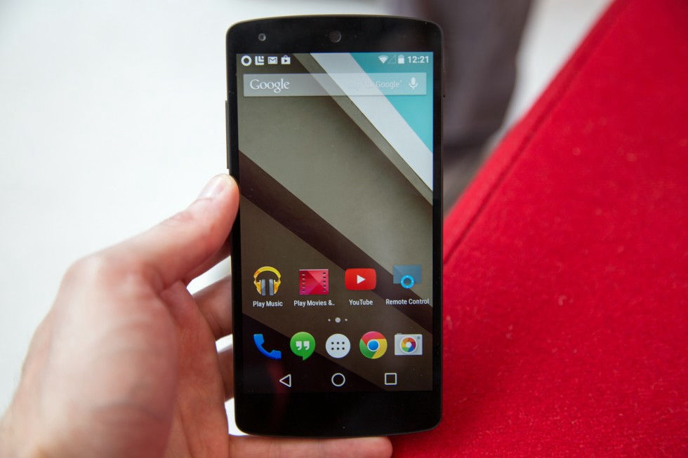
This is a beta version of Android L. The home screen seems not to be much different from the Android terminal so far.
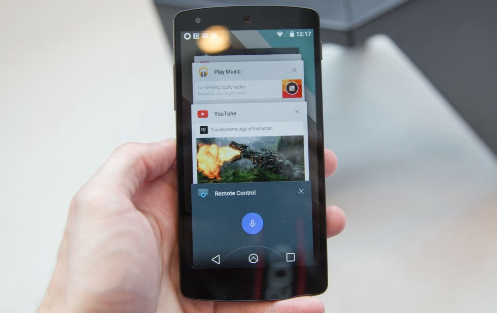
Application switching screen.
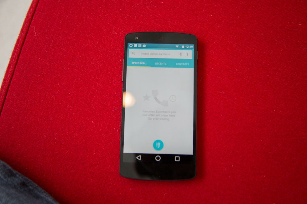
The impression that the call application became a cleaner design.
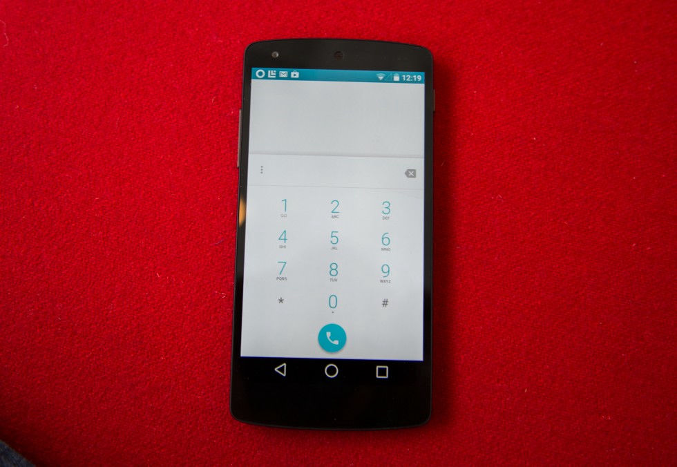
Numeric key of telephone function.
Calculator application.
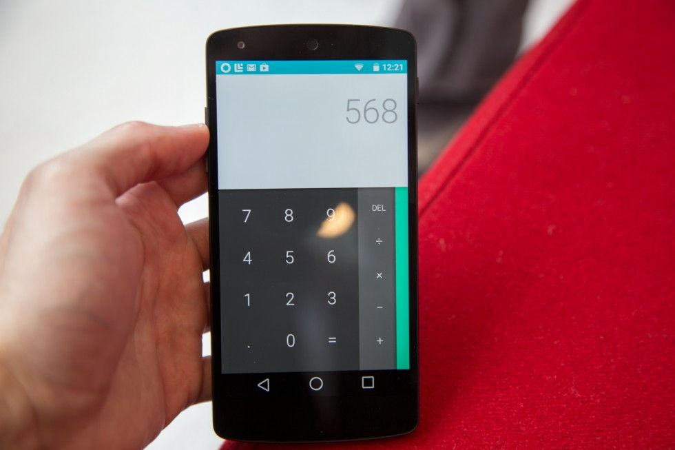
The sign key came out from the right side of the screen.
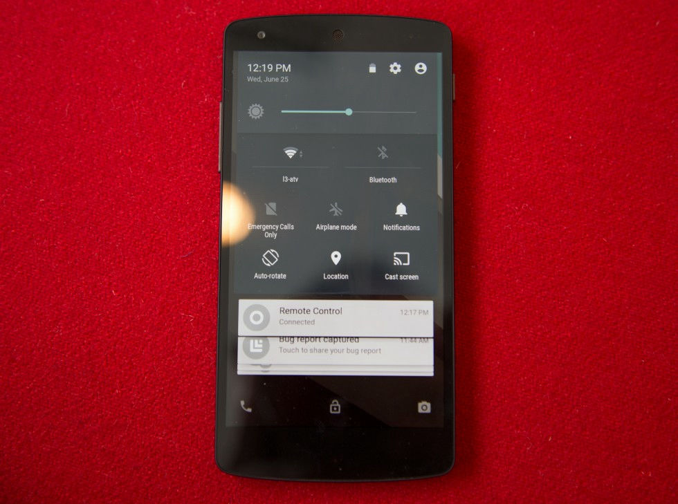
The setting screen looks something like this.

While each function is fixedly displayed at the top of the screen, the display at the bottom of the screen shows movement.
What is Material design can be confirmed from the following PDF file.
Material-design.pdf
(PDF file)http://static.googleusercontent.com/media/www.google.com/ja//design/material-design.pdf
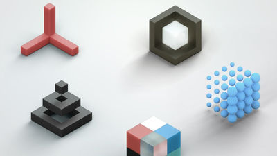
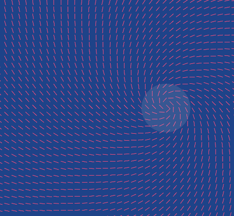
Material design is based on unified theory using reasonable margins and movement. Inspired by the research "going up with imagination with paper and ink" that Google Design has done, it creates Material (substance) as "touching reality" on the screen.
By creating the "face" of the substance, the user is made to recognize intuitively and naturally that "in front of the eyes" is touched.
Light, surface, movement tells the user that "objects interact with each other". Also, realistic light makes it easy to understand that seams and spaces are separated, and where moving is where.

At the root of the design is interaction and margin. Even though it is a system of the same design, it looks different if the terminal is different, but colors and sizes etc are displayed properly for each device.
Bold text is used for content, and hierarchy and concentration points are given to the screen. Also considering the choice of color, it is clarifying the screen clearly and clarifying what to concentrate on by enlarging the screen from end to end, enlarging typography and dare to leave a margin .

Experience designUser action is indispensable. Material design's color and surface / illustration method emphasizes "action".
With the changed interface as the driving force of the user, the screen will start to flow as if touching.
Animation is assigned to each scene, and it is designed so that users can feel the relevance of objects.
Every movement has a meaning and it has become a mechanism to call attention while leaving relevance.

Related Posts: