Apple official WWDC application is "flat design", compared with successive WWDC applications
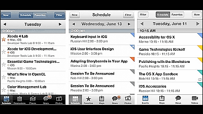
From 2:00 AM on June 11 (Tuesday) of Japan time Apple's "WWDC 2013It is probably thought that there may be announcement of the next "iOS 7" and the latest Mac OS X announcement etc., but it is thought that there is probably a presentation of Apple's official WWDC application released before that The design has changed from the past, and it is designed to support the expectation that "Flat design will be adopted in iOS 7?"
WWDC for iPhone, iPod touch, and iPad on the iTunes App Store
https://itunes.apple.com/us/app/id640199958?mt=8
Surely as you can see from the screenshot below, I feel that it has changed somewhat from the realistic and stereoscopic design so far.
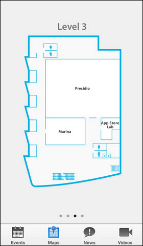
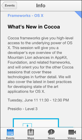
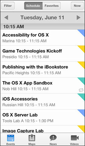
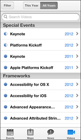
The following image shows that this impression is "not somewhat, it is really changing"We will line up the 2011 WWDC application to the 2013 WWDC applicationBy doing so, you can see that the design is definitely shifting to "flat design".

In the first place, the flow of this flat design was decided by the metro design adopted by Microsoft's Windows Phone, "Like the guide board of the subway, it aimed for everyone to reach the destination quickly"It was so smooth and it was very easy to understand, so I decided what I was getting drunk and adopted in Windows 8 and overturned.

So what does Apple's iOS 7 look like? How about a flat design? In one articleJonathan IveIs involved in the design,Every flat design based on black and whiteThere are various stories, and some say "This is the iOS 7 leaked home screen!"
What some iOS 7 stock app icons might look like like

Do you feel like this? Mockup of expectation

Or is not it just a thing with a glassy luster? Also something.

Wonder how it will change in iOS 7 or not, I can understand the answer in WWDC keynote on June 11 (Tuesday) 2 am.
Related Posts:
in Design, Posted by darkhorse
